It’s not a secret to anyone anymore that web designs based on illustrations feel fun and easy-going and most people simply fall for them. The designers’ striving to present the user with more and more creatively crafted websites has led to shaping all kinds of illustration styles in web design.
Those of you who have been following our blog for a while may remember that we have already put together a mega-collection of illustration-based web designs for your inspiration. Thanks for the awesome feedback, by the way. Means the world! This time, however, we’ll dig deeper and tell the illustration styles in web design apart. Ready to kick it off?
Related: 39 Inspiring Website Color Schemes to Awaken Your Creativity
Flat Web Design Illustrations
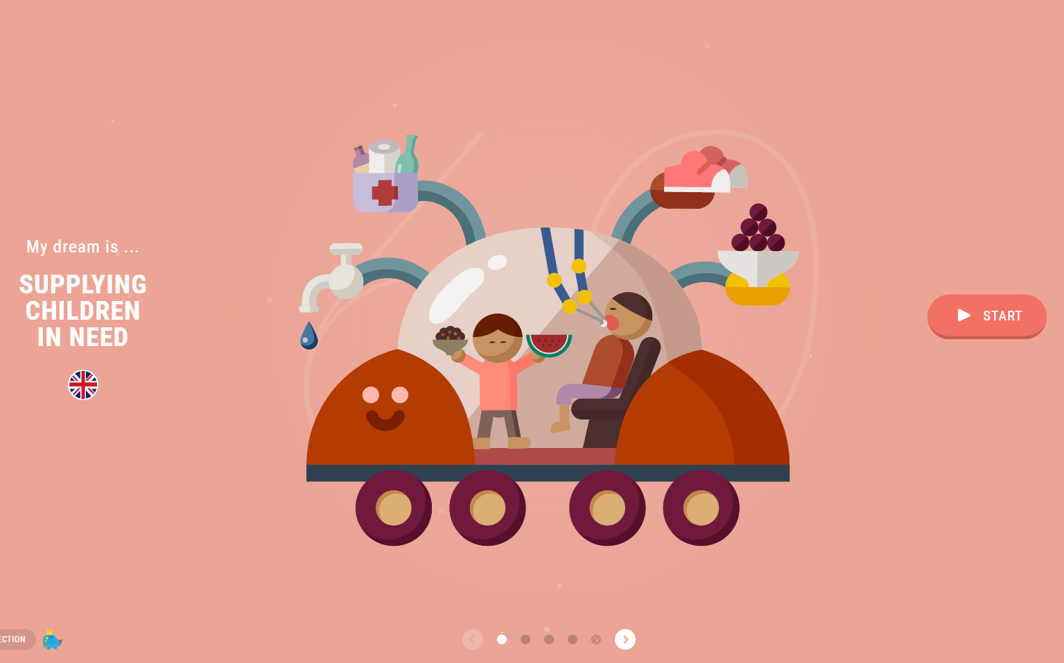
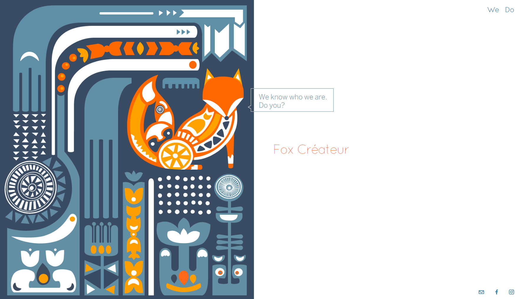
We start this colorful web design collection with the most popular illustration style on the Internet these days: a flat style. The never-dying flat style has certainly passed its peak but can still beat the user’s short attention span. It’s easy on the eye, helps for a cleaner web design layout, conveys simplicity, and effortlessly communicates the brand message. What more would you want from a website design?
The following 5 examples perfectly depict the functionality of this illustration style. Some of the brands that have opted for it are Toyota, Facebook, Airbnb, and more. Check them out:
Textures & Gradients
Meanwhile, some web designers decided to take flat style to the next level by spicing up the composition with textures and gradients. We’ve cherry-picked a few web design examples, some of which are hybrids of flat elements and realism.
These illustration-based website designs are also characterized by simplicity. Whether combined with bold colors or represented in a black & white color scheme, they can easily grab the visitor’s attention. See why in the following 5 examples.
Low-Poly & 3D Illustration Styles
3D is officially back! During the unyielding reign of flat design for the past several years, the designers have somehow forgotten about the powers this technique holds. Now, this trend seems to have been raised from the dead. We have been seeing more and more eye-catchy 3D web designs. You can easily tell that the designers have started juicing up the web.
Coming hand by hand with another super trendy style which we’ll definitely see more of this year: low-poly web designs, 3D is absolutely here to stay. Here are 4 examples of having gone down the three-dimensional road. Some of these are completely low-poly, others are plain 3D illustrations, yet others are a combination of both. See for yourself. Do you also want to check out 20 Beautiful Isometric & 3D Illustrations For Your Designs?
Bright Colors in Web Design
A major web design trend: colorful illustrations! Being one of the most wanted illustration styles in web design these days, bright, contrasting colors certainly scream for attention and they get it like a piece of cake.
This kind of design is often combined with geometric shapes and blocks. A variation is the usage of neon colors which certainly convey a feeling of futuristic and out-of-this-world designs. Here are a few examples for you to enjoy!
Outline Illustration Styles in Web Design
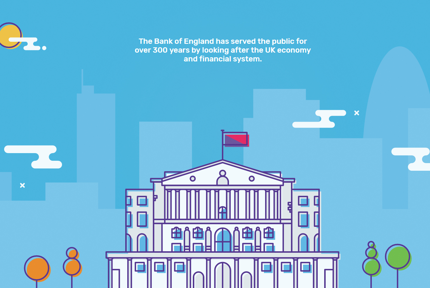
An eye-catchy trend that most people love because it simply reminds them of childhood: outline drawings. Often combined with bright colors and presented as simple, minimalist illustrations, this trend easily gets under the visitor’s skin. It’s unique enough to be remembered. Yet simple enough for the visitor to instantly grasp the idea behind it.
Old but good is the expression that describes it the best. Here are how the designers translated this illustration style into fresh-looking web design masterpieces.
Pencil & Sketchy Drawings
One of the illustration styles in web design that can be encountered more rarely across the web in comparison to the previous styles we’ve already mentioned: hand-drawn pencil illustrations, or doodle illustrations. An unconventional choice of a web design style, for sure. Still pretty unique and memorable, without a shadow of a doubt.
The following examples show how this style can be used to convey elegance, sophistication, and an overall boutiquish feeling. This style can certainly make any website design feel more artistic. It is often presented in B&W color scheme or muted, earthy colors to keep its elegance. Here come the examples.
Watercolor Illustration Styles in Web Design
If we had to choose the single most artistic style of all, this would be it: watercolor. When a website design looks like it has been turned into a canvas, you know this is true art. Creativity, imagination, and incredible art skills flowing right from the screen.
Since imagination is the limit, there are indeed many watercolor illustration styles in web design. We’ve tried to capture the diversity of this beautiful artistic technique and this is why we’ve showcased different watercolor styles. Some are black and white, others are brightly colored but all of them are absolutely impressive.
Well, this is it! We hope we’ve managed to throw some light on the diversity of illustration styles in web design. We’d love to see what else you would add to this collection. If you have any examples to throw in or you simply want to boast about your own illustrated website, go ahead and do it in the Comment section below. See ya!
You may also be interested in some of these related articles:
