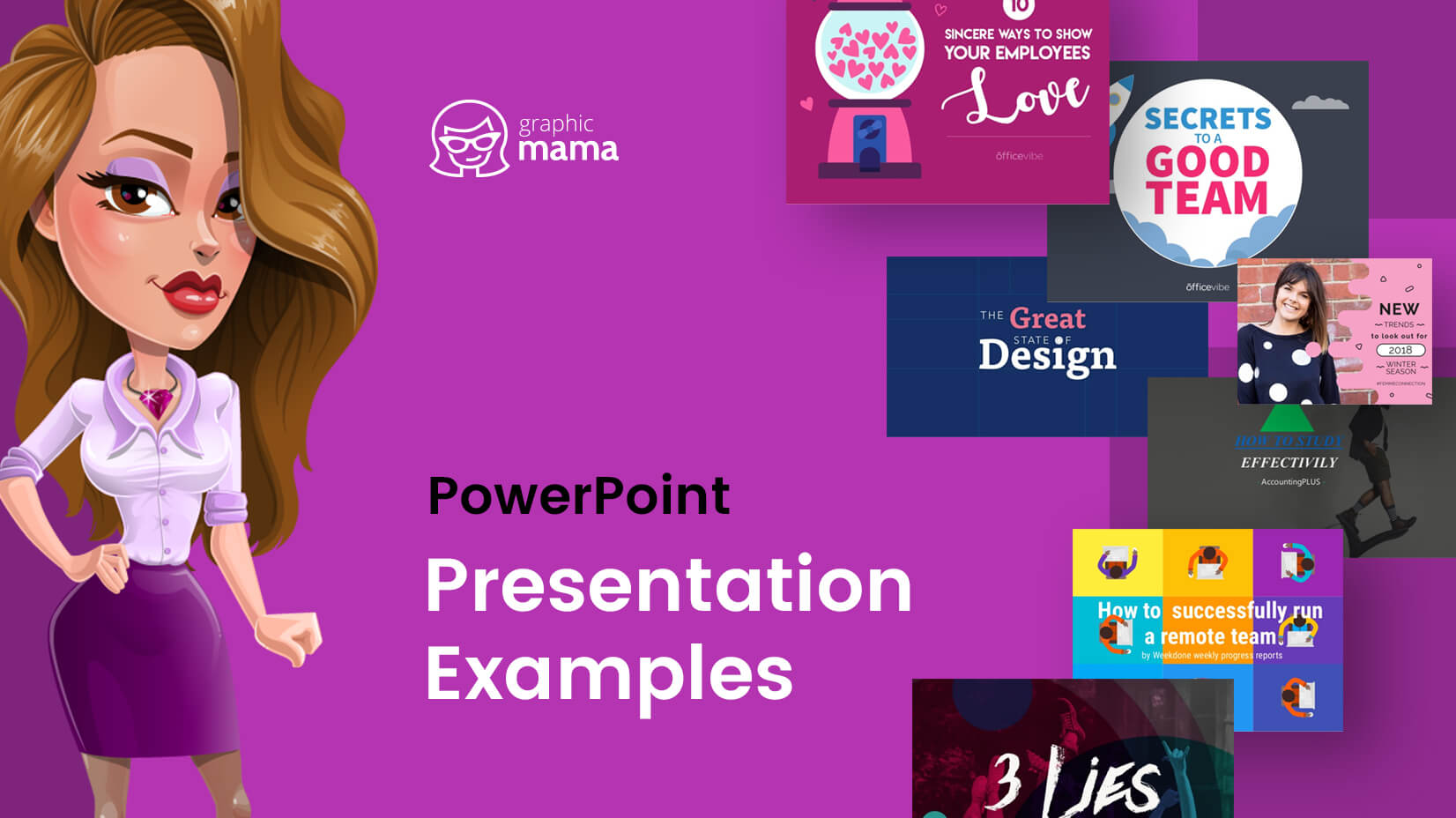
There are way too many bad PowerPoint presentation examples that can bore you to death. Well, today’s post is not about them. We believe that it’s always important to show the good examples out there and follow their lead. We admit it, it was pretty hard to dig out the good PowerPoint presentation examples from the mass. We’ve added our opinion on each piece and why we believe it’s worthy of being included in this collection. Let’s begin!
You may be interested in The Best Free PowerPoint Templates to Download in 2022
1. The Sketchnote Mini-Workshop by Mike Rohde
An eye-catchy PowerPoint presentation example whose content is fully hand-written. What we love about this design, is the high personalization level that is achieved via handwriting. It almost feels like the author is drawing and writing in front of the viewers’ eyes. A digital presentation that conveys a physical feeling.
2. 10 Ways to Spread The Love in The Office by Elodie A.
The following presentation is a real eye candy. We can’t help it, the cartoon style lives in our hearts. An incredibly appealing PowerPoint presentation that brings positive vibes and a good mood through vibrant cartoon illustrations. It gets bonus points for the usage of bullet points and little text.
3. The Great State of Design with CSS Grid Layout and Friends by Stacy Kvernmo
A presentation that tells a story is always a good example that everyone should follow. This PowerPoint presentation has a lot of slides that tell different mini-stories. The way they are depicted is really engaging – they almost look like a sequence of frames that make up a video. This technique really nails the viewers’ attention.
4. We live in a VUCA world by Little Dragon Films
A classy design of a PowerPoint presentation example – a dark theme and white font on top with just a single color accent – red. Such designs are really suitable for serious topics like this one. To soften the contrast between the black background and white font, the author has used a gradient on the background which gives the illusion of soft light in the middle of the design.
5. 2017 Marketing Predictions—Marketo by Marketo
A design that was made over a year ago but it’s still really trendy. In the following PowerPoint presentation example, we can see the combination of 3D shapes, beautiful hand-written fonts, negative space techniques, and more. The overall feeling is of futuristic design. Moreover, they used the color of 2018 – Ultra Violet for their color scheme. Maybe, they did predict the future after all.
6. 10 Ways Your Boss Kills Employee Motivation by Officevibe
Who doesn’t like to see a familiar face? We know your audience does! It’s proven that if you show a familiar face to your viewers, you nail their attention and boost their engagement level. This is the technique used in the following PowePoint presentation. Moreover, the inner slides of the presentation are also cartoons with big conceptual illustrations and little text. The formula for a really good presentation.
7. How to Successfully Run a Remote Team from Weekdone.com
We haven’t really seen many PowerPoint presentation examples with top-view illustrations. The following presentation really reminded us that when presenting to an audience, you should always think: How to make your design stand out from the rest? Well, this one really caught our eye. In addition, we love the bright colors, geometric shapes, and overall flat feeling, all of which are among the graphic design trends for 2022.
8. SXSW 2018 – Top Trends by Matteo Sarzana
People love visuals and this is an undeniable fact. The whole PowerPoint presentation is built on high-quality photos, each including a little tagline in the middle. We love the consistency, we love the factor of surprise, and we love the high engagement level this presentation creates. Just make sure to back up such presentation type with a good speech!
9. How to study effectively? by sadraus
Semi-transparent overlays, geometric shapes, a video inside… Everything about this PowerPoint presentation screams “modern”. The grayscale coloring is accompanied by a fresh green color accent. The choice of images clearly suggests that the target audience is young people. The overall feeling that we get from this PowerPoint presentation – is youthful and modern.
10. Study: The Future of VR, AR, and Self-Driving Cars by LinkedIn
A presentation about the future should look futuristic, right? The following PowerPoint presentation example is proof that you should always connect the subject of your presentation to its design. Everything in this presentation speaks of futuristic: the choice of fonts, colors, effects, and even some elements look like holograms from the future.
11. 9 things I’ve learned about SaaS by Christoph Janz
A PowerPoint presentation example created in a consistent style by using a blue theme. Why did we include this presentation? We love the fact that the author has shown an alternation of text and visuals (from slides 7 to 22). This technique is proven to hold the attention of the viewer. Moreover, the way the graphics are presented (on a napkin) draws the interest even more.
12. How To Achieve Something Extraordinary In Life by Sultan Suleman Chaudhry
A PowerPoint presentation example that shows consistency and style by using a strict color scheme: orange, beige, and deep blue. Orange and blue are one of the most popular contrasting combinations widely used in all kinds of designs. If you are not sure what colors to go with, simply choose a tested color scheme.
13. New trends to look out for 2018 winter season by FemmeConnection
Geometric shapes and negative space techniques are among the graphic design trends for 2018 which is why we see them often in PowerPoint presentation examples and other designs. In the following presentation, we can see a collection of women’s clothes presented in a very engaging way with the help of rounded geometric shapes, negative space technique, and the color pink.
14. Fear of Failure by Sultan Suleman Chaudhry
Speaking of the usage of geometric elements in the presentation’s design, let’s see another example. An elegant design decorated with circles, triangles, and more geometric details. What else we love about this presentation is that it only has one color accent – light yellow which looks classy and pleasant for the eye.
15. The Three Lies About Your Age by Sean Si
A great choice of fonts, beautiful semi-transparent geometric elements, and trendy futuristic colors. This is one of the PowerPoint presentation examples that we absolutely love. The story is engaging and the design is extremely appealing – a combination that keeps the viewers’ eyes on the screen from the beginning till the end.
16. Secrets to a Great Team by Elodie A.
Bright, fun, using lots of illustrations and cartoon characters – definitely our kind of PowerPoint presentation. Why do we love it so much? Well, cartoons are real ice-breakers between you and your audience. Moreover, cartoon characters are easier to relate to than a real human face. If you need to connect on a deeper level with your audience, this is your kind of presentation!
You’d probably like to learn 4 Invaluable Presentation Design Tips You Wish You Knew Earlier
17. How to Build a Dynamic Social Media Plan by Post Planner
A great presentation PowerPoint example with watercolor illustrations and backgrounds that look hand-drawn. We also see semi-transparent colorful overlays, high-quality conceptual photos, and great, useful content. What more would you want from a presentation, right?
We always love to hear your opinion about stuff. So, what do you think of these PowerPoint presentation examples? Do you think that you’ve created a presentation better than these? We’d love to see your own creations in the comments below if you want to share them with us.
You may also be interested to read these related articles:

