Updated: March 24, 2022: Updated with new landing page design examples
Your landing page is absolutely essential, you know it and so do we. It’s where the visitors literally land after clicking on a link in an email, social media, or ads from Google, Facebook, and Instagram. It is the focus of your digital presence, it’s the welcome at the door, and never have these first impressions been more important. You want to increase the conversion rate in your marketing campaign, you want a sale, you need a lead, you want to get yourselves noted and noticed, then what you really want is a landing page that holds the visitor, then informs, inspires, and persuade them then you are worth dealing with. A focused goal is to do a job… it’s not easy but it’s very possible.
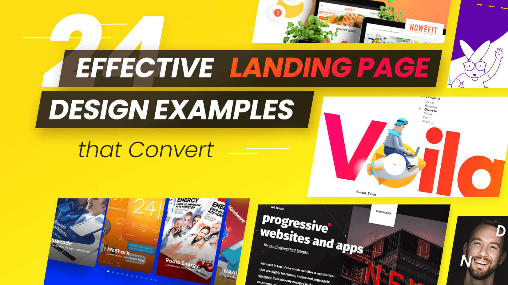
We’ve selected 24 landing page designs that will inspire and motivate, they are both fantastically designed and effective. Check them out, the bar is set high, but every bar is worth aiming for.
1. The Inside Scoop: Landing Page Design with a Metaphor

Great logo, blending the ice cream cone (scoop)and lightbulb –idea metaphor. You’ve got the attention right there, with a spot-on design. After that, it’s all about clean, friendly organized content. Clear typography, consistency of color and text, ease of navigation –breathing space. You don’t need to fight your way through this site, just relax into its delicious simplicity.
Visit Website
2. Planable – Content Marketing Report Landing Page

We start off with a sense of flow, colors, and lines in organics twists and curls. This feeling pulls you in and pulls you down through the page, leading you but not pushing you. It leads to some incredibly effective infographics –doing exactly what they should do –presenting the information in a clear, concise, accessible format. Unfussy, plenty of room, negative space showing real confidence in the data, it gives the viewer a sense of open honesty. Sets the tone of the business.
Visit Website
3. Qwilr – Document Generator

Seriously structural. Dark blue background, white typography, focused icons –what you see is what you get. Divided into strong horizontal blocks, it’s a crystal clear design that lets you know you are in the hands of professionals. Organized, informative, direct –it attracts with its strength of character, creating a perfectly appropriate atmosphere.
Visit Website
4. Login Designer Minimal Landing Page Design

A classic black and white color scheme with pink accent colors especially focused on the call to action buttons. A landing page that is functional and directed, there is no way you cannot see those calls to action, they are front and center, and rightly so. The rest of the page is a beautiful example of the simplicity of explanation, images that add explanatory value, and the briefest of texts. Everything adds, nothing distracts.
Visit Website
5. GraphicMama – Custom Character Landing Page with Demo

Full marks for creativity here. If this landing page doesn’t get you excited, we don’t know what will. A powerhouse showcase, a character creation slides to a real photo and back –front and center –this is what we can do for you!! Scroll down and it’s equally impressive. A step-by-step process guide and ideas on usage, nothing left to chance and all fully illustrated. Combination of full information and showcase of ability –it seems effortless but we know it isn’t.
Visit Website
6. GraphicMama – Custom Puppet Landing Page Design

Whilst the characters rightly steal the show, this landing page is full of useful explanations, videos and ideas, and links but it succeeds in feeling airy. Clear navigation and well structure organization break down the concept into accessible blocks, and all this makes complete sense. But back to the puppets, if you have such a product it’s absolutely the thing to show off. Impressive showcasing, impressive design.
Visit Website
7. The Story of Titanic Interactive Landing Page Experience

This long-read about Titanic’s history is packed in a single page that offers a lot of interactive elements to help you dive into the story. Despite the long scroll, the page works well as an educational presentation and feels like an immersive journey from the beginning till the end.
Visit Website
8. Moburst – Media Offering Classic Landing Page Design

The high point and indeed the focal point of the Moburst landing page is the illustration. A fine example of an illustration, clearly illustrating the exact function of the business with clarity and great style. This vital role is then framed with key information including the prominent role of the big global brands that are clients. The landing page highlights the major selling points and pushes them to the fore. If you’ve got clients such as these, they need to be seen. A page that isn’t shy about selling itself.
Visit Website
9. Wondershare – Filmora Landing with 3D Illustration

A cool, fresh landing page with a trendy color scheme of mint green and dark blues over white clear backgrounds. Crazy illustrations, prominent call-to-action buttons; (download, try free), showcase videos, and plenty of well-organized information all working together to encapsulate the product. Creative and interesting but all the time focused on what they are selling. The rule is never to lose sight of what the site is supposed to do.
Visit WebsiteFor similar graphics and styles, check out Web Design Trends 2022.
10. Promo – Instagram Ads Modern Landing Page Design

A super example of using subtle movement and animation to get the best out of a landing page without distracting from the site. With the animations being placed inside the phone illustration and on individual templates, the whole page feels alive but takes nothing away from the essential information. It seems effortless but it’s cleverly done. Completely apt, completely appropriate.
Visit Website
11. Designer Part Minimalist Modern Landing Page

DP has created a landing page that has a great user interface and therefore experience. The page seems to come alive as you scroll through, with highlighted color, enlargement, movement, and animation combining effortlessly. Add a few staff photos, action shots, and pen pics and you’ve got a fine example of modern style, information, and creation.
Visit Website
12. Purple Bunny Landing Page with Cute Animations

Purple Bunny’s cool landing page is purple, very purple, deep purple. It’s also focused, stating who they are and what they do -no mystery. Oh, and there’s a rabbit, a cute line drawing personification popping out of his hole in the ground. The rest of the site is stuffed with case studies and examples of work. For more illustrations like this, check out 20 Amazing Websites with Illustrations that Will Steal Your Heart
Visit Website
13. Puree Mansion Scrapbook Style Landing Page

Puree Maison, creative studio lands you straight into their video, with a lively, dynamic piece that gives you a great sense of the staff and their creative processes. the imaginative approach runs through of page, static photos, flip to others on hover, and there’s a lovely animated border effect on both photos and text again activated by cursor position. Loads of ideas, make these boys an attractive prospective creative partner.
Visit Website
14. The Nifty Portal Retro-Futuristic Interactive Landing Page

The Nifty Portal is an art NFT art project by a group of aspiring NFT collectors and creators. The Landing page offers a highly interactive experience with smooth micro animations on scroll, glitch effects, and an amazing retro-futuristic design.
Visit Website
15. Intact Software Geometric Landing Page Design

With Intact you immediately find yourself in a pretty ordinary-looking greyscale with a clear statement of intent and philosophy, but more is to come. a scroll of the mouse opens up the scene with the same plain geometrical block transforming into a business illustration of the three separate industries they serve, Merchant, Retail, Wholesale & Distribution. It’s a simple idea done well, exactly what we want from this kind of business, success through simplicity.
Visit Website
16. Studio Voila Clean Landing Page Design

A hit of color from Voila studio, not a bit, a hit. Gradient color from pink to yellow for the brand name, which includes a great illustration, and for key texts. Makes for a super contrast with the heavy black for project examples and contact details etc.
Visit Website
17. Bud Agency Visual Storytelling

Bud agency takes us on a journey with their storybook landing page design, a journey of growth. Starting out with a soft chalky illustration, setting the scene. A scroll down leads us on with equally impressive illustrations and matching icons. Finishing with a beautiful landscape, of course, the all-important call to action button -start a conversation.
Visit Website
18. Pop Web Design Modern Landing Page with Illustrations

A focused landing page design with clear order, subscribe CTA buttons are all prominently displayed. A yellow on a white scheme with black text the only other colors used are in the photos and blog posts. a clear dividing line through minimal color usage. For other minimalist designs here is a must-see: 20 Beautiful Minimalist Website Design Examples for Your Inspiration
Visit Website
19. Digital Present Futuristic Interactive Experience

This Digital Present landing page example explodes out us, literally, via a great immediate animation. The pink shards are consequently scattered over the dark blue background and you are invited to scroll to explore. It’s worth it, the consistency of color usage holds everything together as you travel around if is floating in the space created.
Visit Website
20. Kobu Agency Creative Landing Page Design

Kobu intelligently creates a cool design landing page that explains they are a laboratory for creative design. This concept – lab, chemistry, science- runs throughout. From Organic matter animated backgrounds to the staff photo being a recreated parody of the evolution of man. A great example of a running theme, not laid on too thickly, but it gives a sense of philosophy.
Visit Website
21. Circle Squarespace Clean Minimal Design

The Squarespace Circle landing page drops you into the center of the action, a bird’s eye view of the creator’s desk. Later the desk is spotted from different angles, and so are video references and experiences. The whole page oozes confidence and professionalism, everything has its place, everything has its purpose, and you’re encouraged to sign up along the way.
Visit Website
22. Vaayu Tech Microanimations and Interactivity

Vaayu is the world’s first automated carbon software for retailers to measure, monitor, and reduce their carbon footprint in real-time. The page offers an unforgettable and persuasive experience with modern design and interactive animations.
Visit Website
23. We Cargo Futuristic Landing Page Design

Belgium’s We Cargo landing page wants you to get tickets – and you can’t miss the fact. A landing page with a clear focus, it is more, certainly than your average conference page. Dark scrapped animated background effects of blues and turquoises set a tone that you know will be unusual, and the photos of the speakers continue this – check them out and be sure to hover over them.
Visit Website
24. Coulee Creative Interactive Landing Page

Landing pages with photographic headshots are not so unusual -but this one is. With each face morphing into another and a “we are …” strung over them. There is more to come, of course, video, text, photos but they’ve already impressed…so as they say in the CTA let’s doooooo this.
Visit Website
Conclusion
2022 has landed, and so must you – right where the customers need you to be. These 24 great examples of effective landing pages are effective because they do the job of getting your attention, getting the message across, and most importantly of all getting that action from potential clients. The variety of ways, styles, and processes is tremendous, ingenious, and wonderfully creative as the fight for the market is more and more important. Everybody is upping their game, so be inspired to up yours too. It’s the most important page you have so make it the best one.
In the meantime, why not check out some of the related articles:
- 30 eCommerce Website Design Ideas For Your Online Store
- 10+1 Web Design Secrets That No One Ever Tells You
- 8 Tips for Successful Ecommerce Website Design + Amazing Examples
Advertisement