Maybe you are on your way to starting your own company and you hear the word “logo” around every corner. But what it actually means? What is a logo? Which are the different types of logos? What type of logo to choose for your business? Which are the pros and cons of each logotype?
In this article, we explain all types of logos in the world with their names, we provide examples, and we give you some useful tips to decide if they are a good fit for you!
Here is a quick list to easily access different sections of the article and learn the essentials in minutes… and let’s dive in:
1. Monogram/Lettermark and who is it good for?
2. Wordmark/Logotype and who is it good for?
3. Abstract logo and who is it good for?
4. Pictorial logo and who is it good for?
5. Mascot logo and who is it good for?
6. Emblem logo and who is it good for?
7. Combination mark logo and who is it good for?
8. Dynamic/Adaptable logo and who is it good for?
9. Contoured word logo and who is it good for?
10. Slime logo and who is it good for?
Which Type of Logo is Right for You?
What Is a Logo?
A logo can be a picture, text, shape, abstraction, or a combination of them, used to represent a business. It’s a mark, that can be placed on a variety of products, business cards, and stationery, and help the user identify the business. Not in the last place, one of the most important functions is to provoke a certain emotion and analogy in the user.
For example: think of Nike’s swoosh sign (logo) – it is recognized by the majority of people, without the need of explaining that this is the Nike brand. Also, it implies motion, speed, and agility with its curved and dynamic shape. We can agree that it appeals, even subconsciously, to the target audience – active people, who like sports, and are constantly in motion.
Now, let’s look at the different types of logo design one by one and discuss their characteristics, suitable use, and provide you with examples:
1. Monogram / Lettermark Logo
A Monogram logo also called a letter mark, is a letter or combination of letters, usually the initials of the company. The most common use is when the name of the company is too long, and they choose to be represented only by initials.

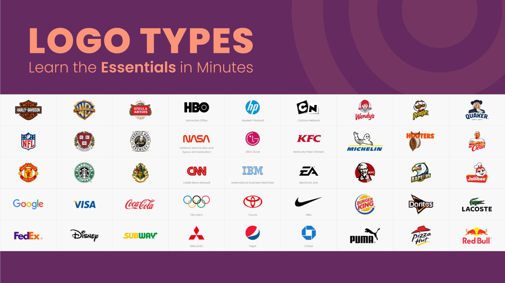
Examples: HBO, HP, Cartoon Network, NASA, LG, KFC, CNN, IBM, EA
✔️ Advantages
- Simplifies complicated/long names
- Fit better in different spaces and sizes
- Easier to remember than a symbol, for example
- Easy to replicate on different mediums, which is good for new and developing businesses
❌ Disadvantages
- Might not be legible
- Can look like many others
2. Wordmark Logo
A wordmark logo (or logotype) is similar to a lettermark logo, but this time the whole company’s name is included. It’s a font-based logo and is mainly used by companies with unique names. The name of the brand itself forms a picture, by using unique typography (fonts and shapes of the letters).

Examples: Google Visa, Coca-Cola, FedEx, Disney, Subway, Netflix, Facebook, Yahoo!
✔️ Advantages
- Easy to remember the brand name
- Simple to use
- Will need less variation and changes over time, compared to other types of logo
❌ Disadvantages
- It can look generic if not done right – use unique fonts, a combination of colors to diversify from the competition
3. Abstract Logo

Examples: Olympics, Toyota, Nike, Mitsubishi, Pepsi, Chase, Spotify, Mastercard, PlayStation
Companies prefer to use an abstract type logo to catch the customer’s attention. The product or service is represented by a symbol or icon – it is both easy to remember and visually pleasing to the eye. In short, it conveys a complicated concept by an interesting shape, form, and icon.
Most often, they are consisting of geometric shapes in different compositions and combinations.
If you can recognize the symbol/icon as a real-life object then you have a pictorial mark.
✔️ Advantages
- Can work well for big companies with numerous divisions, operating in more than one industry
- Very effective for tech companies
❌ Disadvantages
- Difficult to design well
4. Pictorial Type
A pictorial type of logo is a stylized and simplified image, a picture, which is immediately recognizable. The most famous examples are the apple picture of Apple and the bird logo of Twitter. They are a popular type of logos because they communicate more about a brand than just a text or abstract shape. They count on associations that people will make. Also, people have always preferred visuals and images and they help us remember. It often hints at the company’s mission and makes a strong statement.

Examples: Twitter, Target, Shell, WWF, Apple, Domino’s, Puma, Snapchat, Firefox
✔️ Advantages
- Visually pleasing
- It can be very original
- Symbolic and is able to create a certain feeling in the viewer
- Highly imaginative, communicating a promise, emotion, or offering you want to make
- Great for global business, since you don’t make the user read/pronounce strange names (wordmarks)
- Suitable to represent more than one product, service you offer
- Highly unique
- It can be simple, something that the emblem logo, for example, can’t offer
❌ Disadvantages
- Without a wordmark, it can be hard to recognize as a brand, if the brand is new – there is a need for advertising
- If you are a barber, chef, hairdresser, etc – it is hard to create such a logo, which tells the viewer what your craft is that also separates you from the rest
- Sometimes, can be too abstract and ambiguous for concrete professions, services, and products
5. Mascot Logos
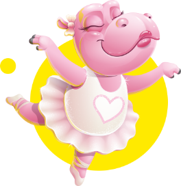
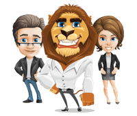
A mascot type of logos is the most prominent element is the use of illustration and characters.
These are vibrant, colorful, playful, and personable. Many children’s products companies and food businesses, sports teams use mascot logos as they are an attention grabber and are the most inviting of all types of logo.
Not in the last place, this type of logo helps the customer to create a bond with your brand and to relate to the animated, human-like character.

Examples: Wendy’s, Pringles, Quaker, Michelin, Hooters, Mr. Clean, KFC, Raptors, Jollibee
✔️ Advantages
- Great for catering to children and families
- Friendly, warm, and put a smile on the users’ faces
- Look more approachable, thus are preferred by large groups of people
- Fun
❌ Disadvantages
- Hard to appeal to more corporate businesses and customers
- Hard to include in more exclusive, high-end products and services (as they are more approachable)
- Need a good designer to create the illustration
- Over time, often design tweaks are needed so that the logo better fits with the current audience’s look and needs.
If you want to learn more about mascot logos check our article, dedicated to them. It can serve as a big inspiration for you and your projects. (link to mascot article) mascot logos article.
6. Emblem
Emblems have a long history – families, castles, and universities use emblems for a long time.
That is why the emblem type of logo evokes a feeling of reliability and a “here-to-stay” attitude.
It features a word, symbol, and a geometric shape, solidity.

Examples: Harley-Davidson, Warner Bros., Stella Artois, NFL, Harvard, Troubled Monk, Manchester United, Starbucks
✔️ Advantages
- Easily replicated on badges, seals, crests
- Great for more traditional companies, universities, government agencies, and other institutions
- Go to if you want to establish your brand as a “classic”, “special kind”
- Perfect for beers and coffee too
- It is very original and hard to imitate to create something similar, thus – hard to confuse
❌ Disadvantages
- Most of today’s trends incline toward simplicity and the principle “less is more”; it’s hard not to overdo an emblem logo, because of its many elements/parts
- Not suitable for all sorts of businesses/companies – limited to traditional brands
7. Combination Mark
This type of logo is a combination between pictorial marks and wordmarks.
The elements can be laid side by side, on top of one another, or integrated together.

Examples: Burger King, Doritos, Lacoste, Puma, Pizza Hut, RedBull, Hawaiian Airlines, Rolex, Dunkin
✔️ Advantages
- You can use this type of logo to separate from the competition (fx many brands have a bear as a pictorial logo, but if you include a typo, the confusion will be less)
- It increases the changes to be remembered – you offer the viewer both image and text to recall
- It is perfect for newer companies, that are yet to be established on the market
- Once established as a company, people can recognize you by either of the symbols
- preferred by manufacturers – this type of logo stands out on product shelves in the shops
❌ Disadvantages
- There are now 2 elements to design to work simultaneously together
- Sometimes it can be hard to place them on different media
- Sometimes the business needs to decide which one of the 2 (picture or text) they should place on products, commercial materials, etc – that can bring confusion
8. Dynamic/Adaptable Logos
It is one of the most modern types of logos – as it is characterized by motion, animation, and changes in shape and form, depending on the context, in that is placed.
✔️ Advantages
- Many innovative and fast-paced companies use this kind of logo to project agility, movement, constant change, and evolution
- Helps the user to navigate changes in the environment and situations (festivals, forums, events)
- Offers diversity
- Fresh, different, and movement always catches the viewer’s attention
- Often preferred by innovative and big companies with many divisions and different services/products
❌ Disadvantages
- It is hard to achieve consistency throughout the different variations
- Harder to communicate a clear message (what is the logo change telling us?)
- Difficult to create a complex symbol, in different shapes, that is recognizable as a whole and by its separate parts
9. Contoured Words
The contoured words type of the logo is very similar to the wordmark logo – it again includes the company name, but this time, an interesting shape is included together with the typeface. This provides an opportunity for the company to include more color. Furthermore, businesses can express friendliness, and approachability by including rounded shapes in the design. If a rectangular is used, in shape language, this translates as stability and reliability.

Samsung, BBC, Ikea, Levi’s, IMDB, Denny’s, Stanley, Danone, Ridgid
✔️ Advantages
- They communicate even more to the user, by including shapes in the design
- They look less strict and dry, more approachable
- Many households, home goods brands have this type of logo – expressing availability, affordability, and comfort
❌ Disadvantages
- Can be hard to compose and place on different media, because of the extra space that they are taking
- It can be hard to create a good contrast between shapes and letters, if not designed well
10. Slime
This type of logo is characterized by a cartoonish style, splashes, dots, and leak effects. They are relatively new, time-wise. Instead of using a more conventional typeface and symbols, these logos have more slime-inspired elements and a more organic feel. In short, they are playful and fun.
✔️ Advantages
- Very attractive for children’s products and services
- Fresh and the market is not that saturated with this type of logo yet
❌ Disadvantages
- Not suitable for more corporate companies, thus it is with more limited use
- If not done well, it can be hard to read, remember and recall
Which Type of Logo is Right for You?
We hope that with this article we gave you an insight into the types of company logos that exist and you can make a more informed choice for your brand. Here is a very short checklist to go through in minutes, to help you decide which type of logo is suitable for you:
- Are you a more traditional business or more innovative?
Consider emblem vs abstract type of logo, dynamic logo.
- Are you a playful, family-oriented brand or a more serious, corporate one?
In this case, a mascot logo, slime logo vs wordmark would be right for you.
- Are you new on the market, or you have established your name to some degree?
You might want to try a mascot, combination mark logo, wordmark vs. dynamic, abstract, pictorial logo.
- Is your business name short or long?
Consider between a wordmark, contoured word logo vs. monogram/lettermark.
Final Words
In conclusion, these were the more popular types of logos you might come across in the wild. all types bring something different to the table and it’s all about what vibe, tone, and the impression you wish your brand to make. I hope you enjoyed this quick guide and already got some inspiration for your next logo project.
Looking for more inspiration? Here are some awesome logo ideas you might want to check out.


