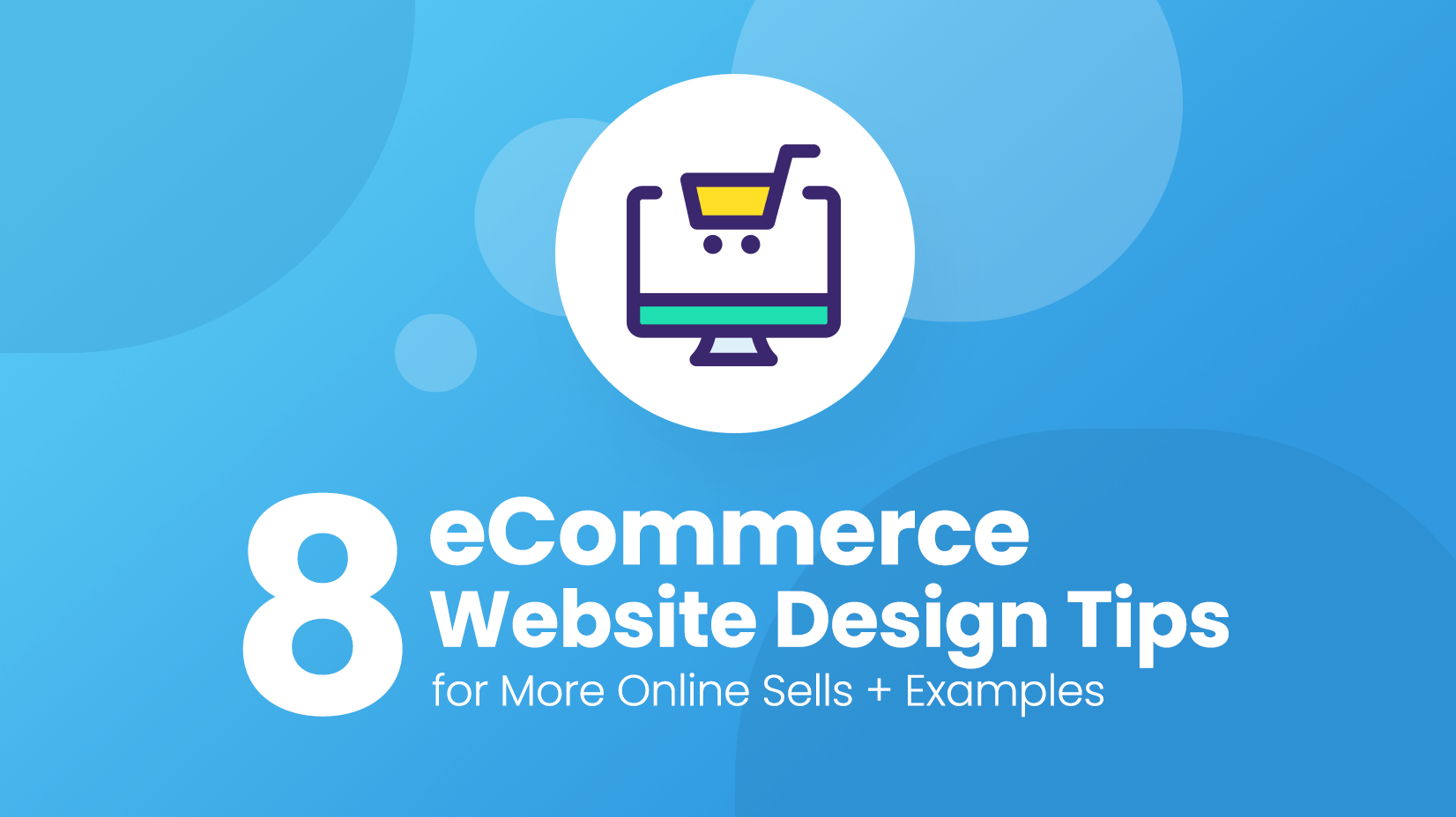
8 Tips for Successful Ecommerce Website Design + Amazing Examples
8 Tips for designing a successful eCommerce site for businesses and entrepreneurs.
8 Tips for designing a successful eCommerce site for businesses and entrepreneurs.
If you are looking at starting an online business, moving some of your business online or you already have an online business but it isn’t living up to your expectations then this is the article for you. It’s an enormous market and it’s growing, growing, growing so you want your share of the pie, and why not. Here are 8 carefully chosen tips to improve your eCommerce website design that are sure to result in a successful online store.
The biggest things you need to be concerned about in your online business are product, service, marketing, and store -and to be honest, if the online store design isn’t up to the task then the other parts aren’t going to make that much difference. So let us help you get the design of the website spot on and then you can focus on your specialties.
#1 Update your website design
#2 Tell the world who you are
#3 Show the Payment Options – Clearly
#4 Accent on Product Reviews
#5 Create a descriptive FAQ
#6 Promote your store
#7 Explain your products in detail
#8 Use more pictures
You may also be interested in 35 Free Ecommerce Illustrations to Step Up Your Digital Store Game
Let’s say you already have an e-commerce website, our question is when did you last update it? Not just the products or promotions, but the whole design. This is a fast-moving market, trends and fashions change and it’s easy to get left behind. If you haven’t had your design updated in the last few years, this has to be your first consideration. Your site is your online representation, if it’s old-fashioned and stale, so I’m afraid is your image. It’s as simple as that.
If you haven’t already got a website, you need to think long and hard about it. Check out the direct competition for ideas, and decide what you like and what you don’t like. But don’t just copy (it’s a trap many fall into) Check some of the inspirational design website examples around for the latest and freshest ideas and style trends. Starting from scratch means you’ve got the freedom to be creative and cutting edge, revel in it. If you want your website to pop from the millions of other websites and you really do, then you should follow your own style with some modern and creative ideas that people will relate to you. If you want to build a brand make it as a brand!
Here are some rather special examples to set you on your way:

Bright and fresh, great imagery. When you enter this online store, you want to stay there for a long!

Fun, funky and colorfully eye-catching, and memorable. This website is a great example of how to use design to make a brand.

Cool photos, animation, and movement, essentially modern. This creative eCommerce website does everything right!

A luxurious atmosphere sets the tone. Very classy and modern design that says “The products here are the highest quality!”.
Even in the virtual world of eCommerce, personal touches matter. The audience needs to know who you are, what you do, and what you represent. You’ll need an “about” or “who we are” page that portrays you in a professional light, the clients can’t see you but they need to feel that you are credible, trustworthy, honest, and knowledgeable. Put yourself in their position and ask yourself what you would need to know before dealing with a company. The content text is important, photo images help put faces and context to the brand and stylish design holds these things together. You can still present it in an original creative way, but the key information needs to be there.
A great tip is to get someone outside the company to view it before it goes live. When you know everything about your company, you sometimes miss out on essential information, what to you is obvious to an outsider may be unclear, ask them key questions after reading. Do they know what you offer? Do they believe in you? Do they trust your promises? Would they buy from you?
Here you can see three top examples of how it should be done:

A great story presented with style. Cool imagery adds to the brand idea.

Personalized, pen pics with mini info, great group shot. Friendly and high-quality.

Well written, accompanied by classy black and white photographic shots. Very professionally done.
This is one thing you’ve got to get right it’s payment options. These days there are so many online payment methods and services that it can be difficult to get your head around it, for you and your prospective client or customer. The common ones, of course, are Visa, PayPal but not everybody uses them and you want as many people as possible to be able to pay. To put it simply, if they don’t find it easy, they’ll go somewhere that they do. Be clear about the payment services you support, from the start. Nobody is going to go searching for them, it’s not pushy it’s essentially useful information your reader needs. Make it loud and clear on the website and put it in the footer too.
Here’s a great example of footer information:

Unobtrusive but clearly recognizable icons on the footer of this website – you understand immediately what are the ways to purchase a product. Butt that’s not all, the checkout process is extremely easy.
People read product reviews, even if they don’t 100% believe them, they still read them! So you need to get some reviews, ratings, and testimonials on your page. Star ratings, written comments, and percentages all add vital credibility to your products and service. When you need to generate trust, we listen to the experiences of others.
You can have a separate page, or include them throughout the online shop, or better still both. It is the designer’s job to include them in a way that will attract attention but not detract from the site. To add, not to confuse. Try clicking on a site and reading some reviews or testimonials – how does it make you feel? … exactly. We know it works and now so do you.
Here’s what we are talking about:

Scroll down and right there is a full bar of reviews, with name, date, headline, star rating, and brief comment -perfect covers all bases. Plus a whole separate page with more reviews in the same format.

Adidas cleverly use its reviews section, like a block of sporting statistics, pushing and emphasizing the feel of the brand and still getting the essential options of others into your head. If global brands like Adidas think reviews help sales, then you can be sure they’ll help you too.
The FAQ is a standard because there are many questions that are frequently asked and you don’t want to be replying to messages on a daily basis. More than that the potential clients, most of the time can’t be bothered to message you- they want all the information they need in one place at the click of a button. So make your FAQ, answer the real questions, and give the client all the information they need, so they can rely on you. Brainstorm questions that customers ask with colleagues, and get an outsider to look at the site. Ask them if they understand, is it readable, and more importantly what they are not sure about. A fresh pair of eyes. try to avoid jargon, over complication and keep it brief and to the point. From a design point of view remember typography matters, especially in these areas.
Trust is everything in online shopping, fully explain your money back options, delivery and shipping options, prices, and so on, so your clients can count on you. Be clear, don’t try to hide anything behind fancy phrases or ambiguous statements, you will be found out and once your reputation starts to be affected your business will be too.
Look at these perfect examples:

Absolute clarity, I challenge you to read them and not understand. It’s always better to show them your mission and explain why you are doing this.

Comprehensive, nothing left to chance.

Clear, bold typography emphasizes trust and nothing to hide.
Your online store is hugely important but it’s absolutely worthless if people don’t visit it. On the high street you’ll get walk-ins, on the internet it’s unlikely. You need to promote yourself. There are many ways of e-marketing, paid ads on google, bing, etc, blogging, social media, and content marketing – there are options but you need a strategy, and there are specialists to help. You should know your audience and you choose the most appropriate method and concentrate your efforts, then build from there.
Create a subscribers list and get them back with discounts, promotions, surveys, and follow-up information. One aim of a Facebook or bing campaign is to get emails from potential customers,…why? Because email lists still convert and you will be surprised by the results.
You can find some great email examples on ReallyGoodEmails.com. Anyway, instead of making your own emails from scratch, you could use premade email templates and modify them to your needs. Check out our article 99+ Free HTML Email Templates to Use in 2022 for some cool free templates.
Social media
Your online store should have a link to your social media so people can follow you. Think of the social media sites that your potential clients frequent, it doesn’t have to only be Facebook, – Pinterest, Instagram, Twitter, and Linkedin are all useful and you can use all of them. Cast your net wide. Have a plan, and a specific goal, just because you are there doesn’t guarantee increased sales and you need regular updates, good content, a bit of creativity, and some imagination. There are services to help or advice sites that can give you ideas.
Take a look at some good examples:

Look at this example of a website’s Instagram profile – stylish, product heavy… and engaging.
If you are selling a product you should be knowledgeable about it already, know it inside out, its functions, its pros (maybe cons), who it’s suitable for, and what other options are there. You are the expert and people like to listen to someone they think knows more than them. Your goal in your online ecommerce store is to get this information across, clearly and succinctly. The key idea here is what do you think the buyers need to know? What are the essential qualities your customer base desires? That is the focus. Other details can be found but the main points are upfront and obvious. There’s a balance to achieve, don’t be over-detailed and full of technical data, unless you are selling a technical product. Think carefully about the trigger words that will appeal to your audience. As for design – break up the content, and bullet points, use headings, subheadings, bold or underlines text, clear fonts, and illustrative pictures.
Check out how these awesome examples do just that:

Lots of detail, broken up into small chunks of very readable information. Plus further details and full specifications are available with an extra click. It’s there if you want it but not overbearing.

This online store example uses basic bullet points, developing (if wanted) into photographic illustrative greater detail

A website with beautiful professional photo images, well organized, lots of information but space to breathe, and lots of key trigger words for the expected audience.
We are all visual animals, seeing is believing, resonates with us because we use our eyes to make sense of the world. Without going overboard on the science, the human brain processes image 60,000 times faster than text, and 90 percent of information transmitted to the brain is visual. So let’s use this to attract, hold attention, explain, personalize, and create the image of your product and what it will give the buyer. Photographic images create trust and credibility as well as personalize a business, illustrations are often used to explain ideas and concepts and can be wildly creative in expressing an atmosphere and tone. So use them, and use plenty of them. But remember a picture paints a thousand words, for better or worse. So make sure they are high quality, appropriate, and fit with the theme of the site. There are some great effects you can add, so they don’t have to be dry-placed bordered product shots or headshots. Get creative. Think about the product in action, create a story for the product, and give it some status.
These two examples show imagination:

Interesting, fashionable backgrounds and products in use shots, and multiple images to show different color selections

Inventive, creative, beautiful! The product image screams from the site.
These 8 tips will help you gain the online success that your product deserves. We could spend all day giving you tip after tip, but let’s follow our own advice and keep it brief, to the point and focused. It’s a basic outline plan of things to take into consideration when planning and designing an ecommerce site. Don’t stand still and be left behind.
You may also be interested in these related articles:

 Top 7 Infographic Creator Tools to Try Now (No Design Skills Required)
 30 Inspiring UX Design Examples For Your Next Vision in 2022
 40 of the Coolest Web Designs with Pattern Backgrounds + Freebies
 The Future of Web Design in 2019: Shaped by Technology
Don’t forget to share!

Lyudmil is an avid movie fan which influences his passion for video editing. You will often see him making animations and video tutorials for GraphicMama. Lyudmil is also passionate for photography, video making, and writing scripts.
Here are some other articles we think you may like:
A source of high-quality vector graphics offering a huge variety of premade character designs, graphic design bundles, Adobe Character Animator puppets, and more.
Browse our graphics