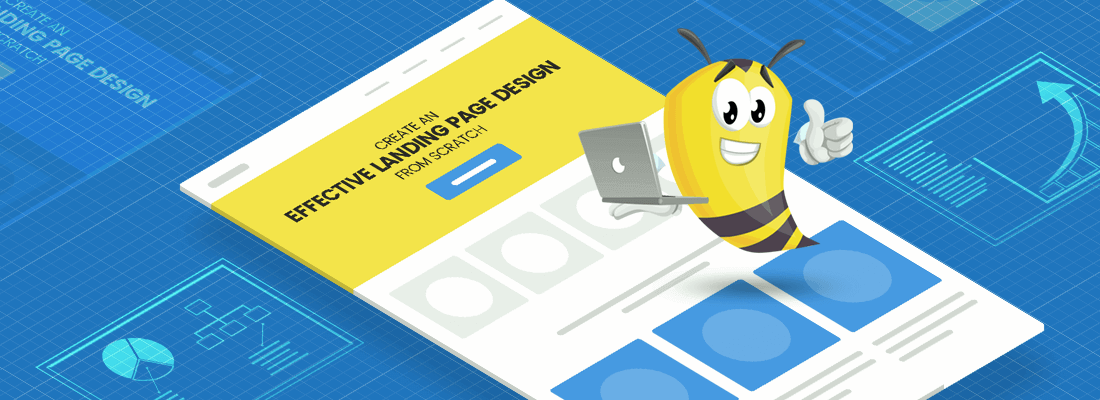
Landing page design is a true work of art and a precious marketing asset that pays off high. Created specifically for the reason to turn your visitors into clients, the landing page design is worth your attention and research.
Fact! A poorly designed landing page may cost you millions of conversions…
We’ve written this article to make sure you avoid this kind of scenario. Keep reading to understand what makes such a page effective, and which elements are obligatory for the landing page design. Let’s start.
 1. Know your Objective.
A beautifully designed landing page can become a conversion-generating machine, as long as you know how to use its potential. Before you start working on the design, you need to understand why you need such a page. Why not send people to your website, instead?
People get distracted easily. A website with so many options, buttons, and links may confuse the visitor. Moreover, some may even forget why they landed there in the first place. Landing pages function as separate web units. They are created with a specific objective in mind – to receive and convert traffic coming from a marketing campaign.
 2. Have a Focus.
Now that you’ve determined your objective, build the entire landing page design concept around it. Focus! Every element included should communicate its objective.
During the process, eliminate all distractions that might navigate your users away. This means, limit the design only to those essential elements that a user needs to make a decision. Carefully think out what you should and shouldn’t include.
 3. Time to Design.
Designing a landing page is a thoughtful process. Wrong elements, wrong message, wrong placement… All of these factors may cost you conversions. So, take your time!
The most important thing to consider when starting from scratch is the arrangement of the design elements. Think of the landing page design as a funnel leading to your primary objective: getting people to convert. To make the process easier, imagine that the design elements all draw a path that naturally leads the eye towards the goal.
Now, there is a short path, and there is a long path. In the best scenario, you need to make sure you have both of them:
- The short path is formed by the arrangement of your landing page design elements above the fold. This section alone should give enough information for a user to convert.
- The long path is for those who need more persuasion. It provides all additional information a user needs in order to convert, such as testimonials, social proof, guarantees such as return policy, money back policy, shipping method, FAQ, etc.
Above the fold, i.e. the short conversion path.
The area that the user sees before scrolling down is what is called “above the fold”. This is the first information people encounter when they land on your page. This is why it is extremely important to pay extra attention to this section. Think out every element carefully and leave only the essential info the user needs to convert. Anything else that works in favor of your objective, but is not vital for the user to make a decision at this point, should be mentioned later.
Once the user lands on the page, they should see:
-
A visual consistency with the ad.
Imagine the following: A shoe sale ad caught your eye. You click and land on a page offering you watches. What do you do – hit Close? We thought so… We cannot even stress enough on how vital it is to make the landing page design consistent with the ad. Think of consistency as the first impression the landing page makes. Colors, message, visuals… all elements should be consistent with the ad that brought them here.
-
An attention-grabbing headline.
The first (and crossing fingers, not the last) message the visitor of your landing page will see. Needless to say, you or your marketing team need to put extra thought into crafting a powerful, attention-grabbing headline. This is the most important message that will determine whether the user will keep reading about your offer, or not.
-
An informative copy.
Keep the landing page copy concise and highly informative. Depending on your objective, some landing pages might just need a subheadline of 1-2 sentences. Others will need to contain a bit more information like a brief explanation of the offer and the benefits you get. The usage of bullet points for such cases is quite effective. It makes the information easy to scan and digest.
-
A high-resolution product image.
Visual content is highly stimulating to the senses. Moreover, the human brain processes visual information much faster than text. Regarding your landing page, a high-quality image corresponding to your offer is a must-have. Even if you don’t sell an actual product but offer a service instead, use a high-res photo or a cartoon character to accompany your offer. It’s proven that cartoon characters in marketing boost your business.
-
A compelling call-to-action button.
The button is the destination to which all other elements lead. The call-to-action button should attract the eye. It needs to be enticing. While there a lot of techniques to visually separate it from the other elements, here are some of the most effective ones:
- Make it pop. Use a highly contrasting color.
- Make it big. The bigger elements naturally attract.
- Give it some more space. The negative space around it draws the eye.
Now, look at your design from distance. If the button is still noticeable, you’ve done a great job. Just to add to this, make the button copy as clear and descriptive as possible. The users should know what happens next (after they click it).
-
A strong incentive.
The incentive makes sure your visitors act now and they won’t leave it for a later consideration. In the second scenario chances are, a significant number of users will talk themselves out of it. Strong incentives are elements such as a countdown, an offer deadline, a limited edition, limited stock, an early discount, etc. Make sure to put these incentives close to the button. They will tilt the scales if the user hesitates.
-
Submission form. (optional)
Depending on your objective, your page might not continue below the fold. In this case, you will need to place the submission form right before the button. People don’t like long submission forms. To lower the abandonment rate, stick to 3 fields at most (e.g. a name, an email, and a message).
While the short conversion path will be enough for some users to convert, others will go search for information before making a positive decision. It’s your job to provide them with this information right here, right now.
Below the fold, i.e. the long conversion path.
Hopefully, a good portion of your campaign traffic will have already converted in the short conversion path. However, you need to have strong additional information for those users who are interested but still need more persuasion. The information included should answer all possible questions, resolve all possible issues, and dispel any possible doubts a user might have with your offer.
-
Information about what to do with it.
Some users might be really fond of your offer but still experience doubts of how and where to use it. What you should do, is clear it up for them. Explain and give examples of where and how your product would fit the best. The goal is to make the person see themselves using it. Once they can imagine all the things they can do with your product, or the desirable result of using your service, they will become more inclined to buy.
-
Information about how it works.
Other users need transparency. They need to know how the process goes before they sign up or get in touch. Don’t hide this information. A step-by-step explanation is the best style to go with.
-
Social proof.
Include logos of famous brands connected to your product or service, trustworthy testimonials of real clients, a social network feed discussing your product, ratings. Anything that shows positive public opinion of your offer will be highly appreciated by your landing page visitors.
-
Technical information and guarantees.
For those users who need to dig deeper, provide information such as production methods and materials used, shipping costs and opportunities for free shipping, payment methods, etc. Give guarantees such as return policy, money back policy. Also include a section of Frequently Asked Questions including real questions people ask.
-
A submission form and a second call-to-action button.
Whatever you decide to include below the fold, remember one essential part: always repeat the call-to-action button. If you haven’t put a submission form in the beginning, the second best (and obligatory) placement is here. No one will go back to search for the form, nor the button! A good idea is to make the button permanent during the scrolling. This way, the reader will have the opportunity to convert in case they make a decision while going down your page.
Voila: a landing page design done right!
Landing pages vary greatly from one to another but the main elements remain the same. We’ve covered all essential information that you need to start creating a conversion-worthy landing page design from scratch. You are welcome to share your point of view in the Comments below, or even show off your own design creations.
 1. Know your Objective.
 2. Have a Focus.
 3. Time to Design.
 Imagine the following: A shoe sale ad caught your eye. You click and land on a page offering you watches. What do you do – hit Close? We thought so… We cannot even stress enough on how vital it is to make the landing page design consistent with the ad. Think of consistency as the first impression the landing page makes. Colors, message, visuals… all elements should be consistent with the ad that brought them here.
 The incentive makes sure your visitors act now and they won’t leave it for a later consideration. In the second scenario chances are, a significant number of users will talk themselves out of it. Strong incentives are elements such as a countdown, an offer deadline, a limited edition, limited stock, an early discount, etc. Make sure to put these incentives close to the button. They will tilt the scales if the user hesitates.
 For those users who need to dig deeper, provide information such as production methods and materials used, shipping costs and opportunities for free shipping, payment methods, etc. Give guarantees such as return policy, money back policy. Also include a section of Frequently Asked Questions including real questions people ask.

