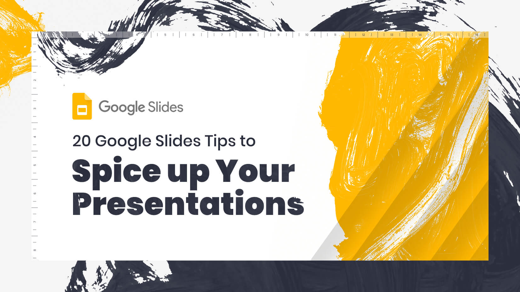
20 Google Slides Tips to spice up your Presentations
Google Slides tips, 20 great tips to push your presentation slide show to the top of the list, make people listen and get your message across clearly, professionally and with style.
Google Slides tips, 20 great tips to push your presentation slide show to the top of the list, make people listen and get your message across clearly, professionally and with style.
If you need to make a presentation, you want to give yourself the best chance of success. To sell the product or yourself, to inform, to get your message across – the better the presentation the better the chances. Slide show presentations are a common way of doing this, but they are no less useful for that. They have many advantages, it’s why they are so popular, they can get the information across clearly, concisely, and memorably if done well. One of the most important decisions is which software to use. One option is Google Slides, but the software alone will not a great presentation make. In this article, we’ll give you some tips on how to really spice up that Google Slides presentation to create something you are proud of and more importantly will get the job done.
Google Slides is a specialized presentation program that is part of the Google Drive service and it is free or there is a paid-for business option – G suite. It is available as a desktop application and also as a web app or mobile app, so it can be used in pretty much any situation by anybody with computer access.
Put simply Google Slides enables anyone to create a presentation and edit it, and significantly can allow you to collaborate with other users in real-time. It is designed for online use and is regularly updated with new, fresh features. Crucially, it is also incredibly easy to use.
You’ve got the resource, you’ve got the concept, so the only question that remains is how do you make it something special? Here are the top 20 design tips to consider when using Google Slides:
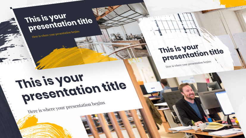
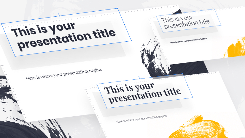
Tip 1: Use templates
Tip 2: Use plenty of images
Tip 3: Experiment with typography
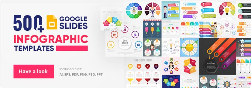
Tip 4: Add diagrams and infographics
Tip 5: Get creative with your images
Tip 6: Be careful with color
Tip 7: Add animated transitions
Tip 8: Collaborate with your team
Tip 9: Add videos
Tip 10: Hold back on the text
Tip 11: Make it a story
Tip 12: Make reference
Tip 13: Add links
Tip 14: Take questions
Tip 15: Make notes
Tip 16: Add bullet points
Tip 17: Make it device friendly
Tip 18: Use numbers
Tip 19: Finish with C.T.A
Tip 20: Don’t extend too much
The theme of your presentation should be represented by the theme of your slideshow. It will hold everything together.
Unless you are a designer yourself, it can be tricky and time-consuming to design a presentation from scratch that looks the part. The professional designers know what they are doing and give you plenty of options. It isn’t lazy, it doesn’t reflect on your design skills (you aren’t a designer anyway), and nobody questions your creativity.
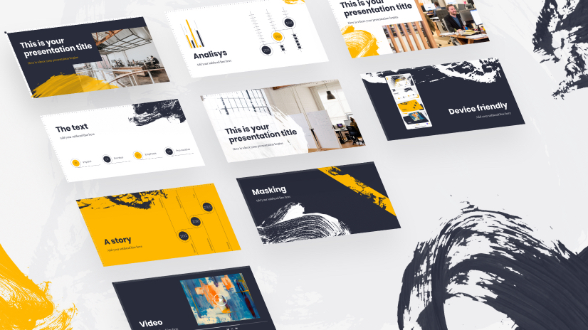
In actual fact, using the numerous professionally designed templates available on Google Slides does two really useful jobs, if, in fact, they notice at all. Firstly it shows the audience that you know your limits and more importantly, it gives you time to focus on the content of the presentation. It is after all the content that is your principal goal. Plus it gives you extra time to concentrate on your all-important presentation skills.
The templates are all exceptionally designed, and completely and easily editable including the addition of images, layout, color, and background color. Really what more could you need?
Presentations need to be visual. We remember images, we understand images, we recognize and associate with images, and we are brief visual creatures. You need to use images, but we wish it was that simple. don’t just throw them in for the sake of it!
The images you use have a huge effect. The key is to use powerful and appropriate images such as photos and illustrations that help you get your message through. Images that emphasize and enhance your words, stoke up emotion and clarify a complex issue, all these images are useful and powerful. They help you deliver what you want, they help you get your message across and you need to get them into the presentation as thoughtfully as possible.
So you know, you want images so then you need to decide on the right ones. Either use your own images previously downloaded or created and saved and insert them or use Google image search. If you use Google’s image search which has a tremendous number of options, we’re talking in the millions here, it isn’t even necessary to download them first, just add them via your browser tab, insert, image, type in keywords and search away then click on your choice and it’s done.
The type of images you add is important and well worth thinking about. Illustrations can show creativity, originality, and imagination. They are great for illustrating more abstract or complex ideas. You can choose between artistic, hand-drawn, graphic, geometric, simple outlines, etc, all will generate a different tone and feel. Photographic images can present reality, credibility, and honesty. With either choice, you can get really creative, grab the attention, hold the attention, and be remembered.
Be aware that heavy files can result in lagging, which is the last thing you need. Run the presentation through, to check it’s smooth.
If you’ve got great content, and we’re sure you have, why go with a bog-standard font. Let’s get creative and choose the font that will suit your theme, your content, and your style, a font that will catch the eye and set you apart. In Google Slides when you click on a text box you get a font option, including size, color, etc. There is a great range but selecting “more fonts” at the top will direct you to the free Google Fonts service. Here you can get really funky. Don’t be afraid an unusual font can have a wow effect but remember it needs to be readable too. You can add your own custom fonts too.
And that’s not all, clicking on the More option on the menu bar (far right) gives you room to play with the text you have, from the usual rotation, size, text fitting, and positioning to the more interesting drop shadow and reflection options. (including opacity, and translucency slide bars.) These add interest and an extra dimension and look like you’ve really made an effort.
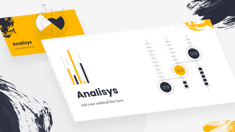
As with the images above, infographics and diagrams are ideal for presentations. They convey masses amount of information in accessible chunks in a visual way. If you’ve got stats and data or even a complex idea to explain there is little as confusing and frankly dull as long lists of figures or long-winded explanations. This is where the latest craze for infographics really comes into its own.
You can create infographics independently of Google Slides and simply insert it, in the correct spot. Alternatively, you can create a chart or graph, a flowchart, or a diagram straight in Slides, using google sheets or one of the standard menu options. Again these are flexible and editable.
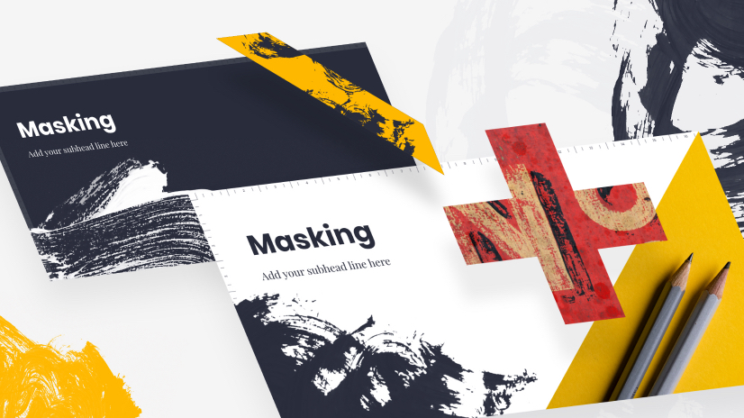
We’ve already established that you need images, right? If you’ve selected the appropriate powerful ones, now is the time to put in a tiny bit of effort to add a little extra style. Google Slides contains an option for masking images, meaning you can play with the edges, round off the corners, change image shape and add other stylistic elements. These little things make a huge difference so get creative and experiment, you can always undo, the many options by simply clicking on the image, then the Mask image icon (the little triangle).
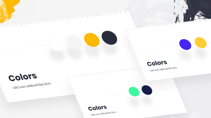
We all know colors can improve a presentation but it is equally true that they can ruin it too. A tendency to throw colors around willy-nilly can look childish and distract from your main aim, so think carefully.
Colors carry associations and are emotive(be aware that they are also culture-sensitive) and can be a great psychological tool when presenting. But you have to make some decisions about what, where, and how much.
Google Slides makes it easy to edit colors into your work, the difficult bit is making the decision in the first place.
The visual effect given when moving from one slide to the next, transitions is one of the simplest methods of adding a professional feel to the overall presentation. In Google Slides, just click on the “Transitions” button on the menu and choose from the many options available. The rule of thumb is to find one you like and stick to it during the whole presentation, there are lots of options but don’t be tempted to mix them up. A great transition will keep the interest and create a dynamic flow, a cacophony will distract.
It’s worth noting you should try to keep the number of slides and therefore transitions as low as possible, too many slides is too much movement and not enough focus.
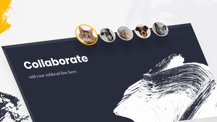
A great advantage of Google Slides is that as it’s online, anyone with permission can see where you are at with the design and even edit it. If you are working with a design team or content writers this is ideal, if you want another opinion it’s a great option too. Another set of eyes can offer insights, and advice, and often see mistakes that you haven’t even noticed. And always get your presentation proofread to avoid potential embarrassment, the last thing you need is to be talking over a glaring typo, hours spent putting together a great presentation can be lost in an instant.
All edits are tracked by the user and indicated by color coding and you can give various levels of permissions. With a revision history that tracks changes to the presentation.

It may be appropriate to do something a little different and add a video, it will cause a stir. If you think this is an option that will add to your presentation and isn’t just there because you can do it, then it’s easy to do in Google Slides.
By clicking on “Insert” then “video”, you can add either form your own saved video to your Google Drive account or search YouTube videos. Be sure to watch the video before embedding it, you don’t want an embarrassing surprise. Then edit or format your video as you wish, you can change position or size and playback options, it’s easy but a great way of impressing the audience.
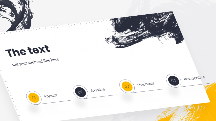
Your presentation is an aid to your speech, a guide, and in addition, it is not a document to be read. A text overload will do one of two things either people will focus on the writing and you’ll lose their attention, or worse you’ll lose them altogether and they’ll focus on neither.
The rule is to be brief, the shorter the better. Strong impacting, emotive, emphasizing, provocative – these are the words you are looking for, nobody wants long explanatory texts (that’s what your images are for).
Experts recommend up to six words per slide is enough to gain the attention and get the audience to listen to what you have to say.
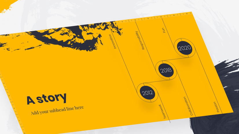
We are surrounded by stories from the earliest fairy tales of childhood to the binge-watched Netflix dramas of present times. If you want your presentation to really strike a chord, storytelling is the way to go. Stories, anecdotes, and personal snippets all will allow your key communicative aim to be understood. They also give you a chance to show your personality, humor, humility, experience, and knowledge, and liven things ups.
The slide show is used as a guide through your story, a background that will hold the key concepts and arguments, keep them clear, and hold the focus. But essentially they supplement and add whilst you do the work.
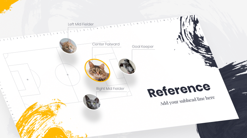
By referring to current events, and culture you kill two birds with one stone. Firstly, the audience can relate to your message and can link your ideas to what they are familiar with. Secondly, it keeps things topical, relevant, and up-to-date and that includes the images of you. It forms a vital link with the audience, you are part of them and not apart from them.
But beware you need to know your stuff, what you may think is topical could fall on deaf ears. Research and know your audience, think of age and cultural differences – you don’t want your witty observation to fall on stony ground. And everything should be focused back on your main point, link it to the presentation.

Links will enable people to lookup more detailed information, links will also show you’ve done your background, links look academic, and links can add a level of professionalism.
With Google Slides there is a research tool, which makes it simple to add links to websites but also to images or additional files in your Drive account. A very useful way of allowing you to be brief and focused but supplying all information that is needed. You can even type into the Google Slides to search for relevant images and sites.
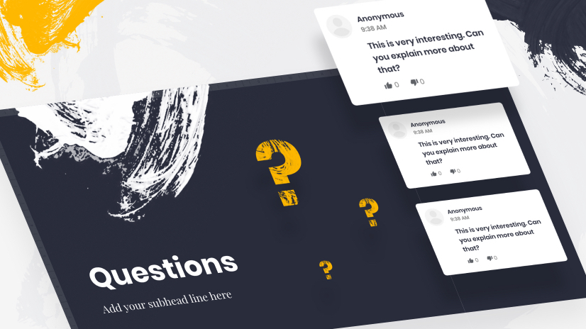
Don’t wait until the end to invite questions, people often forget what they were going to ask or are just desperate to get to the free buffet! Questions should be invited throughout, interaction is good, and it makes the audience feel part of the process. In a physical presence in a meeting room or conference hall, this should be scheduled into your time, it is easy to forget and move on.
Google Slides has a Presenters notes section that only you can during the presentation, this is an excellent place to remind yourself to ask for questions.
If your presentation is virtual then Google Slides can create a link for you to send to your audience. Through this link, the viewers can post questions which then appear in the box. An excellent way of increasing active viewing.
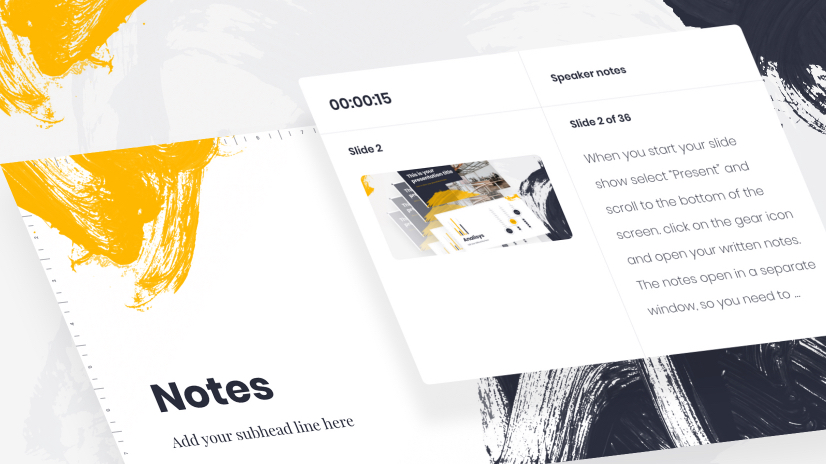
As we’ve established your slide show is not a complete presentation, your skills are absolutely vital. You need to be prepared for the pressure and the performance. Google Slides provides a “Presenter Notes” option where you can create a guide for each slide, or a script if you wish. There is a good chance you will forget something or get lost at some point unless you really know your stuff – and even then it’s more than possible.
When you start your slide show select “Present” and scroll to the bottom of the screen. Click on the gear icon and open your written notes. The notes open in a separate window, so you need to arrange your setup so you have different screens meaning the audience doesn’t see the notes. The notes follow the slide you are on, forwards or backward, and at whatever speed you are working.
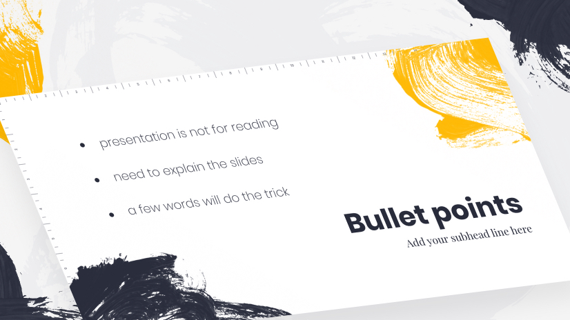
In an article, proposal, or report, bullet points are great, they break up texts, highlight key points, and make scanning easier but these are text for reading. A presentation is not for reading. You need to explain the slides, the bullets don’t. If it’s worth a bullet point it’s worth a slide of its own. Don’t patronize your audience with obvious point breakdowns when a few words will do the trick. If they need a breakdown, or explanation add a link.

You may well be using your presentation slide show in a very standard, typical way, perhaps projecting it onto a screen behind you from your laptop. Remember Google Slides is online so you can access it from a mobile device or tablet. This means that it is possible to cast from your device to a screen. You don’t necessarily have to carry around your laptop for your presentation.
It is also great for working on your presentation remotely, where ever you may be. You get a great idea on the train, take out your phone and access your presentation.
It’s also worth bearing in mind that others can access your presentation from their device too, so remember when doing the design that your presentation needs to look at the part on the small screen.
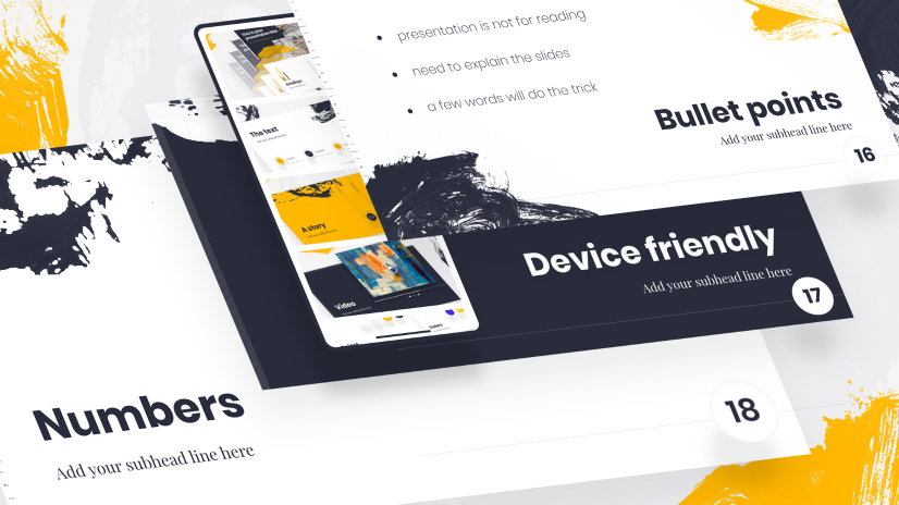
Numbers add clarity, help the listeners know where you are, act as a guide through the process, and make it feel like you are progressing. If you number each slide there is a sense of drawing to a goal, it’s a simple rule but one of the best. They take seconds to add on Google Slides and are proven to help.
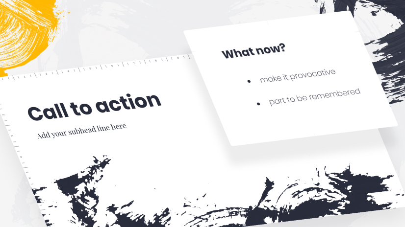
A call to action is a great way to finish. It has the dual function of closing the presentation and opening the next dialogue. Devote a whole slide to it, make it provocative, you want this part to be remembered.
Thank your audience, of course, it pays to be polite… but please don’t waste a slide on this. Your ending needs to be dramatic and memorable. The questions you need to pose at the end of your presentation, and the questions the audience needs to be asking themselves is… what now? Tell them what you want them to do – directly.
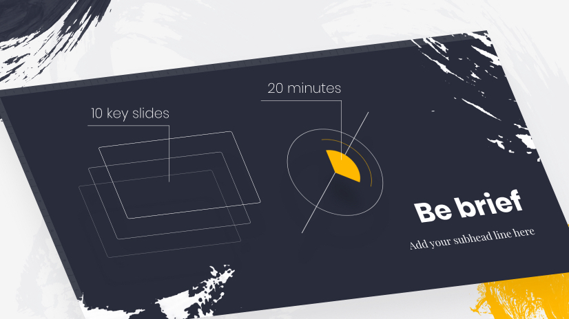
We’ve left it to the end, it’s so important but be brief. Nobody will thank you for needlessly extending, you sat in presentations yourself and you know exactly what everybody is thinking. Let’s get this over and done, yes? This is what the experts say and who are we to argue.
Presentation construction and the presentations themselves are not necessarily dull. These key tips are both general and Google Slide specific. The idea is to create something that will wow your audience, look professional, create a buzz, and most importantly of all – achieve your main goal. Substance and style rather than one over the other.
You and your design are a team, working together to get the information and message across. The design should, of course, look the part and these tips will help you there – but it shouldn’t dominate.
You are a focal point too, and here are some things to remember:
These Google Slides tips are exactly that tips, you use what you want, what you think will work for you, and you will work for your audience. The Slides will help, they are the magic wand but you are the one waving it and speaking the magic words.
You may also be interested in these related articles:
Don’t forget to share!

Lyudmil is an avid movie fan which influences his passion for video editing. You will often see him making animations and video tutorials for GraphicMama. Lyudmil is also passionate for photography, video making, and writing scripts.
Here are some other articles we think you may like:
A source of high-quality vector graphics offering a huge variety of premade character designs, graphic design bundles, Adobe Character Animator puppets, and more.
Browse our graphics


![Win an Oscar for art? Mission possible for the team of Spider-Verse [Interview]](https://i.graphicmama.com/blog/wp-content/uploads/2019/09/19093417/Mission-possible-for-the-team-of-Spider-Verse-120x70.jpg)