What is a presentation? A combination of texts and images. While visuals should always be a priority in your presentation design, you don’t have to forget about how your text looks. Google Slides has given us 25 default fonts + some variations of their boldness. Bear in mind that not every font could be made lighter or bolder. But we’ll touch base on this later.
First of all, why should you bother about which font you use? Let’s find out.
Article overview:
1. When is a good idea to change fonts?
2. How to use fonts appropriately?
3. How to change fonts in Google Slides?
4. How to add fonts to Google Slides?
1. When is a good idea to change the fonts?
Fonts influence trust, credibility, and even the route people take to their destination. In the same way that music evokes certain emotions, font types can affect your state of mind as well. The choice of font is a crucial part of setting audience expectations and determining professional versus informal settings. It’s important to consider the subconscious effects fonts can have before you make a final decision for presentation text.
Fonts tell your customers a lot about your brand. Every font has its own personality, and that personality is associated with the brand that uses it. For example, a professional, corporate-looking font would go well with a formal business, just like a hand-written font would fit well with a unique restaurant.
But what are the most common cases when people change fonts? Let’s see:
- Branding fonts – using specific fonts is part of the branding strategy for many companies. Most corporate presentations use fonts that the company has approved.
- Standing out with the presentation – as we have already written, the font does play an important role in setting the tone of the presentation.
- Topic-relevant fonts – if you have a presentation on a specific topic (like a horror story), you might create a better visual effect if you add a specific font.
2. How to use fonts appropriately?
It goes without saying that choosing the right fonts matter. It is a defining part of your success. Knowing how to use fonts in a presentation will separate you from bad presenters and boost your confidence. Let’s see some good practices.
✅ Be consistent with fonts – while it may look cool initially to pose with different fonts, it’s typically considered a mistake to mix fonts from different font categories. Using Helvetica fonts mixed with Comic Sans is not a good idea, since they are not from the same family. If you’re using different fonts, it will be best if they are all Serif, all Sans Serif, etc. ReallyGoodDesigns has an article dedicated to font combinations.
✅ Don’t use more than 2-3 fonts – even if you are using fonts from the same category, it’s still a good idea to stick to two, a maximum of three fonts. Otherwise, you risk getting your audience distracted by the variety of fonts. Keep it simple – you want to impress with content.
✅ Use fonts according to your presentation – while some fonts might look great, they might not be relevant to your presentation. Typically, decorative fonts don’t look okay when shown in Google Slides so you’d better avoid that from happening. If you don’t know what to use for your next Google Slides presentation, stick to Open Sans and Lato – you won’t get it wrong this way.
3. How to change fonts in Google Slides?
Before we show you how to add fonts in Google Slides, let’s see how to change the existing ones. There are more than 25 options + and so many sub-variants, that in most cases you would never need to add fonts different than the established ones.
Step 1. Open your Google Slides presentation
Step 2. Select a text
Now, it’s time to select the text you desire to change the font of. So, click on the text box to mark the text and select every letter you want to modify.
Step 3. Change the font
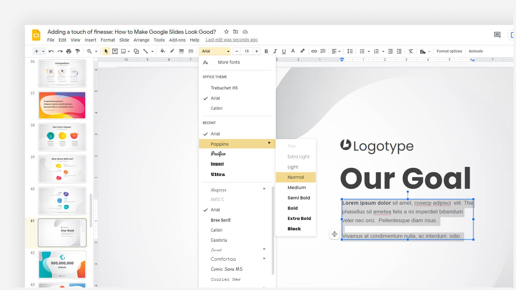
When you have selected the text, it’s time to change the font by selecting another font and picking font weight (if possible). In order to find if your desired font can be further modified, it should have a dropdown option. Once you hover over the triangle, you can see how many options you have at your disposal. Merriweather has only four options available, while Montserrat has nine.
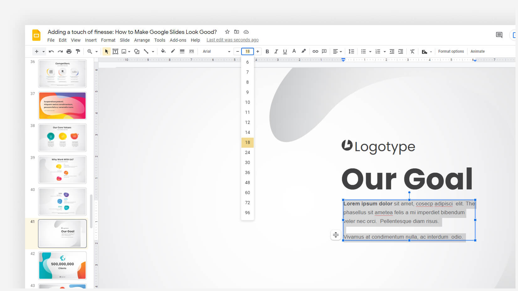
Step 4. Fix font size and the other font components
Your task is not done, once you change the font. The different fonts might take up more space, thus becoming unusable. Ensure you have fixed the text weight, font size, and colors before moving on.
4. How to add fonts to Google Slides?
Sometimes, the fonts available in Google Slides are simply not enough. But worry no more – there are hundreds of fonts (more than 900) that you can add to your presentation. You can find fonts dedicated to specific language groups or stylings like Serifs, Sans Serifs, Handwriting, etc.
Step 1. Open your Google Slides presentation
Step 2. Highlight the text you wish to edit
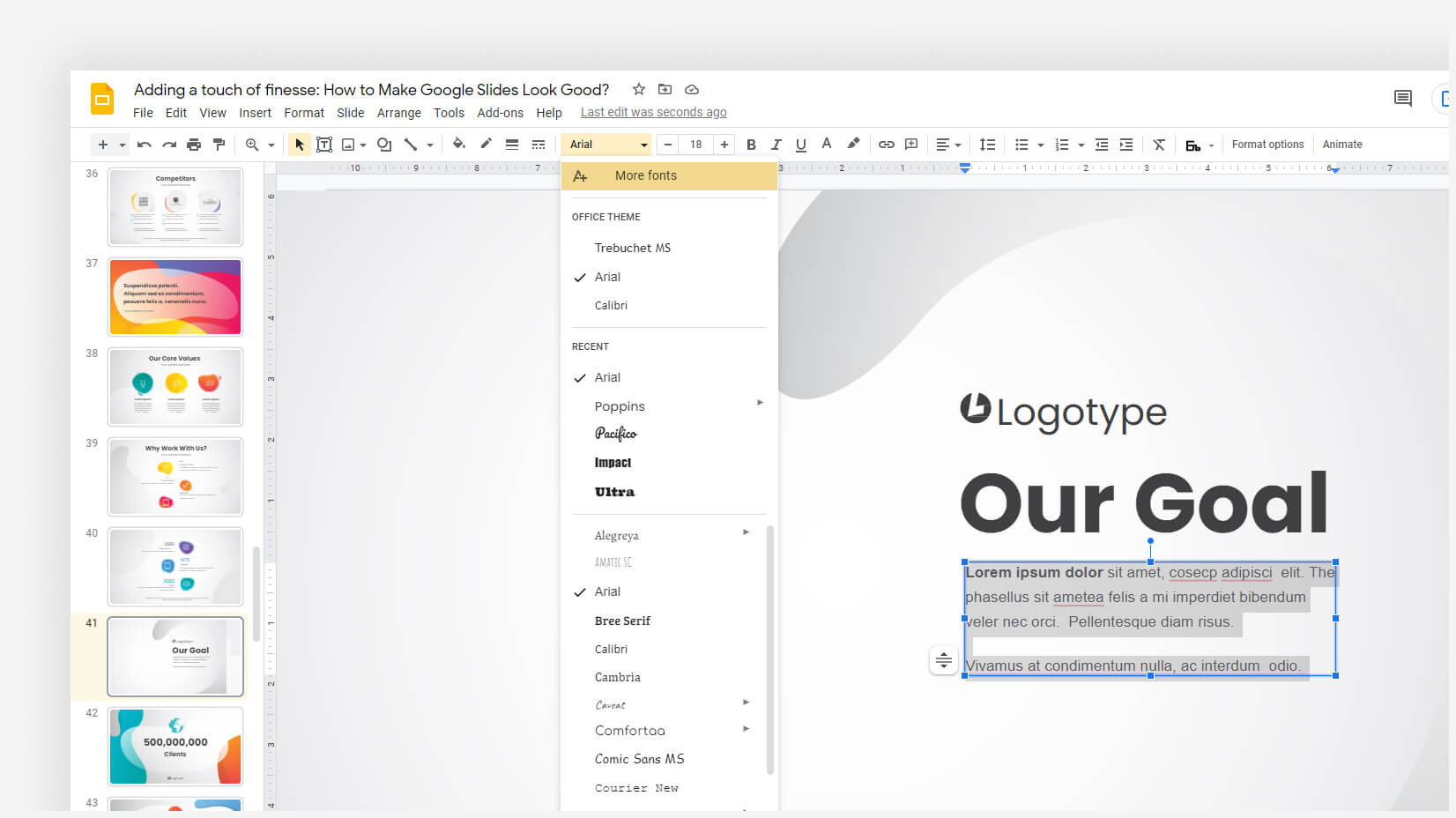
Step 3. Click on “More Fonts”
Instead of picking a font from the list, click on the top option which will display you much more fonts.
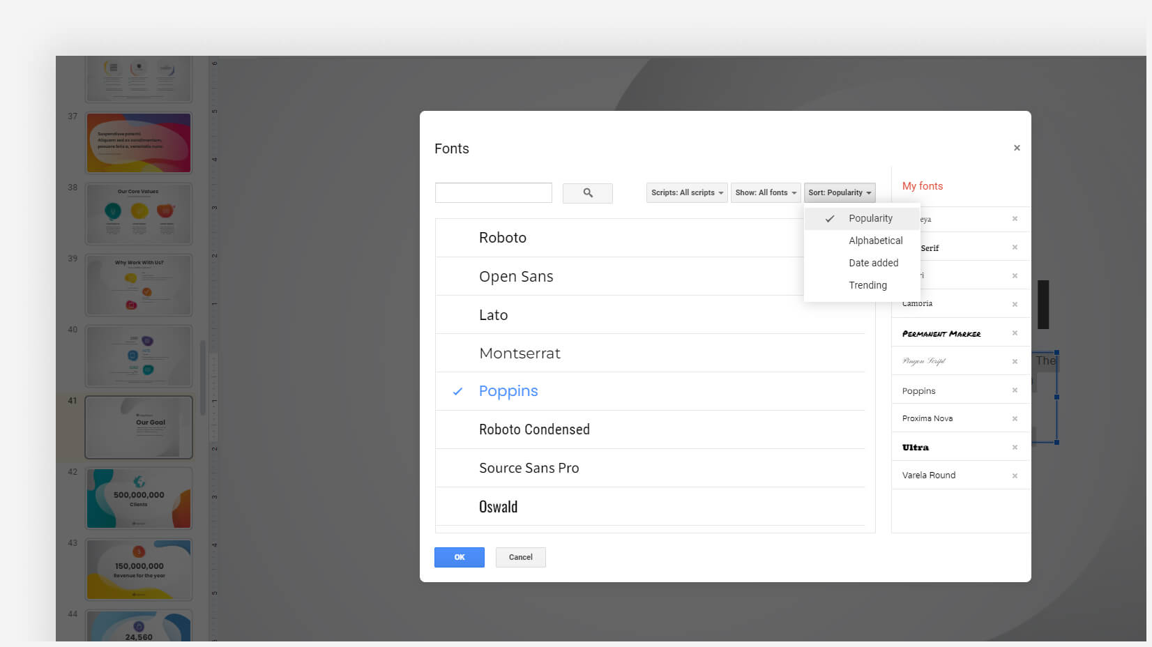
Step 4. Select a font to add
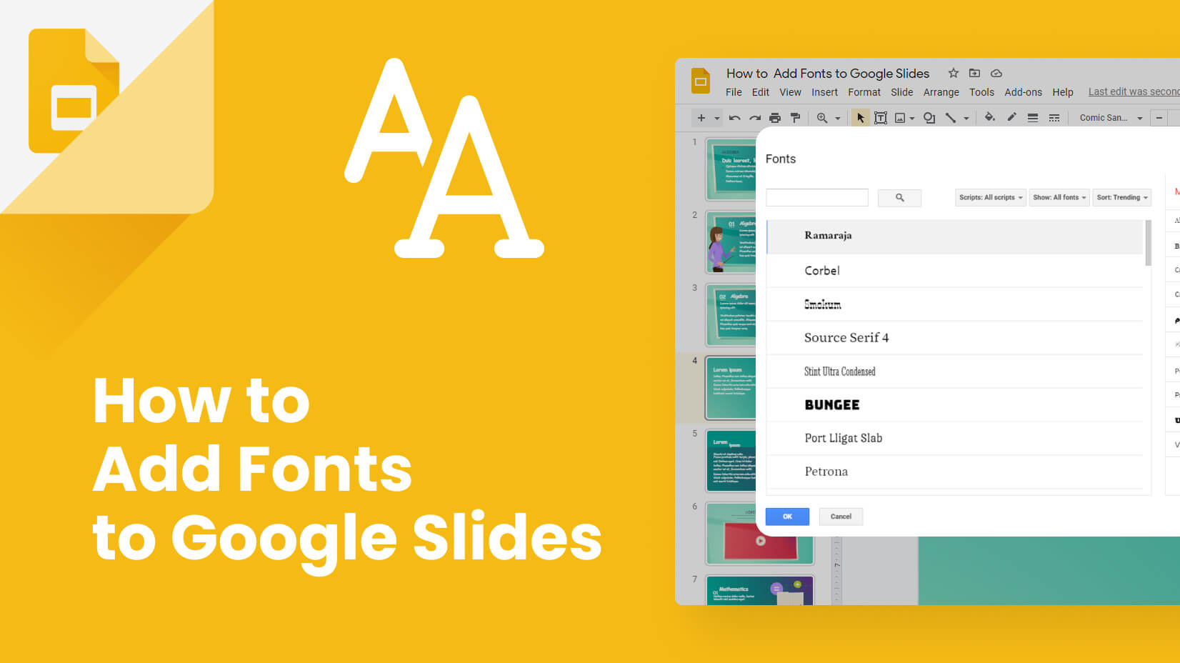
Now, you have the option to add new fonts. You can pick them up either from the search box (if you know the name of your desired font) or via the different filters: Scripts/Show/Popularity.
Step 5. Start typing/replacing
You can start using your recently added font straight away.
Conclusion
As we could see, there are plenty of fonts to choose from in Google Slides and it is not hard to change or add new fonts to your presentation. However, finding the balance between fonts and combining them is one of the most crucial things you need to do.
If our guide about adding and changing fonts has been helpful to you, why don’t you check some other similar articles that you might find useful:
