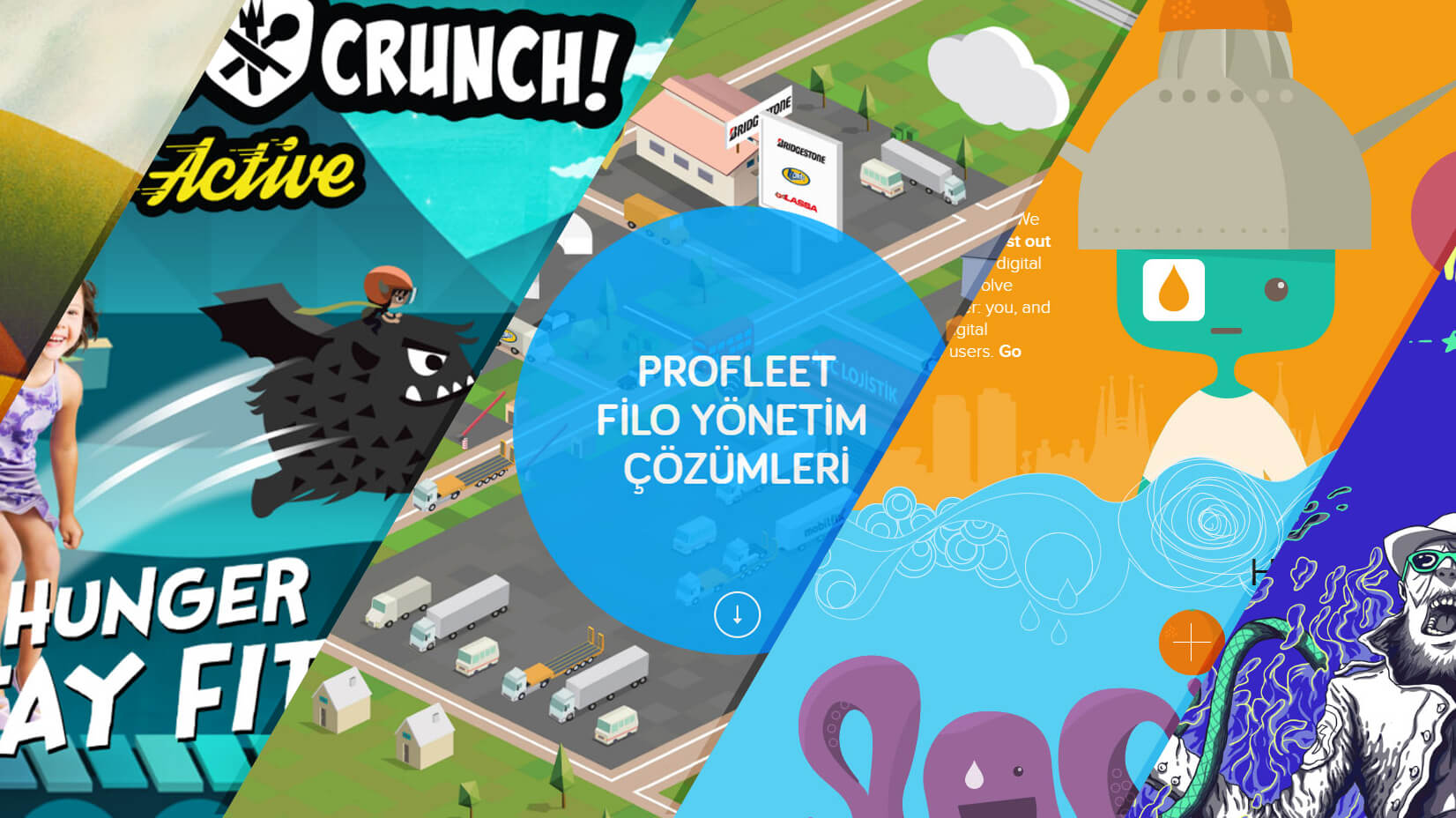
“With the new day, comes new strength and new thoughts” Eleanor Roosevelt’s quote has never been more true. In the world of design, the search for new ideas and inspiration, the next big thing is the fuel that drives us forward. In web design it is even more so – dynamic, fast-moving, cutting edge – using the latest technology to push the latest fashions, while all the time needing to fulfill the client’s brief on content, U.I. and user experience.
The good news is – there are always new ideas that take the best new technological innovations and combine them with artistic flair and creativity to push the boundaries. The equally good news is that we’ve decided to nudge you in the right direction by giving you 15 ideas for web design that could well be the next big thing. The even better news is that we’ve also dropped in some great, fresh links to freebies and free asset that could save you valuable time and effort but still wow your clients and colleagues.
Article overview:
Idea 1: Add Textures and Patterns
Idea 2: Add Some Illustrations
Idea 3: Make It Monochrome
Idea 4: Try Retro Style Design
Idea 5: Use Big Images
Idea 6: Add Some Gradients
Idea 7: Experiment With Emojis
Idea 8: Add Dark Mode
Idea 9: Use Virtual Reality
Idea 10: Visualize Information as a Web Infographic
Idea 11: Add Some Dynamic With a Video
Idea 12: Try Big Bold Fonts
Idea 13: Make Shadows Colorful
Idea 14: Add Some Micro Animations
Idea 15: Split the Screen
Idea 1: Add Textures and Patterns
Adding patterns and even more, so textured patterns to your background rarely fail to create interest and add depth. They’ve come back into fashion in recent years, with new pattern styles, and ultra-realistic textures, especially natural textures and building materials, wood, stone, brick, and even concrete. Helped by high-definition photography technology and designers searching for images that reflect the mood. Add this to new ideas of use, patterns don’t have to be one single seamless background, look at mixing and combining patterns and sectional patterning as well as differing patterns for different elements or parts of the screen. Even using a full photo image for a background can tie the whole site together and hold the focus.
Remember though patterns can easily dominate the content, so remember their role to add to the site not to be the site, and be daring with combinations.
Free Patterns and Textures: 150+ Free Patterns for Your Designs
Idea 2: Add Some Illustrations
No matter how well you think you write, illustrations literally illustrate. There are so many styles from flat 2d to 3d, from graphic icons to hand-drawn sketch styles, and more often than not combinations of them. There is little that hasn’t been done or isn’t being done and there is 100% a style that suits every site.
The key idea is to take more care and put more effort into the illustrations, making them an art form in themselves rather than an afterthought add-on to the site. A customized illustration that spells out your identity and makes you recognizable. It’s also a great idea to combine styles and combine photo images with drawn on illustrative sections.
Free Illustrations: 300+ Free Illustrations For Your Next Design Project
Idea 3: Make It Monochrome
Whilst there will always be a place for classy, elegant black and white, monochrome is no longer synonymous with grayscale. Monochrome is literally one color, it doesn’t specify which one. Monochrome color filters are more and more used on photos and images. Everybody knows the psychology and power of colors and keeping them to a minimum monochromatic palette emphasizes a feel and tone for a website in a dramatic and confident way. Even a majority monochromatic feel with an accent of another contrasting color works extraordinary well and says to the viewer that you really know where you are going and what you want to achieve. You don’t need to impress with childish garish color combinations to attract attention for two minutes, you have an image and want to share it without fuss but with the cool.
An idea that is popping up here and there is monochrome sectioning of elements of a photo or sections of a site, strongly eye-catching, and has instant interest appeal.
Idea 4: Try Retro Style Design
The best thing about Retro design is its contradictory ability to move with the times. A couple of years ago it was all the 50s and 60s vibe, flowers, muted browns and yellows, geometric patterns, and in places it still works. as we move into the 2020s suddenly 70s and 80s are retro too.
We are talking, platform shoes, terrible hairstyles, early computer imagery and games, cold war, etc. Certainly, there is plenty to play with content-wise, a massive range covering 2 decades of questionable style that can be used with a playful zest and panache to keep your design ahead of the retro backdraft.
Captured your interest? Check out this related article Retro Designs in Modern Times
Idea 5: Use Big Images
A pretty common design trend that captures the attention right from the off, is the large banner image. It’s good, it works and with the right image, it can be exactly what your site needs. Still, it is conventional, and if we’re truly looking for new fresh ideas to move forward into the next decade, is it too traditional? Perhaps not, good ideas and designs don’t become bad designs overnight. We are in danger of throwing the baby out with the bathwater, let’s think about how to build on rather than knock down the past.
The right image or images, especially as stunning photos can set a mood and tone in an instant, and if it’s the exact image you want why not make it big. Not necessarily the bigger the better but they need to stand out, whilst taking into consideration the large number of mobile devices that people are using to view sites. We need to get creative, think off-center images, effects, borders, overlapping, parallax scrolling – all ways in which your super worthwhile central image can work with the overall design. The most important thing though is the most obvious, if you are using large images they need to be top quality and striking. They aren’t there to fill up space, every image does a job……nail the purpose.
Idea 6: Add Some Gradients
It seems like flat design is all the rage at the moment, but we like gradients, viewers like gradients and when used well they do add an element of depth and interest. The color transition works best if it fits in a theme and merges more subtly with the site’s image. It’s easy to get carried away with a rainbow of effects but gentler shading often draws the eye in a softer way and hold the focus longer.
Use sparingly, on a background a couple of colors is plenty, use on bullets and buttons for a sense of motion, use on sectioned background perhaps an image, use on illustrations to create a 3d depth look.
Idea 7: Experiment With Emojis
The cute little text-sized pictures that depict emotions such as joy, sadness, laughter, flight, celebration, victory, clap, love, and so many others are popular these days. Mainly used in person-to-person communications but increasingly in brand communication by businesses such as Domino’s Pizza and Coca-Cola. They are becoming a communication strategy in their own right breathing friendliness, emotion, and wish to be communicative, which is great for advertising and branding with the right audience. It’s also worth noting that studies show people open emails with emojis on the subject lines quicker than the others.
A key to good branding and advertising and website design is to know your audience. Vital if using emojis, is the need to compliment the textual content and images, fit with the site’s context, be easily understandable and interpreted correctly and be instantly identifiable. These can be done by good design, custom-designed emojis can show a style in simplicity and a talent for capturing the mood
When you’ve selected or designed the emojis for you and decided their functions – then you can use them to freshen, modernize and inject fun into a site. They are best when used for their original purpose to engage the visitor but can attract attention and focus on key call-to-action buttons. Whilst not appropriate for all sites there is a right time and a right place.
Create Your Own Emojis with Vector Emoji Graphic Maker by GraphicMama
Idea 8: Add Dark Mode
It even sounds cool as a heading. Dark Mode has become known as a function that helps you quickly turn the screen to dark at night time. As seen on Facebook, YouTube, Instagram, Pinterest, and a growing number of sites, especially used on phone apps and mobile apps that people frequently use at night it has a practical purpose -saving power, battery life, and screen lifespans and whilst also physically being easier on the eyes.
It’s great when practical and aesthetic can work together and in this case, they really can. Dark Mode looks cool, modern, fresh and different, the essential deep, dark background allows contrasting colors in text or other elements to jump out and give drama and dynamism. Dark moods, atmospheric sites, futuristic, science fiction, anti-utopia, dystopia, fantasy – all trendy areas of design that have taken on this Dark Mode technique and are pushing and innovating with its use.
You’ll see more of this not only on phones but on all sites.
Idea 9: Use Virtual Reality
It’s been coming….talked about for years – technological advancements are making it a reality. At the moment as far as websites are concerned the usage is rather limited but it is sure to grow and grow and be a source of design inspiration for years to come. Of course, there is a learning curve but we all know how fast we can ride this wave once you get on the board.
It’s the next step in the very impressive rise of motion and animated design. Just as these features are great for showcasing, grabbing, and crucially holding attention the prospect of VR in the website design world is potentially huge and definitely exciting. Literally adding another dimension to a site. At the moment we have some basic games, some site introductions, and experimental elements. But how long before we are completely immersed in the site, interacting, exciting times. Inspiring a new field of design.
Idea 10: Visualize Information as a Web Infographic
We are data-obsessed, more and more data a greater more unquenchable thirst. This need for information and even more so this information in memorable, chunked, graphic, visual ways has led to a powerful and creative rise in Infographics.
It is no longer an option to present the data in a dry soulless, factual manner of graphs and tables. Designers have recognized this and taken their infographic designs to new and exciting levels. This rise in infographic design combines the raw data with great user experience, combining statistical data with cutting-edge presentation and design style and evolving into something that is bigger than both.
Whilst it’s true to say that “pictures paint a thousand words”, it could also be true to say that infographics do more, by turning those words into trends, comparisons, processable conversation pieces, decision influencers, and even art.
Designers are bursting with fresh ideas on how to visually portray information, using more and more custom illustrations, animation, and movement.
Idea 11: Add Some Dynamic With a Video
Video, especially short animated videos can add a great look to your design. They are increasingly in popularity and acceptable by the viewer with social media has helped to create a thirst and wish in the form of animated gifs and short clip videos. They are easy to embed than ever before, easier to make than ever before, and being used more than ever before.
Video can and increasingly are used to replace images, including background images, can be used to explain and show features in a clear, quick, and effective way, and can be looped or animated to add personality, branding, and styling. They are flexible and a great way of getting your key message or image across but your design needs to adapt to the constant movement of a video. TV and Film have demonstrated the effectiveness of viewer engagement over many years and now is the turn of the website.
Ideas for video use are simply too numerous to mention, think of the audience think of what you want to present, and try to use the video as an addition rather than a focal point. The site is best when it can do the job with or without the video.
Idea 12: Try Big Bold Fonts
To boldly go and to go bold. Font’s can and do have a vital role to play in website design -you know it, everybody knows it. Ideas and fashions are moving towards bigger and bolder fonts in both style and size. This is not only a reflection on the trend in Website design but can be seen in all areas of design from product design to logos, from packaging to posters the fashions is the bigger, the better. Heavyweight, no-nonsense, clear, confident, solid-looking lettering that creates a statement of intent.
This gives designers the flexibility to work with and within the typography. we’ve spoken and seen the lean towards animation and movement and giant typography certainly lends itself to that in a great way. You also get the chance to play with color, shadows, gradients, 3d, and other effects and patterns in and around the lettering but still keep the text clear. A whole world of creative possibility. Maxi Typography with maximum creative flair.
You can split words, animate letters, overlay images, alternate sections, and get playful whilst crucially keeping the clarity of the words themselves.
Idea 13: Make Shadows Colorful
Shadowing is a quick, simple yet effective way of creating depth and cool 3d lite look. A soft and subtle way of adding a detailed quality not only in graphics but also for texts, borders, and around photographic images. Shadows can help distinguish multiple layers and different elements and create a lightness of touch and style that seems to be floating and floaty.
Adding color to the shadowing effects adds an unusual quality that draws the eye. Whilst shadow should be the absence of light, here we give it a touch of what it really shouldn’t have. The eye knows it is somehow wrong but sometimes the wrong things are what attract. Experiment with tones and hues, mixed color and gradient shadows, something so simple can be so cool, you might even surprise yourself.
Idea 14: Add Some Micro Animations
We’ve talked video, we’ve discussed animations but one problem that still remains is slow page loading times, and really nobody is prepared to wait these days. The answer could well be Micro animations, small and functional, brief, and effective they can add the modern motion effects and provide the user with greater, interest, direction, and navigation at the same time. Win, win.
Small but important details like micro animations make all the difference. Think loading screens, hover states, deleted/disappearing content, animated cursor effects, transitions, scrolling, and parallax scrolling. they can blow you away. You need to take into account the usefulness too, think of how much information can be hidden so a smaller screen viewer can get to grips with the content. Think about menus, buttons, feedback all essential elements of design that should not be forgotten and in many ways hold a site together.
Idea 15: Split the Screen
Take one screen and divide it into two. Splitting the focus of the site would seem counter-intuitive, there is no or little priority, and everything is equally important – why would you? Because breaking the established rules is immediately original and distinctive but the best thing, and there is no point in breaking convention just for the sake of it.. the best thing is somehow, sometime it works.
Mainly two panels splitting the screen vertically, but we know that’s going to change too, this design technique works brilliantly well, especially in areas and sites where you want to show off multiple equally important facets. Staff and product, Style and quality, what is one without the other?
Think about if this style is appropriate, what are you trying to achieve by bravely going against the grain. Do you want to have two completely separate panels, color scheme, style, and imagery, or are you going to tie them together and have them combined? Are you going to continue it throughout the site or just sections, will you alternate images and text, it’s worth thinking about and there are a great variety and various possibilities.
Final words
“Daring Ideas Are Like Chessmen Moved Forward: They May Be Beaten, But They May Start A Winning Game.” and so said one of our favorite German writers (and we have many) Johann Wolfgang Von Goethe.
Not all these ideas and inspiring websites will be for you, or in fact for your clients. Pick and choose, play around, experiment, and as Goethe said you may just start a winning game.
You may also be interested in some of these related articles:


