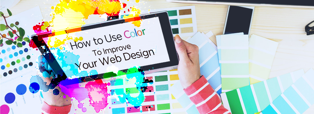
In this article you will learn some basics for how to use color in your design.
No matter what’s the case with your website – if you want to sell, educate or just share your ideas, in the end of the day, you are aiming at cathcing the viewer’s attention and retaining it. Most probably too, you have content on this website of yours, that you want to be read, understood and lead the audience to certain actions.
Many designers understand that one of the strongest tools for achieving these goals is good design. Good design keeps people on your page, helps them understand your content and creates positive experiences. Not to argue, one of the most important elements in design is color. The successful or poor implementation of color in your design can often be make or break situation for you and your project.
Related: 39 Inspiring Website Color Schemes to Awaken Your Creativity
Why using color in your design is important
 We are surrounded by color and in recent times – honestly speaking- overexposed to it. Brands are fighting over the attention of customers and trying to stand out from the crowd and the vast amount of visual stimuli around us. We are not going to delve too much into detail why and how colors have effect on us, but here is some statistics, which could be particularly interesting for you, as someone who is doing business:
85% of shoppers place color as a primary reason for why they buy a particular product.
80% increases in brand recognition when using color. Brand recognition directly links to consumer confidence.
If we caught your interest, then we’d like to explain some terms and definitions that we are going to work with in this article.
What is color theory?
The interaction of colors in a design through complementation, contrast, and vibrancy.
Let’s look at the last 3 terms in detail:
What is complementation?
We often see colors in proximity to each other and not isolated. They form different relantionships. Studies and experiments have shown, that colors occupying opposite ends of the spectrum are visually more appealing to people. In short, these colors “complement” each other.
Here we used Adobe Color to generate some colors – note how the colors sit at opposite ends and they form really pleasant combos. Try and experiment with the tool yourself, it has a very user-frienfly interface and it is very intuitive, so even without knowledge about color you can manage to create nice color palettes!

What is contrast?
Contrast is important because reduces eyestrain and helps focus attention in certain areas. Contrast is most crucial for areas with text. If used correctly it can help you “highlight” important areas and “mute” others. When in doubt, use very light background color and very dark color for your text – this is one of the most used combinations for making a text readable.
Here you can see an illustrative example of contrasting colors. Using the same tool, we generated high-contrast color scheme, and a low-contrast one:

What is vibrancy?
Vibrancy dictates emotion in design. If you use brighter colors, the user will feel more energetic and active, where using of deeper and darker colors, often relaxes the viewer and stimulates more critical thinking. Think of some tabloid designs- they often use bright, red color, which excites the user, whereas sites with information, which need more focus – use dark, somewhat pale colors.
Here is an example of a website with darker, muted colors:

Then, example of a website with vibrant colors:

To sum it up, some of the main topics treated by the color theory, are how colors and their qualities work in relationship to one another.
Psychology and preference of color
Color psychology – the feelings and meanings people often associate with particular colors
Preference of color


Source: Infographic: How Colors Affect Conversions & Gender and Color
Have you thought that driving a particular car, going to a hipster coffee shop, or wearing high-fashion purse – they all quietly communicate what the person wants to be associated with. Brands make careful and thorough analysis of their customers, how they behave, what their feelings and thougths might be, and they often use color to provide a ceratin feel for their users.
Think of industrial cafeterias with lots of deep greens, dark grays and elegant, resticted color palletes. Who is the typical customer? Who buys bright, red sports cars? Who buys pink clothing and accessories? Well, we gave you some room for thought when you are planning your design. Always keep in mind, WHO are you designing for. In the end, your personas will buy the products and you should offer them something they like, and something they can “connect” to. You can read more about how brands influence people and connect to their emotion and identity in our article about visual storytelling.
We will give you one more simple fact about color – in the vast majority, tastes for color and color preference depends on the sex of the customer – yes, men and women like different colors, but don’t worry there is an established “common ground” for some colors. Again, you simply have to have your audience in mind!
Meaning of color
Different colors often have unique, applied to them meanings and evoke different emotions in the viewer. By carefully selecting colors, you can reinforce the overall message of your project/design. Note, that sometimes colors are interpreted differently across cultures and around the globe.
 1. Red color – vibrant, power, flair
In combination with:
- black – masculine, aggressive, sport, style, class
- white/gold – love, passion, feelings, affection
- yellow – danger / food
 2. Orange color – warm, less aggressive, attention catcher, fun, energy
Used for:
- construction, safety
- hunting
- fall, Halloween
 3. Yellow color – sun, warmth, summertime, most visible color (color pop)
Used for:
- school buses, taxi
- safety equipment
 4. Blue color – professional, mind, calm, tropical, space, water, refreshing, trust
Used for:
- travel and leisure
- banks
- cleaning companies
 5. Green color – growth, health, youth, organic, environment, nature
Used for:
- organic prodcuts
- wealth
- finance
 6. Brown color – luxury, earthiness
Used for:
- fashion sites
- nature
- reliability, stability
 7. Purple color – luxury, royal, wisdom, knowledge
In combination with:
- red – intimate, romantic
- white, pink – playful and childlike
Used for:
- fashion
- institutions
- luxury
 8. Black color – strength, evil, death, unknown, luxury, elegance
Used for:
- luxury
- fashion
- night clubs
- bod designs
9. White color – purity, innocence, sterility, cleanliness
Used for:
- health
- bridal
- science
- spirituality
Here is one more illustration of how different brands use color in their logos, to create ceratin mood and send particular message to the audience:

Types of websites and how they use color
1. Fun and professional
High contrast colors, vibrant accent color create clean look, which is lively, but elegant too.

2. Simple and elegant
Muted tones, white, black, gold – all that helps in creating sophisticated look.

3. Modern and energetic
When using brigther colors in your design, try to balance them out with more neutral, warm greys or white.

4. Warm Soft / Earthy Tones
Warm colors and neutral backgrounds keep things clean, inviting and comforting. No wonder the designer chose such color pallette for wood, furniture and interior project:

What about…
5. Warm but Bold Colors
Rich, bold red, warm colors, combined with dark and deep blues can create very exciting, stylish and modern design. No wonder many mobile and IT companies use it to symbolize innovation, strong presesence and modern feel.

Another example is combining cooler gray tones with accents of warm colors. It’s punchy color pallete and creates contrast and dynamic in the design:
6. Warm vs. Cool Colors

The designs we looked at so far were quite bold, with strong contrasts and bright colors. But what about a website with more pastel color scheme? Let’s looka at one great representative of this type:
7. Soft Pastel colors
Pastel colors are fun, inviting, feminine. When using them, make sure to give the design enough room to breathe – using “white space”, so you keep your design fresh and spacious.

Of course, there are many other striking combinations and appetizing color schemes, and we encourage you to further explore them yourself. One of the best ways to learn, is through observation, so just dive into the web and find your own inspiration! We also recommend Pinterest to “pin” and save your ideas and what you like, so you can later use these designs for your reference. If you are not familiar with pinning, you might find our article about Pinterest very useful – it is super easy and fun way of saving information and visuals.
Inspiration for color schemes
Stil hungry for more inspiration for color schemes for your website? Here are some useful links, enjoy!
Finally… Choose your own colors
Adobe Color is very useful for experienced designers, but sometimes, if you lack the time for experimentation, it can be overwhelming and simply, not knowing where to start from. That’s why in this section we offer you a simpler way of picking colors for your website. For beginners, the best way to start is to learn from the more experienced, what’s good, and what is already available out there and… working. In short – learn from other designers.
Choose your base color
Dribble is a great website, where you can not only enjoy beautiul designs, but you can search designs by color you like. Just go to the menu at the top, click “Color” and you should see something like this:

Click on “Update” each time you want to search new color, and use the slider to control the amount of color used in the design. Browsing through the different designs, you can easily see other colors that match the base color you chose.
Choose a cohesive color palette
Base color: As a beginner, all you need is your base color (which you already have) and an accent color. Having that, you can use white, dark and light gray to complete your color scheme. Using to many colors could be overwhelming, so we advice you to stick to this approach, until you feel a bit more comfortable using complementaries, split-complementaries, triads, etc.
Accent color: An accent color is color used only in small amounts on your web, logically, helping to “accentuate” things. You can use the Adobe Color here, find a complementary color, as we showed you in the beginning and voila! you are good to go!
Adding grays: Already wondering where we are going to use the two grays? It will look best, if you use the darker shade for text and the lighter one for the background (dividing the large white block of space into smaller areas). If you are hesitant of what gray colors to choose for your design – this tutorial will help.
Bonus tip: If you are still struggling with color, create your design in grayscale first, to see how different elements work together, to scale them and to decide on the hierarchy. Then, you can start applying the color palette you just created and be proud of the results!
We hope you enjoyed this guide and the examples we gave you in this article – let us know what you think and if there is anything else we could add!
Do you want to take a look at: