Updated: June 28, 2022
As a designer, one of the hardest things is to be original. With the sheer volume of websites being designed, it takes something really special to be unique in this day and age. There are trends, fashions, new technology, and innovation emerging all the time and the real trick for the web designer and developer is to be creative whilst still creating a user-friendly and functional site that still fulfills the brief. How to design the look, without distracting from the site’s focus, how to portray and capture a style and image and still be true to the client, and how to be original but not startling for the viewer… These are difficult questions but there are some fine examples of the latest sites that can inspire your design vision.
We’ve put together a selection of our favorite sites that have unique design elements, style, and creativity that stand them out from the pack. They use the skills and design tricks to their fullest to leave impactful, memorable statement sites that you can’t wait to show your friends and colleagues and revisit time and time again.
We’ve also added some of the top sources of web design inspiration around, a breakdown of the leading design trends of 2022, and some of our own tips for successful web design. All in all a complete design inspiration package that leaves no stone unturned.
1. Web design inspirational examples
2. Sources to find more web design inspiration
3. Web design trends to inspire you in 2022
4. Tips for successful web design moving forwards
5. More Web Design Inspiration
1. Web design inspirational examples
1. Bite Tooth Paste
A site that gives you the fresh feel that the product means you to have. Full of cleanliness, full of air. Informative, bubbling with personality, video, parallax scrolling, animations, etc a bit of everything but it never feels heavy, never feels like you have to work at it. Accessible and friendly -hallmarks of quality creative design in 2022.
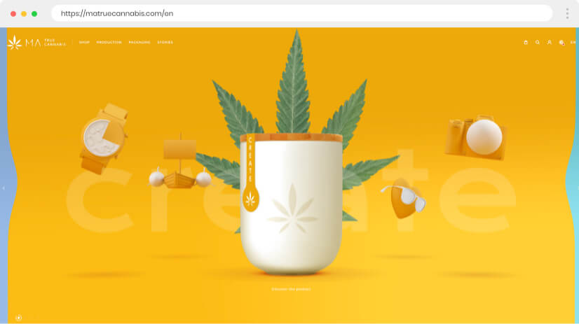
2. Matrue Cannabis
Animation and movement on sites are growing trends partly because of improvements in technology. Matrue has managed to use parallax and animated motion to set their image on the landing page and create a seamless flow on the scroll. The animations, brilliantly designed surreal 3d images are used as borders, this allows the style to remain and holds the page together beautifully whilst focusing the eye on the central information panel. Watermarked cannabis leaf and consistent text/heading colors and fonts do the essential job of tying everything together in one neatly organized package. Design works hand in hand with the product.
3. Handwrytten
Handwrytten makes handwritten notes counter-intuitively using robotic technology to personalize messages. This site mixes great illustrations, and hand-drawn style obviously with photographic product shots. The combination gives the viewer a full understanding of the process and product, following a process timeline in a totally clear but still interesting cool “Heath Robinson” way. With enough animation and color on the illustrations to create interest but not too much so it distracts from the central message. A fine example of awesome illustrations used in a functional way. If you like the style of Google, Heath Robinson, you won’t be disappointed, classic, and obviously inspiring web design.
4. Viens la Web Agency
A seemingly basic and elegant black and white theme that comes alive with great parallax effects and a lovely simple and effective animated cursor arrow. Fabulous background-colored images of previous projects emerge as if from cutouts on the layered screen and floating bubbles pick up the image background. It’s totally cool, elegant, and image-conscious. Further pages take pastel green, blue, and pink color schemes. Truly well done.
5. Parsons Branding
South African branding experts set their stalls out front and center showing the brands they worked with on a great click and drag or scroll landing page. It gets really interesting when you click on the specific projects. Superb scrolling and sidebar headings routing you through each stage of the process. It’s nothing super fancy but it does a simple job very well indeed. Not for a moment do you lose track of where you are, what you are doing, and where you should be. Crisp and minimal with are a great combination of informative text and design ideas.
6. Happy Egg
Full of eggs, full of happiness. Nice cursor effect revealing videos on movement. It is the use of video here that we really like, bringing oodles of personality to the site and making you feel right at home and involved. There’s plenty of other stuff to like too including a great recipe page with mouth-watering photos and even the animated effect when you hover and move over the photos. What’s not to like?
7. Weglot Webflow
Explore this site for great examples of multiple techniques to add interest and show off design flair. Top-class illustrations, interactive devices, super vertical and horizontal scrolling, transitions, and effects all rolled into one playful yet still informative website. Inspired and inspirational web design, playing on its a multilingual business idea and using this to add layers of fun and meaning.
8. Gingko
Classy is the first adjective that springs to mind when you open up this website. From the subtle colors, carefully hand-drawn illustrations, and typography to the transitions, and other effects, the site exudes refined elegance. Mixed horizontal and vertical scrolling is used rather well to organize the information on the site. The best thing though is the combination of the photographed gardens and the drawn illustrations and plans – when you’ve got subject matter like this don’t avoid showing it off to the full.
9. Grupo Gomariz Motor
Outlined boxes of text, outlined boxes of images, outline boxes of navigation, and outlined boxes of instruction. Joined and link a monochromatic Mondrian. It leaves you with a pleasant sensation of trust and direction, everything neatly interlinked, nothing left to chance. Refreshingly simple, stylish minimalism with a modern edge that fits right into 2022.
10. Kern Inc Design Agency
Kern waste no time in showcasing its portfolio with a landing page effect to be proud of. Showing enough to get the interest, enough to tease but never too much until you overtly ask for it by clicking. Once you are in you get the fullest detail. Clever and engaging.
11. Penz Gidro Mash Industrial Equipment
In a similar way to Vallourec, Penz Gidro Mash pushes the statistics angle and intertwines their technology. Great greyscale images of huge tanks, that look at the same time stunningly cool and strongly practical – there’s a sentence I never thought I’d write. Confident organization, nothing flashy – everything is done for a purpose. You know what you a getting, and you know it will work. The type of product that could easily be tempted to get away with an ordinary site but take it a step further to great effect. Worth it.
12. Zenly
Bright, friendly, and full of fun. Zenly’s friends locating app makes use of fantastically, colorful 3d animated illustration, sound, and great transitions to pull off an ambitious site with style and flair. The effect takes you into their world – perfect, zany & candy flossed and leads you on a journey that explains exactly what this app has to offer, all the time dragging you further in. Storybook quality that makes you feel right at home, safe, and secure.
13. 2Create
Using a limited pallet of red, black, and white alongside side black and white photography, this site from web design and development company 2Create is classy and stylish with an impact that oozes quality. By following the arrows (in all directions) you take the trip through the business like fitting together a piece of a puzzle, a technique that cleverly emphasizes that equality and collaboration between all parts is the essence of this business. A site that works like a mind map, designed with a philosophy behind the practice. Good move.
14. In-House Team
The in-house team uses personal photo images to reflect the people and conditions that underpin the business. These attractive images contrast with strong graphic elements and clear fonts but create a great combination of personality and serious technical ability. A completely functional site, well organized and crystal clear with those extra personal twists and tweaks that gel together so well.
Go to 26 more inspirational web designs
2. Sources to find more web design inspiration
There are literally millions of websites out there and more and more every day, whilst you can check through and be inspired by the ones you come across, it’s inevitable that you miss some classics. Luckily, design inspiration sites have got you covered. There are a number of renowned, respected sites that collect, collate, and sometimes curate sites from all over the world, giving you the opportunity to search or select areas, types, and subjects that you are particularly interested in or even just spend some hours browsing through. These sites offer various filter options to make everything easier for you.
2.1. Awwwards
A professional awards body for web design inspiration and development. Sites are submitted daily, and nominees are judged in categories of design, usability, content, and creativity. Sites are awarded site of the day, week, and month year. As far as inspiration is concerned here you are guaranteed the creme de la creme of web design and can see what elements the well-respected industry judges particularly liked as well as comments from other site members. It’s a great way of getting a feel for what’s hot and what’s not in this fast-paced business.
2.2. Behance
A huge design showcase site covering all areas of design including web design (but don’t be afraid of searching the other fields for inspiration -it comes in the most surprising of places.) As well as its sheer scale, Behance is great because it is so straightforward. Filters allow navigation via design areas or creative tools and you can also filter from here using color and location. It’s free to post projects and free to view but this open nature means that you may have to work to find the quality you want -not that it’s difficult to do and like we said inspiration comes in the strangest of places, so even lesser quality designs may push you in the direction you need to go.
2.3. Dribbble
Right up there on the size front with Behance is Dribbble. It’s another showcase site for creativity from all industries and all locations and has a great filter for narrowing down searches via color, type, time frame, etc. You get a snippet of the designer’s work, and clicking on an image will bring further information and comments from other members of the community. It is broad-based and uncurated but well organized and there’s certainly something for everybody.
2.4. WebDesign Inspiration
A showcase site that publishes fresh and creative new websites from creative agencies and web designers all over the world on a daily basis. A great selection of filter tools including industries, site type, site style, and color. An editor’s pick section that is varied and well-curated, plus a great feature that allows you to view the designs for desktops, tablets, mobiles, or a mix. Great place to find design inspiration and ideas worth keeping in mind.
2.5. The Best Designs
The Best Designs is a curated selection of the best web design and their designers. Designs are categorized for ease of navigation by designs, or designers, and even WordPress themes. The latest and most up-to-date sites with lovely detail above each featured one. A fantastic source of inspiration.
2.6. Inspiration De
A great multi-subject design inspiration site that literally throws up thumbnails galore in your chosen area. It’s light on further filters but if you need some quick imagery to get those creative juices flowing this could be your thing. It’s worth giving it a quick try.
2.7. CSS Nectar
A quality awards-based site stuffed full of great sites. Filter by nominees or winners or tailor your browsing by category, color, feature, or location. If you need to see what is trending in a particular part of the world, it is here at the touch of a button. The sites are scored on design, coding, and creativity, and seeing these scores can really help guide you towards your goal of producing a recognized quality site.
2.8. Best Website Gallery
If you want technical filters this is the site for you. Allowing you to filter through CMS and framework as well as the more usual color and style. You can go directly to a Shopify or Drupal site, or flip to NextJs or Laravel. It’s not an enormous site by any means but all the featured sites have been handpicked over the years to form a carefully crafted and varied selection
You may also be interested in The Best UI/UX Design Software: Complete Comparison Guide
3. Web design trends to inspire you in 2022
With all these designs flying around the net, and design inspiration sites coming out of your ears, it’s well worth thinking about the latest fashions and trends in the lightning-fast journey of web design.
3.1. Patterns in web design
Patterns are back with a bang. The rise of technical aspects of websites can leave sites looking bitty, everything is thrown in together just because we can. patterns do the job of holding a site together in a subtle way yet can be interesting and dramatic. The rise of pattern designs as a whole background or even different patterns to various subsections looks likely to continue. Additionally, the development of high res photography means that natural textures work very well as patterns too.
Do you want to learn some useful tips for creating and using pattern designs?
3.2. Minimalist web design
Less is still more in 2022, as a design tool but also for speed of site loading. A double plus for designers. Minimalism allows you to be focused and user-friendly but still exudes cool when done well. Minimum color palate, hidden navigation, negative space, and clear fonts all allow the idea and content of the site to shine through but keep everything stylish and confident.
3.3. Retro-inspired web design
Retro has been around for a while, retro will always be around and every year retro moves forward by definition. There is a great range of vintage fonts, icons, and images available for designers to play with and you can encapsulate a feeling in seconds with a well-thought-through retro vibe. Retro makes people feel nostalgic and comforted and the customers of today are often the children of your theme, so it’s a perfect combination.
3.4. Illustrations in web design
The fashion for illustration is a difficult one to pin down. It’s certainly happening, but the great thing is, it’s so varied and experimental that the themes are equally numerous. In general personalized illustrations continue to hold the fore in whatever style fits the site. The key is to make the style appropriate to the feel of the site. The other growing trend is an illustration or part illusion mixed with other techniques such as photographic realism and animation.
Do you want to check out 20 Amazing Websites with Illustrations?
3.5. 3D Elements in web design
The sense of depth created by 3d techniques is a great way for designers to experiment and bring the viewer into the site. 3d created by multiple overlapping, shading, and gradients are easier to create with technological creative tools. The trends are for something experimental with the 3d, something that wows, and an effect that attracts and is remembered.
Read our full article about Web Design Trends 2022
4. Tips for successful web design moving forwards
We can look at the trends and fashions, we can store up awesome examples, and we can be inspired by other top designs and designers but what about the tips that will push our concept that little bit further and make something good, truly great.
4.1. Integrate innovative technologies
Top designers are ones that are at the top of their game in all areas and web design is one of the most innovative fields of art. New technology is moving so fast that it can be difficult not to mention time-consuming to keep up with. It is, however, worth it! Innovative technology needs to be skillfully integrated into the design. The rise of Chatbots and improvements in AI and Voice Interaction are examples of technology taking vast strides forward and utilizing your design means using your artistic flair with your technical skills side by side. Don’t be left behind.
4.2. Add Videos and Animations
Video and animation software is making it easier and easier to add tailored content in alternative forms. Dynamism and movement grab attention and vitally hold the interest of the ever-more flittering browser. whether you have a video background or short video sections, these are becoming more and more standard on sites. Animations, animated characters, animated graphics, and photos all provide enormous flexibility for your creative instincts. Use everything available to lengthen the shortening attention span.
4.3. Check out the trending colors
Colors and color schemes go in and out of fashion. Check around our latest articles for the color of the year 2022, and color combinations that work beautifully well. There are also fashions and trends in graduating colors and color shadows that can help transform your site into a piece of top-quality design.
4.4. Integrate social media
Social Media integration is a must, no doubt about that. The design question is how can you integrate the social media buttons or features into your site in a way that works with the other design elements. The share buttons should be in the most visible places and social media icons in headers and footers too. The more links and shares the better for your profile. Look at the incorporation of social media features, shareable content, embed video, and make the whole site social media-friendly, advertise your numbers on Instagram. You can’t fight it, so use it.
Check out some more top secrets and tips: 10 Web Design Secrets That No One Ever Tells You
5. More Inspirational Website designs
Just when you thought you were all set up and ready to go with inspiration dripping out of every pore -here are some more unmissable sites of unbelievable creativity and quality.
15. Circus Inc Advertising Agency
A landing page that can’t fail to wow. Interactive 3D animation, like the child’s game “mousetrap” but here you click and drag to move the ball along “Circus”. As an advertising agency being memorable is a huge plus and this site is certainly difficult to forget, and you wouldn’t want to. Scrolling to explore results in well-organized informative text blocks and photos, with a colorfully playful effect on heading scroll, that is continued on the further pages and menu. But it’s the original landing that you keep returning to, time and time again.
16. LG
Backgrounds are in fashion in 2022 and this multicolored liquid patterned background can’t fail to grab your attention. But it gets better, down scroll, takes you out and the background turns out to be the screen of a laptop. this blending between background and images happens throughout and it’s an effect that doesn’t get dull, check out the luscious rain forest and toucan. The LG tagline -redefine everything is taken literally in this stunning innovative and original design.
17. Chez Boulay
A site full of great images that oozes personality and emphasizes quality and style. You just know this Canadian bistro will be the same. Excellent use of appropriate food and chef photos all laid out with a simple freshness and faultless choice of typography. A fine example of a clean, elegant functionality that sets the tone for this eatery.
18. Rewind YouTube
A classic example of incredibly good parallax techniques used. absolutely appropriately, to create a clarity of vision and stimulation. Simultaneous horizontal and vertical scrolling, combining fabulous icon images and text boxes to take you on a journey through the YouTube year. It could be visual overload but it is way too interesting for that. A genius design that demonstrates how a seemingly relatively simple idea can blow you away. Stunningly good.
19. Laracon Festival
The venue of the festival is used as a clever theme for this wildly innovative site. The Atlanta Georgia Aquarium and the essential information on speakers and guests at the Laravel applications conference are interwoven with great skill using the frighteningly trendy parallax technique that is being seen more often. The scrolling takes you on a journey down from the arid desert landscape into the water, where divers and other sea life float around the text and photo images. a great example of combining using a central theme to hold the site together in an interesting intelligent and fully appropriate way.
20. Fru.it
A site that is bold and confident as well as stylish. A well-designed eCommerce site with great product photos, mixing real-life shots with alone product shots, and super clear UI and UX. Text info is clean, crisp, and clear too -you know where you are and are happy to be there. The same with the menu- no bells and whistles but strong, bold, black and white, and eye-catching.
For more innovative menu ideas check out 13 Websites with Creative Menus
21. Oslo Innovation Week
When you have innovation in your title, it’s no good having an old-fashioned tried and testing website. OIW set the standards for their forthcoming week event with a cool, colorful site that has a trendy retro feel but still uses cutting-edge techniques of animation and movement. Solid blocks of color, childlike graphics, and geometric shapes work together to make this a statement website that doesn’t forget the past but is definitely looking forward.
22. Meet Chris Field
A personal site with plenty of personalities. Packed full of information, if you don’t know about a man before you sure will after. The photos are carefully picked and placed to both inform and personalize the site and the texts are brief, readable but fully rounded. An example of giving enough to inform and interest but not so much as to irritate -a difficult balance on such a site.
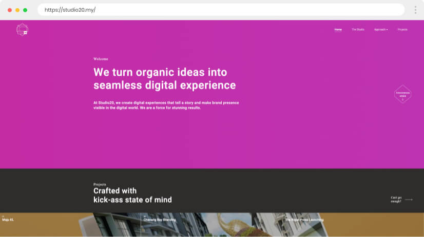
23. Studio 20
Creative storytelling, visual digital branding, technologically innovative -if this is your business, then you better make sure your own site is a showcase of exactly what you can do. Studio 20 uses all its knowledge of tricks and flicks to bring energy and life to this site and leave nothing to chance. Great examples of techniques, superb use of images and graphics, color, movement, and a fully comprehensive portfolio. Nice work that will bring more work.
4. Bubbas 33
The creative design doesn’t have to be all about new techniques and technological flair. Bubbas 33 gives you everything you need with the minimum of fuss, but it’s taken to the next level with little touches and fine detail. We see the mouth-watering, stomach-rumbling photos of the food and drink offered, we get what we need from the 70’s typewriter font but what we also get is a sense of place and a sense of fun. Lovely doodled retro illustrations and a consistent color scheme do enough to brand without the heavy-handedness.
25. Erika Senft Miller
A multi-sensory designer with you has guessed it-a multi-sensory site. Interactive navigation, sound, and video work successfully toward one goal. There’s a softness and gentleness to the site delivered by a fine combination of soft colors and gentle swaying movement. It gets you into the atmosphere, the zone. It’s well thought out – it is well worth visiting. An awesome example of a website creating an atmosphere.
26. Sitara – Let Girls Dream
Start the experience they ask us -we do, and we look. Esoteric design.
27. Eat Sleep Work
A gem of a site, with a cool retro feel. Flat custom graphic icons, simplified and stylish. Neatly organized, super easy navigation, and plenty of information. It gives a sense of fun, a sense of cool, and a sense of “can do”.
28. Frank Body
Frank Body effectively combines an old skool type-writer font with modern photo images. Hover and change techniques, show off the products and their fun use, and keep the site fresh and clean looking. Excellent examples of social media integration especially with Instagram.
29. Syndy
Syndy digital community site is full of quirky cleverness. Graphic icon animations tell a story and process in Heath Robinsonesque motion cartoons that are stylish but clear and pointed. The whole site is held together with great consistency and flow by the total design and color scheme. Seamless.
30. Sweet Magnolia Gelato
A fine example of illustration and theme combining in perfect harmony. The site reads like a menu, perfectly fitting the context. Clear, well explained, and cleverly spacious. For something very special check out the “Our Story” section, a fantastic sequence of illustrations, and scroll through storyboarding, What can’t help putting a smile on your face.
31. Big Drop inc
A site that is as clear as a Caribbean pool. There is nothing fancy on the landing page, but everything serves one purpose. Inform in the clearest and most direct way. Navigate to other sections, including the portfolio gives you all you need with a calm elegant quality.
32. Eleanor Auto
Eleanor Auto’s monthly vesicle subscription site is explanatory and manages to break the concept down into easy step-by-step processes. The mixture of concise texts, alluring images, and overlaying works in harmony. Overall an exemplary site.
33. Senses lab
Some great touches, elevate this site to a higher level than most. Senses lab uses all its skills to present a crafty, fun design pairing fun illustrations with photorealism and inviting text content. The whole feel is professional but personal, fun, and functional.
34. With Jack
An insurance company specializing in freelancers, With Jack, comically personifies the issues of a freelancer’s life. Humorous and yet serious, a great strategy for its target market. A site that never loses focus for even an instant.
35. Panoraven
Panoraven offers no excuses for showcasing what it does on its site. It is a 360-degree viewer and the site is too. Its cursor control scanning allows you to move the central landing image and give you a feel of what’s possible. The drawing’s illustrative style continues throughout with fun and freshness and of course, there are more examples of 36o photos to play with.
36. Hey Tempo
Bright but not brash. Tempo aims to join employees with employers and the split-screen design highlights these two aspects perfectly. Scroll down for more info and be treated to strong colored blocks and images that serve to break up the site into areas.
37. Few
An example of how well video can work on sites, providing an instant insight and feel for the company. This site also stands out for its use of gradient coloring that works to sweep you across the screen.
38. Root Studio
With video animation, movements, and transitions, there’s a lot to see. Root studio keeps the site light by holding text to a minimum on the landing page and letting the key content come out on hover. Everything can be found easily, everything has its place and everything still feels light and airy despite the detail.
39. Riskified
The things that impress us on this site are the completely appropriate cool animations. The store to check out to your revenue animation perfectly illustrates a seamless path flow by running marbles along the track. it’s hypnotic but highly illustrative, managing to explain a difficult concept, simply and without any fuss.
40. Lessonly
Everything has its place and there is a place for everything. Despite the masses of information on this Lessonly site simple navigation and menu give a feeling of lightness of touch, which is perfectly targeted at the audience. You want the info but you don’t want to feel overwhelmed. Mixing up personal photos with adding illustrations creates a fun feel and lets the atmosphere flow through.
Conclusion
It’s been a pleasure to journey through these creative, innovative, and carefully crafted designs. A mish-mash of the latest thinking and techniques, a variety of styles and focus but a richness of quality ideas and design flair. The principles of design remain the same even as we move forward- and without great designers, the new techniques and technological innovation would be wasted. Be inspired by great web designers, take inspiration from their top unique designs and high standards, and push the boundaries of your limitless potential. There are sources and tips and secrets of success but at the end of the day – you are the one.
You may also be interested in these related articles:

