I’m a small business, working locally with a good reputation and client base, so do I really need a website? The answer is undoubted – YES, you need one.
The web has changed everything and will continue to do so. Consumers, customers, and clients all realize that going online to find a business is the fastest and most efficient way. Just look at the number – a huge 97% of Americans go online to find a local business and there are similar statistics for Europe, in a trend that is Whether you are a cleaning service, freelance photographer, coffee shop, own a store, or have another type of small business, a great website is vital for your success.
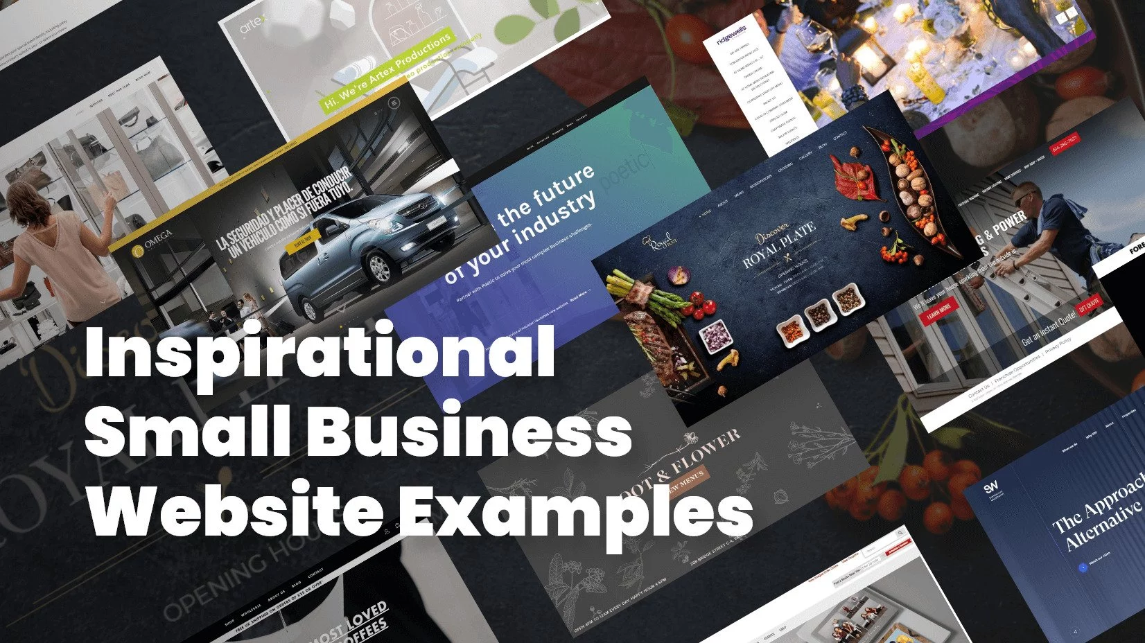
Now that’s established here are some examples of small businesses that have done it in style. A great selection to inspire you as a business owner, or self-designer. Enjoy
1. Pixel-industry.com – Restaurant Website
Royal Plate starts with an above shot of a table containing food both static and moving. There’s a very clear navigation bar across the top so you can access any information you need quickly and easily. Food shots and shots of the restaurant itself are mixed and merged throughout. There’s an additional gallery to make the most of their scene plus a blog to get you coming back for more. And not to forget the vitals, reserving a table, getting directions at the touch of a button to get those customers through the doors.
2. Omegacarrental.com – Rent a Car Website
A car rental site that does everything required but does it well, starting with three alternative languages is an absolute must for this type of business. The choice of images features cool photographic shots of the cars available and the search bar across the center asks the key questions you need to answer to get a quote. There really is nothing superfluous here. It’s focused and to the point.
3. Stphilipshomes.co.uk – Real Estate Website
The Phillips Homes estate agency uses a variety of techniques to attract us to their site and therefore their business. The site is clear and clean with a handpicked selection of examples of properties on a crisp white background. You are not mauled by a great mass of houses and flats, there is space to breathe with further information to be found in your time. The photos are also a nice mix of professionaL property shots and friendly staff group pictures with the occasional family grouping. Professional, friendly, and aspirational.
4. Uvelanghe.it – Wine Bar and Hotel Website
Uve Wine Bar & Hotel La Morra starts our selection. Opening with a brief animation, then a panoramic photo. If you’ve got something this beautiful to show off, you may as well get it upfront. There is a video accessible from the homepage, combining drone and video footage with a classy soundtrack. The information, from rooms to services is well-spaced, clear, and illustrated with soft photo shots. The whole site encapsulates a feeling of classy elegance. A great example of how your site can set the feel and atmosphere of your business. Of course, there is key information too regarding prices and availability. Everything you need is there but it’s a pleasure to find. And all in a choice of languages.
5. Le-mugs.com – Restaurant Website
Another restaurant that sets out its vibe on the opening page and keeps it going throughout with a consistent theme of great photography on bold backgrounds. To add extra interest, the photo images float around as you scroll down, and backgrounds slide in and out of the shot. It’s cool and funky and very fashionable. Food shots included on a timeline of food from breakfast to evening meal are other clever twists.
6. Roastworks.co.uk – Coffee Shop Website
Another site grabbing your attention with an above shot this time of an inviting cup of coffee. What we like about this site is the absolute clarity of purpose, of selling coffee. Black, grey, and white with a tiny shot of coffee brown keep the site minimal and extremely easy to find exactly the coffee you want. A great example of a functional website doing its job and doing it with style.
7. Thegoodburger.com – Burger Restaurant Website
A Spanish burger site with photos of its product does not sound particularly inventive but the Good Burger shows a great use of icons, including the burger itself to organize the site and allow you to navigate around it. From the burger, everything else emerges. Therefore the burger is always front and center and rightly so.
8. Soapwater.com – Cleaning Company Website
Soap + Water is an outside cleaning company with the landing including lots of glossy action shots just to let you know what kinds of things they cover. The specific information pages are bullet-pointed with cool little water drops as bullets. (the little details matter) and some excellent before and after shots of the service they provide. A testimonials page too, so you can read the reviews and feel confident about the workmanship.
9. Burgerij.be – Burger Restaurant Website
This time a Belgian burger site or restaurant, takes a different approach, including a 360-degree view from inside the restaurant. Side navigation bars pop out to allow you to quickly nip to your required destination. Each separate page has a clear consistent theme based on actual real-life situational photos. These photos in particular give a natural rather than staged image.
10. SW.co.uk – Consultant Agency Website
Chartered Surveyors, Property Consultants and Asset Advisors, I want to see trust, honesty, and professionalism. This site gives all that with a simple branded blue and white theme and solid typography. It then adds some photos of the office day to day approach with a much more friendly open focus. Add to this a video, blog, and further detailed information section and you really have what you need all in one place.
11. Mio3.de – Cafe Bar Website
Mio3 cafe bar and restaurant is another site that ticks all our boxes. Friendly active photos of real-life customers and staff, reservation pages, full menu, map plus directions. The tone is professional and stylish.
12. Weareforeal.com – Design Agency Website
Forreal design agency has gone to town with their site, as you you imagine lots of great illustrated graphics, and photos of products. Clicking on each will bring you more information, alongside a larger image. There is also an interesting social wall element taking you directly to the Instagram page, showing the design next to comments from followers.
13. Taleo-consulting.com – Management Agency Website
Taleo management consultants have constructed the site images around a graphic target of red concentric circles, a video background showing clips from major world cities, and angular flashes of bold colors for the text boxes. The theme on a landing page is continued on the other information pages. This is a bold design that tells the visitor exactly what the company does and stands for.
14. Rootandflowervail.com – Cocktail Bar Website
Root & Flower is a wine and cocktail bar offering drinks and tasting sessions. The site background is an exceptionally stylish beige and grey look of hand-printed wallpaper. The typography throughout is clear and spaced in boxes with explanatory headlines. The only deviation from the color scheme is the photos of food, drink, space, and staff. You are left with the feeling the owners know exactly what they want and how to express themselves without being showy. Distinctively low-key but very cool.
15. Msplaced.com– Professional Organizers Website
Professional organizers Ms.placed from Austin, Texas go for a white clean background full of personal and professional glossy photos. As you would expect the site is well constructed and organized, feeling fresh and room with images that show you what the team offers. The further information pages use bullets points to arrange the information with clarity the fundamental response. There is also a “Meet the Team” section with mini penpics of each staff member, this adds a personal touch.
16. Myclean.com – Cleaning Agency Website
The MyClean site is fresh, bright, and clean with white, blues, and greens. Not an unexpected choice of colors but appropriate nonetheless. The landing page offers a straightforward step-by-step timeline with cool icons showing you just how simple the service is. The whole site a reassuring and trustworthy, exactly what you want if people are coming into your home. There’s all the information you need plus a comprehensive FAQ, a good idea when your business is relatively niche.
17. Poetic.io – Marketing Agency Website
This site is dominated by broad horizontal bars, symbolically giving a very solid and stable effect. This is carried through to the other pages beyond the landing page. We like the mini personal philosophy profiles of the team, with action shots and all linked to other media sites in this case Linkedin. The service section is also a nice example of easy to access information with each service given a title and a drop-down arrow opening more detailed information, meaning you are not overloaded with lots of useless info you don’t need but can focus on exactly what you want.
18. Ridgewells.com – Catering Website
A catering site, lots of food pics but event shots too. Sidebar navigation allows access to specified event types and offered menus. Each contains limited well-edited text explanations but is dominated by nicely chosen photos showing how successful your event can be.
19. Kasparsseattlecatering.com – Catering Website
Another catering site but with a different approach. Here each event is broken up into themes, with tabs giving you access to the menu for each. We like the way these tabs deliver you to a menu as if you were sitting choosing in a quality restaurant, even the cooking classes on offer are presented in the same menu style. A well-thought-through site.
20. Jcpportraits.com – Photography Website
This photographic portrait site offers so many examples it could be easy to get lost. However, clever organization and construction are obvious. A main top navigation bar gives you overall categorization and a second sidebar gives options within the category. This means that a vast amount of examples and options don’t overwhelm you.
21. Studiobfilms.com – Video Production Company Website
StudioBfilms uses its own specialist area to make its site special. The landing page contains filmed demo reels and video testimonials. The portfolio section is particularly inventive, grid line organized stills to grab the attention, hover over them to find their title or use.
22. Artexproductions.com – Video Production Services Website
Artex productions similarly open with a video, well cut and interesting, gracing the landing page. Artex uses a case study section to highlight exactly what they offer, with some very interesting accompanying text so you get a real feel for the productions. The about section also works well, clicking on individual photos of the various staff member brings a mini-history accompanied by a childhood photo, an interesting and different way to personalize.
Final Words
You know you need a site, you want it to do all the jobs and more. These a just a selection of great sites that have moved out of the traditional zone and into a more creative space, whilst (and this is probably the most important thing) still keeping the point of the business clear. Despite the fabulous designs we’ve featured, it takes only moments of viewing for you to know exactly what the business is, what they do, what they offer, and where to find them. Inspiring designs working with the key business functions. We hope you have had as much fun looking through them as we did select them. There are others out there, have a browse, take pointers and start to think outside the box for your new site.
You may also be interested in some of these related articles:


