Users get more and more demanding and if a design itself delivered great outcomes some years ago, there is no guarantee it will work today.
However, finding inspiration for your next website or app design might be a tough task. You need to consider plenty of ideas, many of which not be suitable for your business. As a result, you might be wasting productive time.
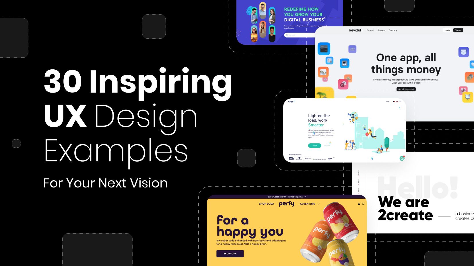
In this article, we have gathered 30 design examples with an outstanding user experience, which can serve as a guiding light and inspire you to the bones. We have carefully selected our examples to cover as many niches as possible, focusing on both B2B and B2C. Let’s take a look:
1. MILU – Product Tutorial

Type: Cosmetics | Country: the Netherlands
MILU is one of our top user experience design examples for a couple of reasons: not only does the color palette indicates who these products are for, but there are a lot of high-quality images and videos, and on top of that – there are explanations of each product (ingredients, target audience, etc.) and a video of how to use it. Simply amazing!
A great example for:
- Video instructions
- A detailed explanation of each product
- A beautiful feminine color palette, indicating the target audience
- Creative choice of icons
2. Revolut – Personalizing user experience

Type: Fintech | Country: UK
Revolut offers an exceptional experience for its customers. You can personalize everything there – from your virtual card look to your user interface. It’s an example of mobile UX design that can serve as a role model for other apps that want to offer such a level of customization to their clients.
A great example for:
- Great attention to detail
- Sublime personalization
- Simple, and well-explained icons with services
3. Clutch – Detailed Filters

Type: A Review Platform | Country: USA
Clutch.co showcases a large portfolio of B2B agencies. It offers one of the most advanced filters we have seen, thus the platform can easily qualify as a benchmark in filter design examples. On top of that, the review feature gives companies a lot of credibility and makes people trust Clutch when making decisions. Users can also see hourly rates, total budget costs, etc, which is pivotal. The cherry on the cake is the “Verified” badge that is the whole essence of such platforms – to connect clients with trusted partners.
A great example for:
- “Verified” badge
- Advanced filters
- Service focus tab
4. Kitchen.co – A Brand New Service Explained

Type: Communication platform | Country: Bulgaria
Kitchen.co is a B2B and B2C communication platform that allows seamless information exchange between teams and clients. What made it rank among the good user experience examples is how well-explained each feature is on the landing page and the interactive Agency/Client view achieved by a toggle button. There are lots of platform screenshots and bullet points that make things clear to understand.
A great example for:
- Complicated service explained simply
- Great, descriptive visuals
- Showing multiple reviews
- 100+ features explained clearly
5. Vunabaka – Useful Time and Weather Plugin

Type: Luxury resort | Country: Fiji
Vunabaka is a luxury resort in Fiji and the website shows it as such. The website design boasts a friendly UI with amazing high-quality images of the place and a luxurious copy that goes along. What ranked it in our UI and UX design examples is the smart plugin that allows you to access the local time and weather forecast in Malolo village in real-time and make you want to go there. A small but smart and creative concept.
A great example for:
- Luxurious text copy
- High-quality images
- Real-time time and weather plugin
6. eDreams ODIGEO – Case Studies

Type: Travel site | Country: Spain
eDreams is a travel website with a couple of different services. What we loved, though, is the case studies that sparked our interest. It’s very interactive, full of infographics, and it has plenty of high-quality images and illustrations. We believe it’s one of the best UX design case study examples you can find today – elegant, professional, interactive, and most notably – creative.
A great example for:
- Creative concept for case study
- High-quality images
- Interactive infographics
7. DrinkPerfy – Product Benefits and Reviews

Type: Soda Drinks | Country: USA
DrinkPerfy is a company that offers non-alcoholic beverages with natural ingredients. We rated their design based on how well they managed to promote their product by stressing its benefits and attaching reviews from people. Lots of bullets, illustrations, and a gradient background make the website interface more “juicy”.
A great example for:
- Product benefits
- A unique UI that matches product design
- Comparison table between Perfy and other similar products
8. Netflix – TV Streaming Services Made Simple

Type: Streaming services | Country: USA
Netflix is the most popular streaming app available. It ranks as one of the best wevsute design examples because of the simple navigation, the dark theatre-like theme, and a straight-to-the-business structure – they know you are there to watch movies – you will find completely different movies/series based on your taste on one page, and nothing else to distract you from movies. And you don’t even have to read a synopsis or search for a trailer – it automatically starts on hover, genius! Not to mention our favorite function to automatically start the next episode or skip the intro.
A great example for:
- Clean and simple navigation
- Great visuals
- Explanations written in a plain language
9. Octaevo – Using Shape Patterns

Type: Accessories | Country: Spain
Octaevo is one of the examples of UX design that impresses with imagination. It perfectly blends shapes and images, and the 3D illustration design makes this website extremely useful if you want some motivation for your next art design project.
A great example for:
- 3D forms
- Use of shapes
- High-quality images
10. Blueventure – Utilizing Color Theory

Type: Accessories | Country: USA
We have brought this UI design example because the whole website is made to ease people who want to be credited. Venture capitalism is hard to explain but here, things are made simple and friendly, and another thing we loved is the elements that have been used – a positive trend that appears when the website is loading and utilizing the color theory perfectly.
A great example for:
- Illustration with a positive trend (arrow up)
- Combination of whites and blues (build trust)
- Simple explanations
11. Clac – Getting Personal

Type: Personal Assistant Services | Country: France
Clac is a very interactive animated website. What makes it a great user experience example is how well the design “communicates” with users – it’s playful and quite interesting. What impressed us is the direct tone of voice that gets personal. In fact, the FAQ section leaves us with the impression that Clac is a name of a person, rather than a platform.
A great example for:
- Design communication with the audience
- Lovely explanations
- Quirky FAQ section
12. Google – Competing Against Itself

Type: Search Console | Country: USA
Don’t you find it weird how design trends change but Google has remained with the same interface since 2016, and it even has similar looks to the design from 1999? The concept “less is more” will never get old. There are a lot of features that you will only access once you look for them. It’s the recipe for being #1 in the world for so many years.
A great example for:
- Design consistency
- Lots of tools available upon search
13. 2Create – Showcasing Brand Portfolio

Type: Service page | Country: Bulgaria
2create is one of the best-looking portfolio design examples. It may serve you as inspiration if you have multiple brands which operate within the parent company. All products are explained with a few sentences but include numbers, the black and white color palette gives the company a more premium interface, and the big bold letters ensure great text legibility – crucial for mobile experiences.
A great example for:
- Lots of branding, including font colors
- Great explanation of the brands
- Creative navbar
14. Paolo Cottini – Adding Elegance

Type: Winery | Country: Italy
If you sell high-end products, then having a premium user design is a must. We can easily spot the elegant touch with the handwritten signature text and using “premium” colors plus black-and-white photography makes the design exquisite.
A great example for:
- Personal signature
- Detailed product explanations
- Bold letters
15. Soxey – Minimalistic Design

Type: Socks | Country: Switzerland
We rate Soxey highly among the examples of UX design because of its design consistency, minimalism, and the usage of square forms. We can also praise the Swiss for adding such a photo as the main one. It sets the tone of the whole website. Last but not least – for each pair of socks there is a detailed explanation that gives further value in terms of SEO.
A great example for:
- SEO
- Great filters
- Detailed About Us page
16. Masterclass – Aggressive Sign-Up Page

Type: E-Learning | Country: USA
Masterclass is a premium e-learning platform with lectures from industry professionals like Gordon Ramsey, Marques Brownlee, Richard Branson, etc. It’s one of the best customer-focused experiences for SAAS companies, as it offers easy access, a dedicated B2B portal (called “At Work”), and an amazing Plan page with comparison. Add the stunning user interface with rich blacks and red CTA buttons, and we see why this platform is so popular.
A great example for:
- Dedicated B2B section
- Great Price page
- Aggressive Sign-up page
17. Rib Rack BBQ – Stating its Benefits

Type: Sauce | Country: USA
Rib Rack BBQ is another website design that utilizes comparisons between the product and competition. One page that many other websites lack is the Community page where people can share their experience with the sauce. It creates good vibes and brings more attention. Other than that, we also have to compliment the FAQ page which has 14 questions that concern the product and allergens.
A great example for:
- Community page
- FAQ page
- Highlighting features through a product comparison
18. Wana Brands – Playing with Text

Type: Gums | Country: USA
Wana Brands focuses on showing off some creativity. And indeed – it works. From creative headlines to a great podcast section and a variety of other videos and blog posts. If you want to express yourself, then this is one great customer-centric approach to how to do it.
A great example for:
- Creative headlines
- Different types of content
19. Booking – Gamification in user experience

Type: Travel App | Country: the Netherlands
Gamification is a great way to optimize the user experience and Booking.com are well aware of it. Genius Levels incentivize customers to spend more money and serve as loyalty programs. On top of that, travel-related services are also offered, like rent-a-car and flight services. It is one of the best examples of gamification and cross-selling opportunities.
A great example for:
- Cross-selling
- Gamification (progress levels)
- Search options
20. Duolingo – User Personalization

Type: Language App | Country: the USA
Duolingo can easily go down one as one of the best mobile UX design examples. The app offers an easy-to-use interface and access to many languages. You get to answer how you reached Duolingo which is crucial to show which channel delivers. On top of that, there are other quiz questions you need to answer to be segmented.
A great example for:
- Client personalization
- Gamification
- Additional services (upselling)
21. Burger and Sauce – Utilize Options

Type: Restaurant | Country: UK
Customers love to choose. That’s why we bring you one UX design example that provides you with lots of choices. Want to check menu online? Sure! Or do you prefer to download it, instead? Okay! You can also place an order or subscribe. One thing that can serve (pun intended) as inspiration can be the gallery – as a restaurant, this is a must-have condition.
A great example for:
- Choice of options
- Following industry guidelines
22. Aspen Homes – Direct Call Button

Type: Real Estate | Country: USA
Aspen Homes is another one of our UI/UX design examples that stands out with original ideas. What we love is the seamless “mature” experience of the website. Designated pages such as “Our Approach” give more depth, while advanced filters, high-quality images, and short and clear explanations impress a lot. And let’s not forget about the truly amazing button that calls the number directly.
A great example for:
- Advanced search options
- Our Approach page
- Direct Phone Call button
23. Apple – Product Comparison

Type: Electronics, Services | Country: USA
We cannot submit an article about amazing user interface designs without mentioning Apple. If your brand offers a variety of services and products, you can get inspiration from Apple – they have an amazing multi-page layout. You can find FAQ sections for everything, and the comparison tables between their own product lines are a genius idea.
A great example for:
- Product comparison
- Designated FAQ section
- Insane page optimization
24. Zapier – Connecting Clients with Professional Guides

Type: SaaS | Country: USA
It’s always challenging to create a web design for B2B clients. There are different demands and simplicity plays a crucial role. The business automation software is hard to understand, but we love how each supported service is easily available through scrolling and a search box. On top of that, there are flexible pricing charts, a big community, and a network of experts that can help you set up your account.
A great example for:
- Big professional network
- Flexible pricing models
- Lots of useful information on the website
25. We Are Jude – Showing Stats

Type: Supplements | Country: UK
It’s not an easy task to create a website for bladder pads and supplements that attracts audiences. However, this website comes with a stunning UI design – lots of numbers, all proven statistics, many useful infographics, comments from a Ph.D. from Harvard, and a Community section. Top that with an amazing blog section, and you can clearly see why it appears on our example list.
A great example for:
- Superb use of statistics
- An amazing blog section
- Easy access to all products
26. Puzzle Break – Offering New Solutions

Type: Virtual Meeting App | Country: USA
Puzzle Break offers brand new experiences for its customers. We gave it a place in our UX examples list because we believe CX (Customer Experience) is a crucial part of it. And we can see it with the variety of opportunities to organize team buildings online, virtual escape rooms, and even escape rooms in Seattle. A lot of options, and you can get a quote easily.
A great example for:
- A variety of choices
- You can get a personal quote
- Good FAQ section
27. Amazon – Overal Experience

Type: Ecommerce| Country: USA
Amazon offers a unique experience for its customers. Starting from the “Buy Box” button that allows users to shop directly if they don’t want to choose between different manufacturers, to Amazon Prime which gives plenty of options for discounts, free shipping, etc. Also, Amazon gives plenty of other services – like video streaming, TV channels, servers, and lots of B2B tools. However, if there was one thing that makes Amazon truly awesome, it’s Amazon Prime – arguably the best loyalty program globally.
A great example for:
- Buy Box button
- Detailed filters
- Loyalty programs
- Range of services
28. ESPN – A Complete Media Package
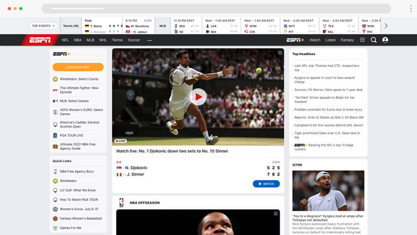
Type: Sports Channel | Country: USA
It’s common for TV channels and radio stations to slightly neglect their websites. That’s not the case with ESPN. It can be classified as one of the finest UX website design examples for sports fans, with lots of videos from games, a large article collection, interview sections, social media handles, TV channel integration, and a live score plugin.
A great example for:
- Video footage
- Live data
- Social media handles
29. Birkenstock – New Market, New Version

Type: Shoes | Country: Germany
Birkenstock is among the most popular manufacturers of sandals and has a long history. The reason this legacy shoe producer ranks in our example list is simple – it customizes its product according to the market. Not only does the Birkenstock website has different cover photos and images for each region, but also the featured models are tailored to fit local shoppers.
A great example for:
- Separate edition for each target market
- Product customization per region
- Quick loading speeds
30. BMW – Delivering More Than What is Expected

Type: Car Manufacturer | Country: Germany
BMW has a superb website design. You can feel the BMW experience – by listening to some podcasts or reading articles about climbing Mount Fuji. Of course, if you’re just looking forward to buying a new car, just press the “Models” sections and you can configure the models in your local language, as the website optimizes user experiences for local markets. You have all the standard options and a high-quality rotation image of the car’s exterior/interior.
A great example for:
- Focusing on the customer journey
- Easy car configurator
- “Hypnopolis 2” page
Final words
It’s easy to get carried away by our top UX design examples. And while for brands like BMW and Apple exclusive design comes at a high price tag, you can always think of Google – delivering simple solutions but optimized to the last bit. After all, design is all about customers. Your customers.
If you find our article helpful, you can also check some of our other content: