8 Logo Design Trends 2018: Stay at the Top of Your Game
Are you following the logo design trends 2018? It's not too late to catch up! Here are the 8 logo design trends that will rule in 2018.
Are you following the logo design trends 2018? It's not too late to catch up! Here are the 8 logo design trends that will rule in 2018.

Update Nov. 2021: Top Logo Design Trends in 2022 are officially out bringing back the hype for logotype. Check them out.
Logo design trends reflect the individual faces of small businesses, huge corporations, and everything in between, but they also stand in for larger social mores. The best designers have an innate sense of which way the cultural winds blow because logo design trends are so closely linked to the ability to recognize all things relevant and fresh. So take this chance at the beginning of the year to take stock of what’s coming this year in logo design trends.
Of course, аrchitectural and graphic design have always inspired each other. However, architectural design is providing new inspiration to logo designers, and regaining popularity in exciting new ways. We’ve all come to expect certain things from the physical space we associate with top brands; every time you enter a Starbucks you intuitively know where to go and how everything works. In 2018, logo designers are taking a lesson in physical space as they create brand identity, using visual interpretations of architecture’s physical expressions in space, in the digital world.
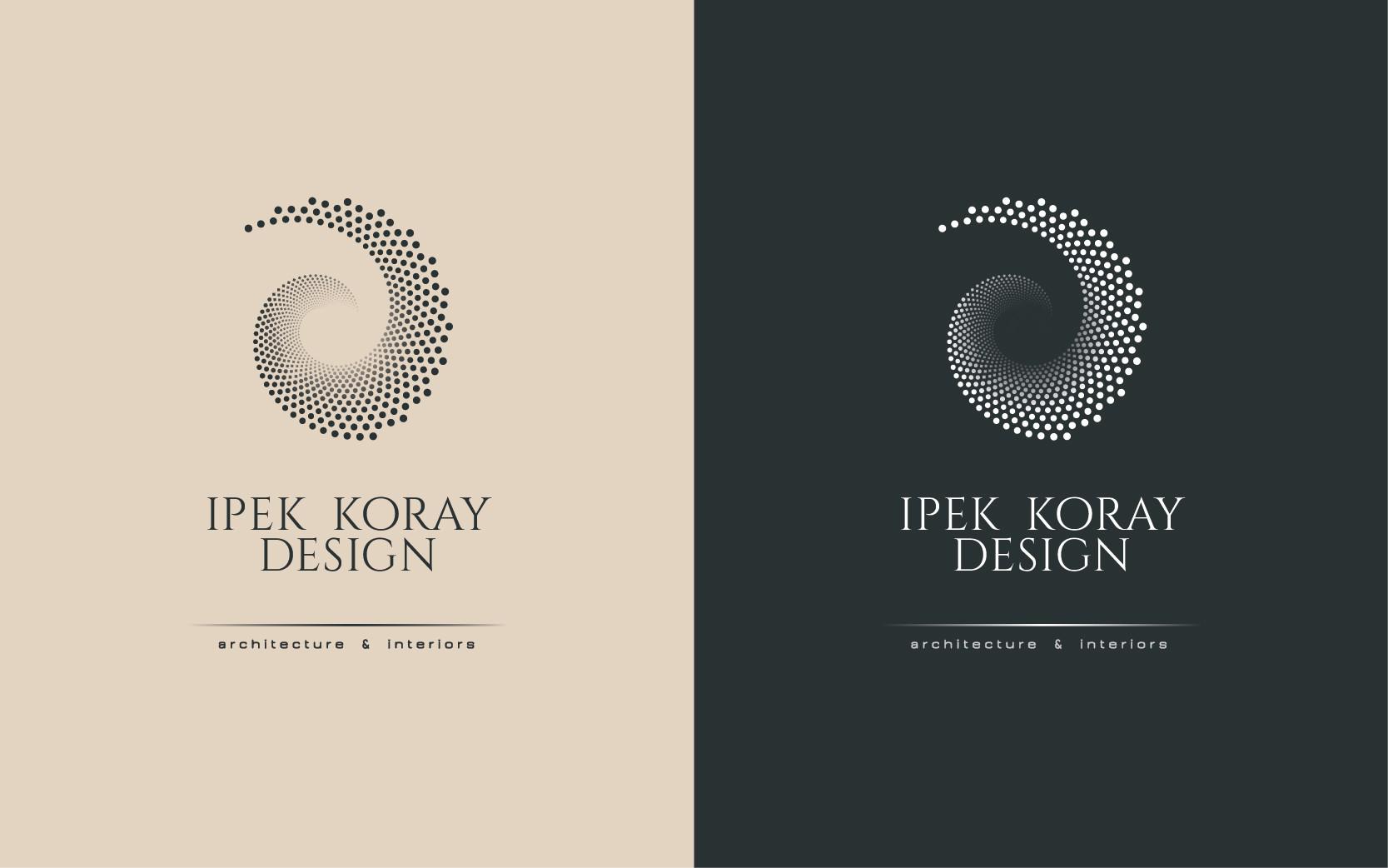
A fine example of this trend in architecture-based logo design is Piasecki’s logo design for Ipek Koray Design, an architectural and interior design company in Istanbul. The Fibonacci spiral of the logo is reminiscent of a spiral staircase, a feature that figures in various designs by the company and suggests luxurious style. The spiral also strikes a balance between nature and human design, and their harmonious occupation of physical space.

Logo by Ipek Koray
Experimental typography allows basic information to be communicated in ways that are complex and meaningful. Doing new and creative things with typefaces isn’t itself a fresh idea, but the practice has consistently led to the modification of existing typefaces, and the development of completely new styles, often with the help of new artistic or photographic techniques. This year expect to see more experimentation with typography, from designs that use negative space and modern design to create a monogram logo with cropped typography:

Logo by ludibes
To custom typefaces that function as optical illusions and more literal interpretations of the message they communicate:

Design by RotRed

Design by Tamara Milakovic
Chaotic typography rejects the notion that typeface should be orderly and aligned – coupled with hand-drawn lettering, it’s a perfect way to get a retro look:

Logo design by Ctrl
Finally, look for typography dotted with other compositional elements to create letters transformed into objects:

Logo design by Ron | Graphics
Let’s be honest: we could all use a little more fun in our lives. That’s probably why fun sells so well. Energetic, fun, and funky fresh logo designs are going to be trending in 2018, bringing cartoons, bright colors, and silly puns with them.

Logo design by MAd Pepper

Logo design by Mky

Logo design by Mad Pepper
We may also see more weird effects like faux glitches and corrupted or broken/destroyed images worked into logos in 2018.

Logo design by Ameernagdy
Logo designs have recently been getting back to basics, focusing on fundamental geometric shapes. Informed by a less-is-more attitude and the complementary trend of minimalism, look for more of these shape-ly logos in 2018.

Logo design by Milos Zdrale

Logo design by Marija
Grid-based logos are all about perfection, imposing order alongside creativity. 2018 is going to see some of the same in the realm of grid-based logos, but also probably some new twists on the same art and design tool.

Logo design by Ludibes

Logo design by djmdsgn
To achieve richer, more visually interesting designs, masking and layering color and patterns allow a designer to include and, sometimes, selectively reveal more content and meaning inside a design’s basic shapes.

Logo design by themetamy_studio

Logo design by EnvyFX
Taking a great metaphor as far as it will go is an art form that works beautifully in logo design. In 2018 we’ll see logo designers perfecting that art form, maximizing metaphors, and creating funny, clever logos that make you think and pay attention a little longer in a world that counts gains in milliseconds.

Logo design by Sava Stoic

Logo design by Sava Stoic
Sometimes, for some brands, nothing works quite as well as a truly classic looking design. The right pairing of a clean, simple typeface along with a monogram can achieve this type of effect. This back to basics kind of look demands careful attention to the details of typographic design, from spacing and kerning to typeface choice.

Logo design by kosta-xd

Logo design by Niklancer
It’s an exciting time for designers, and for people who love to drink in what people in the visual arts come up with. Some nice design trendy infographics have already highlighted the diversity of the styles we can expect. The logo design trends of 2018 promise both exciting elaborations on complex creative themes and back to basics concepts. Clean, crisp geometric patterns and grids along with experimental typography and layering of patterns and color will make logo design an exciting space to watch. 99designs can help you make the right choice in terms of trends you can use to revamp your logo.
Camille Franc is our guest author from the logo design platform 99designs and he works as a Marketing manager there. Camille is passionate about visual communication, psychology, and entrepreneurship. When not immersed in the world of digital marketing, you will likely find him traveling the world, playing music or practicing meditation.
You may be interested in these related articles:
Don’t forget to share!
A growing source of high-quality vector graphic illustrations you wouldn’t find anywhere else on the web! Behind GraphicMama stands a talented team of illustrators, designers, marketers, and coders who work hard to make GraphicMama one of the most reliable sources of vector graphics on the web.
Here are some other articles we think you may like:
A source of high-quality vector graphics offering a huge variety of premade character designs, graphic design bundles, Adobe Character Animator puppets, and more.
Browse our graphics