


We all remember the good old websites. They were extremely light, loaded fairly quickly (especially given technology back in time), and delivered amazing experiences according to the standards in the 90s and in the 00s.
But Internet has emerged and what it looked like space to gather information has rapidly monetized. Once the money started to play a huge role online, websites started to compete against each other by adding lots of images, subsections, long descriptions, and loads and loads of stuff, making sites load slower and creating an inferior user experience.
The rise of smartphones created another problem – how website content will appear on a smaller screen? As a result, Google introduced Material Design – an answer to the ever-increasing user demands.
In this article, we’ll provide a material design definition, go over the main principles, and see how icons and colors are used in material design. We will end the article with some useful resources you can apply to your projects.
Article overview:
What is Material Design?
Principles of Material Design
Icons and Colors in Material Design
How to Get Started?
Resources
1. What is Material Design?
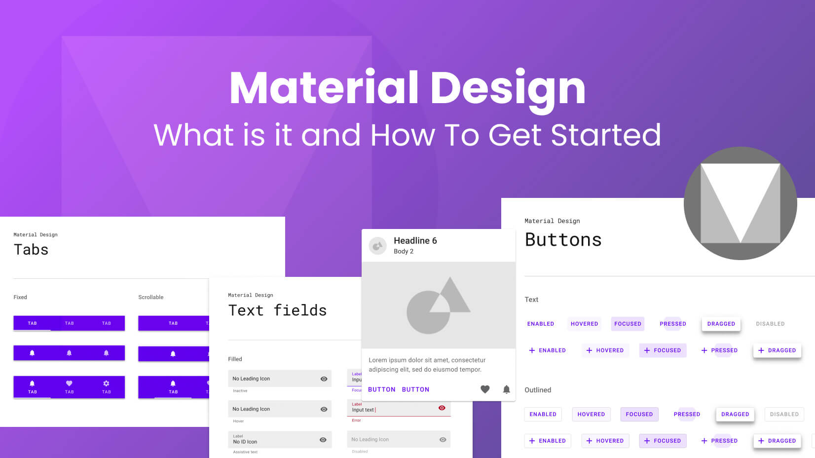
Material design is a design standard (or system) that has been developed by Google back in 2014. The entire idea behind that decision was to create a design system that will create better consistency across all devices, and add predictability to all designs, in order to simplify the user experience.
For one system to remain adequate in such dynamic times for the Internet industry, evolution is inevitable. Google’s Material Design is always transforming, always improving, and always riding the new waves of design!
In October 2021, Google released Material Design 3, with updated guidelines, and many websites and apps using Material Design 2 started migrating to the latest version.
2. Principles of Material Design
For a design system – and any pattern, in general, is crucial to have a specific checklist of requirements, in order to be qualified as such. Google Material Design guidelines are there to help you. Below, we will show you some principles you need to apply in your design, so it can be regarded as “Material”.
2.1. Understand the concept behind “material”
Material Design has its name for a reason. Unlike Flat Design, here we see a completely different concept. A concept that uses visual hierarchy to create a real-world feel to designs. Human beings can make associations. Material design heavily relies on 3D forms, to add more depth and realistic user interfaces.
2.2. Utilize shadows
Shadows are a crucial element across all Material Design components. They should be carefully chosen, as they aim to improve user experience. Using shadows will better orientate users about their current location on your app or website. Bear in mind all shadows should be subtle and non-intrusive.
2.3. Pay attention to colors
The Material Design color palette is specific. First and foremost, you should use a maximum of two main Material Design colors – one primary color and one accent color. You’re also limited to 3 hues per each. Since you’re not left with much “room” for maneuvers, it is considered pivotal to use bold colors to capture attention.
2.4. Keep consistency
Material Design is all about creating a consistent user experience. This means you should follow the same hierarchy across all pages – same hover button effects, same on-click colors, same site structure, and page colors. Your users should intuitively select components from the website/app and easily know where they are at any moment.
2.5. Follow the image guidelines strictly
Images also play an important role in the whole “picture” (pun intended). They should be aligned perfectly, appear in full HD quality at least, and be edge-to-edge. The latest is key to the success of the whole concept. If images are a part of your design, they should also define the primary and accent colors, so all hues fit naturally in the design.
2.6. Consider whitespace as a crucial part of your design
In Material Design, whitespace plays just an important role as components, colors, and shadows. Why? Because utilizing it could significantly improve readability, thus creating better UX. Negative spaces also serve another purpose – they can put the focus on the desired element, for example, the call-to-action button.
2.7. Take advantage of motion design
Motion design leverages user experience by creating interactions between the content producer and content consumer. By providing visual feedback upon each action taken by your users, you drive more engagement. Each Material Design animation should be intuitive, smooth, and authentic. For example, if users click backward, they should see their screen going from left to right, as this is their natural comprehension of turning back pages.
2.8. Select components properly
Each component you insert into your user interface serves a specific purpose. One of the main requirements is to use components in their respective field – if you have a roadmap, having a progress map might make great sense. But will it make sense on your Pricing page? A rule of thumb is – if you’re not sure you need it, avoid it.
2.9. Optimize for a mobile-first experience
From 2017 to this day, mobile traffic has multiplied by 7 times. As a result, mobile UX quickly becomes existential. It even compensates for the website experience. Material Design for mobile devices includes fewer components, larger fonts, a dark theme for a battery life saving method, and other measures.
2.10. Less is more
Material Design lays the foundation of the new wave in UX/UI design – minimalism, and it follows Google’s concept – “less is more”. If your goal is to utilize Material UI Design, then you should get rid of unnecessary elements and components, and leave room for what truly matters.
P.S. The result will be a faster page load speed, and Google will reward you with higher positions in its SERPs.
3. Icons and Colors in Material Design
Material Design icons and colors are crucial for the successful execution of each project. We already stressed the importance of colors. Let’s see in detail some of the main requirements for both icons and colors.
3.1. Icons
It’s impossible to have a website without icons. But the variety of screen sizes and resolutions has created a problem – icon legibility. That’s why Google has come up with a separate icon checklist that you should complete.
Icon Size
The standard Google Material Design icon has a 24px size and is a scalable vector graphic. It’s crucial you place them on the grid.
Icon Clarity
Icons are meant to be clear and legible. To avoid any distortion, you should place icons on the coordinate system on pixels.
Strokes
For your icons to be considered acceptable, they should have bold and consistent strokes. Avoid rounded stroke terminals and thin strokes at any cost.
Icon Shapes
Icons in Material Design should have geometric and consistent shapes. Do not use loose and uneven shapes.
Complex Icon Shapes
If you have to make complex static icons, make them face-forward and skip hard-to-make shapes. Static icons are not recommended to appear as 3D shapes or digital art.
Spacing
According to the best practices in Material Design, you should leave space between icons equal to 2X your icon size. For a standard 24×24 px icon, the whitespace should be 48x48px.
Animations
Animated icons should have a duration. According to the Material Design guidelines:
- Simple icon animations should have a 100ms duration
- Standard icon animations should have a 200ms duration
- Complex icon animations should have a 500ms duration
3.2. Colors
Colors also play an essential role in your Material User Interface. Whether you use them in the background, extract them from your images (with a color picker tool), or use font colors, every single nuance has its unique purpose. We always recommend learning how to use the Color Theory before you conceptualize your Material Design vision.
Color palettes
Google developers are aware not everyone is born a graphic designer, that’s why they have developed their own color matching tool which allows you to select your primary color, and then automatically generates the additional hues which match it. The same logic is applied to the secondary color.
Primary colors
Primary colors will appear most of the time on your designs. Ensure they are bold and represent your brand in the best way possible. If you have large images, you should extract your primary colors from the picture, to achieve design consistency.
Secondary colors
Secondary colors are a great choice for progress bars, highlighting texts, etc. There should be a direct correlation between primary colors and secondary colors. A good practice is to use a secondary color that is between the primary colors, especially after the introduction of dark themes.
“On” colors
“On” colors, or the colors that appear when you hover over a component, are a significant part of the user experience. They emphasize the desired action and should separate it from the other similar components. This effect is achieved by adding more contrast for more accessibility – a 4.5:1 ratio is the minimum.
Background and surface colors
Background colors are the ones that are behind the website or app content. Surface colors are the colors that appear on the site components. Depending on where the text appears (on the surface or it is directly placed in the background), it should have enough contrast from the background/surface color.
Status colors
Status colors represent a certain state in Material Design. They are globally accepted standards like road signs and users are quick to notice them. For example, green is always received as a “complete” stage – regardless if it is about a task or a process. Red, on the other hand, represents an error. Status menus should have the same color code across all designs.
Dark and Light themes
We have to emphasize that colors will vary between the different UI versions of a website/app. Dark and light themes usually use contrasting colors aimed at keeping the legibility. As a result, we might end up with 2 primary colors, instead of one.
Icon colors
Icon colors should match the theme. While they might look on a light or dark theme, you should inspect the other version – is there enough contrast? Stick to a 4.5:1 ratio and you won’t be disappointed. If there isn’t enough contrast, consider adding a second primary color.
4. How to get started?
Creating Material Design websites and user interfaces for apps requires you to have knowledge of UX and UI design. You should work with UX design software. In this section, we will provide you with a couple of tutorials from some of the best UI/UX apps on the market.
4.1. Adobe XD
Adobe XD has become a fan-favorite for many UX and UI designers, and especially for Creative Cloud users. We have already published 25 supreme Adobe XD tutorials that you should definitely check out. But there’s more to that!
Let’s see a video example.
Material Design Blog UI
In this Material Design tutorial, you will see how to create a basic UI Design for a blog app. What you will find is how to include buttons, icons, color palettes, and texts, and save the final version of the design. A simple, yet very efficient video tutorial.
4.2. Figma
Figma is another popular software in the UX design world, and we have covered it with 24 quality Figma tutorials. It’s an amazing app that you can utilize to create super Material designs.
Let’s check a video example:
Material Design Color System
In this Figma video tutorial, you will find out how to create a color system in Figma utilizing a Material Design theme builder plugin. You can also use an image to create the color palette which is even better!
4.3. Sketch
Sketch is probably the best UX/UI software for a macOS environment. You can create a variety of gorgeous designs with it and it is no coincidence the developers are well prepared for Google’s Material Design system. You can check Sketch’s guideline which also includes a couple of videos.
Let’s watch an example video of how to implement Material Design with Sketch:
Material Design in Sketch
This tutorial will show you how to use a color palette from the Material Design guidelines, and how to apply those changes in Sketch. What might astound is how all components switch colors, once you apply the change.
4.4. Photoshop
Photoshop is one of the most capable software solutions you can find for design, despite being the only one on our list that works with raster files (note that Adobe enabled vector functionalities in their 2021 release). We have already prepared a guide with 30 amazing Photoshop tutorials, so checking it out might give you a helping hand.
Material Design with Photoshop is not impossible, and given the latest updates, it’s better than ever! Let’s see a video – it is a bit dated but the concept is great.
Photoshop Material Design
The tutorial is extremely helpful even though it’s not “fresh”. During the first part, you will see how to use Material Design in Photoshop, and how this software can help you craft masterpieces despite the limitations.
4.5. Webflow
Webflow is kind of a “hipster” among the other members of this prestigious list. Well, we ranked it 5th in our UX software comparison, so there are strong arguments why it should be there. As a capable UI and UX program, it can implement Google’s concept perfectly.
Material Design with Webflow
This video tutorial will guide you through Webflow – first, it will provide a quick definition (you can skip it if you like), then move to the “real job” – optimizing your design and aligning it with the best practices of Material Design.
5. Resources
In this section, we will pay attention to some resources, guides, and templates that you can apply in your practice, and get better with your designs.
Free Figma icon set
Figma developers have come up with 2,000 free icons for Material Design, available for everyone. They come in five variants, so you will have plenty of choices when building your website or app UI concept.
Material Design 3 Color Guideline
It’s a good idea to check the new requirements for MD3 when it comes to colors. The color system is well explained. One thing to pay attention to is tonal value and how a color can become 13 unique colors.
Angular Material Design Guides
Angular is one of the most popular frameworks for creating designs according to Google’s procedures. Let’s have a look at their Material Design guideline.
Type scale generator
As we have already realized, this design system pays attention to all details, and fonts are no different. Google has come up with a type scale generator you can use for creating a combination between a headline and body text font. The generator calculates the pixel size automatically.
Material 3 Full Guideline
We already mentioned the color guideline. “Material You” as some people say it, has a brand new guideline with resources. Resources are available also for React and Flutter users.
Free 600 brand logos
A free collection of 600 free material icons that you can utilize in your web or app design.
Material Design UI Kit for Adobe XD
This Material UI kit can be added to your libraries and can be downloaded for free. It consists of 200+ elements for a light theme.
Paid Sketch Material Kit
A collection of 1200+ high-quality symbols, 100 and more different styles, more than 1000 icons, and other components. The UI kit is part of a popular React library.
Figma Material Design UI Kit
Figma has released its own Material 3 Kit that is free to use. While it’s being updated regularly, bear in mind that it’s still a work in progress and there are some issues here and there.
Adobe XD Material Design Guidelines
Adobe has released its own article about Google Material Design and the way you can implement it in its product. The good news is all steps have good explanations, and there are a lot of screenshots available.
Conclusion
Material Design is a great concept. It creates consistent user experiences and simplifies website and app design, ensuring all users will easily access buttons and layouts. While no design system is perfect, having common standards that will reduce bad experiences is always a good idea!
If you find this article useful, why don’t you check some other design-related ones?