Blogs are big news these days. Way, way back blogs were very simple diaries of the day-to-day activities and goings-on of the writer. Whilst this can and often is still the case as the profile has risen, people have grabbed the chance to get information out there in this new way.
Reasons for starting a blog are as varied as the information they contain, for some it’s personal, others business. You can keep people, friends, customers, and consumers informed, get their attention, and show off your talents, or wares. You can learn more about How To Write a Killer Blog Post in 10 Easy Steps in our blog article.
But one thing more is that if you have a great frequently updated blog it connects to an audience and increases traffic making you or your business more searchable. It can build your brand again personally or business and get you known, increase credibility, and build a relationship.
Another change over the years has been in the presentation of the blog. From very simple, screens of text with a few pictures blogs are now almost on a par with websites regarding the creativity and imagination involved not only in the content but in the design and feel they create.
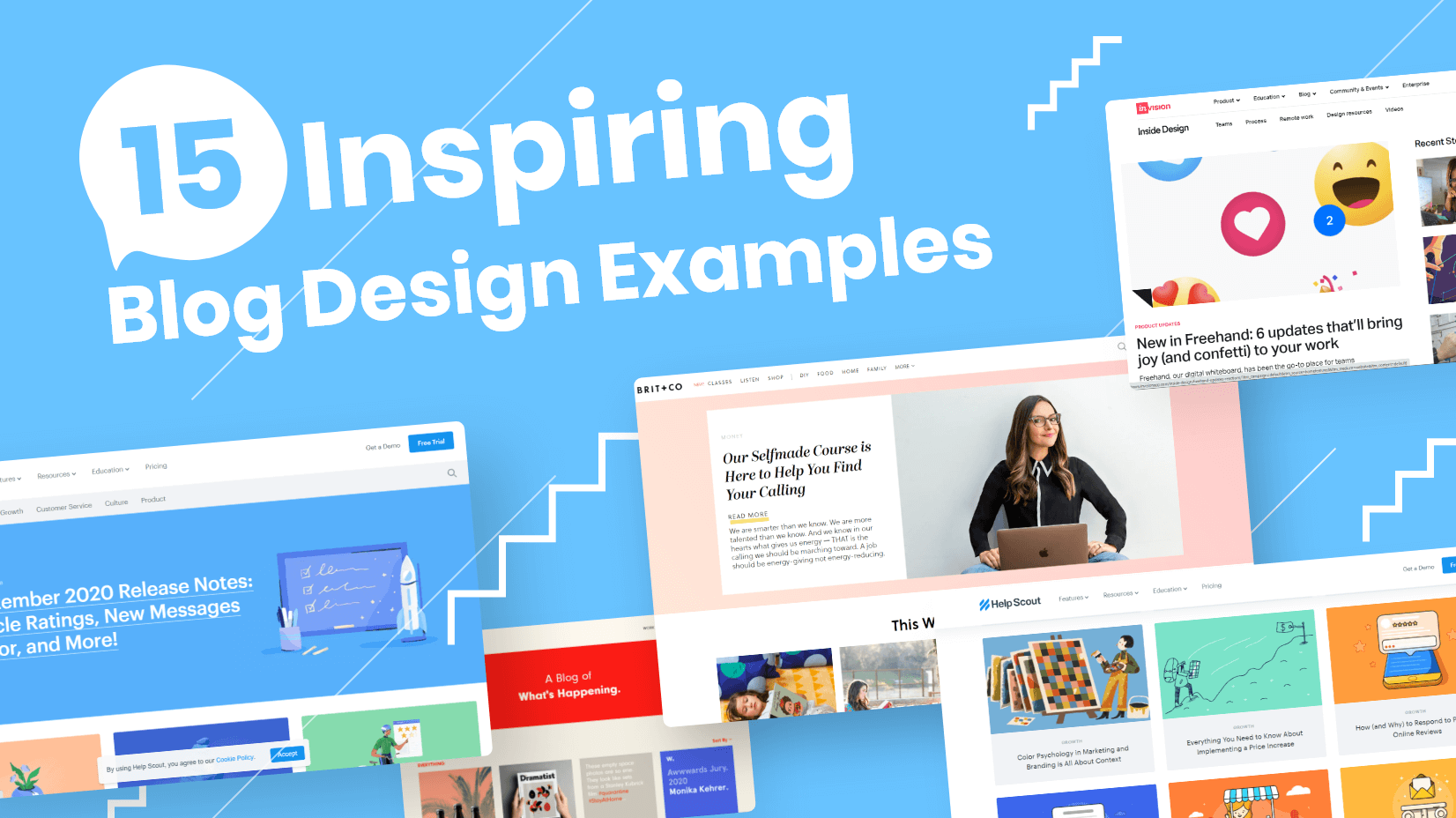
If you are looking at starting a blog for whatever reason and you are looking for inspiration, ideas, concepts, and other design elements then we’ve collated some superb examples for you. If you want your blog to be more content or image-based then we’ve got that too. Either way, you are more than welcome to browse through our selection and take from it as you wish. Enjoy.
1. Dowse.org.nz
Our first choice is an art news blog from New Zealand. Cleverly designed in columns and a black & white theme reminiscent of a newspaper. Each article is represented by a colored photographic image of the event in neat border boxes, standing out from the black & white background theme. A very brief lead into the articles encourages you to click on and read more. Importantly each article is clearly dated. This is a great example of how organization and planning can make a large volume of accessible articles seem light and airy.
2. Dishoom.com
Another blog taking its inspiration from newsprint is Journal from Dishoom. A journey through history, an Irani cafe/restaurant venue originally from Bombay, and now throughout the UK. The design manages to effortlessly create the vintage style of Empire and the Raj, immediately via the off-white newspaper background, headline texts, bordered images, and classic newspaper layout. The texts themselves are wonderfully written in elegant prose making them stylistically a joy to read and imaginatively interesting. Very classy indeed.
3. Trufcreative.com
Truf’s blog is designed to showcase creativity and sell products. With a bright, bold red/black/white theme the landing page is a collage of images that you can hover over for title and date. By entering the image you are taken to either read the relevant article, scan more images, or both. This blog also links the other social media outlets that Truf posts on, so you get everything in one place. Design for designers.
4. Mammothmedia.tv
Mammoth media makes films, commercials, videos, and photographs and this blog is created to give you the story behind the camera. Working in reverse chronological order, clearly dated, and with icon categories you can click on a film or photo that catches your eye, open the post for a little more text information, then if you are grabbed, click on further for extras such as the video itself. This blog succeeds in creating a relationship by letting you have the inside track on the process or spark.
5. Wrayward.com
Wrayward are branding specialists who focus on the American home market. The articles are represented by a single image, date, article genre, and larger scaled headline, giving you a brief glimpse of what you’ll read about if you, as invited, view the article. We particularly like a simple, tiny feature that makes a great deal of difference. If you hover over the article’s image it edges toward you, psychologically attracting you in. Little things please us.
6. Invisionapp.com
InVision breaks up its blog articles in a different way, with a large featured article taking prominence on the left and the right side breaking into a scroll down series of articles under various categories and headings. There are also video links and a cute little underlining sequence as you hover over article headings. Another small feature that holds your attention over select articles increases the chances of you opening them for more.
7. Helpscout.com
This customer loyalty blog caught our eye by using some really cool cartoon images to represent the articles. Clicking on each article brings you to a text-heavy information piece. However, the organization and breaking up of the writing into selected subheadings and bullet points allows the information to be accessible and not burdensome. Sometimes you need text, but we know how off-putting large amounts can be these days. Breaking up into smaller bite-size sections is more attractive for your audience, especially the younger audience of this site. A great example of how to target the right audience with good, thoughtful design.
8. News.microsoft.com
On the Microsoft site, you can find two blogs, the official Microsoft blog, and an AI blog. Both blogs have a consistency of style that leaves you in no doubt they are from one company. Regular articles keep the site fresh and up-to-date ensuring return visits, and the landing page ism image-heavy but text light. Once you do delve into the articles they are quite technical, again perfect for the audience. Microsoft uses frequently highlighted possible links within the text to allow you to get more out of what you are reading. And of course, you’re never far away from the branding that runs throughout.
9. Urbaninfluence.com
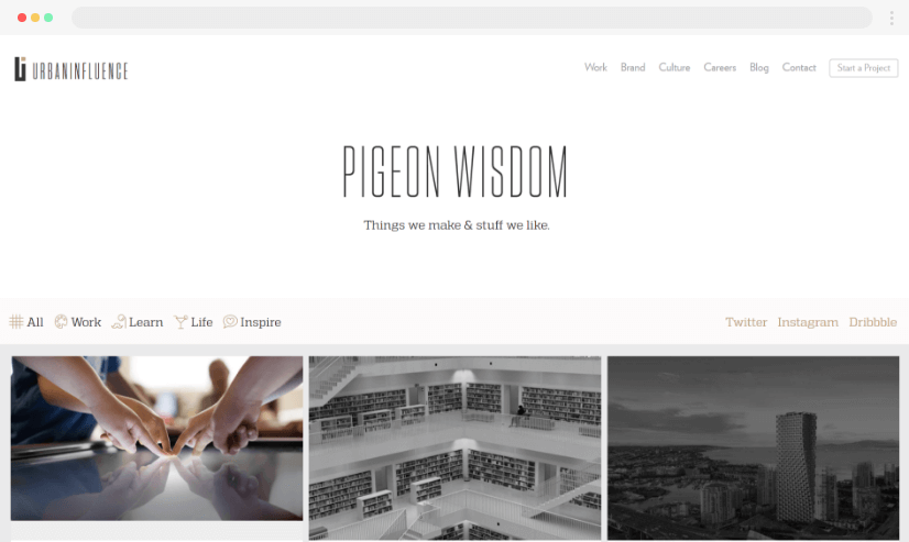
The urban Influence blog carries many of the features we’ve already discussed. The actual articles are interesting and full of content plus numerous examples to aid clarity and break up the text. This blog also has a featured link section to the Instagram page plus you can search for previous blog articles by category from the top of the page.
10. Evernote.com
Evernote cleverly separates articles whilst leaving them altogether. “How to” articles are accessed through green and yellow graphic icons whilst the more personal and business-related articles have a photographic cover shot. A simple idea that immediately categorizes information sent to your brain without you noticing allowing a large number of articles to be taken in your stride rather than fought through.
11. Adventure.com
Adventure.com has a great excuse for using beautiful luscious glossy photos to illustrate each travel article, and they use it to the full. The articles contain these too but they add to the interest of the story rather than distract from it. Don’t shy away from the obvious, if it looks great, it looks great! Tiny headshots of the individual writers on the landing page next to each article help you target who you want to read.
12. Fubiz.net
Fubiz blog showcases selected designs in photography, architecture, videos, etc. Similar to a couple of our other choices, the featured images change as you over them, this time to completely different images. The articles themselves are images laden with brief explanatory text. The photographs are of high quality and quite striking. As this site covers a wide array of design areas the blog is separated into different categories which in turn are broken down into subcategories as you scroll over them. Quick, easy access to whatever your area of interest is.
13. Webdesignerdepot.com
A web design blog absolutely needs to be well designed, but that alone is not enough. This site throws together lots of tricks of the trade. Highly visual, moving scrolled over images, highlighted, underlining of text when hovered on. But there are also regular features and articles added every few days. In a fast-moving area, you need to keep the content moving just as quickly. Viewers come back to read and don’t want to see the same things again and again. This is an example of an attractive design and content working hand in hand.
14. Thelondoner.me
The Londoner here is the nearest thing we’ve chosen to the old fashion diary blog. The Londoner in question is Rosie and the pages are about her life, travels, style, places she eats, shops, etc. Photographs illustrate the individual articles, a scroll over reveals a headline and graphic icon so you are able to quickly categorize the general theme. A blue-on-white color thread runs throughout creating a lightness and clarity and consistent typography that brings the whole site together despite the wide-ranging coverage. Each article is also illustrated with photos neatly breaking whilst adding to the text.
15. Brit.co
The San Francisco-based Brit + Co is a website focused on can-do DIY crafts for women. Including recipes, self-care advice, travel ideas, advice for new mothers alongside creative projects, and much more. Each area has its own articles under horizontal band headings, making it easy to simply scroll down, scan through areas of particular interest and concentrate on your personal interest of that day. These areas are also kept to the 4 most recent articles, although there are more to be found. As such the pages are often changing leaving a dynamic, up-to-date feel. The content of the articles is varied and there is something for everyone. A site you would come back to time and time again, and frequently. A top navigation bar also gives you flexibility when choosing specific areas of interest.
Final
As you can see, our choices are not straightforward diary entries. They mix great content – interesting, well written, varied, and importantly regularly updated with excellent style – themes, organization, color, imagery, and typography. If your blog has these things not only are you likely to get more traffic, but you are also like to take more pride in it, which in turn leads to more work on it, which in turn leads to more traffic. The aim of our selection is to give some ideas and inspiration when you are considering your blog, but of course, there are many many more great examples floating around. Have a search, and look at the sites that have similar content to your planned site, ideas are not limited and neither should you be.
Want to continue reading? Check out these related articles:


