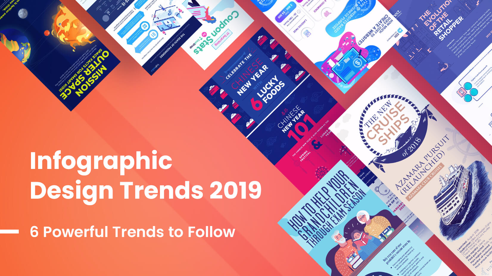
Infographic Design Trends 2019: 6 Powerful Trends to Follow
We've browsed the web to identify the hottest infographic design trends 2019. Check them out!
We've browsed the web to identify the hottest infographic design trends 2019. Check them out!

Update 2021: Infographic Design Trends 2021 are now here!
Update Oct. 2023: Graphic Design Trends 2024 are officially out. Check them out.
Infographic design trends 2019 promise quite a colorful year in the niche, marked with a boom of flat oversimplified characters, a revolution of line art and outline graphic elements, amazing illustrations in all styles and more eye-catchy trends.
Infographic designs trends 2019 are undoubtedly influenced by graphic design trends 2019. With the remark that infographics have to put the focus on the information rather than on the design itself, we saw quite a lot of artistic and inspiring pieces. Keep scrolling to get inspired and learn what’s trendy in the world of infographic design.
Flat simplified and oversimplified cartoon characters have conquered the throne as the most desired character style for infographics. The simplification has gone so far that this character design style may not even include the characters’ facial features. It turns out, this oversimplification thing is a huge hit in character design right now.
Characters in infographic design are considered supportive elements. This specific characteristic of oversimplification allows designers to keep the viewer’s focus on the essential part of the infographic, i.e. the information.

Source and full infographic: InfographicBee

Source and full infographic: CoolInfographics
Flat, semi-flat, watercolor, outline, cartoony and more creative illustration styles are present in infographic design trends 2019.

Source and full infographic: DailyInfographic

Source and full infographic: Visulattic

Source and full infographic: DailyInfographic

Source and full infographic: Visulattic

Source and full infographic: InfographicBee

Source and full infographic: InfographicBee

Source and full infographic: DailyInfographic

Source and full infographic: DailyInfographic

Source and full infographic: InfographicBee
Line art in all forms – illustrations, charts, icons and typography made in an outline style, and even lines drawn over photos are a huge hit right now in infographic design. Whether combined with flat style or used solely, the web is booming with amazing outline infographic designs. They look simple, clear of unnecessary details, and viable in visualizing the content’s message.

Source and full infographic: DailyInfographic

Source and full infographic: InfographicBee
Making an infographic is a creative work and as such, you will often see interesting design interpretations of a particular trend. Outline illustrations in infographic design are often presented in a more creative way such as unfinished or dotted lines.

Source and full infographic: InfographicBee

Source and full infographic: InfographicBee
One of the major trends under the spotlight in the past several years has been bright colors. The simple reason is that they scream attention. Isn’t this one of the main purposes of an infographic?
In 2019, there is quite a boom of a particular niche of bright color family – neon colors. Neon colors look amazing on dark or white background (examples below) and are particularly effective in catching the attention among many other designs.

Source and full infographic: DailyInfographic

Source and full infographic: InfographicBee
You may be interested in this related article: 12 Amazing Animated Infographics
Classical bright combinations won’t be out of the spotlight, as well. A combination of bright primary colors: red, blue and yellow, complemented by the secondary green, orange, and purple are simply an evergreen trend. Combined with other highly trendy looks such as outline or flat designs, they create a truly modern infographic design trend.

Source and full infographic: CoolInfographics

Source and full infographic: CoolInfographics
Bright color gradients are still trendy in 2019. Designers use them to achieve more mysterious and dreamy looks. Gradients are usually well combined with flat design elements and line-art elements, as well as neutral background colors.

Source and full infographic: InfographicBee

Source and full infographic: DailyInfographic
Surprisingly or not so much and probably emerging as a response to the bright color trend, we’ve been witnessing many infographic designs with muted or monochrome color schemes. This trend is usually combined with the flat design style and helps achieve a cleaner, more elegant look of the infographic.

Source and full infographic: InfographicBee

Source and full infographic: InfographicBee
In most infographics you’ll see, designers position all elements of the design inside the borders of the infographic. This is called a closed composition. In open compositions, the rule is quite the opposite – elements seem to go beyond the infographic’s edges, which makes the whole design more moving and breathing.
The trend is influenced by graphic design trends right now. Elements in open composition designs are not centralized but they are still very well balanced for both graphic and illustration infographic designs.

Source and full infographic: CoolInfographics

Source and full infographic: InfographicBee
Infographic design trends 2019 seem to be quite exciting and colorful in diversity of styles and design techniques. In the same time, they keep the essential quality of being effective in communicating a message. The most trendy infographic designs for 2019 are quite various in looks but united by one quality – they keep the reader’s interest ’till the end.
You can also check out our infographic we’ve made to showcase the trend:
Would you like to learn how to make an engaging infographic yourself?
Don’t forget to share!

Iveta is a passionate writer at GraphicMama who has been writing for the brand ever since the blog was launched. She keeps her focus on inspiring people and giving insight on topics like graphic design, illustrations, education, business, marketing, and more.
Here are some other articles we think you may like:
A source of high-quality vector graphics offering a huge variety of premade character designs, graphic design bundles, Adobe Character Animator puppets, and more.
Browse our graphics