![The Best 24 Fonts for Modern PowerPoint Presentations [+Guide]](https://i.graphicmama.com/blog/wp-content/uploads/2022/06/11065214/the-best-24-fonts-for-modern-powerpoint-presentations.png)
Presentations are pieces of art. From slide structure to animations, every single detail matters. In this blog post, we will show you the 24 best PowerPoint fonts for all uses. Of course, like everything in design – you might like some and frown at others.
What we can guarantee you is that using this collection of top fonts for PowerPoint will always be a safe bet when you’re in doubt.
Article Overview:
1. How to import a font into your presentation?
2. Great Fonts to Use for your PowerPoint Presentations
3. Great System fonts for PowerPoint Presentations
4. How to design text in PowerPoint?
1. How to import a font into your presentation?
If you don’t know how to import fonts into PowerPoint, it’s important to learn how to do it.
Step 1. Download your fonts
The first step is to select your desired font and download it.
Step 2. Extract the font
Once you’ve downloaded the font, it’s most probably compressed. You need to extract it before installation. If it comes directly as a .otf or .ttf format, there’s no need to unzip.
Step 3. Install the font
Install the font. The process is similar to installing any software, just press “Next” until you see the option “Finish”. If your fonts have been successfully installed, they should appear in the Font library in Windows. To access it, go to your computer, Local Disk (C:)->Windows-> Fonts.
Step 4. Open PowerPoint
Once you open your PowerPoint, the new font should appear among the others.
2. Great Fonts to Use for your PowerPoint Presentations
Fonts are a great way to show some branding skills but also a significant part of your presentation. Of course, we cannot select the best PowerPoint fonts or the best fonts in general, it’s a too subjective matter. But we will try to show you some of the most versatile ones that you will not make a mistake with. Let’s start!
1. Lato
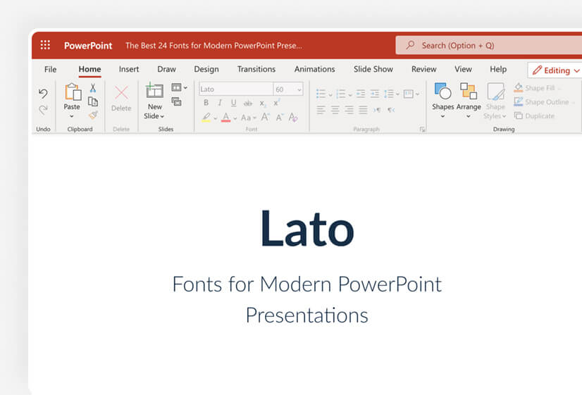
Lato is a very common font that is used in digital forms since it was created for this purpose. It is a sans-serif font that is flexible. One of the most useful things about it is that you can choose between 5 different options for font thickness, giving it extra value when creating PowerPoint presentations.
Recommended title size: 20px
Optimum size for legibility: 18px
Perfect for: headers and body text
You can combine it with: Roboto, Montserrat, Merriweather
Download font
2. Open Sans
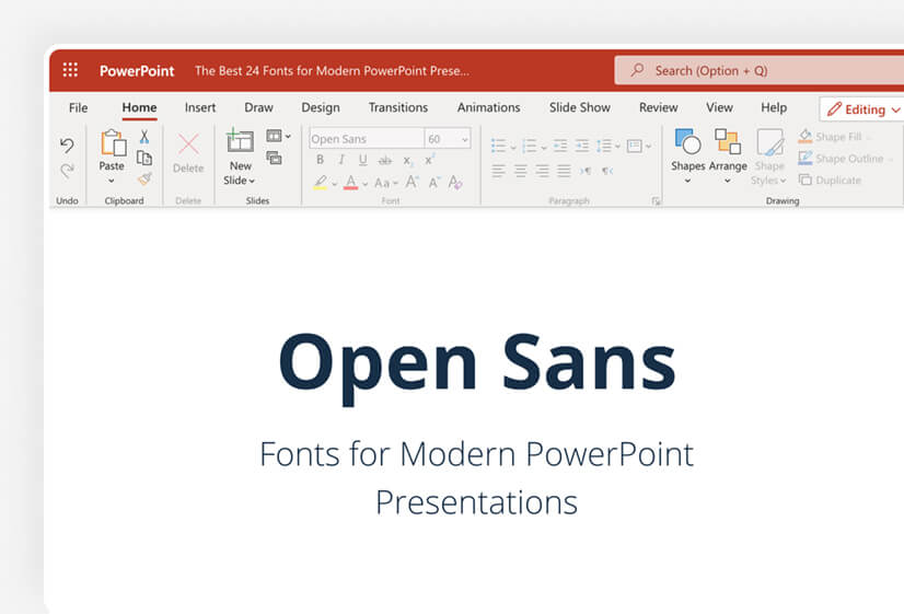
Open Sans is another great font that can fit PowerPoint presentations perfectly. Since there is some line spacing, it can be easily readable. If you have large paragraphs that you cannot break down in bullets, it’s your perfect choice. It’s a standard PowerPoint font, so you’ll most probably have it in your font library.
Recommended title size: 28px
Optimum size for legibility: 16px
Perfect for: body text
You can combine it with: Georgia, Lucida Grande, Publico
Download font
3. Candara
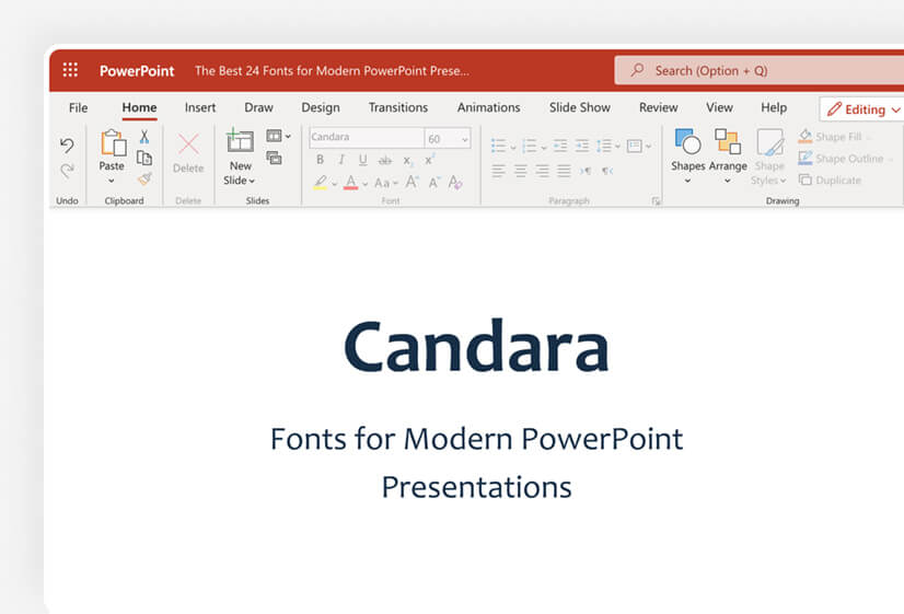
Candara is not your everyday font. While you cannot use it in Linux or the web, as it’s proprietary, it’s accessible in PowerPoint, and what makes it interesting are the curved diagonals, and it’s the curves that give it more “personality”.
Recommended title size: 20px
Optimum size for legibility: 16px
Perfect for: body text
You can combine it with: Calibri, Cambria, Corbel
Download font
4. Tahoma
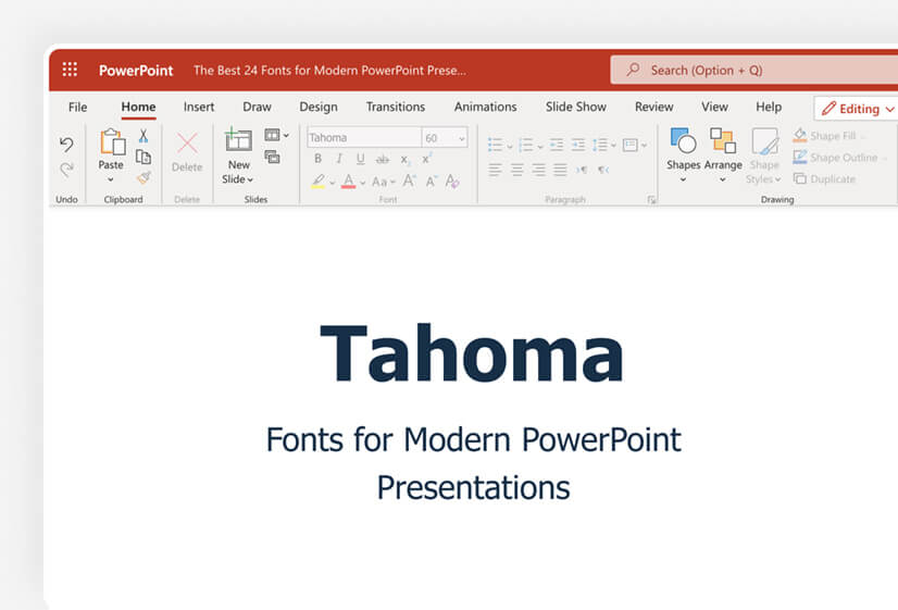
Specifically designed for Windows 95, Tahoma is a very formal font that can fit business presentations perfectly. It is a very clear and distinctive font which can help avoid confusion, thus it makes it great for formal presentations that need clarity.
Recommended title size: 28px
Optimum size for legibility: 18px
Perfect for: title headers and body text
You can combine it with: Georgia, Helvetica Neue, Arial
Download font
5. Montserrat
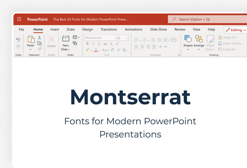
Montserrat is an extremely popular font, as it can be utilized everywhere – from website texts to presentations. Due to its high practicality, you can find it almost anywhere. Well, we need to warn you that you won’t get many “originality” points but you’ll also be “safe” when using it.
Recommended title size: 30px
Optimum size for legibility: 16px
Perfect for: body text
You can combine it with: Open Sans, Lora, Carla
Download font
6. Whitney
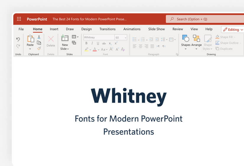
Whitney is an amazing font that will make your presentation stand out. There are two options – Whitney Condensed and Whitney Narrow. To be honest, Whitney can be used for both headers and body texts (check Discord), but we find it a bit overwhelming for PowerPoint paragraphs.
Recommended title size: 22px
Optimum size for legibility: 15px
Perfect for: title headers
You can combine it with: Sentinel, Mercury, Gotham
Download font
7. Proxima Nova
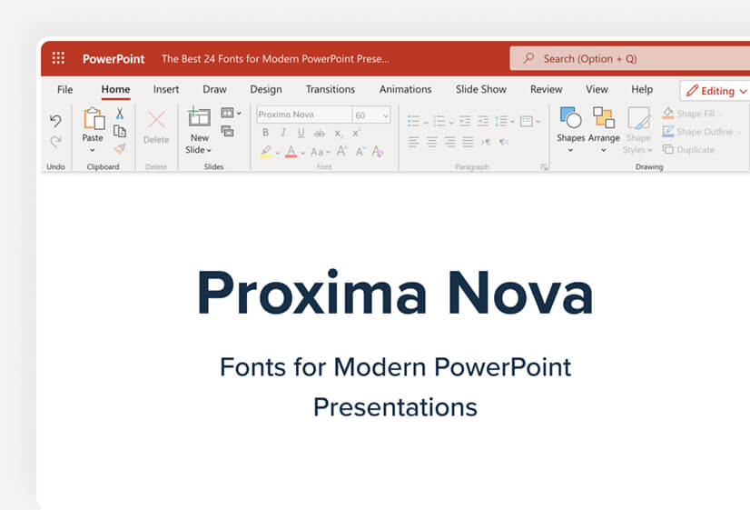
Proxima Nova is one of the most versatile fonts out there with not 2 but 7 variants! That makes it a viable choice for many purposes and it’s part of the Adobe Fonts collection. The popularity spike is not without a reason, and Proxima Nova certainly won’t disappoint as it is one of the better fonts for PowerPoint.
Recommended title size: 26px
Optimum size for legibility: 16px
Perfect for: headers and body text
You can combine it with: Adobe Garamond, Futura, Helvetica Neue
Download font
8. Oswald
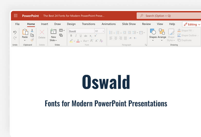
Oswald is a very decent sans-serif typeface and has 3 different versions – light, normal, and bold. It’s an interesting combination of some modern elements combined with classic gothic style, thus it’s perfect for your presentations.
Recommended title size: 18px
Optimum size for legibility: 16px
Perfect for: headers and body text
You can combine it with: Merriweather, Arial, Roboto
Download font
9. Europa
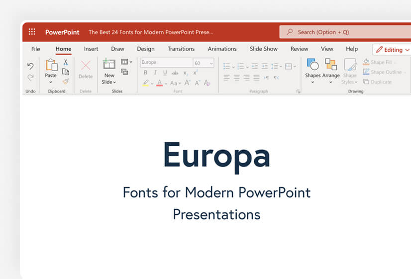
Europa is an amazing font from the Adobe Font Family. It’s a modern geometric sans-serif font that goes well with other fonts from the Adobe family but it can be used in a combination with non-Adobe fonts. It’s up to you.
Recommended title size: 32px
Optimum size for legibility: 20px
Perfect for: headers
You can combine it with: Adobe Garamond, Chaparral, Kepler
10. Roboto
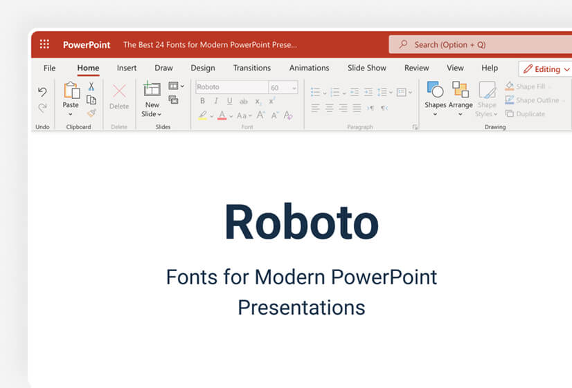
Roboto is one of the most versatile fonts for the web, as it comes with 6 variations. Described as a grotesque sans-serif, it is the default font of Google Maps. Being easy to read makes it great for body texts where scanning is pivotal. While it’s great for small texts, it doesn’t perform that well for titles.
Recommended title size: 38px
Optimum size for legibility: 22px
Perfect for: body text
You can combine it with: Roboto-Slab, Oswald, Abel
Download font
11. Adelle
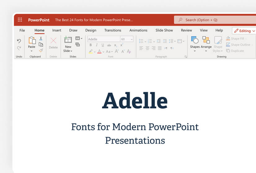
Adelle is a slab serif font that is part of the Adobe Family. It’s multipurpose and could work be well utilized and magazines. Its personality and great visibility make it a viable choice on our PowerPoint fonts list. While it can be used for body text too, we prefer to recommend it for headers.
Recommended title size: 36px
Optimum size for legibility: 18px
Perfect for: headers
You can combine it with: Freight Sans Pro, Proxima Nova, Lucida Grande
Download font
12. Bebas Neue

Bebas Neue is one of the best PowerPoint fonts we could recommend for headers and a good variety of font weights – five. Bebas Neue, however, is only available in uppercase, thus it isn’t a good fit for body text, so consider this before utilizing the font.
Recommended title size: 60px
Optimum size for legibility: not recommended
Perfect for: headers
You can combine it with: Аvenir, Roboto, Montserrat
Download font
13. Avenir

Avenir is a relatively old geometric sans-serif but it’s beautifully made and has been highly regarded. There are six font weights available and if creativity is the focus of your presentation, then Avenir is your perfect choice.
Recommended title size: 30px
Optimum size for legibility: 14px
Perfect for: header and body text
You can combine it with: Canela, Future PT, Kepler
Download font
14. Lobster
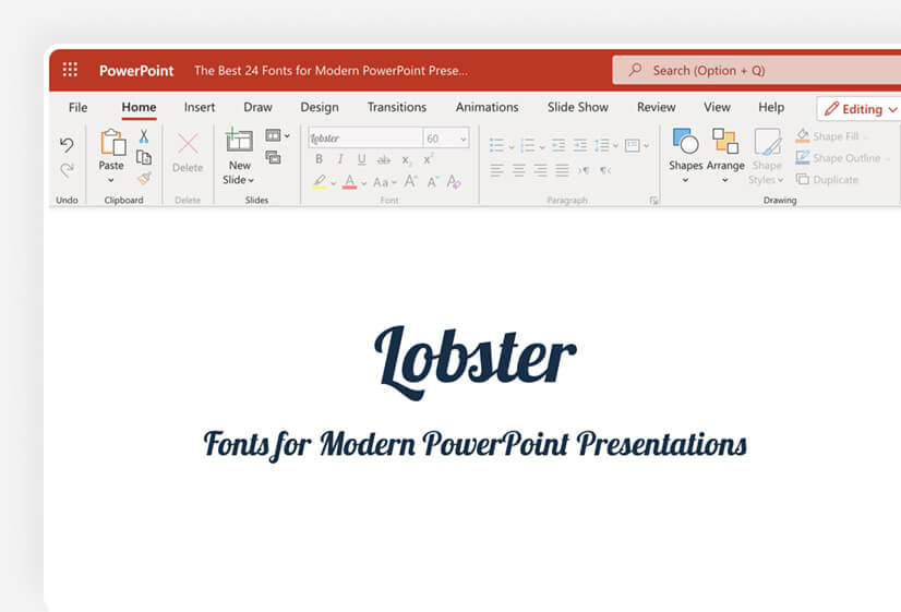
Lobster is a great choice if you want to create some funky text. It’s a great font for posters and headers but ensure you don’t use it much for body text, as it has very poor legibility if written in small letters.
Recommended title size: 58px
Optimum size for legibility: not recommended
Perfect for: headers
You can combine it with: Lato, Open Sans, Muli
Download font
15. Futura
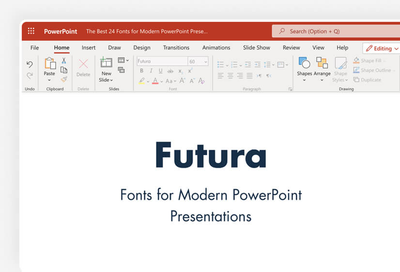
Futura is almost a century old but still converts well today! It’s one of the most versatile fonts for PowerPoint in case you download it. Who would suppose a 95-year-old font would still be relevant these days? And you will win points for creativity.
Recommended title size: 22px
Optimum size for legibility: 17px
Perfect for: headers and body text
You can combine it with: Proxima Nova, New Caledonia, Trade Gothic
Download font
16. Canela
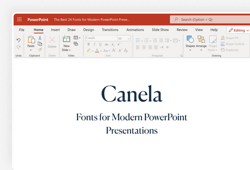
Canela is a hybrid font, as it can neither be called serif, nor sans-serif. It’s a very graceful typeface and we find it amazing for title texts. We also loved how it performs in the body from an artistic standpoint. However, we cannot rate it as very suitable for long paragraphs. Still, it can be used in bullets quite well.
Recommended title size: 22px
Optimum size for legibility: 16px
Perfect for: headers
You can combine it with: Caslon, Futura, Maison Neue
Download font
17. Aleo

Aleo is an modern slab serif typeface designed as a “companion” to other popular fonts, like Lato. It has a sleek design but that doesn’t sacrifice readability which matters the most. As it has great clarity, it can be used both as a title text and in the body.
Recommended title size: 25px
Optimum size for legibility: 19px
Perfect for: headers and body text
You can combine it with: Lato, Arimo, Halis Grotesque
Download font
18. Poppins
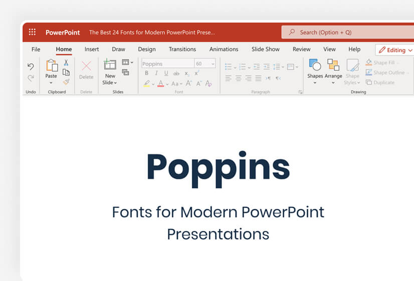
Poppins is a playful sans-serif font that can be used as a main PowerPoint font without any issue. Thanks to its versatility, this PowerPoint font can be used both for title headers and body text, although we prefer the latter.
Recommended title size: 24px
Optimum size for legibility: 17px
Perfect for: header, body text
You can combine it with: Raleway, Work Sans, New Caledonia
Download font
19. Eras
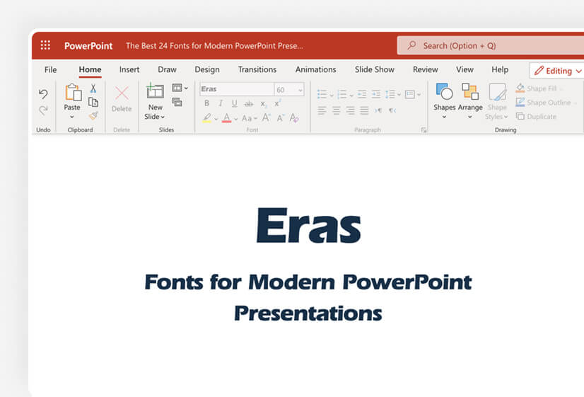
Eras font has 4 weight options in PowerPoint and is absolutely stunning. It won’t be a mistake if we use it as a synonym to “elegance”. It’s slightly italic, thus making it perfect for long paragraphs and web content.
Recommended title size: 20px
Optimum size for legibility: 16px
Perfect for: body text
You can combine it with: Garamond, Futura, Helvetica Neue
Download font
20. Lora
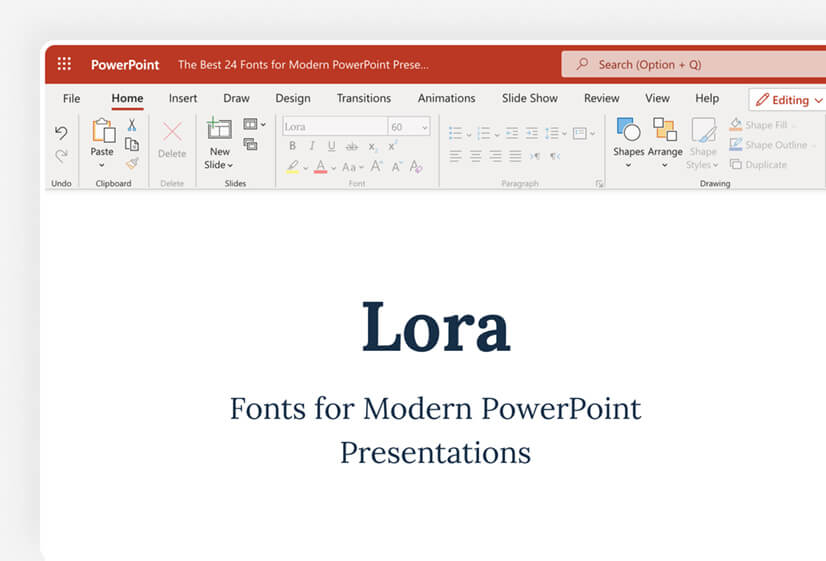
Lora is a great font that is offered for free by Google. It is a formal font that doesn’t turn its back on art, and as a result, it can be utilized greatly in PowerPoint both as a header and in the body, and it can work perfectly in print, too.
Recommended title size: 22px
Optimum size for legibility: 15px
Perfect for: header and body text
You can combine it with: Lato, Avenir, Montserrat
Download font
3. Great System fonts for PowerPoint Presentations
System fonts are a classic choice for PowerPoint presentations as they are a pretty safe bet – you can access them on all types of devices and operating systems. While some of them might not be as beautiful as the previous ones on our list, they will serve you well!
21. Georgia
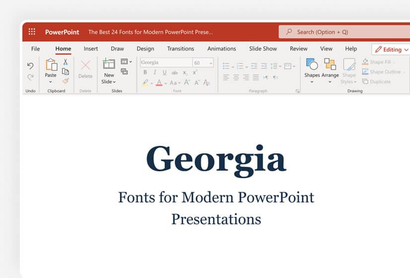
Georgia is a classic serif font that doesn’t impress with outstanding looks but what makes it a viable choice for PowerPoint presentations is its versatility – you can use it on any type of presentation, as a header or in the body. It’s popular, so you won’t make a mistake using it.
Recommended title size: 24px
Optimum size for legibility: 16px
Perfect for: headers and body text
You can combine it with:
Download font
22. Times New Roman
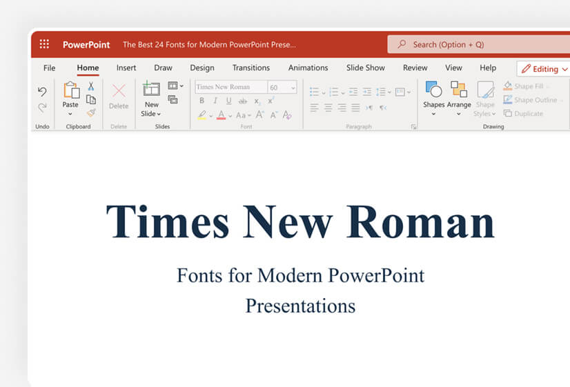
Times New Roman was “The Thing” back in time. It was used as a default font for many web browsers and software, thus it was overwhelming. Recently, this serif font has lost its “halo” and is less common but you will never get it wrong if you bring it back to life.
Recommended title size: 18px
Optimum size for legibility: 12px
Perfect for: header and body text
You can combine it with: Arial, Gotham, Helvetica Neue
Download font
23. Arial
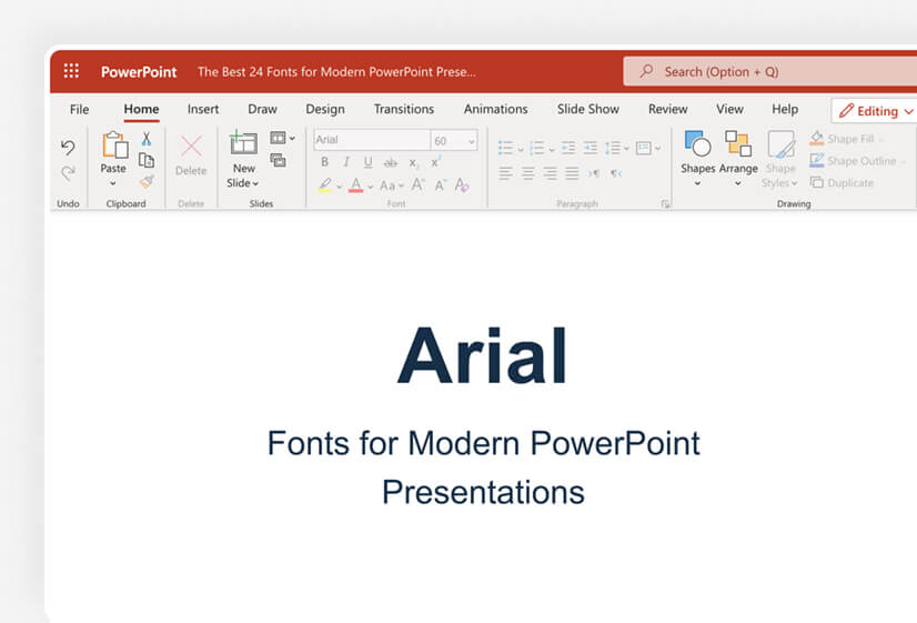
Arial is another well-known name in the web font industry. You can also check this neo-grotesque sans-serif font used in PowerPoint presentations quite often, as it offers a lot of versatility.
Recommended title size: 22px
Optimum size for legibility: 15px
Perfect for: headers and body text
You can combine it with: Oswald, Verdana, Georgia
Download font
24. Helvetica Neue
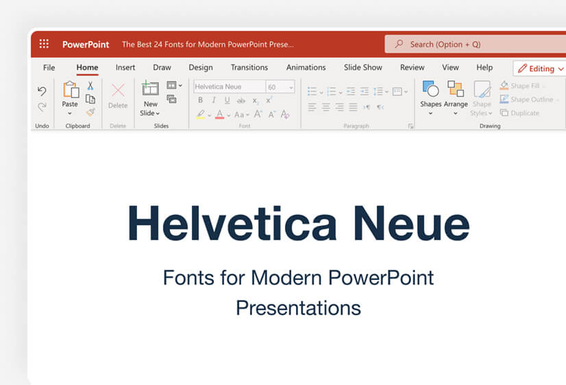
Helvetica Neue is the successor of Helvetica which improved legibility and made it more modern. It is one of the most formal fonts that you can use in PowerPoint (and at all). This sans-serif font has 23 different variations in PowerPoint 2022 that you can choose from.
Recommended title size: 22px
Optimum size for legibility: 16px
Perfect for: headers and body text
You can combine it with: Open Sans, Proxima Nova, Adelle
Download font
4. How to design text in PowerPoint?
There are certain standards that should be met, in order for your PowerPoint fonts to appear correctly. Let’s see how to order your texts.
1. Make sure the font size is readable
Do you wonder why some websites have HUGE fonts? It’s to ensure their content will be easily scannable. While you don’t have to use a 60px font size for your letters, you should consider making your text more readable.
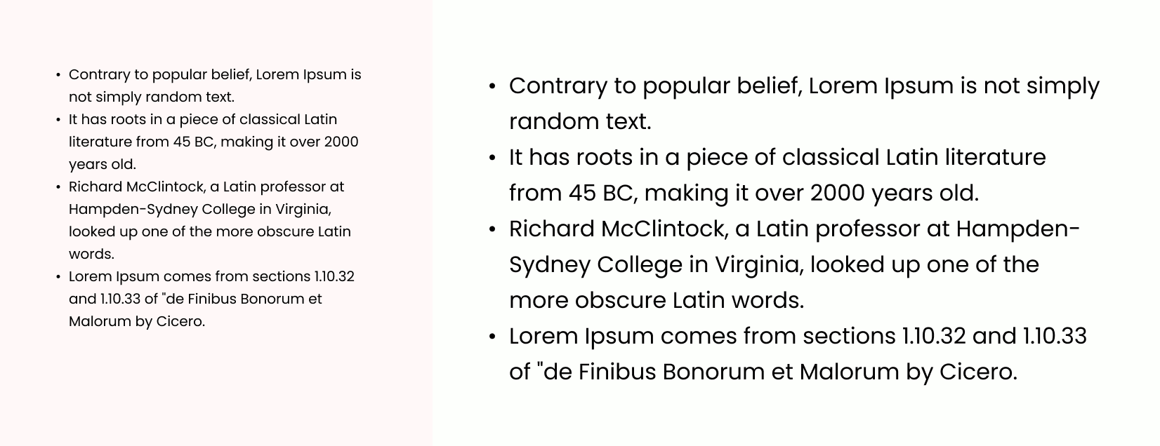
Pro tip: A simple and straightforward way to achieve this is to try and remove large paragraphs, and replace them with single sentences and bullet points.
2. Make a contrast between the text and background
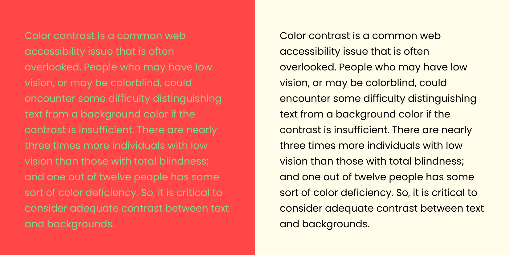
There is an adopted standard of a minimum 4.5:1 contrast ratio between text and background for content to be scannable, and 3:1 for large text. There are people who have bad eyesight, and others are color blind.
3. Use white space
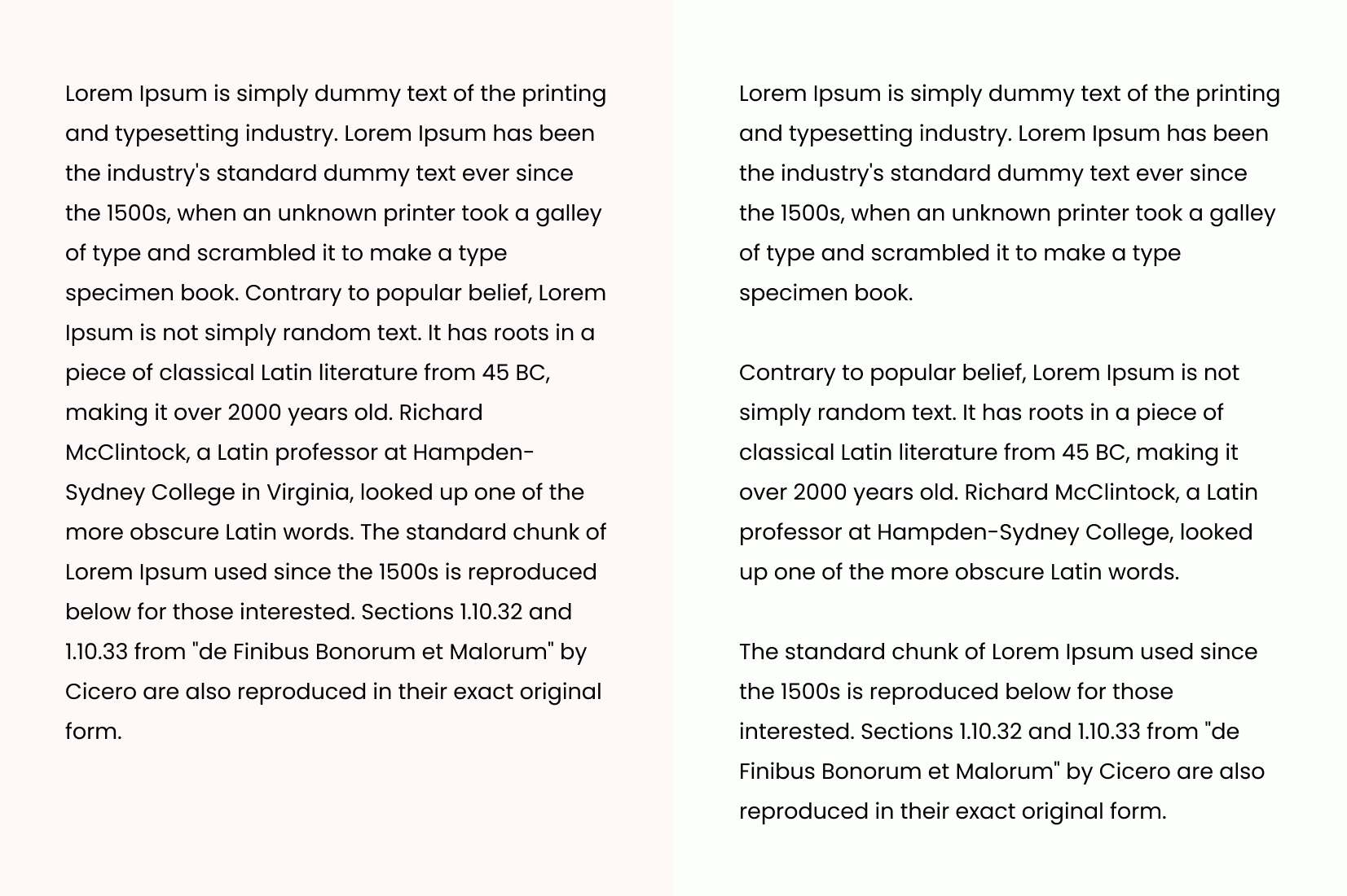
White space (or negative space) is crucial for your slide design. It is used to separate different parts of the text, making content more readable. It’s crucial to remember that you should leave some “air” after finishing a main point in the slide.
4. Find the right text balance
One of the best PowerPoint presentation practices is to write between 6-8 lines and use no more than 30-35 words. Also, you should try to balance the text evenly – you cannot write 4 lines, then follow them with 3 lines, and then 1. Typically, writing 2-3 lines per paragraph is considered a good move, then followed by white space.
Final words
Structuring your PowerPoint text is not an easy feat. You need to pick the right PowerPoint fonts, as well as follow some basic instructions to make your slide text more scannable for your audience.
If this article has helped you, why don’t you have a look at some other font-related content from GraphicMama: