Being up to date with the market is always critical for your agency. But sometimes, you need a little inspiration. And a little bit of flair. In this article, we will go through some stunning marketing website design ideas, and most importantly – you will see 47 real-life examples of successful creative agency sites that work.
But what is so specific about marketing websites? Why do they need to present the agency in the proper way and attract new customers? Here are some of the key elements your marketing website needs:
- Your website should be professional – you are a marketing agency, and if you cannot “sell” yourself as a professional, how would you sell your products to potential clients? Your site should be error-free, it should be regularly updated and upgraded, and it shouldn’t look like you’ve used a cheap premade theme.
- Showcase your work – let people know what you did for others. Show them your current or previous customers, and let them see that you are worth it and people want to work with you.
- Let your potential clients reach you easily – simplify contact forms and be present. People use different communication methods(email, phone, social media), and you need to be close to your people – if the communication is poor, it is almost impossible for things to happen.
- Be different – marketing is a creative industry – your website should be unique and artistic, and people should say WHOAAA!
Now let’s take a look at some really nice examples of marketing websites:
1. Serendipity Agency (Switzerland)
Services: Digital Marketing, SEO, Advertisement
The first example from our list is a digital marketing agency from Switzerland. The website can stand out with an amazing combination of color palette choices and using gradients in the text. On top of that, you can clearly see the noise background which is quite a trend nowadays.
What we love about this website:
✔️ Great home page
✔️ Easy contact form
✔️ Excellent portfolio visualization
2. SKINN BRANDING AGENCY (Belgium)
Services: Marketing Strategy, Branding, Advertisement
If you’re targeting branding design, then SKINN’s concept might be suitable for you. A good combination of bold design ideas and supreme use of shapes can give your brand a more premium and exclusive look, even on a white background.
What we love about this website:
✔️ Using photos as an integral part of the design
✔️ Portfolio visualization on the landing page
✔️ Linear design
3. Intello (France)
Services: Social Media, Production, Cooperation
Intello includes a very interactive modern website design and the company works with reputable partners like NASA, NordVPN, Credit Agricole, and Spotify. There is a great contrast between the white background and cool everyday colors.
What we love about this website:
✔️ Great color combinations
✔️ Not much text
✔️ Lovely About Us section
4. Lēonard Agency (France)
Services: Creative, Video Marketing, Mass Media
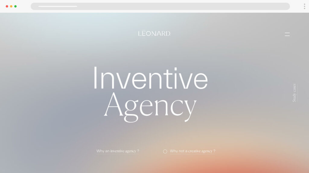
Leonard Agency label itself as an “inventive” agency. Their focus is on original design concepts and high-profile clients like Adidas and Samsonite trust Leonard Agency’s expertise for video production projects. The page load speed is quite impressive, considering the stylish 3D elements.
What we love about this website:
✔️ Stellar gradient background
✔️ Simple and intuitive UX
✔️ 3D modeling
5. Heighton Agency (UK)
Services: Web design, SEO, Branding
Heighton Agency’s website heavily utilizes shapes and even its logo consists of multiple differently colored shapes. The website uses rotating images and a very intuitive user interface that grabs the eye. On top of that, the menus are straightforward.
What we love about this website:
✔️ Easy to find what the agency offers
✔️ Linear design at its finest
✔️ An amazing-looking roadmap
6. Meanpug Digital Agency (USA)
Services: Digital Marketing, Advertising, Software development
Meanpug offers website design and marketing solutions for law firms, and it’s admirable that the company has stated the message on the landing page. Being niche allows businesses like this to gain more in-depth knowledge, and the colorful user interface only adds to the great impression we’ve already had.
What we love about this website:
✔️ Straightforward target audience message
✔️ Lovely Quiz form
✔️ Access to amazing case studies
7. Bob’s Agency (Spain)
Services: Copywriting, UX/UI Design, Graphic Design
Bob’s Agency can pride itself on mixing motion design and minimalism. And pink. Lots of pinks. Including a pink pineapple. Other than that, the UI design is simple, efficient, and consists of many blocks.
What we love about this website:
✔️ Original design
✔️ Great display of the services
✔️ Lots of motion
8. 2Point Agency (USA)
Services: SEO, Advertisement, Social Media Marketing
2Point is following all the patterns of a successful website. It uses an interesting combination of light and dark themes on the landing page and all services have dedicated pages which is not typical for this industry. Colorful motion design adds even more value to the company’s offer.
What we love about this website:
✔️ Two themes available
✔️ Dedicated pages for each service
✔️ Origami vector animations
9. Inspirux Digital Agency (UK)
Services: Web and App Development, UX/UI Design, Content Writing
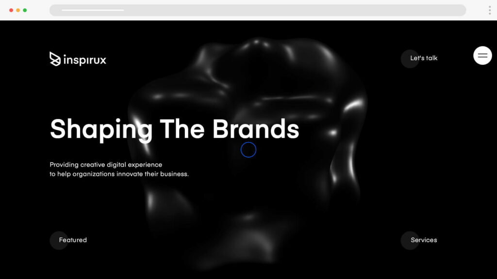
Inspirux offers a plethora of services easily available to you. The black and white minimalistic design, combined with vector illustrations, adds a lot of premium “touches” to the already well-crafted interface, and the homepage allows you to see everything – from services, to case studies.
What we love about this website:
✔️ Playful design
✔️ Black and white combinations
✔️ Services are well explained
10. Croing Agency (USA)
Services: Influencer Marketing, Linkedin Networking, Email Marketing
A creative agency cannot be successful if it only offers one single service. At Croing Agency, you will have access to lots of extras but that’s not the reason we liked the design. It offers a dark theme as well as a light theme, and all you need to do is click the toggle button. Other than that, it uses heavily blacks and whites to add a more premium feeling to the brand.
What we love about this website:
✔️ Dark/Light Theme
✔️ Tremendous amount of services
✔️ Amazing color balance
11. Magnetism (France)
Services: UX/UI Design, Social Media, 3D Design
If popular fashion brands, including Louis Vuitton, trust their projects to Magnetism, we need to consider them as inspiration. The website design doesn’t “promote” aggressive forms. Instead, it focuses on high-quality images and elegance which can be seen on any page.
What we love about this website:
✔️ High-quality images
✔️ Simplicity
✔️ The red dot that smoothly follows the cursor
12. VOVI Studio (UK)
Services: Video Production, Social Media Marketing, Branding
We have showcased VOVI Studio before but really – this is one hell of a website. Sleek design in dark theme, gradient colors that add depth, and a stunning user interface that aims to reduce carbon footprint. What we adored the most was how case study images were opened upon hovering. Truly amazing.
What we love about this website:
✔️ Images open upon mouse hover
✔️ Gradient colors in the text
✔️ Carbon-friendly website design
13. Cre8tive Agency (USA)
Services: Photography, 3D / Motion Graphics, Go-to-market Planning
Once you open Cre8tive’s website and see names such as Adidas, Puma, Red Bull, and Beats by Dre, you know it’s not just another agency. With a focus on music and entertainment services, it boasts an amazing dark-theme design with a noise background, to create an exclusive feeling for potential customers.
What we love about this website:
✔️ Dominance of the red color
✔️ Dark theme
✔️ Bold design
14. Arctos Agency (USA)
Services: Web Design, Influencer Marketing, Social Media
Arctos Agency can easily grab the spotlight with its linear website design. On top of that, it uses lots of blurred shapes and grain to make shapes more dramatic. Some letters in the headers are also quite interesting and if we see the brands that cooperate with Arctos directly or indirectly, we can find huge names there – like Skoda, Honda, WURTH, etc.
What we love about this website:
✔️ Great showcase of linear design
✔️ Unique color combination
✔️ Partnership with influencer organizations
15. Spire Agency (USA)
Services: Branding, Growth Planning
Spire Agency focuses on making B2B brands more capable on the market but their website design is no slouch either. They use one of the newest trends in marketing web design – black/red/white color combinations which create an upmarket feeling and add value.
What we love about this website:
✔️ Great color combinations
✔️ Target market is mentioned at the beginning
✔️ Lots of numbers and statistics, including a funny report about Spire employees
16. 128 Digital (USA)
Services: NoCode Websites, UX/UI Design, Marketing & SEO
128 Digital uses the rule of the boxes pretty well across their design. There’s a blue dot with a circle that follows the mouse cursor and the hover buttons are pretty awesome, too. The choice of fonts is also something worth our attention and the dark theme with white letters just adds more depth.
What we love about this website:
✔️ Superb font selection
✔️ Easy to access services
✔️ Straight shapes
17. Green House Agency (UK)
Services: Route to Market Strategy, Event Management, Merchandising
Green House Agency is a typical example of a marketing website design that is focused on providing a great user experience by utilizing large fonts and showing case studies on the landing page. On top of that, we can easily see the portfolio of clients, among which are industry giants Coca-Cola and Jack Daniels.
What we love about this website:
✔️ Combination of different styles
✔️ Logo “embroidery” on the black background
✔️ The News & Press page
18. MBM Agency (USA)
Services: Website Design, SEO
Smart, neat, straightforward. That’s MBM Agency’s philosophy. If you’re looking for inspiration to create a simple, yet unforgettable interface – this is a great example. From the earthy colors used in the design to the choice of italic fonts, it’s all well-balanced and not overdone.
What we love about this website:
✔️ Choice of colors
✔️ Design simplicity
✔️ Referral page without affiliate links
19. Square Media Agency (Italy)
Services: E-commerce websites, Website development, Social Media
Square Media Agency can boast of a flashy design – from the fancy folded 3D logo, to the bold headings, text highlights, and illustration choices. The interface is expressive and shows a lot of passion. A typical Italian job (in a good way!)
What we love about this website:
✔️ Bold fonts
✔️ Expressive colors
✔️ Amazing 3D logo design
20. Waltz Creative Agency (USA)
Services: Package Design, Lead Generation, Events
Waltz Creative Agency is not a typical marketing agency. They cover a lot of other areas, like graphic design, and can even organize events. When it comes to their website design, it’s really creative, uses rich colors, and big bold letters at the beginning of the landing page, and the waves add so many good vibes to the whole website.
What we love about this website:
✔️ Cursor dot with instructions
✔️ Left-to-right and then top-to-bottom structure
✔️ Journal page
21. Shadow Agency (USA)
Services: Influencer marketing, Content development, PR & Media relations
Shadow Agency focuses on communication with people and social interactions. Thus, it’s not a surprise that video content is present across the whole site. A dark theme and white letters are a classic move, while hover actions are an added bonus that we kinda liked. It’s a fascinating one-page website.
What we love about this website:
✔️ Smooth on-hover text color change
✔️ Vintage-looking photos and videos
✔️ One-page site structure.
22. Nation & James (UK)
Services: Creative, Video Production, Digital Marketing
Nation & James’s website shows a good knowledge of linear design. The landing page is structured and the dotted-pattern gradient background gives a sense of uniqueness. The numbered list also gives points in the UX department, while the menu dropdown list is also gorgeous.
What we love about this website:
✔️ Roadmap style
✔️ Dotted pattern
✔️ Contact page access
23. Flipp Advertising (Canada)
Services: Social Media, Real Estate Marketing, PPC
Flipp Advertising’s website design loads with the logo on a black background which creates an expectation of a premium product. Design consistency and high-quality image choice give the agency a better brand image. The agency offers one very cool feature – an adjustable text box where you can select your needs, giving clients indirect messages about how they can customize their experiences.
What we love about this website:
✔️ High-profile vision
✔️ Design consistency
✔️ Cool adjustable text box
24. Engine Shop Agency (USA)
Services: Entertainment Marketing, Gaming and E-sports, Earned Media
Engine Shop Agency uses very interesting concepts in its marketing website design. Apart from the main color combination – black/yellow/white, the background has a square pattern that looks like a coordinate system, and interactive text boxes that disappear after reaching the top of the screen.
What we love about this website:
✔️ Square-pattern background
✔️ Cursor effects
✔️ Amazing About Us page
25. The Keenfolks Digital Agency (Spain)
Services: Big Data & AI, Buyer Persona Identification, Marketing Automation
The Keenfolks Digital Agency is a global award winner, and it is evident from the landing page. An awesome linear design and original creative ideas (like “Keensights”) add more value to the already valuable services that Keenfolks are offering.
What we love about this website:
✔️ Linear Design
✔️ Our Team page
✔️ Digital Gap Management illustration
26. JYZ Design (Canada)
Services: Website design, Digital marketing, Email marketing
JYZ Design relies heavily on using circles, half-circles, and quarter-circles. The color choice is amazing, as there are combinations not seen anywhere else. The website relies heavily on illustrations, including the team members’ profile pics. The blog section is impressive, as there are several topic categories people can choose from – great news from a UX point of view.
What we love about this website:
✔️ Circular design
✔️ Superb color palette
✔️ Fancy CTA buttons
27. Beans Digital Marketing (Ukraine)
Services: Design, Marketing Management, Market Analysis
Beans Digital Marketing provides one of the most unique website experiences on the market. They focus on being creative and the 3D interactive beans add a lot of valuable branding points. There are a lot of use cases with long story videos, and the higher management is represented on the landing page in high-quality creative images.
What we love about this website:
✔️ The 3D beans
✔️ Team images
✔️ Original ideas throughout the whole site
28. Fishfinger Creative Agency (UK)
Services: Motion Design, Package Design, T-Shirt Design
Fishfinger offers a lot of marketing and advertising services but its main priority is graphic design. If you’re inspired by colorful motion illustrations and boxy layout design, you’ll surely find what you need here. Trusted by Nike, RIOT Games, and Red Bull, this agency has certainly earned its reputation for being creative. And the Meet The Team part is out-of-this-world creative.
What we love about this website:
✔️ Boxy layouts
✔️ Animated illustrations
✔️ About Us page
29. Amuse Bouche (Portugal)
Services: PR & Media, Event Management, Brand Activation
Amuse Bouche is an agency that focuses on promoting Portuguese cuisine and restaurants in front of the world. Their creative approach can be found in the website design, and we can even find a couple of animated knives when scrolling! And when you open the menu, the next thing you see is a knife-cut effect which is so cool to watch.
What we love about this website:
✔️ Premium feeling
✔️ Interesting effects
✔️ Great choice of fonts
30. Peanuts Creative Studio (Israel)
Services: Motion Design, Video Production, Branding
Peanuts Creative Studio offers a unique approach to brands – through motion design. And the website design is aligned with the corporate vision. It uses a lot of motion, including a peanut (the brand symbol) while perfectly incorporating the minimalistic design.
What we love about this website:
✔️ The slogan with 3 peanut emojis and “Contain Allergens.”
✔️ Design simplicity
✔️ Good use of motions
31. Wreel Collective (UK)
Services: UX/CX, Marketing Strategy, Brand Positioning
Wreel Collective is an exquisite agency that also uses black/red/white as the main colors. Bold headers, consistent design, and usage of high-quality photographs create a smooth and intuitive user experience across the whole site.
What we love about this website:
✔️ Mouse cursor hover effects
✔️ Bold headers
✔️ Upmarket user experience
32. Say Hey (Belgium)
Services: Content Marketing, Web Design, Strategy & Planning
Say Hey is a Belgian agency that utilizes heavily black & white colors but adds green. Their website design is heavily inspired by the minimalism trend. When scrolling on the landing page, you can find some case studies, as well as usage of circle shapes.
What we love about this website:
✔️ CTA box appears after the end of each menu
✔️ Strong brand appearance
✔️ Minimalistic design
33. Panic Studio (Latvia)
Services: Commercials, Explainer Videos, Branded Content
Panic Studio definitely offers something different to its clients. The website design is full of hilarious illustrated animations, and even the team poses for a photo in a funny way. The portfolio of clients is vast and you can find names like Netflix, Microsoft, VW, Tommy Hilfiger, and other big brands.
What we love about this website:
✔️ Cool illustrations
✔️ Site speed considering the number of motion designs
✔️ Portfolio selection
34. TWKS (Switzerland)
Services: Brand Strategy, Media Planning, 3D and Motion Design
TWKS successfully implements minimalism with high-quality images and bold headers. It’s the combination of moving visuals, Swiss simplicity, and modern bold texts that attracts clients like Bvlgari, Omega Watches, PEPSICO, and other high-profile Swiss names.
What we love about this website:
✔️ Seamless site flow
✔️ Different styles that match perfectly
✔️ Bold headers
35. Statement (USA)
Services: SEO, Copywriting, Explainer Videos
Statement has a very exciting website design and utilizes a lot of motion circles. There is a dotted-pattern background the fresh orange color makes the user interface playful. The logo is also quirky: “Let’s connect the dots.”
What we love about this website:
✔️ Concept with dots
✔️ Interesting motions
✔️ Fresh colors used in the design
36. Tiller Digital (Canada)
Services: UX/UI Design, API Integrations, Copywriting
Tiller Digital has a minimalistic dark-theme design that utilizes all types of shapes – like rectangles, triangles, and circles. The company services are well-written and you can easily navigate through the website. While there are some 3D elements and cool illustrations, the UX is not overwhelming – in fact, it’s rather pleasant.
What we love about this website:
✔️ 3D illustrations
✔️ Balance between elements and texts
✔️ Each service has a dedicated page
37. Quadrate28 (Ukraine)
Services: Digital Marketing Services, Recruitment, Retail
Quadrate28 (or Q28) is an amazing offshore agency that offers a variety of services. What impresses us the most is the straightforward intuitive design which focuses on useful content, rather than images and illustrations. Minimalism can easily be spotted. If fast loading speed and simple design inspire you, then this is the perfect digital marketing website design example.
What we love about this website:
✔️ Telegram and WhatsApp buttons
✔️ Elegance in simplicity
✔️ Great choice of images
38. Foodie Marketing (Australia)
Services: Photo and Video Production, Digital Marketing, Digital Menu
Foodie Marketing focuses on the food and beverage industry exclusively. Tasty 3D illustrations are all over the place and the portfolio of HQ images only adds more credibility to this agency. It’s also easy to spot the CTA buttons which have a “bite” effect upon hovering.
What we love about this website:
✔️ 3D forms
✔️ Focus on a single industry
✔️ CTA buttons
39. Arrival Agency (UK)
Services: Public Relations, E-Commerce, Print Design
High-quality videos in the website design are a double-edged sword, as they can affect performance. However, Arrival Agency has done a great job to ensure the website will look stylish, professional, and expensive!
What we love about this website:
✔️ Images are well positioned
✔️ Fast loading speeds
✔️ High-quality videos
40. Wildish & Co. (UK)
Services: Digital Services, Creative Campaigns, Branding
Wildish & Co. really stands out with great website design! While it’s a bit weird to get used to, some of the effects you’ll see here you won’t notice almost anywhere else. If you don’t trust us, just click on the hand and go around the screen. Nice, uh?
What we love about this website:
✔️ Logo spreads in an amazing fashion
✔️ Push button “explodes”
✔️ Lots of moving icons
41. Spice Marketing Agency (USA)
Services: Product Marketing, Content Planning, Whitepapers
Spice Marketing Agency has an amazing minimalistic website design and it combines it with some great illustrations. Circle forms are dominant in the UI and the navbar is very straightforward, without many menus.
What we love about this website:
✔️ Design simplicity
✔️ Circle forms
✔️ Landing page quality
42. Web Fries Agency (India)
Services: Mobile App Development, Website Development, Digital Marketing
Web Fries is an agency that offers a variety of solutions but what grabbed our attention is the variety of patterns used there. There is a lot, from the dotted background to 3D icons and simple illustrations! Another thing to mention is how well optimized the page is in terms of speed.
What we love about this website:
✔️ 3D elements
✔️ Variety of styles
✔️ Page load speed
43. Upcut Studio (Romania)
Services: Content Marketing
Upcut Studio perfectly utilizes a minimalistic user interface with lots of bullets. While there are some motion illustrations, the content is easy to scan and loads extremely quickly. On top of that, there are two very detailed case studies on the platform.
What we love about this website:
✔️ Bullet points simplify the content
✔️ Minimalistic forms
✔️ Insane loading speeds
44. MST Agency (Russia)
Services: Mobile App Development, UX/UI, Game Development
MST Agency has an amazing website design that boasts a lot of 3D elements, interesting effects, and a minimalistic design. The site is very well optimized and high-profile clients include Audi, Ikea, Panasonic, and other popular brands.
What we love about this website:
✔️ Unique concept
✔️ 3D shapes
✔️ Really smooth transitions
45. MaxBurst Digital Agency (USA)
Services: Local Search Marketing, Media Buying, Web Development
MaxBurst Digital Agency takes things to the next level with supreme user experience and even better use of the green color and its nuances. In fact, there are many things to like in MaxBurst’s design – starting from the roadmap, going through the clients and partners, and then the team with normal clothes and branded T-shirts appearing when you hover the mouse over the standard images.
What we love about this website:
✔️ Amazing use of gradient
✔️ Superb site structure
✔️ Great portfolio page
46. Olifant Digital (Bulgaria)
Services: Amazon Marketing, Google Ads, Email Marketing
Olifant Digital optimizes strategies for clients but its website design plays a crucial role in targeting new customers. They offer a free marketing plan which is a lead generation tool, and the roadmap with services is well explained. The simple 2D illustrations deliver a stylish but not over-the-top UI.
What we love about this website:
✔️ Simple forms
✔️ Well-explained services
✔️ Use cases available
47. eDesign Interactive (Bulgaria)
Services: Graphic Design, Copywriting, 3D animations
eDesign Interactive uses a lot of motion 3D designs and lines in the user interface. When you scroll down, the first thing you see is the brand’s portfolio, which is a bold move. The services are well explained and if you see the client list, you’ll quickly realize how professional they work.
What we love about this website:
✔️ 3D forms
✔️ Lots of case studies
✔️ Elegant user interface
Final words
If you need inspiration and you’re not sure what to do next, these marketing website design examples might help. While every agency offers distinct products and has a different target audience, more likely than not a good idea can inspire people from many niches and even industries.
Did this article help you out? In case it did, you can check some other practical pieces of content:


