Update 2021: Infographic Design Trends 2021 are here!
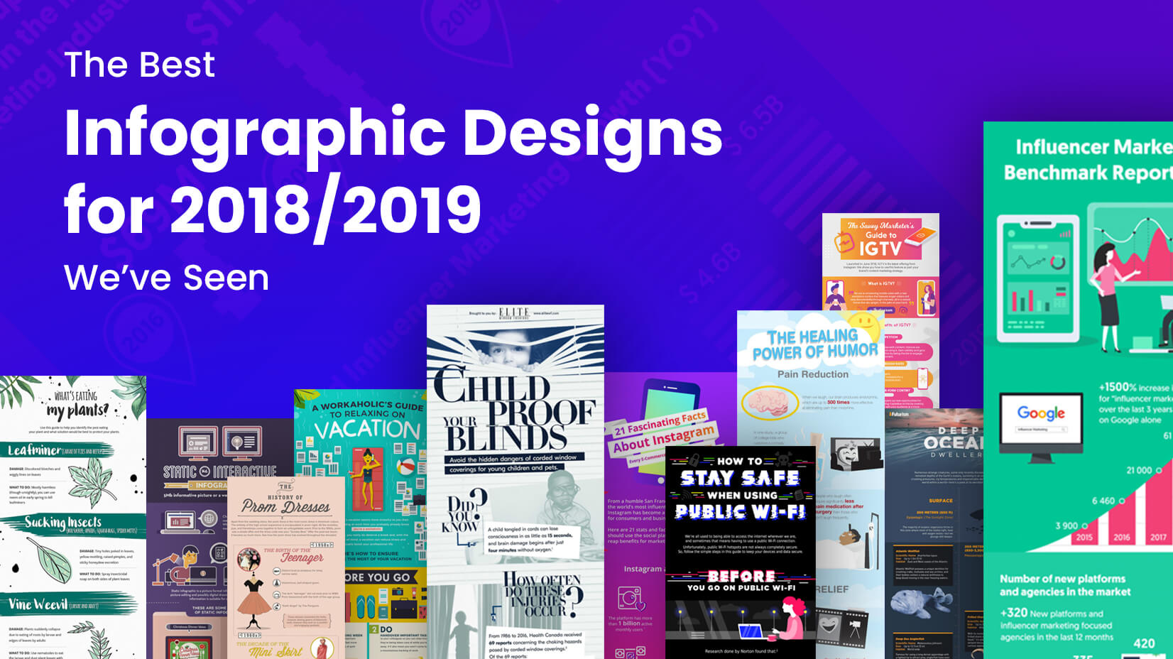
Looking for a strong dose of inspiration with some of the best infographic designs in 2019 so far? Just keep scrolling!
Infographics have been one of the most popular forms of visual content in the 21st century. They are the perfect tool that combines useful information with a visually appealing graphic design to create one powerful duo which engages the user from top to bottom. Just like any other graphic design niche, infographic design can be bad and good. Today, we’ll show you a collection of some of our favorite infographic designs for 2018/2019 so far, that are following the latest infographic design trends. Sit back, enjoy, and get inspired!
The Savvy Marketer’s Guide to IGTV

About: A pleasant infographic design that presents Instagram’s feature IGTV.
Why do we love this infographic? With its isometric and flat illustrations, dreamy colors, and gradients, this infographic design looks modern and engaging. The color palette helps the viewer make an instant connection to the Instagram brand. In addition, each element of the design is chosen in accordance with the latest graphic design and illustration trends.
Design highlights: perfect branding in terms of colors, oversimplified flat characters
See full infographic
A Workaholic’s Guide to Relaxing on Holiday
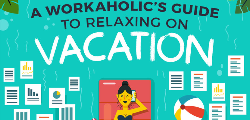
About: A flat, fully illustrated in bright colors infographic with a block structure, giving useful dos and don’ts about working before, during, and after your vacation.
Why do we love this infographic? One glimpse at the design and your mood is already up! The bright and fun color scheme perfectly correlates with the topic, bringing up just the right emotions to prepare the reader for the nature of the infographic’s content. Each tip is backed up with a cool conceptual flat illustration that doesn’t steal the spotlight but supports the message. Regardless of the multicolor palette, the rules for good contrast are well-considered. As a result, the readability is quite high.
Design highlights: flat conceptual illustrations, bright cheerful colors, block structure
See full infographic
Deep Ocean Dwellers

About: An engaging infographic design that introduces to the reader the deep ocean inhabitants.
Why do we love this infographic? A tasteful infographic design that grabs the attention with a captivating hero image, smoothly transitioning into the infographic’s body background. Although the designer has chosen a classical font throughout the whole presentation, they have added a small design touch on the word “ocean” making it look wavy and interacting with the ocean picture behind. The structure of the infographic is based on the depth in which each water habitat can be found. Such a structure gives the feeling of evolvement, relevance, and harmony between the content and the design, as the viewer keeps scrolling down.
Design highlights: a catchy hero image, illustrations in watercolor style
See full infographic
How To Stop What’s Eating Your Garden

About: A pleasant, well-structured infographic design that engages with very good imagery and interesting information about pests on plants.
Why we love this infographic: The design catches the eye with a great choice of illustration types. The watercolor background leaves go perfectly with the solid green color leaf elements illustrated with mismatched black outlining. The choice of fun fonts for the title and headings is well complemented by the classic font for the paragraphs to make the infographic look artsier while maintaining its readability high.
Design highlights: watercolor illustrations, brush details, green color scheme
See full infographic
What’s The Best Infographic For Your Business?

About: A modern flat infographic design with an asymmetrical structure which makes a comparison between static and interactive infographics.
Why do we love this infographic? First of all, outline elements are highly trendy – in terms of illustrations and typography. Secondly, flat illustrations have been an absolute classic. In this case, they stand out with thick white outlining which gives this infographic a high-end look. The rounded shapes, on the other hand, look quite appealing to the viewer. The purplish background with highly contrasting white outline elements makes the whole infographic design feel futuristic.
Design highlights: flat illustrations, white outlining, purple and earthy colors
See full infographic
Child Proof Your Blinds

About: A serious topic presented in a very engaging infographic design – with high-class graphic and photo manipulation techniques.
Why do we love this infographic? An excellent information flow. Images in monochrome tones enhance the dramatic effect of the design. Big serif fonts convey the feeling of a newspaper. All of these factors support the seriousness of the subject. A good design touch, which we love, is the slightly angled typography throughout the whole design – angled in alignment with the background image blinds.
Design highlights: big serif fonts, monochrome imagery
See full infographic
How To Use Instagram To Grow Your Business

About: A very modern and clean infographic that shares useful Instagram stats and tips on how to make the most of this social network.
Why do we love this infographic? A perfect example of a very well branded infographic design with Instagram’s signature gradient color palette as a background. Not only are color gradients very trendy at the moment but all other graphic design elements which we see in this design, as well. Doodle style icon illustrations with thick lines, flat illustrations with gradients, 3D real-life elements – all of these are a part of graphic design trends for 2019 which make this infographic design ultra-trendy right now.
Design highlights: perfect branding, doodle style icons, ultra-modern gradients
See full infographic
The History of Prom Dresses

About: A tastefully presented infographic design taking the viewer through the history of prom dresses from the 50s to the present day.
Why do we love this infographic? Very girly, beautifully designed, and super easy to scan – this infographic design is in perfect harmony with its topic. The neatly arranged content in the form of a timeline structure, the visual line which leads the viewer’s eye from the beginning to the end, and of course, the rich valuable content that provokes the reader’s curiosity – all these factors make this infographic design super engaging and pleasant to read.
Design highlights: a pleasant combination of three different fonts (two for the titles, one for the paragraphs), a timeline arrangement with visual cues
See full infographic
How to Stay Safe When Using Public Wi-Fi

About: An infographic giving insight on how to protect yourself from hackers when using public Wi-Fi.
Why do we love this infographic? Everything about this design “speaks” digital networks and technology – a design that is in perfect harmony with the topic. The bright neon illustrations and design elements that contrast with the dark background remind of the early computer interfaces. The familiar glitch effect applied to the typography is easily associated with anything digital. All of this while keeping the modern vibe throughout the whole presentation with the super trendy semi-gradient flat illustrations and outline icons.
Design highlights: bright neon colors on a dark background, glitch effect typography, oversimplified flat character design
See full infographic
The Healing Power of Humor

About: A cute infographic design devoted to the power of humor and the importance of laughter.
Why do we love this infographic? A fun, cartoony design that boosts the mood – a design that is intended to make you smile! The content of this infographic is about laughter and the design easily contributes to the overall feeling of fun. The designer has used a safe font that doesn’t steal the spotlight but still puts an accent on the key information points with a bold text colored in the same nuance of red as the “heart” cartoon character.
Design highlights: flat illustrations in a cartoon style, a “heart” character in a cartoon style
See full infographic
7 Types of Online Harassment

About: A very serious subject presented as a very appealing infographic design that makes information easy to comprehend.
Why do we love this infographic? Not only is this infographic very informative and important in terms of content but its design makes it very easy to read. Another proof that a good infographic design can raise more awareness for a problem than the same information presented in plain text. The theme is made in blue and orange – two highly contrasting colors. The flat illustration style with textures is very trendy right now making this infographic to be perceived as modern and its content – topical.
Design highlights: simple flat illustrations with textures, orange-blue color combination
See full infographic
Influencer Marketing Benchmark Report 2019

About: A fresh infographic design presenting stats about influencer marketing.
Why do we love this infographic? Infographics with charts and graphs are not the typical visual content that people would consider engaging and provoking the user’s interest. However, this one is a great example that the right visuals can make any statistics fun to read. The designer has chosen a great bright color duo as a palette for the infographic design – mint and Fuschia which instantly grab the attention. The well-designed graphs and charts, as well as illustrated examples that support the content, keep the viewer’s interest till the end.
Design highlights: mint-Fuschia color scheme, simple flat character design, and illustrations
See full infographic
Future of The World We Live In

About: A compilation of infographics combining several topics united by the theme of what the future of the world will look like.
Why do we love this infographic? A modern design approach and a highly engaging visual technique that escapes from the borders of the traditional infographic styles. This collection of infographics that have combined 3D visual style with isometric and 2D styles, colored in bright captivating nuances, perfectly captures the modern look and feel and graphic design. The focus in this case is on the visual part of the design, supported by paragraphs of text for the viewers who’d love to learn more.
Design highlights: a combination of 3D, 2D, and isometric design styles, bright colors
See full infographic
7 Chakras in 7 Days

About: An informative infographic about chakras in yoga.
Why do we love this infographic? The main purpose of an infographic is to provide information through pictures and text. This infographic combines these factors very well which is why we decided to give it as an example of an infographic done right. Unlike most infographic orientations, this one is horizontal and the user doesn’t have to scroll down to get info. The content is wisely depicted with flat illustrations and additional information to maximize the value it provides.
Design highlights: horizontal orientation, flat illustrations
See full infographic
Game of Thrones Infographic Predicts Season 8 Finale

About: An infographic devoted to Game of Throne predictions about the season 8 finale.
Why do we love this infographic? A design that has completely captured the thematic of the hit series. Everything about this infographic speaks of perfect harmony between design and theme – from the design details (crown, swords), through element arrangement (depicting the throne), and last but not least – the color scheme and fonts.
Design highlights: perfect harmony between design and theme
See full infographic
Infografia Rey León

About: A beautiful artistic infographic devoted to The Lion King.
Why do we love this infographic? An infographic is a real piece of art that not only the movie fans will appreciate. This beautiful infographic devoted to The Lion King pleases the eye with mesmerizing artistic hand-painted illustrations of the animal kingdom which makes it absolutely unique and captivating.
Design highlights: hand-painted watercolor illustrations
See full infographic
10 Foods That Are Great For Building Muscle

About: A fitness infographic giving information about the foods that are great for building muscle.
Why do we love this infographic? Whether you are using illustrations for your infographic or prefer photos, you should definitely use high-quality imagery. This infographic is a great example that with high-quality pictures (in this case, all in the same style – top view photography), a great choice of fonts, and a simple symmetrical layout the result will be engaging and pleasant for eye design.
Design highlights: top view HQ photography, black-and-orange color scheme
See full infographic
Food & Wine Pairing 101

About: An infographic about how to combine foods with different types of wine.
Why do we love this infographic? An infographic with neatly arranged content in a block structure makes it extremely pleasant to read. The symmetrical design and the choice of a muted color scheme depicting the shades of red and white wine make this design relaxing and awaken the senses.
Design highlights: symmetrical blog structure, muted colors, flat style
See full infographic
How To Stay Safe When Traveling

About: An infographic giving information about the worst and best destinations for traveling regarding safety.
Why do we love this infographic? Pure flat design still looks modern and engaging after being one of the top trends for a very long time now. This infographic provides quite valuable information embellished in an eye-pleasing flat design with a symmetrical layout and flat high-quality illustrations.
Design highlights: symmetrical layout, flat illustrations, handy numbering
See full infographic
The World’s Largest 10 Economies in 2030

About: An infographic comparing the world’s largest economies in 2017 and 2030.
Why do we love this infographic? A simple infographic with a very effective design conveying all needed information with the help of a comparison layout. Besides being minimalist, this infographic still has an artistic vibe conveyed thanks to the colorful watercolor circles in the middle. These circles stay at the core of the information presented and make the design stand out from the rest.
Design highlights: minimalist design, a side-by-side comparison layout, artistic watercolor elements
See full infographic
What Women Want… Dating Secrets Revealed

About: A fun infographic telling us about what women want in a man when online dating.
Why do we love this infographic? Because we love cartoons! Plus, the whole infographic is super fun and provokes the curiosity of the reader. The statistics scattered all over the infographic’s body but handily accompanied by visual cues (the lines) are a perfect match to the two humorous cartoon characters in the middle. The overall result is quite entertaining.
Design highlights: a fun cartoon style, text scattered all over with visual aids (lines)
See full infographic
How Instagram Changed the Restaurant Industry

About: An infographic telling us about the influence of Instagram on the restaurant industry.
Why do we love this infographic? A well-designed infographic with a pleasant block structure and nice supportive illustrations made in flat, outline, and isometric styles. The effective combination of illustration styles, accompanied by the eye-pleasing combination of a handwritten and classic font, and the choice of muted color nuances, make this infographic design quite easy on the eye.
Design highlights: a flat design style and illustrations, a muted color scheme – green, blue, orange
See full infographic
Amnick Social Enterprise Infographic 2025 Blueprint

About: An infographic showing Amnick Social Enterprise’s vision for 2025.
Why do we love this infographic? An unconventional choice of horizontal infographic layout combined with a classic color scheme of orange and blue with brighter and more muted nuances. Despise lacking any illustrations or photos, the sections with wicked shapes make this infographic significantly more interesting.
Design highlights: blue-orange color scheme, horizontal layout, sections with wicked shapes
See full infographicRubik’s Cube Infographic

About: An infographic that shows exactly how to solve the Rubik’s cube.
Why do we love this infographic? An ultra informative infographic, is quite different from the majority of infographics. This infographic is devoted to the Rubik’s cube and besides showing some interesting data about the inventor and other types of cubes, with the help of flat isometric illustrations, it shows in detail how to solve the famous riddle.
Design highlights: isometric illustrations, numbered sections
See full infographic
5 Stats About Small Business

About: A cheerful illustrated infographic telling us several insightful statistics about small businesses.
Why do we love this infographic? An infographic that combines a few modern trends right now: isometric illustrations, oversimplified flat characters, and bright colors. This infographic design impresses with great transitioning from one section to another and high-quality illustrations along the way which depict each stat.
Design highlights: bright cheerful colors, isometric illustrations, simple flat characters
See full infographic
How to Kaffemik: Visit Grenland Infographic

About: An infographic that tells us how to behave when invited to a kaffemik in Greenland.
Why do we love this infographic? The impressive low-poly and 3D illustrations used throughout the entire infographic make this design quite immersive as if you can actually feel the atmosphere of Greenland and the event presented. The diagonal text sections also provoke the user to keep scrolling holding the attention till the end.
Design highlights: low-poly and 3D illustrations
See full infographic
Universe Infographic

About: An infographic about the space giving information about celestial objects.
Why do we love this infographic? An infographic design that can keep you staring at it like a map for several minutes while exploring all sections of the design. The infographic itself has a lot going on which is why the illustrations are made in a flat style in order to simplify and keep the design cleaner and organized.
Design highlights: flat colorful illustrations, horizontal layout
See full infographic
Magazine Making Process

About: An infographic about how the process of making magazines goes.
Why do we love this infographic? The isometric style has been quite trendy lately, and often, you will see infographics entirely made in this style – like this one. The isometric design style allows to present two-dimensional objects as three-dimensional, and in this case, with the help of arrows leading the viewer’s eye, the result is quite a cool and effective infographic.
Design highlights: simple flat illustrations in isometric style
See full infographic
Infographic Global Economy: Emerging Markets

About: An infographic informing us about the emerging markets in the global economy.
Why do we love this infographic? These days the majority of infographics are flat which is why when you see a cool infographic with gradients that create depth, it simply makes an impression. With the help of lights, shadows, and gradients, the designer of this infographic has achieved the effect of distinctive layers and volume.
Design highlights: illustrations with gradients, shadows, transparent elements
See full infographic
Economy Impact of Great Lakes Shipping

About: An infographic about the economic impact of Great Lakes shipping.
Why do we love this infographic? Impressive illustrations with a rough texture made in a greenish-blue cold color scheme with accents of warm orange to keep up the balance. This infographic is beautifully illustrated, showing not only illustrations but maps and sketches, as well.
Design highlights: textured illustrations, а greenish-blue color scheme with orange accents
See full infographic
Craft Your College Visits

About: An infographic about how to behave when you first visit your campus.
Why do we love this infographic? A cheerful infographic design with bright colors and a zig-zag road in the middle makes the viewer keep scrolling. This infographic is made with illustrations in an isometric style which gives it a little bit of perspective. The zig-zag road illustration in the middle plays the role of a transition between the sections which are also numbered for additional convenience.
Design highlights: simple isometric illustrations, bright cheerful colors
See full infographic
Ah, so much inspiration!
We are pretty sure designers will surprise us with even more awesome infographic designs by the end of 2019. So, we’ll make sure to keep this article updated as soon as we spot a design worthy of sharing. Meanwhile, would you like to learn How to Make an Engaging Infographic yourself?
How did you like this collection of best infographic designs? We’d love to hear your comments, so feel free to share your thoughts in the section below.