![How to Use Seamless Patterns in Your Designs [Tips and Tricks]](https://i.graphicmama.com/blog/wp-content/uploads/2020/07/14125818/How-to-Use-Seamless-Patterns-in-Your-Designs-Tips-and-Tricks-120x70.png)


As a continuation of our inspirational examples and palette ideas for great color combinations, today we will have a look at the basics of color theory and go beyond that. Therefore, in this article, we will learn everything about colors from their properties, through how they combine, and how they can influence your audience to take the desired actions.
You can also review the color theory article overview below and fast-travel to the specific sections you need.
Guide to color theory overview:
1. What are colors?
1.1. Color properties
1.2. The Color Wheel
1.3. Types of Colors
2. Types of Color Combinations
2.1. Monochrome Color Combinations
2.2. Complementary Color Combinations
2.3. Split Complementary
2.4. Analogous Color Combinations
2.5. Triadic Color Combinations
2.6. The Tetradic Color Combinations
2.7. Individual Color Combinations: What Colors Go Well Together in General
2.8. Gradient Color Combinations
3. Color Combinations in Psychology
3.1. How Colors Influence Mood and Emotions
3.2. Individual Hues in Marketing
3.3. Moods and Emotions Through Color Palettes (Examples)
1. What are Colors?
1.1. Color Properties
We will start our brief color theory by defining what colors actually are. As abstract as it might sound, the closest definition is that colors are defined by the different ways our eyes perceive the light when it hits an object. With that being said, each color is defined by three main properties that create the vast diversity of that color effect.

Color Properties: Hue, Intensity, and Value
- Hue:
The color property references the color family, meaning each segment on the color wheel. On the traditional wheel, there are 12 segments, one for each family. - Intensity:
It reflects the saturation of the color. Naturally, this defines how vivid or dull the color is. - Value:
The third property forms the tints and shades of each color. It refers to how light or dark is that color. You create tints by adding white to the color, and you create shades when you add black.
Colors have four more properties related to their hue, intensity, and value. Color theory teaches us that since the color hue is the segment of a particular color family on the wheel, it is also the purest state of the color. From there, by changing the intensity and value, you can create tones, tints, and shades.

- Tones:
You create tones when you add grey to a particular hue. - Tints:
These are the colors created when you add white to a particular hue. - Shades:
When you add black to a particular hue, you create shades.
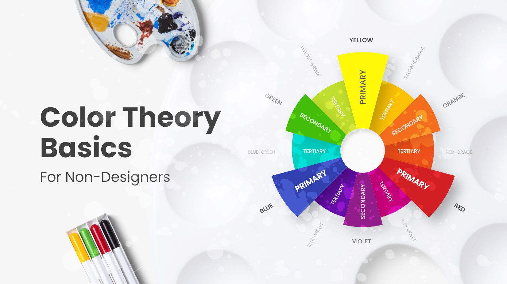
1.2. The Color Wheel
In color theory, the color wheel is an illustrative way of organizing and visualizing color hues and the relationship between them around a circle. The 12-hues traditional color wheel (see graphic below) shows the primary, secondary, and tertiary colors as well as their relationships. Thanks to that visualization of theory, you can easily determine what colors work together for harmonious color combinations in a variety of ways.

1.3. Types of Colors in Color Theory
When talking about color basics, everything starts with the color wheel that shows the relations between all types of colors.

- Primary colors (Ps):
Red, yellow, and blue are the three primary pigment colors. They can’t be created by mixing other combinations of colors. However, the combinations of these hues deliver all other colors. - Secondary colors (S):
Orange, green, and violet are the first color that we get when we mix the primary ones directly. Respectively, the combinations are yellow and red, yellow and blue, and red and blue. - Tertiary colors (Ts):
Also known as intermediates, these are the hues that we get when we combine a primary with a secondary color. For that reason, each of the six tertiary hues has a two-word name, as follows: yellow-orange, red-orange, red-violet, blue-violet, blue-green, and yellow-green.
Color Temperature
In color theory, colors also have a temperature. It’s a characteristic that refers to the relative coolness or warmth of each color. When you divide the color wheel into two halves, the cool ones start with violet and ending with yellow-green, while the warm colors start with yellow and end with red-violet.
- Cool colors:
Blue and any color that includes blue as a predominant component. The closer a color is to blue on the color wheel (the bluer it has), the cooler the color. - Warm colors:
Yellow and any color that includes yellow as a predominant component. The closer a color is to yellow on the color wheel (the more yellow it has), the warmer the color.

The distinction between the two types in terms of temperature is extremely useful in design. This is not only because of the significantly different psychological impact of cool and warm colors. There is also the property of cool colors to appear distant and farther away from the observer, while warm colors appear closer.
Neutral Colors
In addition, there are also colors that struggle to earn the definition of colors. They are known as neutrals, as they hardly fall into the warm or cool category. In fact, the neutrals, especially black and white, are really capable to create amazing designs on their own without the use of vibrant colors.

- Black:
In science, black is considered the absence of light, while in design, it is created by pigments. In fact, designers use colors to create the darkest approximately black colors, since true black as a pigment is impossible to make. - White:
Similar to black, white is the absence of color and you can’t mix colors to create white. Also same as black, true white is impossible to recreate unless we’re talking about unfiltered sunlight. - Neutral colors:
They are pale or dark shades of natural colors that are almost devoid of hue. On the wheel, they are at the far center and periphery. Neutral colors include black, white, greys, browns, and tans.
2. Types of Color Combinations in Color Theory
When it comes to combining colors by using the color wheel, there are five ways to achieve that in color theory. Truth is, you can create as many harmonious schemes and palettes as you can imagine, but the results will always fall into one of those categories. So let’s see how they work.
2.1. Monochrome Color Combinations
The first and simplest method to combine colors, in color theory, is to create a combination of different variations of a single hue.

In the graphic above, we have included only different shades and tints of the pure yellow hue. However, you could also try out similar tones. Although this method seems limited, it’s quite fun to experiment with and will always give your designs a visually appealing and simplified look.
This is especially useful for projects that include heavy data and overall busy designs.
Another absolute advantage is if your brand has a particular color that your audience identifies it with. Simply combining different shades, tints, or tones of your brand color will personalize your presentation even further.
In the first example, we have a monochrome color scheme with two different tones of blue that look rich and diverse, because of the different shades and tints created by the gradient. The same goes for the second example, which also uses gradients to enrich the orange tones.

Institucional BDMG 2020 by Pedro Assis
2.2. Complementary Color Combinations
As the title suggests, complementary are the colors that sit directly one against another on the color wheel. In the graphic below, you can see two examples of complementary colors: yellow-orange against blue-violet, and blue-green against red-orange.

The colors work great for creating high- contrast and give accents to elements in your design that you need to direct your audience’s attention to. This is easily achieved when you pick your dominant color, usually the cool one, and use the complimentary warm color only for the most important sections or CTAs. Surely, since such high-contrast colors are usually vibrant at full saturation, they must be managed carefully to be balanced and not look too jarring and overwhelming.
In the first example, the main complementary colors are violet and yellow. We also see a lovely addition of blue-green and lime, however, none of those greens is complimentary to violet or yellow. In the second, pastel tints of blue-green and red-orange create a complementary combination. There is also a third accent color yellow, but similar to the first example, it’s not a complementary color to any of the dominant two.
2.3. Split Complementary
In color theory, this method is a variation of the previous one for richer palettes with more colors. However, with split complementary combinations, instead of two, you use three colors that sit directly against one another on the wheel.

These palettes include cool and warm colors and bring a lot of balance to your designs. Similar to complementary palettes, here you can use two cool colors for your overall design (for example, blue background with violet sections), and set the warm color (in this case: orange) for your target elements.
What we see in the first example is a split complementary of tones of red, red-violet, and green with additional white for contrast. In the second, the main colors are variations of yellow, purple, and pink.
2.4. Analogous Color Combinations
Opposite to the complementary colors, these hues are located next to one another which creates balanced harmonic palettes. These combinations look natural as one color is dominant and the others highlight and complete and it.

This method works amazing with more colors as harmony allows it without overwhelming the design. Another reason is that using just two or three colors are that way too similar would sometimes wash out the design.
To prevent that from happening, many designers use high contrast neutrals such as black and white, as you will see in the two examples below. The usual scheme involves one dominant color, a second to support it, and a third along with neutral as an accent.
In the first example, the designer has bet on blue, blue-violet, violet, and red-violet that blend through a pattern and serve as a great base for the black logo. In the second, blues and greens contrast perfectly with white.
2.5. Triadic Color Combinations
The triadic color combinations use colors that sit evenly around the color wheel. This allows three different hues that create a nice contrast even if you decide to unsaturate them.

As with any other method, in order to create a perfectly balanced triadic palette, in most cases you let one color dominate the design and use the other two as accents. As you can see on the graphic above, in a 12-colors wheel, you can have four triadic color combinations. We illustrated blue-green, yellow-orange, and red-violet; as well as yellow-green, red-orange, and blue-violet. Respectively, the remaining two would be red, yellow, and blue; and orange, green, and violet.
The examples below, however, show a perfect triadic balance. In the first photo, the dominant color is a neutral one (the skin tone of the models serves as a base), while the triadic combination of red, yellow, and blue is equally used as accents, contrasts perfectly, and enriches the composition. In the second, we see dominant green, combined with secondary pink and orange for accent.
2.6. Tetradic Color Combinations
Also known as the rectangle color scheme, this method uses four colors that sit into two complementary pairs, as illustrated in the graphic below. There is another variation of this color combination that uses a square for similar results. In this case, the four colors sit evenly around the color circle.

Back to the tetrad, the method offers even richer and more diverse color palettes in comparison to the tetrad, and many possibilities for a variation. When you use the rectangle to combine your colors, please keep in mind to balance the cool and warm colors in your overall design.
With the examples that use tetradic combinations, we see a logo which design allows the even use of the four colors without a dominant one (if we exclude the neutral background), and the four elements of the carousel contrast perfectly. The next illustration offers other variations of green, blue, red, and yellow and uses the green tones as dominant.
2.7. Individual Color Combinations: What Colors Go Well Together
This is generally subjective as every pair of colors can be combined in the right tone, tint, or shade. However, there are some classic combinations that you will find in many designs from fashion, and interior design, to graphic and web design. So let’s have a look at some of those pairs.

Neutrals
- Black:
Since it’s a universal color, it looks great with any other color. It combines especially well with orange, green, white, red, and yellow. - White:
Another universal color, goes perfectly with blue, red, and black. - Beige:
Blue, brown, green, and red. - Brown:
Bright-cyan, cream, pink, and beige. - Grey:
Fuchsia, violet, pink, and blue.
Metallics
- Gold:
Black, burgundy, rose, and military green. - Rose Gold:
Red-violet, flamingo pink, and peach. - Silver:
Blue, brown, and antique gold. - Copper:
White, neutral green, and navy.
Cool Colors
- Violet:
Golden-brown, pale-yellow, and mint. - Blue-Violet:
Orange, pink, yellow, and white. - Blue:
Lilac, cyan, yellow-green, brown, and grey. - Blue-Green:
Brown, orange, pink, cherry-red, and beige. - Green:
Orange, yellow, brown, and creamy-white. - Yellow-Green:
Cherry-red, blue, and gray.
Warm Colors:
- Yellow:
Gray, azure, lilac, and black. - Yellow-Orange:
Gray, brown, and olive. - Orange:
Cyan, blue, and lilac. - Red-Orange:
Cyan, mint, and creamy-white. - Red:
Yellow, green, blue, and black. - Red-Violet:
Gray, lime, mint, azure, gray, and beige.
Update: You may also be interested in learning more about the color of 2022: Very Peri.
2.8. Gradient Color combinations
For a while, gradients were put aside from graphic and web design in favor of flat style, but since 2018, they have once more returned to the scene. The trend is constantly evolving as designers constantly master their skills to create beautiful color transitions and use them way better in comparison to the overwhelming gradient designs in the 90s. Remember the big red high-contrast gradient CTA buttons with lights, drop shadows, and patterns? Thankfully, those aren’t coming back any time soon.
So what are gradients? In short, these are color transitions that blend from one color to another and aren’t limited to just two hues. There aren’t rules for the type of colors you blend, as you can make a transition between similar colors or completely contrasting ones. In the graphic below, there are ten different examples of gradients. Some include the transition between two warm colors, others between cool tones, while in other instances they are mixed.

The methods to combine colors according to the color theory are the same for gradients as well as for flat design. What gradients do better than flat, however, is they add more depth and create texture. Gradient color combinations are rich and attention-grabbing and since they came back in 2018, they feel more luminous, bright, and modern.

Illustrations June Series – 2016 by Nuria Boj
3. Color Combinations in Psychology
3.1. How Colors Influence Mood and Emotions
Combining colors isn’t just about aesthetics, optimization, and making your designs beautiful and eye-catching. Therefore, the color theory might not be enough for modern design. Half the work for creating palettes is strategically choosing the specific colors that will successfully convey your message and influence your audience to make the response you desire.
Colors evoke emotions and there’s no way around it. On one hand, the psychology and meaning behind each tone of a hue vary in different cultures, cases, and combinations. On the other, there are a few established guidelines that could help you start.
Amongst the most popular claims is that warm colors are inherently positive while cool ones are negative. This is somewhat true, but it’s not a rule. For example, red is a warm color but most of its tones, especially with higher intensity and purity, evokes the feeling of rage or danger. Yellow, the primary warm color, can evoke anxiety and a sense of urgency. There are even some tones of yellow that are associated with jaundice and look sick. So let’s touch the hues in their purest most vibrant tones briefly and see how each one can affect the behavior of your targeted audience.
3.2. Individual hues in marketing
While people usually respond in a certain way towards individual colors, it’s important to keep in mind that the effect of each hue depends on many factors: combinations, contexts, experience, personal taste, age, gender, and cultural differences. Additional research is always essential when you choose your colors for a specific target audience.
Warm Colors:
- Yellow:
Bright and intense color that is attention-grabbing, warm, and lively. At the same time, it’s difficult to read and overwhelming to the eyes, and can also create feelings of frustration and anxiety. It’s usually common in sales for impulsive buyers. - Orange:
Very engaging and popular for CTA, logos, and accent colors for its ability to draw attention. It’s rarely used outside accents, as it’s a very intensive energetic color that calls feelings of excitement and enthusiasm. Too much orange might irritate your visitors. - Red:
Commonly used with sales, a strong color that causes faster reactions. Red raises blood pressure and is also great to use for engaging and socializing. Therefore, if it’s heavily used, it might have a negative effect on the audience and turn your visitors away. - Pink:
The most feminine and romantic color, it’s ideal for children’s toys, nurseries, and women’s health products. In comparison to its primary color red, the longer you’re exposed to pink, the calmer you become. - Purple:
A royal color, is associated with wealth, sensuality, and wisdom. This is why it’s heavily used with luxurious goods, as well as high-end beauty products. Due to its dramatic nature, it also gives romantic and mysterious vibes.
Cool colors and Neutrals:
- Green:
Easy on the eye and relaxing color. It’s strongly associated with nature, bioproducts, good luck, health, and wealth. On the other hand, green is also the color of envy or poison, so the right tone and shade of this color are of extreme importance. - Blue:
According to a worldwide survey, blue is the most popular and loved color not only amongst men but also among women as well. It has strong uses in communications, banking, and insurance as it evokes feelings of security, loyalty, honesty, power, and reliability. Depending on the shade, blue can also evoke sadness and loneliness. - Black:
Universal elegant and sophisticated color that is commonly used in high-end brands. It’s associated with high class and power and is often used in communications. - White:
Universal high-contrast color that adds space and conveys purity, cleanliness, freshness, and simplicity but it can also feel sterile and cold. It’s heavily used in healthcare and the tech industry. - Grey:
Subtle color for subtle people who prefer not to stand out. Due to its simplicity, it’s used to calm visitors and make them feel comfortable. It’s also a common color in the tech industry.
You may also be interested in 39 examples of website color schemes to awaken your creativity.
3.3. Moods and emotions through color palettes
Those were the major effects of the purest state of the colors, according to color theory. When we take all factors into consideration and decide what feelings and emotions we wish to convey, this effect depends heavily on the brightness, tone, tint of the shade, and temperature of our colors. Your orange is too energetic? You can turn down the intensity and add more white to create a relaxing pastel color. You have too many blues in your design and it feels sad? Mix with a warm tone to cheer it up.
- Calm colors:
Those are usually lighter tints of blues and greens. The most soothing color schemes are the pastel palettes. Think of baby blue, mint, lilac, rose pink, and light yellow, especially when combined with neutrals such as beige, white, and light soft grey. - Energy colors:
The brightest most vibrant shades of the hues such as bright red, neon green, magenta, cyan, bright yellow, and vibrant blue. Those are the colors that stimulate and energize but can also irritate and exhaust.
- Happy colors:
These are the warm pinks, oranges, and reds. They can be pastel, and candy colors, as well as vibrant and engaging. It’s important for these colors to be at a high intensity, meaning you could play with the value, but avoid adding grey. - Sad colors:
The greyish, unsaturated, and darkened tones of cool colors. When colors are devoid of their vibrancy and warmth, they can feel empty, lonely, and depressing.
Cool color palettes
These are the color schemes that include shades of cool colors such as blue, green, and violet and are often mixed with neutrals for better contrast. In general, cool colors are calming and relaxing. However, depending on the specific tones, cool palettes can convey sadness and depression. Such lonely schemes usually include greys and unsaturated blues and greys. With more intensity, the same colors can feel more positive and communicate health, beauty, reliability, and even freshness.
Let’s have a look at some visual examples of the versatile nature of cool color palettes.
Sadness and melancholy

Melancholy girl by ?.
Calming and relaxing

Calming Costal View by Alex Spenser
Fresh and uplifting
Peaceful and serene
Freezing cold
Loyalty and reliability
And by the way, cool colors can also communicate happiness.
Bubbly joy
Cozy and cheerful
Warm color palettes
As with cool colors, warm hues are also a double edge sword. On one hand, they communicate optimism, happiness, energy, enthusiasm, and passion. On the other, they can also convey anxiety, urgency, signal danger, and enrage. Red and yellow provoke fast reactions and increase heart rate, as well as appetite. So let’s see their different uses in color schemes and what moods they evoke.
Romance and sensuality
Anxiety
Panic and fear
Final Words
In conclusion, colors are indeed a very powerful tool in design for influencing moods and emotions. In order to use that power, however, it’s necessary to understand the science behind colors and how they work.
That’s why today we covered the basics of color theory and what it means to graphic design. What’s left to do is to experiment and get creative with combining colors. By the way, we have also created a special gallery with inspirational examples and ideas for color combinations that go beyond trends, so why not check it out as well.
You may also be interested in some of these related articles: