Design is a field of ever-streaming inspiration. Today, we’ve prepared for you a collection of amazing website designs with pattern backgrounds that are very creative and trendy right now.
Pattern backgrounds are very popular in website design, usually used as a supportive element or the last designer touch. But often, without them, the design simply won’t look finished. In this collection of pattern background examples, we’ve gathered some of the best website designs with pattern backgrounds, so all you have to do is sit back and enjoy the inspiration.
And to make it even more enjoyable, we’ve included an exclusive collection of over 80 free patterns to download for your next projects. Let’s begin!
You may also be interested in Web Design Inspiration: 40 Designs to Get Addicted To
1. Nistorcristian.com
Diagonal lines tilted to the right on a cheerful yellow-orange background.
A website design for an online moving car game presented with a background pattern with diagonal lines tilted to the right. We love that the side to which the lines are tilted is synced with the direction to which the car is moving. Plus, the orange color adds up to the optimistic mood of the game.
2. Simpleasmilk.com
A pattern of icons in a doodle line art style on a raspberry background color.
For this website’s hero section, the designer has chosen faded line art icons with thick outlining on a fresh raspberry background color. This pattern actually reminds us of doodling – a graphic design trend which is quite hot right now. Would you like to learn more about graphic design trends?
3. Thegigi.it
A pattern of small-scaled, large-spaced crosses – animated when you interact.
A great example of a simple background pattern made of small-scaled black crosses or pluses on a white background. Nothing special at a first sight but quite interesting when you find out it is actually a dynamic pattern which interacts with your cursor as you move it over.
4. Sweetmagnoliagelato.com
A geometric diamond pattern on a lovely pale yellow background.
A geometric pattern we often associate with cooking – a diamond pattern. Combined with pleasant hand-drawn illustrations and a lovely pale yellow nuance, this pattern really adds up to the feeling of home-made gelato.
5. Monyssb.com
A cool Mexico-themed pattern with colorful hand-drawn illustrations.
A very cool, fresh and colorful pattern on a Mexican team which speaks to us: Fiesta! This cheerful pattern definitely puts visitors into a good mood and to increase the effect even more – parts of the pattern “fall down” as you keep scrolling, making you read the menu and working hours of Mony’s.
6. Brandalmanac.com
A pattern with dust and star particles floating around.
An edgy and quite unique website design made in a vibrant yellow color that instantly boosts the viewer’s mood. The website patterns used in this design give the overall feeling that you are in space – dust and star particles floating around and creating a zero-gravity effect, and a big black ball in the middle imitating the moon or a planet.
7. Simplychocolate.dk
A background pattern made of yummy chunks of chocolate and caramel.
An irresistible and yummy pattern that goes perfectly with the overall online presentation of this dessert. The pattern which is made of mouth-watering chunks of chocolate and caramel effectively contributes to the mission of tempting the viewer to try out the dessert.
8. Clubhouse.io
A clean and elegant pattern of dots imitating a classical stationery pattern.
Dots. So simple, yet so effecting in jazzing up a classic white background. The pattern of dots in this website is distributed only in different key spots in the design, giving it a modern and clean business look while keeping the focus on the essential content.
9. Limonades-la-beauceronne.fr
Three different patterns with a hand-drawn look colored in refreshing blue nuance.
Why choose just one pattern when you can have many? This website has chosen a dynamic background which changes three different hand-drawn patterns – a doodle pattern, a pattern of bubbles, and a pattern of waves. The cool thing is that these patterns are all in the same color scheme – they keep the hero section diversified and consistent at the same time.
10. Furgoneta.com.ua
A fun doodle background on pattern with hand-drawn illustrations on a street food theme.
A very cheerful website design – fully illustrated in a funky style with outline illustrations. The site design impresses with a fun and cool pattern background made of food-themed doodle illustrations that add up to the whole easy-going vibe of the website.
11. Hanskissle.com
A pleasant green background with a pattern of dots.
Dots are a typical pattern you will see in the kitchen – on aprons, napkins, tablecloth, etc. People easily associate them with anything related to cooking and food. This is why it isn’t a surprise that this website has used dots as a partial pattern on the fresh green background.
12. Octonauts.com
A cool illustrated website pattern introducing cartoon characters from a book.
A website design which presents children’s book series. As a background, we see a very cute pattern introducing all characters in the books. The choice of color is dark blue, so it keeps the viewers’ focus on the colorful middle section.
13. Typeandpixel.com.au
A small-scaled pattern of stairs, partially covering the background.
A website design partially covered in a small-scaled grey stairs pattern. It is wise to use such a pattern only on a part of the design, especially in the form of a geometric shape. It makes the design look innovative and modern.
14. Otadesigns.com
A background pattern made of geometric shapes with a parallax effect to create depth.
A pretty pattern of various geometric shapes over a gradient purple background. The depth of the pattern design is boosted with the well-known parallax effect that has been among web design trends for several years. According to this effect, different layers move at a different speed, as you move your cursor or scroll.
15. Friendlyprojects.com
A grey background pattern resembling a stationery pattern, also being used as a game canvas.
A grey dotted background pattern on this website design, also playing the role of canvas of the game which you can play on this site. The safe grey color is easy on the eyes and the placement of dots helps users line up the elements when playing the game.
16. Twelvesaturdays.com
A light grey pattern as a background imitating cotton fabric.
If you are using a background pattern for your website, it’s a really good idea to match it with the theme of your site. This website sells clothes and uses fabric as a background pattern. The choice of pattern is a light grey cotton fabric that doesn’t steal the attention.
17. Kaneang-pier.com
A fish-themed pattern background used for a seafood restaurant website.
A seafood restaurant with a modern website design whose designer chose an interesting background pattern of different fishes. The pattern is pale, so it makes the design more thematic while it doesn’t distract the viewer from the main content.
18. Marianopascual.me
A pattern of a squared paper sheet imitating a school notebook.
A fully illustrated website design with a background pattern of a squared paper sheet that reminds a little bit of a school notebook. This pattern matches perfectly the flat outline illustrations in the design. The overall feeling achieved is an old school website design.
19. Soccerpattern.com
A small-scaled dotted pattern jazzing up the white background.
An eye-catchy color scheme of blue, red, and white embellished with a small-scaled dotted pattern that would otherwise be a plain white boring background. Regardless of being subtle, the background pattern gives a completely different feeling of fullness to this website design.
20. Koox.co.uk
A subtle geometric background in a pale beige color matching the style of the illustrations.
A beautifully illustrated website with a very subtle geometric background in a pale beige color. The choice of the pattern is a very good match to the illustrations and the text, as it helps them stand out.
And if you are keen on patterns, you should most definitely check out our professional megapack with over 1000 seamless vector pattern designs in different styles and themes.
21. D7-Creative.com
A black-and-white pattern of thick diagonal stripes – interacting with the lettering.
A website design made of different section blocks, some of which are completely made of patterns. Like this one on the screenshot above. The black-and-white pattern made of thick diagonal stripes is nothing extraordinary at a first sight. But as you keep scrolling and hover your cursor, you will see an impressive interaction between the pattern and the lettering.
22. Affari.co
A minimalist and clean website pattern background in a low-poly style.
A very clean and elegant website design with a subtle grey low-poly background pattern. Low poly has been one of the hottest trends of the decade. As such, it effectively contributes to the overall trendy feeling of the design – while keeping the design minimalist and clean.
23. Lessonly.com
A subtle pattern of waves and dots only partially covering the background.
A very subtle pattern of waves and dots which partially appears on the background. The “spots of pattern” perfectly matches the concept of “spots” of colors and gives the overall design the feeling of openness and air.
24. Symbio.agency
A subtle background with a grey texture resembling concrete.
A grey textured background imitating a concrete wall. The choice of a background pattern perfectly complements the grayscale color scheme of this website whose only pop of color is an energizing orange.
25. Tdhcreative.com
A grunge pattern background with a dusty effect, colored in a brown-greyish nuance.
A background pattern imitating cardboard with a dusty effect presented in the typical light brown-greyish color nuance. Together with the other elements of this website design, the background pattern helps to achieve an overall retro grunge look of this site.
You may also be interested to check out more examples of Retro Design in Modern Times.
26. Marciaemaro.com.br
A website background resembling luxury paper, achieved with texture and light gray nuance.
A website design using a grey textured pattern imitating luxury paper. The choice of background pattern is perfectly complemented by the golden handwritten letting and hand-drawn flower illustrations to create a sense of beauty, exclusiveness, and high class.
27. Jamesanderson613.com
A classical pattern of stripes in a beige color resembling
A beige pattern of small-scape stripes forming a classical wallpaper for this website design. The website itself is made as an infographic – with stats, data, and text. As such, the choice of the pattern allows the viewer to focus their attention on the information itself.
28. Trumpsxmasmeltdown.com
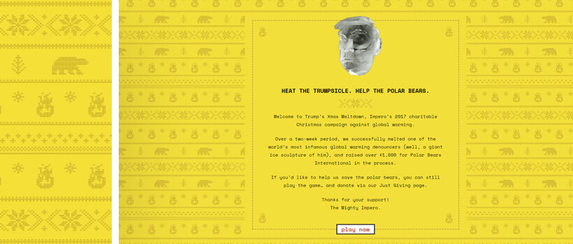
A background pattern in a knitted style imitating a Christmas sweater pattern.
A Christmas-themed campaign made in help of the polar bears. The website is presented with a cute yellow pattern as a background, recreating Christmas sweater’s knitted decorations of polar bears, snowflakes and fireplaces.
29. Armatdrinks.am
A subtle website background with a texture imitating snow.
An impressive website design presentation of a famous vodka brand. The design of this website is made with a background pattern imitating snow which stays consistent while different bottles are switching over.
30. Myersinfosys.com
A high-tech website design with two patterns of cubes designed in an isometric style.
On this website design, we see two types of cubes patterns in isometric perspectives, both used as backgrounds in different sections. The choice of patterns speaks of high-technology which is quite appropriate since the website is about a software product. The overall feel is of a futuristic design.
You may also be interested in 10 Web Design Secrets and Tips That No One Ever Tells You
31. Eattheordinary.com
A background pattern with little dust particles unevenly scattered around.
A pattern of little dust particles scattered all over the background presented in gray on black and black on gray blackground colors. The pattern certainly adds a nice texture to this grayscale website and the parallax effect applied to the gray-on-black version – to us, looks quite much like the night sky.
32. Marieguillaumet.com
A large-scaled diamond pattern with a cork texture conveying coziness.
A large-scaled diamond pattern often associated with coziness and the feeling of home (You can often see this particular pattern on cozy sweaters and socks). In this case, combined with the cork texture easily conveys the feeling of something hand-made. This concept is in fact, in great harmony with the overall hand-illustrated website design.
33. Unionefabbrichemostardamantovana.it
A pale background pattern made with different fruit illustrations.
A nice fruity pattern in pale colors. This pattern is chosen as a background pattern for a website presenting unconventional types of mustard. Together with the nice illustrations of fruits and veggies, the pattern conveys the feeling that fresh and natural products are used in the making of the mustard.
34. Doze.studio
A multi-color background with square sections of patterns of dots and diagonal stripes.
Quite modern and very dynamic website design of this creative studio. For their website, they use several background patterns – mostly in square forms to harmonize the chaotic design (with many scattered elements) with organized symmetrical patterns of dots and stripes.
35. Retourazero.com
A website pattern of white dust particles and dots on a black background.
A website design with a vintage look that takes us right to space. The space-themed pattern used as a background is made with a lot of white dust and dots particles on a black color background, achieving depth and endlessness. The whole website design looks like a retro poster design.
36. Letters-inc.jp
An isometric background design showing blocks in a black-and-white color scheme.
A black-and-white geometric website design – fully illustrated in a line art style. As we scroll down, we see interesting patterns such as animated line art pattern in the beginning and isometric blocks later on in the design.
37. G-a.co.nz
A large-scale stationery pattern achieving a minimalist organized design.
A pattern of dots resembling a grid or a large-scale stationery pattern. This mathematical pattern helps achieve an arranged, more organized look while keeping the design minimalist.
38. Bacchica.com.br
A textured background pattern that helps achieve a grunge vintage look.
A website design for a barberia with a lot of noise and monochrome images to achieve a grunge vintage look. The website has a subtle textured pattern as a background to add up to the overall retro feeling of the site.
39. Gift.gucci.com
A soft pink background with a woody texture that helps achieve a girly website.
For the website presentation of their line “Gucci Gift 2018”, Gucci has chosen a soft girly pink background pattern which imitates wood. A background which doesn’t hurt the eyes and allows all images to pop.
40. Styletil.es
Large and small-scaled square patterns as a background imitating tiles.
The designer of this website has chosen a pattern which combines large and small-scaled squares. The light grey color is a safe color which means the pattern certainly doesn’t steal the attention from the website’s content. Right on the contrary, it provides a little bit of texture and allows the viewer to focus on the text.
86 Bonus Free Patterns Exclusively for GraphicMama’s Blog Readers
The moment we’ve all been waiting (scrolling) for. Exclusively for you, we’ve prepared an ultimate collection of over 80 seamless patterns to use in your web and graphic design projects. The collection is diverse, including patterns of grass, paper, treadplate, wood, fabric, stone, as well as cute illustrated artistic patterns. Enjoy!
FREE DOWNLOAD
That’s it!
We hope you are feeling more inspired by this collection of pattern backgrounds in web design. If you have a favorite website design with a pattern background, you are more than welcome to share it in the comments below.
You may be interested to read these related articles:


