Updated: May 16, 2022
Searching for amazing websites with illustrations to inspire you? Check out this collection!
Websites with illustrations are probably the most creative ones since they combine the artistic side of illustrators and graphic designers’ precise eye for functionality. Today, we’ve prepared for you an inspiring collection of websites with illustrations and various color palettes that will give you amazing ideas if you are considering this style of website design.
You may also be interested in this related article: Guide to All Free and Premium Sources of Stock Illustrations
1. David-hckh.com
David Heckoff’s portfolio website is something many cartoon creators could be proud of. This illustrated website is a masterpiece. The transition from the desk to the capsule is amazing and it all ends with a simple contact form with a 3D character that turns into a picture of David.
2. Design Maturity Model
Hero areas are the most preferred areas to place an impressive illustration. Here is a website project with an eye-catchy flat illustration in the hero image. The futuristic color scheme of purple, pink, and blue matches the space theme of the web design.
3. RecruitFirst.co
Recruitment services are often considered boring, but in this case, RecruitFirst’s designers use a sleek purple design associated with finesse and class. The 3D illustration on the landing page completes the upper-class impression that the website has already left on us.
4. Make Me Pulse
An interactive website design with beautiful artistic illustrations. This style of illustration is rarely seen in website design. It’s more common for illustrated books and editorial design. This website is a combination of both – it tells a story via beautiful hand-drawn illustrations.
5. Drone
A great website with illustrations of drones and other advanced technology. The illustrations remind me of material design – subtle gradients, sleek shapes, and a greyish-white color scheme. A great combination to convey futurism and high-end technology.
6. Puzzlebreak.us
PuzzleBreak is an escape room with an interactive website with background illustrations. It combines modernistic space UI design which is combined with 3D shapes, and an interesting graining effect, to add a little bit of texture.
7. Chirpley.ai
Chirpley connects brands and influencers. What we really loved is the bold design which uses aggressive forms and color palettes in the red gamma. The 3D illustrations are accompanied by an infographic and another 3D illustration of an egg. To be honest, I’ve never seen an egg to be present in a non-food design. Kudos for the brave idea!
8. Reliefy
A medical-themed website with a modern flat design and liquidy background shapes. A design that pleases the eye and conveys trust. On this site design, we see oversimplified characters which is one of the current character design trends.
9. Replyco
A website that uses illustrations only in some parts of its design. The website achieves a nice balance between illustrations, photos, and content. The illustrations are made in a flat style, with a modern color scheme, and include characters.
10. Niftynafty.com
NiftyNafty welcomes us with a big bold “Ready?” text. This is a very attention-grabbing move. But this NFT project has a very artistic website and the cool illustrations that are displayed there just add to the provocative style of the creators.
11. Chronobank
A clean and classy website design made with conceptual illustration in line art style. Being clean and simplistic, the illustrations based on line art don’t distract the viewer with unnecessary detail and keep the whole design tidy, modern, and focused on information.
12. MetaMusique
A website design based on simplistic line art illustrations combined with solid color elements in a flat design style. Line art is the perfect choice to convey powerful concepts and keep the design very clean and modern. The style also reminds of doodling which is a huge hit right now.
13. Secretrad.com
SecretRad is an illustration website that uses a cartoon version of San Diego’s map. The 90’s design kind of reminds us of Wally’s World magazine. The project is about 29 interesting places to visit when you’re in San Diego and there is a short intro for each one.
14. Goastro.com
GoAstro creates integrated payment partnerships with software companies. The reasons it appears on our list are the trendy-looking website UI, which is combined with a sleek minimalistic design, and this cool 3D cartoon character appears to be the company mascot.
15. Tide
A website design made with illustrations in line art doodle style. Besides keeping the design simple, the doodle illustrations provoke the user to keep scrolling down – they create a visual path that the viewer subconsciously follows.
16. Climate Animals Extinction Crisis
An innovative website design with a mixture of geometric and organic shapes, a horizontal scrolling, a parallax effect, and illustrations that absolutely impress and captivate the visitor. The motion achieved by the parallax effect makes the illustrations stand out even more.
17. Matterapp.com
MatterApp is a feedback survey website with illustrations. It manages to combine neumorphism design with great 3D icons. Another thing to pay attention to is how to website uses a light theme with an amazing color selection – the colors are fresh and the whites are non-intrusive.
18. Atomic
A modern illustrated web design made in a trendy color palette with colors that convey mystery and innovation. Boosted with small pleasing animations, the illustrations are a mixture of flat design and seamless gradients.
19. Belazor Technologies
A very colorful and pleasant website with beautiful artistic illustrations. The brand even presented its team with illustrated characters. A combination of a flat style with great textures and a super impressive hero area illustration.
20. Coco Business
A website with a fully illustrated hero area and beautiful supportive illustrations later on. The designer has chosen the popular flat style for the illustrations and bright colors which boost the mood of the visitor.
21. Cafe com Proposito
A website combining modern layouts and high-quality images with retro-inspired illustrations. The retro trend currently has been rising in popularity, so we’ll be seeing more and more websites that choose this style for their branding.
Would you like to see some more amazing examples of retro design in modern times?
22. Roomrs
A website that shows an interesting collaboration between photos of real-life items and characters in flat style interacting with them. The mixture of realities is, in fact, one of the graphic design trends in 2020, especially a mixture of photos and hand-drawn illustrations.
Do you want to learn the current web design trends for 2022?
23. Welcome TAG
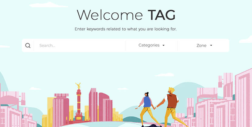
Beautifully textured illustrations in fresh and bright colors depict a great idea behind this platform – to help you find places in the city with no discrimination. The illustrations are diverse and appealing but made in the same style and spirit.
24. OLGA HOTEL
Amazing textured illustrations of a winter resort and hotel parts that convey coziness and relaxation in the winter atmosphere. The artistic illustrations are made in a soft pastel color scheme and beautifully recreate the atmosphere in the resort.
25. Google Lenta
An interactive website design with full-width illustrations made in a simple flat style. The home page is quite eye-catchy, especially when you find out that it interacts with you when you move the cursor around.
26. Marie Sahy
A very extraordinary and definitely attention-grabbing hero illustration image of a website portfolio. A great combination of bright colors, a playful small animation of details, and an engaging interactive motion when you move the mouse’s cursor.
27. Be-connected.ch
Be Connected is a networking platform for startups in Bern, Switzerland. And while it focuses on building relationships with huge institutions, the website UI focuses on creativity. We can see a lot of animated 3D cartoons which illustrate the roadmap of each startup project.
28. Clacdesdoigts.com
Clac is a unicorn business, as you’ll rarely come across personal concierge services. Clac has a website with illustrations but the French company uses a minimalistic design. We can safely say the website copies the “gourmet” philosophy – it has the looks, it’s refined and the content is just enough.
29. Wavetotable.com
WaveToTable focuses on raising awareness about the habit of eating fish and finding more sustainable ways to preserve the ocean. The website uses animated flat illustrations to create a lasting impression on people. There is a visual hierarchy where “blue” is the main color but the CTA buttons are “orange”, to create contrast.
30. Sony Music
This is one of the best websites with illustrations, and it’s Sony’s own one for Japan! There are lots of marvelous cartoons. And we have to say these motion 3D characters look amazing in the background which ensures they will stand out.
31. Onedashcloser.app
3D motion illustrations give “life” to any website. Especially for this DoorDash driver recruitment program. Using a story with a main character can be a killer move if used correctly. It makes the UX interactive, and it drives engagement rate.
32. Prevalent.ai
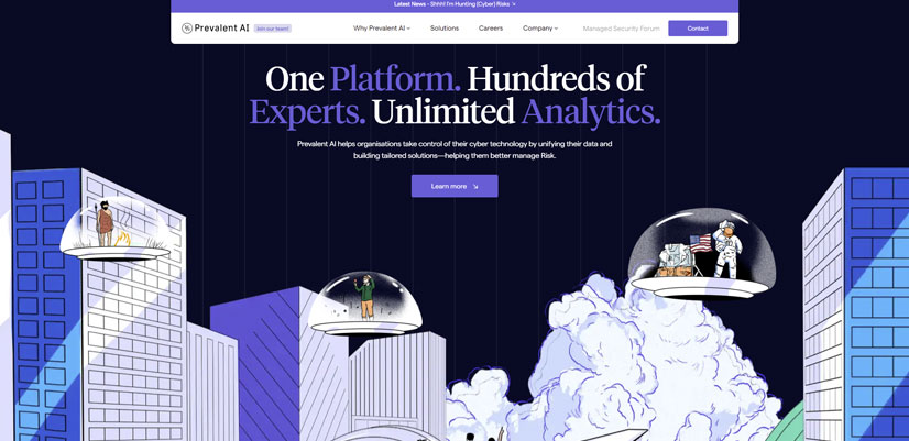
Prevalent AI is an illustrated website that has an interesting mix of standard header and footer, and a ton of illustrations to display their security data science services. Another impressive thing is the linear design which we can find here, creating a feeling of structure and organization.
33. Madskullz.io
MadSkullz is a game in the NFT space. It’s full of NFT illustrations as any website of such kind but what grabs the attention is the dark/light mode with several options available, and there even is a grainy background on the Madskullz Playground menu.
34. Enricmor.eu
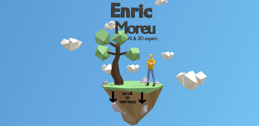
On this website we can find a lot of illustrations, and cool 3D motion design. The website revolves around the portfolio of Enric Moreu which is a one-pager and the only text here are the titles of each “chapter” of the resume. What we liked here is the original idea to represent a person with art.
35. Happykdcxmas.nl
Camping Geversduin is a Dutch company that offers outdoor tourism activities and stays. The green color is primary in the website design, as it is associated with “green activities”. The illustrations on the landing page represent the business idea and the animations make you pay attention to the scene.
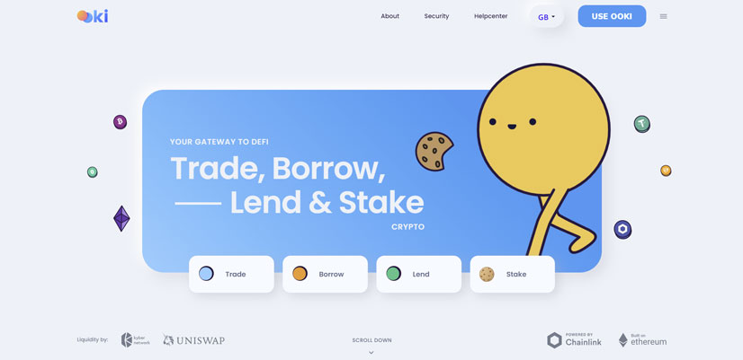
36. Hello.Ooki.com
OOKI is a financial decentralized application with an adorable mascot that brings a smile to your face immediately. The interesting thing about the design is how well financial charts and flashy 3D illustrations work together. We have to mention blue and its nuances are dominant which is typical for financial services.
37. Viviresacojonante.campofrio.es
Тhis is a unique campaign that wants to brighten us. This illustrated website is quite interesting, as we can see the front being colorful while the back is dull. This specific type of website design is called perspective and it creates the impression of something big.
To wrap up, if you have decided on using illustrations for your next website design, you are definitely on the right path to impress your future visitors. Being a little biased for illustrations here at GraphicMama, we really believe that websites with illustrations fall into one of the most creative web design styles.
If you are looking for even more website design inspiration, why don’t you have a look at:
- Web Design Inspiration: 40 Designs to Get Addicted To
- 39 Inspiring Website Color Schemes to Awaken Your Creativity
- The Best UI/UX Design Software: Complete Comparison Guide
- 37 Character Illustration Styles and Examples [Mega Inspiration]













![The Best 24 Fonts for Modern PowerPoint Presentations [+Guide]](https://i.graphicmama.com/blog/wp-content/uploads/2022/06/11065214/the-best-24-fonts-for-modern-powerpoint-presentations-120x70.png)

