![How to Use Seamless Patterns in Your Designs [Tips and Tricks]](https://i.graphicmama.com/blog/wp-content/uploads/2020/07/14125818/How-to-Use-Seamless-Patterns-in-Your-Designs-Tips-and-Tricks.png)
Seamless or repeated patterns are versatile and create interest and texture as well as a flow. Product and package design have long used this method and graphic and web design, in particular, are quickly picking it up.
Patterns in web design are seen as being one of the fashion movers and shakers in recent years. They have been coming for a while and it seems it’s their time. Often used to make backgrounds more interesting, seamless, or repeated patterns create a continuous image. The trend for right/left up and up/down scrolling patterns can link the site as a whole. They can be single repeated images, numerous images, or a texture placed without borders or frames.
The great thing about patterns is the variety, from floral curves to geometrical shapes and lines, from images to illustrations, colored or black and white. Now, we’ve set the scene – we need to give you some vital pattern design tips to help you create beautiful patterns to accentuate your design.
The most obvious thing to point out is that if you are doing a seamless pattern design, please, please, please make sure it is seamless. Mind the gaps. It’s not even in the tips – but better to get it straight out there.
Now the really useful tips.
Tip 1: Scale Matters
Scale is not size. Scale is the size in relation to its surrounding objects. Perhaps more than other elements, the scale can direct attention to the relation between a design and its pattern. But beware equally it can distract away. If your pattern is a background, its job is probably to add to the design not dominate it.
Tip 2: Readability is Really Important
One of the most, if not the most important factors in website UX design is readability. You need the readers to take in the text, easily and efficiently. Nobody will work for it, they need it on a plate. If your pattern is being used as a text background there needs to be contrast – clear and distinct contrast too. You can make this with some solid background for your text for example.
Tip 3: Patterns Set the Atmosphere
Given that patterns are mostly used as backgrounds, the quality they give to the design is essential to creating an atmosphere. The most important thing to remember, it seems obvious but you’d be surprised, is that the feel of the pattern most fits with the content of the page. The most fantastically imaginative futuristic, street art style may look great but does it fit with your law firm?
Tip 4: Choose The Right Format
Pattern designs are available in different formats – use some lower size formats such as JPG, WEBP, or even better for web projects – SVG. Check which is more appropriate before getting carried away with the creative act.
For more information, you can take a look at the best image file formats right now.
Tip 5: Choose The Perfect Pattern Color
Pattern designs need to be more careful than most when considering color. The brighter the better does not necessarily hold true. Subtlety is often the key, nothing overly aggressive or dominating. Equally, keep your color combination simple, and remember to contrast with the foreground. Don’t fight it, feel it.
You may also be interested in our Color Theory Beginner’s Guide or you can take a look at some of the trendy color combinations in 2022.
Tip 6: Check The License
There are many pattern designs on the net, an incredibly varied selection often editable with literally something for everyone. Many are free, some are paid. Check the licenses – even if the design is free, it may need attribution, sometimes the licenses will limit usage to personal only… a little time checking might save a lot of work later.
You can start searching patterns from here: 13 Sources of Free Vector Images for Commercial Use
Tip 7: Branding Consistency
You want your brand to be instantly recognizable as you, you want your brand to represent you, and you want your brand to attract attention. Patterns are perfect for branding, allowing the creation of a unique vision and style. If the brand already has some brand identity and style – use it. Don’t run from the obvious embrace it. Try brand colors, lines, and shapes that are synonymous with the brand, or at least associated. Think about the products that the company is selling, could be some clever usage opportunities here.
Tip 8: Don’t Overuse The Pattern
The old adage less is more is still true today. There is a temptation to overuse, especially as you’ve got a great design. The problem is that over-stimulation is a real issue. You don’t want to make people ill. Split the use for certain sections, or use vary the colors slightly. Very light patterns that won’t distract too much, and are still subconsciously effective in holding everything together as one.
Tip 9: Optimize The Files
The general rule is to keep your patterns light, not necessarily in color but definitely in file size. Heavy files will affect the site’s performance and that’s the last thing you need. Optimization tools, such as tinypng.com, or ezgif.com will do the trick.
Tip 10: Test, Test, Test
If you are planning to use it for print, you should definitely make some test prints first. What looks good on your mockup might not look good on a full scale. Also, it’s worth being aware that different print agencies use different printing machines. Check this out before ordering a huge amount – it could be costly.
Web designers need to test the real look and think about the effect on different devices, screen qualities, etc.
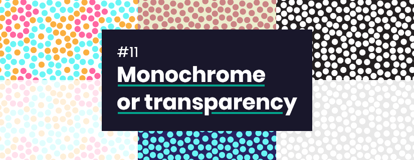
Tip 11: Consider Monochrome or Transparency Patterns
Think outside the box, and push your comfort zone. Monochrome doesn’t have to be black and white, experiment with other colors. Transparency is another fashionable background choice these days. Often creating a background that is hardly noticeable but strangely effective, almost hypnotic.
Tip 12: Experiment With Different Patterns
Designers are pushing boundaries all the time. You might have something specific in mind but keep your options open, check out inspirational sites and blog articles, save sites that have interested you, and look at competitors or award-winning sites. You don’t need to take a passive approach to be active. Place different backgrounds on your design to see the effects yourself, try a few different ones, it’s quick and easy to change, and you are not tied.
Tip 13: Ask for Opinion
Ask for the opinions of others, sometimes you get so caught up in a design that you can’t see the woods for the trees. Step back, invite others to view, and listen to their point of view. You don’t have to agree but you do have to acknowledge their comments, even if it’s only to reinforce your own.
Final words
Patterns can make an incredible difference to design so they are worth thinking about. They can push a good design into being a great design, they can also make a good design into a mess. As a designer, you already know what you do better than most, but that doesn’t mean there isn’t more to learn, inspirational ideas to find, and doors to open. There are loads of pattern design sites and pattern categories on stock sites, or why not try creating your own with software such as Adobe Illustrator, Photoshop, Figma, Adobe XD, Sketch, Indesign, Affinity Designer, CorelDraw, etc. We hope these 13 tips will prove lucky for some, useful and helpful, even if they just lodge somewhere at the back of your mind. The main thing to remember is a pattern is not a pattern for its own sake, it is a pattern to complete a job.
You may also be interested in some of these related articles:
- 150+ Free Pattern Designs: Seamless & Fully Editable
- 40 of the Coolest Web Designs with Pattern Backgrounds + Freebies
- The Best Free Photoshop Brushes, Textures, and Patterns on the Web
You can test your new skills with these 15 free pattern designs:
Check out this vector seamless pattern designs collection, which includes 1114 unique pattern designs with 15 free seamless patterns to test the bundle), that are perfect for print, web design, graphic design, presentations, and more. It can be used in any design software, such as Illustrator, Photoshop, Indesign, Sketch, Affinity, and more. Available in vector format (AI) and transparent PNG.
Go to Download


