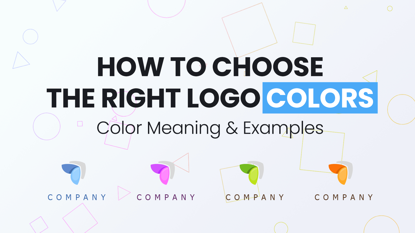
Creating a logo that resonates with the brand’s personality is one of the biggest challenges that designers face. One of the main and well-considered decisions that have to be made is the choice of the right logo colors.
In this post, we will review the most popular logo colors and explain their characteristics, along with the associations they raise. When designing a logo, it’s extremely important to take all these factors under consideration, so you send a clear and strong message to potential clients. Let’s begin!
You may also be interested in the Top Logo Design Trends in 2022
Red logos
Red is the hottest color on the color wheel and as such, it manages to bring out the most intense emotions in humans – from passionate love to rage and danger. Red is a color that doesn’t go unnoticed, so brands who choose it in their logo certainly love being in the spotlight. Red is suitable for strong and confident brands that simply can’t play it safe.
✴️ Meaning: passion, love, danger, anger, power, confidence
✅ Perfect for: bars, clubs, gaming, brands in the food industry
Orange logos
Orange is a secondary warm color, way more playful and down-to-earth compared to the aggressive red. Orange is the color of the fall, so it is often related to movement and change as it marks the transition between seasons. Brands who choose orange for their logo, usually want to be accepted as fun, creative, youthful. These brands are certainly ones who embrace change and fresh ideas.
✴️ Meaning: creativity, fun, youthful energy, vitality
✅ Perfect for: innovative and creative brands
Yellow logos
If you want your brand to be accepted as optimistic and bursting with joy, then yellow is your color. Being the color of the sun, yellow is not only the second primary color on the color wheel but the color that brings the most positivity among all. Yellow is a highly noticeable color that can nail the attention instantly, so often means importance and alert, as well.
✴️ Meaning: optimism, joy, energy, importance, caution
✅ Perfect for: brands with fun and accessible products, brands in the food industry
Green logos
Green is a down-to-earth, refreshing color that mostly suits brands who are ambassadors for healthy living, spiritual peace, and harmony with nature. Green is a relaxing cool color and one that represents eco-friendly production and recycling. On the other hand, green is also related to money and wealth, so in some contexts, it may mean prestige.
✴️ Meaning: nature, renewal, freshness, health, money
✅ Perfect for: pro-organic and close-to-nature brands, real estate and finance-related brands
Blue logos
Blue is a cool primary color and the most preferred color in the world. Blue is the color of the business – it conveys stability and trustworthiness. Moreover, blue has a calming effect because it is naturally associated with the sea and the sky. Brands who choose blue in their logos, usually want to be accepted as stable, reliable, and communicative.
✴️ Meaning: reliability, stability, professionalism, calmness
✅ Perfect for: corporate and business brands
Purple logos
Purple is a rarely used color for a logo which is why brands who choose purple for their identities are quite easily recognizable. Traditionally, purple is associated with high class and luxury which is why it goes very well with high-class, elegant brands. But purple is quite a mystic color, as well. It provokes curiosity and boosts the imagination. The lavender nuances of purple are connected with romance and softness.
✴️ Meaning: royalty, luxury, mystery, imagination, romance
✅ Perfect for: luxury brands, romantic brands
Pink logos
Depending on the intensity, pink can convey various characteristics but usually, it is accepted as a feminine color. Paler shades of pink are accepted as girly. Soft and medium pink nuances are often used in romantic projects (think of St. Valentine’s day designs). Neon pink is more energizing and screaming for attention, however, again considered more feminine than other neons.
✴️ Meaning: a feminine color, romance, love
✅ Perfect for: feminine and girly brands
Did you know, that pink & purple are one of the best color combos in 2022?
Brown logos
Brown is a warm, natural, earthy color usually related to natural earthy materials like wood and soil. Brown conveys simplicity and unpretentiousness but also durability and stability – perfect for organicity oriented brands. And of course, chocolate! Brown raises instant associations with the sweet cocoa-rich temptation, so this is the perfect color for chocolate brands, cake stores, etc.
✴️ Meaning: earthiness, organicity, simplicity
✅ Perfect for: pro-organic brands, chocholate and pastries stores and brands
Black and White logos
In terms of logo design, black and white is usually a color duo used for minimalist logo looks. The two opposite colors which according to the color symbolism have completely opposite meanings – one representing the good and the innocent, while the other representing the bad and the mystery – actually look good with any other color from the color wheel. This is why almost every logo has a black-and-white version, as well. It is versatile, neutral, and unobtrusive.
✴️ Meaning: simplicity, minimalism
✅ Perfect for: brands that aim for simplicity and versatility
Gray logos
When it comes to using gray in logo design, this is usually an additional color. Since pure gray is a mixture of black and white, it goes well with any other color on the spectrum. Fully grey logos usually mean unobtrusiveness and keeping neutrality. Gray can have the characteristics of either black or white depending on which one is prevailing. Light grays look softer and pure, while darker grays look more dramatic and mysterious.
✴️ Meaning: neutrality, conservativeness
✅ Perfect for: a supportive color in logo design
Multicolor logos
The spectrum of the rainbow has been an inspiration for many brands and it expresses the variety on all of its senses. Brands who choose a multicolor color scheme for their logo, usually communicate informality, openness, inclusivity, and/or speak of a huge diversity of products or services. Such brands are easy-going and approachable and their logos certainly manage to catch the attention.
✴️ Meaning: diversity, playfulness, informality, creativity
✅ Perfect for: global brands, brands for children’s products
Let’s wrap up
Logo colors and what they mean are among the first tasks of each newbie logo designer. The power of colors is undeniable and proven on many occasions, so the best you can do is use in the favor of the brand itself. When in doubt, use neutral colors, when certain, go with bold colors. Either way, we hope this guide was useful to you.
If you are interested to check out more useful topics, have a look at:
- Cool Logo Ideas for Your Next Outstanding Logo
- Best Logo Creator Tools & Generators: Fast, Easy, Cost-Effective
- Free Logo Design Templates: 100 Choices For Your Company


