A selection of tutorials and tips on how to create a poster in Illustrator, Photoshop, and InDesign.
Posters are everywhere. both in the physical and virtual worlds, whether you notice them or not! It is a traditionally accepted medium for conveying a message or information to the public. So, if made carefully and beautifully, they can be very useful in establishing contact between the brand and its audience.
A few of the best software used to create and design logos, graphics, typography, and other complex illustrations, are Adobe Illustrator, Photoshop, and InDesign. So, now let’s discuss some tutorials available online to teach you how to create a poster easily by using all three of these.
So, let’s move forward!
1. Create a typographic poster in Adobe Illustrator
2. Create a movie poster in Adobe InDesign
3. How to create a poster for an event in Photoshop
4. Abstract Gradient Style Poster Design in Illustrator CC 2019
5. How to make a show poster in Adobe Illustrator
6. How to create a poster: tips for Illustrator
7. Five poster design tips
8. Creating analog poster design
9. How to make a COOL poster
10. What makes a good poster design
11. How to create a retro poster
12. Creating a movie poster
13. Crafting an infographic poster design
14. Figma poster design tutorial
15. Brutalism-inspired poster design
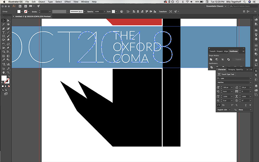
1. Create a typographic poster in Adobe Illustrator
A blog post tutorial by 99 Designs.
If you are a complete beginner, we would recommend you to start from the very basics of poster creation with Adobe Illustrator. This article thoroughly explains the whole process of creating a very basic typography poster. It starts by explaining how to set up the document, how to add text, and how to set fancy arrows, shadow text effects, and curves on texts. Then it explains how to create under-text ribbons and play with intents and invents, and finishes with the tips on how to add texture to the background.
So, if you have no experience with Illustrator, you might take your first steps of creating a poster with an inspirational or funny quote by following this tutorial.
2. Create a movie poster in Adobe InDesign
If you are interested in making posters in Adobe InDesign, then you should definitely check out this tutorial. It’s crazy how in just 20 mins it shows how to create a movie poster. The tutorial starts from the very beginning, including even the technicalities of how to create the file. You will learn how to play with the objects and will get some impressive tips and tricks on working in Adobe InDesign. At the end of the video, you will have insights not only on the images and objects in your poster but also about the text and colors. This will be very simple to understand even if you have no previous experience with InDesign.
3. How to create a poster for an event in Photoshop
Here is a very useful tutorial introduced by Design Cuts on Youtube on how to create an event poster in Adobe Photoshop. In less than 10 minutes this video tutorial shows how to create an awesome event poster using different paint textures. After watching this video you’ll think that all those hours spent trying to figure out how to make that event poster was pointless. All you had to do is to watch this video which lays out everything so perfectly for you that it seems like a piece of cake.
4. Abstract Gradient Style Poster Design in Illustrator CC 2019
Ram Art Creator is a graphic designer from India who has a Youtube channel where he shares helpful practical videos on Photoshop, Illustrator, CorelDraw, etc. This specific example here is on designing an abstract poster using Adobe Illustrator. The process starts from the very beginning: how to set up a new document. So, again, you can do it without any prior knowledge and skills. The video does not contain audio guidance, but there are texts below on what you should press, etc. What is more, you can feel free to ask for help or for further explanation from the author. When going through the comment section we see he is being very responsive and helpful. So, feel free to ask. Overall, the process is very detailed. You will learn to work with shapes, colors, and typography.
And also, we would recommend watching other videos available on his channel on similar topics to find working hacks for different art styles.
5. How to make a show poster in Adobe Illustrator
This funny article is a very useful guide for a complete beginner to learning how to make a show poster using Adobe Illustrator. It starts from the very beginning, showing how to download a legal version of an Illustrator.
The course explains the whole process and teaches all the tools and techniques you will need to start the process. It starts with how to create a document, introduces the workspace, tools, and panels menus. Then it explains how to make shapes, change their colors, etc. It then acquaints you with alignment and grouping tools. Overall, you will learn how to work with objects and texts. In the end, it shows how to export the file in a print suitable format.
6. How to create a poster: tips for Illustrator
This is not a tutorial on how to use the Adobe software. It is rather a theoretical guide on how to create a poster. Watch this video and you will have a checklist of what to pay attention to when making your poster.
Here is the checklist for you here:
Concept: Think about the concept of your poster and you know what you are doing, even before touching your computer.
Theme: Take into account the typography, color choices, the imagery, graphics, and how all of these elements interact together in your poster design.
Distance: Make sure your final design is readable from a distance.
Space: Don’t include too many things in your design to avoid making it noisy. Leave some space for it to breathe.
Typography: Be mindful of how many fonts you are using and if those go with each other well.
Contrast: If you want to grab attention, add some contrast to your poster design.
Keep it simple: This pretty much speaks for itself. Don’t complicate things.
7. Five poster design tips
Will Patterson is one of our favorite design lecturers, as he can break down his points into subtopics and make it easy for beginner designers. In less than 9 minutes, you will learn how to create a poster that stands out by applying five unique tips:
- Adding contrast – you’ll see why adding color hierarchy is well worth the shot.
- Using grids – to help you position your designs professionally.
- Working with typography – how and why you should stick to a minimum amount of font families.
- Utilize images – to understand how images can bolster your design.
- Zoom In/Out – you will see why having a “natural” glimpse will help you out.
8. Creating analog poster design
This video tutorial teaches you how to create an analog poster design. Jesse Nyberg explains in a couple of simple steps how to start from an image and then turn it into a beautiful and provocative concept.
You will see some good techniques and the guide is especially useful if you use Photoshop for your designs. Jesse covers the image layout, how to position text, add proper spacing, etc. What we loved here is that he turns to creative techniques, like printing out the design, adjusting it, and scanning it again. While you can achieve it by using Photoshop only, it’s always a good idea to try something out-of-the-box.
9. How to make a COOL poster
Elliot is a very cool lecturer and he teaches you how to create a poster that stands out. This video guide is probably not the best one if you are looking for something straight-to-the-point. However, we loved how the video is oriented toward designing a concept, rather than just coming up with “something”. As a designer, you’re supposed to take breaks and recharge your batteries. The final product was a beautiful and inspiring Photoshop poster.
10. What makes a good poster design
No matter if it’s related to poster design or any type of design, it’s always crucial to follow the best practices. In this video, Gareth David explains the history of posters and not only that.
The tutorial mentions few crucial topics:
- Visual Hierarchy – how to position each item depending on the value you assign them.
- Element placement on the grid – how to place items on the grid.
- How to find a balance between shapes – how to utilize space and focus on more important details.
- Creating an impression – how to grab your audience’s attention with the poster.
11. How to create a retro poster
Trends change and what has been interesting yesterday might not be interesting today. But might be the “new black” tomorrow. 80s designs are a thing today. In this video, you will learn how to create a poster using Kittl. While this app isn’t that popular, we liked the concept of retro designs. You will also see how to add retro illustrations and Memphis elements, and how to carefully choose icons and add texture so that the design captures the attention.
12. Creating a movie poster
Movie posters are quite popular, so we need to pay them attention. In this video tutorial, you will learn how to make a poster that will impress film fans. A variety of techniques are used in the Photoshop explanatory video – like object selection tool, clipping masks, playing with colors, and many others. The good thing is we can see the whole process in the video, rather than just the steps and the final results.
13. Crafting an infographic poster design
Learning how to grab attention with infographics is going to be a major difference-maker. In this video tutorial, you will not only learn how to create infographics, but how to properly create the design in Adobe Illustrator. Bear in mind this is an advanced tutorial, so you need to have some drawing skills before achieving illustrations like these. Fortunately, you don’t have to be a design hero to create the infographics.
14. Figma poster design tutorial
Figma is an amazing app where you can create plenty of things. We have already come up with Figma tutorials for beginners and advanced designers. In this partial video guide, you will learn how to create a poster promoting a webinar. The guide is pretty straightforward, without commentary, so if you like videos with no voiceovers, then you might find this tutorial useful. You will see how to utilize shapes, fonts, and gradients, as well as add images and optimize components.
15. Brutalism-inspired poster design
Brutalism is a relatively new web design trend that is quite impactful. It’s a raw interaction with users, and it creates a sudden impression, as it appears to be contrary to all other trends. In this video tutorial, you will see how to create a poster in style. You will see which elements fit the “agenda”, how to add texture, or how to choose fonts, and icons. What we also loved is how the author switches from Adobe Illustrator to Photoshop to get the best out of each program.
These are just some quick tutorials you can follow to easily create something similar. You can also read and watch all of it and experiment later. However, if you are interested in graphic design, then you should definitely go deeper into learning more and advancing your skills to free your creative mind.
Here are a few related articles which you may find useful:


