Facebook profile and cover images are very powerful tool to express yourself or your business on social media. Visitors are immidiately attracted by these visuals and their opinion and perception is influenced by the images you choose. Last, but not least they communicate a large amount of information and the main message you want to send to your audience.
There is one difference, though, between the profile and cover image – the profile image is displayed not only on your profile page, as the cover image is, but also next to comments and stats you add. Keeping that in mind, we thought of an interesting, single coordinated design where your profile and cover images work together. We made a step-by-step tutorial + template to help you create unique designs for your social media.
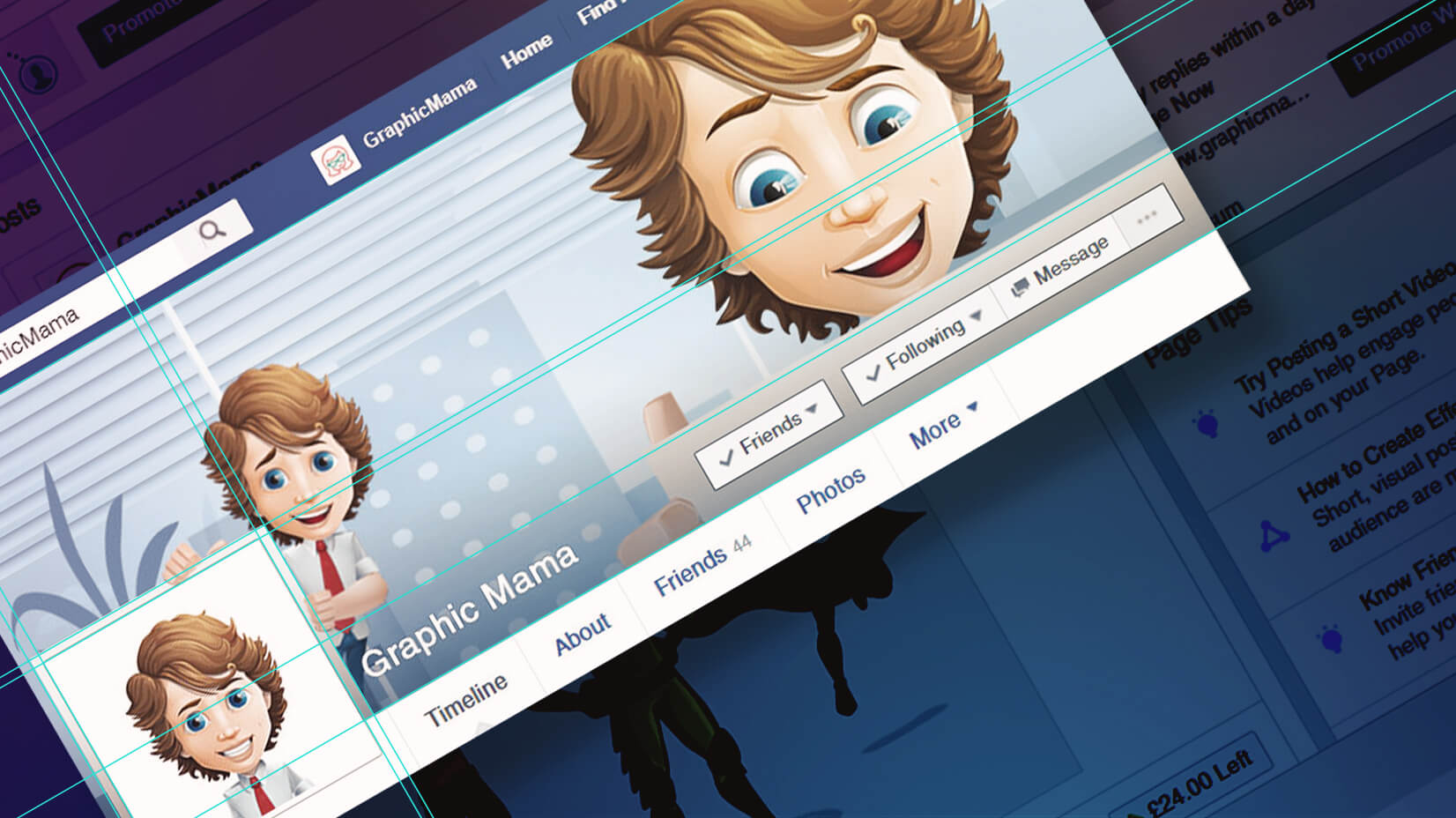
In this tutorial, we will explore how to create a cartoon facebook cover image where you appear to be holding your profile pic in your hands. Also, a cartoon character will be holding the facebook buttons. It’s a creative spin that will impress your followers.
There are tons of characters on GraphicMama that will do a great job fitting in nicely in almost any creative project, related to cartoon facebook cover photos.
1. Get Familiar With Facebook’s Requirements for Cover Images
There are some basic things you need to know in order to get the most out of your cartoon facebook cover design project.
- Your image must be exactly 851×315 pixels otherwise Facebook will try to crop or resize it which will result in an obvious disparity between your design project and the final result on your facebook profile page.
- Your profile picture on your facebook page is displayed as 160×160 pixels which is a perfect square. Facebook requires you to upload atleast a 180×180 pixels image. This is the minumum image size they accept. You can upload your image in any size above 180×180 pixels, just make sure it’s a perfect square.
- Facebook adds a thin solid white border around your profile picture and there is nothing you can do about that. Your only option is to incorporate it in your design.
- Facebook adds a black to transparent gradient at the bottom of every cover image.
Before we get started with the actual tutorial we took some time to prepare a template for you to work with, just to make things much easier.
Download the Photoshop Template File
2. Getting Ready
Step 1: Be Creative
This is the part where you get the chance to express yourself through your facebook profile page. You can do pretty much anything but since we are making cartoon facebook cover image, we chose one of our resources from GraphicMama – Mike Millennial. He is young professional and full of energy and comes in diferent poses to work with, just as any other resource on our website.
Step 2: Prepare The Resources You Are Going to Work With
The idea for our cartoon facebook cover image is to make Mark stand behind his profile picture while holding it with his hands. We also want to place him one more time on the right side, this time holding a blank paper behind the facebook buttons, ovelapping the cover.
These are Mark’s poses we decided to use:
For the cover’s background, we used an office illustration from Nikki’s bonus poses.
3. Design Phase of the Cartoon Facebook Cover and Profile Pic
It’s time to put the resources we’ve gathered in use.
Step 1: Open The Cover Photo Smart Object
Open the template file you just downloaded and open the smart object called Cover Photo by double-clicking on it’s icon in the layers panel.
Once you’ve done that another file will be opened in Photoshop. This file is the exact same size your cover image should be – 851×315 pixels. This is the place where we are going to design our cover.
You will notice some light blue lines crossing the document. If you don’t see them, go to View -> Show -> Guides and they will appear. These guides indicate where the profile picture and it’s border will overlap the cover image. For your convenience we’ve highlighted that area in red on the picture above. Everything that ends up in this area will be hidden from the profile pic.
The line that’s close to the bottom of the document plays the role of a safe area for your name and the buttons facebook places over the covers. If you want these to be on a solid color background, for example, this line will guide you. In our case we are going to use it to position Mark and his blank paper behind the buttons.
Step 2: Put Mark Behind The Profile Picture
In order for Mark to be able to hold the profile picture without his hands ending up hidden behing it, we need to create another border, slightly bigger than the one facebook will add. This can be easily done by creating a rectangle around the outter profile picture guide.
Now that we have something Mark can hold onto, we simply place his hands over the white rectangle and his body behind it. Make sure his hands are not in the profile picture area. If you leave his hands there, he might lose a finger or two.
Step 3: Bring Mark Number 2 Into The Picture
The green area on the image below indicates where your name and cover buttons are going to be. You can make it solid color if you want, it is always an option, just remember that facebook also applies a black to trasnaprent gradient on the bottom of the cover images, so your name would be visible even if you upload image with white background.
Here we need to make sure Mark’s blank paper is slightly over that guide line near the bottom. You may have to redo this step once or twice until you get the perfect result.
Step 4: Add a Background
Since Mark is a business boy, we decided that an office environment will suit him well.
For this purpose, and also for the sake of saving time, we used the office illustration from Nikki’s bonus poses.
Congrats! Your cover is ready!
Save the smart object document, close it and go back to the template from the beginning of the tutorial.
This is what we got:
Step 5: Customize the Profile Picture
At this point your cartoon facebook cover image is ready but since it goes hand in hand with you profile picture, we need to pay some attention to it, too.
Get inside the smart object called Profile Photo by double-clicking on it’s icon.
In case you have transparent PNG image, you can change the red color to any other color you like by double-clicking the Background Color‘s icon in the layers panel.
After you’ve changed the color, place your image in the document and position it the way you want it to appear on your profile.
This document is 540×540 pixels. Remember that facebook displays your profile pic as 160×160 pixels image so if you want to see how it’s going to look like once uploaded on facebook, just save this document and go back to the template file. It should be already updated there. Repeat this process until you are finally happy with the result.
4. Exporting the Images
Once you are happy with your final cover design go ahead and open the two smart objects we’ve worked in again and export them as JPEG files.
Choose File -> Save As, select JPEG from the Save as type dropdown menu and click Save.
We hope this tutorial was useful for you and if it was of any interest for you, let us know, and will create more of this type of content! If you have any questions, drop us a line, we will be happy to answer all of them! Now go smash your Facebook profile with awesome design! Oh, and we are curious to see your results, too! So don’t be shy and show them to us!


