
Today we will be throwing light on some issues related to web design mistakes and design principles in general. It is an era of digital media and now designers have to pay attention to two main components specific for web design.
We will discuss the very common 22 design mistakes that beginners make and how we can avoid them. Even if you are not a designer, this article is easy to read piece, which will help you evaluate your own business’s website, apps or other products and help your design team with some useful insights and comments.
After all, it is very competitive time for brands, and you have to make sure your products are easy to consume, interact with and pleasant to look at!
UX or UI?
In short, UX design refers to the term user experience design, while UI design stands for user interface design. Both elements are crucial to a product and work closely together.
What is User Experience
The first takes care of how users interact with your product, how they use it, what they look for, how they navigate, etc.
What is User Interface
The second one is concerned more with the “look” of things. The UI designers try to create beautiful pages using contrasts, typo, color and different styles, depending on the project.

UX

UI
UX mistakes and how to avoid them
1. Bad communication
Visitors spend 3 to 7 seconds average on a website. That is why you have to clearly communicate from the beginning what is your site about. If you don’t manage to catch visitor’s attention and if they can’t figure out what is your site about they will go some place else. Think what is your product, service and what you are trying to provide the customer with.
Good example
Here is an example of communicating “done right”. You immediately see what is the site about. On the left you can easily find information about the services under the different, simple menus. There is provided LogIn area, which is nice as well:

Bad example
Here is also a bad example of communication. Can you tell what is the website about and where to click first if you want to learn more?
Bridal Store

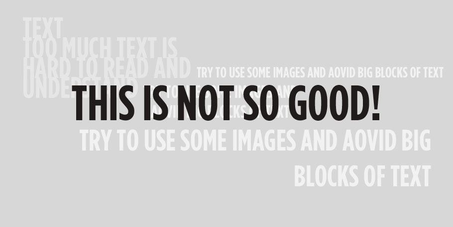
2. Non-scannable content
Websites are not books. If your text has no paragraphs, bullets, images and other ways of sub-dividing information, you risk to bore your customers or frustrate them. Visitors should be able to scan through all the content, so avoid large blocks of text without formatting.
Good example
HostelWorld is one of the good examples for a website with easily scannable content. It is a website, from which you can book hostels around the world. As you can imagine they have loads of information that they had to organize and create an enjoyable visitor’s experience:

Bad example
There are many things that went badly for this design, but one of them is the long lines of text, center-aligned, everything written in capital letters and so on:
Some tips for creating scannable text:
- Use headings
- Don’t forget to use spacing
- Use color to organize content
- Make lists where appropriate
- Highlight keywords
- Prune and chunk it (remove unnecessary info)
Here some further reading on the topic of chunking content and organizing information.
3. Small text
If you make your visitors zoom to see your content, that counts for mobile too, then, you are making a mistake, which can cost you people leaving or not coming back.
Good example
Here is example of content which is made responsive, and is well read on desktop, as well on mobile versions:

Here is a very good article on how to handle all your text issues and design readable content.
4. Registration and subscriptions
Users are often irritated if you ask them to register just to get some useful information from your website. Usually, they come to find information, not to give theirs. Of course, that will depend on your particular project. Avoid to subscribe the users without their permission too. It is not a good practice to send them newsletters, for example, if they didn’t choose this option themselves.
5. Playing audio automatically
If you need to provide some content with audio, give the user the chance to play it whenever he/she needs. Usually, a simple, nice play button will do.
6. Not including your contact details
It’s bad for your clients and yourself to miss out on giving your updated contact details. Often users are irritated to see them both in menus at the top of the page and at the bottom. Some of the best design solutions are when you place your main navigation at the top, and your contact and about us links at the bottom.
7. Many steps to reach your content
Many designers create beautiful home pages… and lots of other pages as well. What they fail to understand is that the users look for the fastest possible way to get to certain information.
8. Slow loading speed
If the website is too slow to load, you risk people leaving before they even see the content. Some of the reasons why your site is slow might be bad code, large images, too many external calls to cloud services, or an overload hosting company.
9. Hunting for information
Depends on the country, but usually users start reading from the top left and move right and down. Place your most important information accordingly and don’t make users “hunt” for the information they are looking for.
10. Avoid clutter of elements
Use white space and give room to your content to “breathe”. Using negative (or white space) is elegant and allows the user to enjoy the experience on your website.
UI design mistakes and how to avoid them
11. Overusing stock images
Stock images often come in handy when you don’t have the resources to hire a professional photographer.

Still, many design studios offer custom graphics as well, which can help you avoid creating overly familiar look with stock photos. Photos are powerful tool and communicate better than text, so spend some time and consider what kind of imagery will give your site a boost. Carefully selected images can significantly increase engagement from users.

You can save yourself a lot of headache with raster images, image resizing and loss of quality by trying to use as much as possible vector graphics. You can read about the differences between raster and vector graphics in our article.
12. Failing to checklist
It is a good practice to show your work to fresh pair of eyes during the process and when you are finished. Working long time on a project can be exhausting and we can can overlook some things. Like the following example – it’s bad. Spend a little time to run a checklist for quality and to ask someone to look over things.![]()
13. Too many words without images
Too much text is hard to read and remember.
Structure your information and put your most important information first. Remember to include photos. You can read more about effective content structuring by reading about inverted pyramid writing.

14. Too many fonts
Using too many fonts looks confusing and “heavy”. Try to look for an inspiration from website you like – explore how the designers made them and what combinations they used. Also, don’t forget to check if the fonts you fancy are free to use or they are copyrighted from owners.

Sometimes, using just one type but with different weights, creates interest and brings structure to your content.

15. Bad letter spacing
Be careful when resizing your text- sometimes you need to adjust the kerning (letter spacing) too. Eyes tend to group things positioned closely to each other and see them as one, that’s why it is important to form nice groups of words, which are easy to read.
Can you read this text?

Much better!

16. Too many colors and poor combination of them
There are a lot of tools on the web, helping you create attractive color combinations and color schemes for your projects. Try and look at AdobeColor for example – you can use it to pick one color, and leave it find the rest, which will look good with it.


17. Not aligning elements
One way to create order and symmetry in your design is to properly align elements. A lack of alignment can make your project look messy, confusing and disorganized.

Here is a the same information but nicely aligned:

18. Not enough contrast
Usually designers use light, dark and bright color to create contrast in the designs. If colors and elements are too close in value, the eye reads it as secondary information… or doesn’t read it at all.


19. Not using visual hierarchy
Visual hierarchy communicates to the viewer what is the most important thing to look at and what is secondary. Highlight the most important areas with color, different font size and thickness.

20. Hard to read text
Sometimes the image you use is too bright, or with many colors and elements. Trying to place a text on top could be a nightmare!

Still, there is a solution – if you put a color overlay on top of your image, you will increase the readability of your text!

21. Complete symmetry
Sometimes complete symmetry can look boring and is one of the design mistakes you can easily make.

Try to mix things up by creating areas with “heavier” content and areas with smaller elements.

22. Lack of consistency
Going through all the examples above, try to pick some colors, fonts and stick to a certain theme when making a project. If you use different effects, colors, etc throughout pages, your product won’t be see as whole, or the user would have to figure out the logic and structure of each page. When you are consistent, you help the viewer to get used to your content and how to find information.
Well, this is our list of 22 most common design mistakes, we hope we helped you identify these problems and avoid them for your own projects!
Stay tuned for more fresh articles and don’t hesitate to ask – we’d be glad to chat about what interests you!