Looking for inspiring website color schemes? We’ve put together a collection of beautiful website designs whose great color schemes will certainly make your creative juices flowing. This collection includes:
- soft and pale website color schemes
- pastel and earthy website color schemes
- bright website color schemes
- dark website color schemes
- monochrome website color schemes
Do you want to check out the Top Web Design Trends 2022?
I. Soft & Pale Website Color Schemes: Feelin’ Comfy
Soft pastel website color schemes are among the most popular choices for website appearances. Such website color schemes are easily associated with romance and purity. They also covey calmness. This makes them perfectly good for a wide array of brands that need to communicate reliability and comfort.
Soft and pale website color schemes are welcoming and cozy. Here is a selection of websites made with such color schemes Can you grasp the comfort and coziness?
1. Beauregard
A website that focuses on the art and beauty of watch designs. The website offers an intuitive experience and was made with a beautiful color scheme conveying purity and comfort. The hex codes correspond to the following colors:
- ISABELLINE
- QUICK SILVER
- AUROMETALSAURUS
- LIGHT GRAY
- BLACK OLIVE
2. Squilla Fund
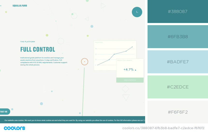
Soft beige tones combined with calming turquoise nuances make this corporate website about investment in crypto industry convey reliability and comfort. Here are the colors used in the creation of this website design:
- TEAL BLUE
- MOONSTONE BLUE
- POWDER BLUE
- MAGIC MINT
- WHITE SMOKE
3. Libenar
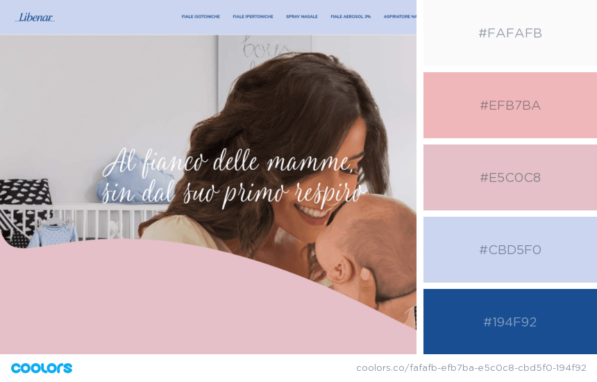
Soft pastel website color schemes convey purity which makes them great for presenting baby products. This particular website was made with soft and pale pink and blue nuances, complementing the main website message. The colors used are as follows:
- SNOW
- SPANISH PINK
- DUST STORM
- SOAP
- YALE BLUE
4. Mont Roucous
A clean and beautiful website promoting a baby product. The designers bet on pale pink hues combined with more purplish nuances to create a beautiful website color palette, as follows:
- CAROLINA BLUE
- PASTEL PINK
- TEA ROSE
- MAXIMUM BLUE PURPLE
- UNITED NATIONS BLUE
5. Cowboy bikes
A website about a new generation of electric bicycles. This design was made with soft golden pink nuances, bold typography colors, and fun golden details. The website color scheme consists of:
- LAVENDER BLUSH
- TEA ROSE
- ROSE GOLD
- RADICAL RED
- LIGHT FRENCH BEIGE

Inspiring Website Color Schemes purple pastel purple and pink website
6. Sahel
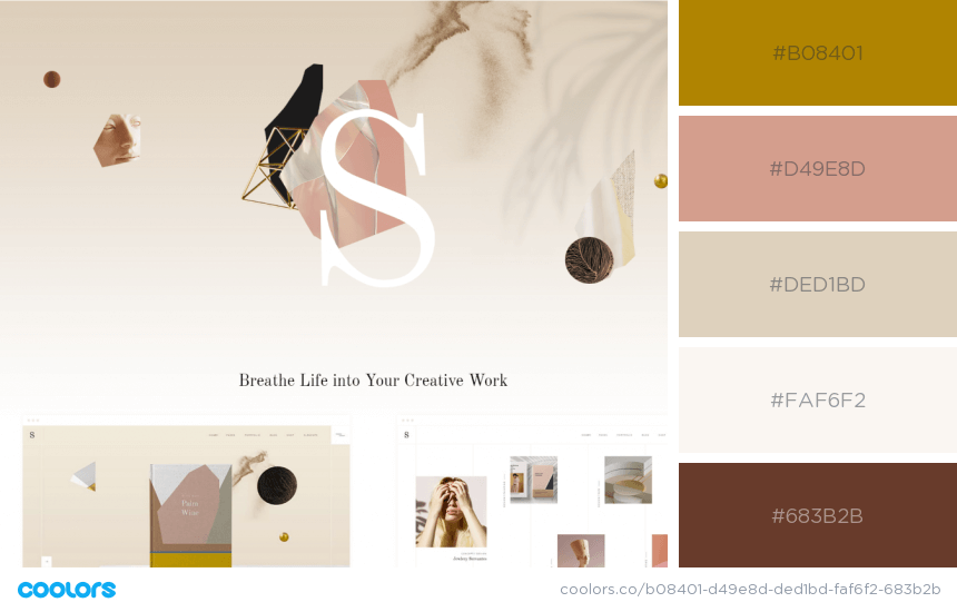
A soft and elegant website design achieved with a sophisticated color scheme combining gentle pastel pink and beige nuances with golden and copper design elements. The names of colors used in this website color scheme are:
- DARK GOLDENROD
- TAN
- DUST STORM
- WHITE SMOKE
- VAN DYKE BROWN
7. Me and Mr. Darcy
A blog presented in a very feminine web design pleasing the eye with beautiful warm colors. This blog about “life and love”, as stated by the owner, was made with a color scheme with these leading colors:
- ALMOND
- CHAMPAGNE PINK
- MIDDLE PURPLE
- KOBI
- SUNGLOW
8. Save the air
A multicolor website design made with a beautiful enchanting rainbow color scheme. Presented in the pale hues of the colors, this scheme surely conveys purity and freshness. The colors used in this design are:
- AERO BLUE
- LIGHT MEDIUM ORCHID
- HONEYDEW
- LIGHT CORAL
- UNBLEACHED SILK
9. Mend Seltzer
A beautiful and romantic website color scheme specifically chosen to present new pro-health products. Combining romantic hues of pink, yellow, and lavender, here are the exact names of the colors used in this web design:
- PLATINUM
- TANGO PINK
- ORANGE-YELLOW
- TOOLBOX
- BRIGHT LAVENDER

Inspiring Website Color Schemes colorful pastel colors website
10. Lobster
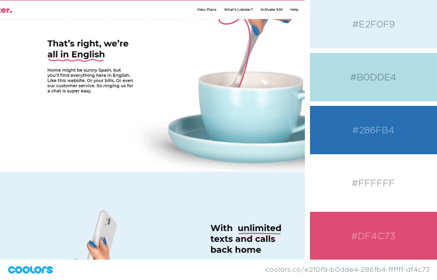
The pink-blue combo is among the most preferred color mixes that please the eye. For this website design, the designer has chosen several nuances of pastel blue jazzed up with energizing pink.
- GLITTER
- POWDER BLUE
- GREEN-BLUE
- WHITE
- FANDANGO PINK
You may also be interested in this article: Psychology of Color – How to Improve Your Web Design
II. Pastel & Earthy Website Color Schemes: Inspired by Nature
Earthy colors, or in other words all colors that can be found in nature, are among the most popular colors chosen for website color schemes.
Greens – the color of leaves and grass, browns – the colors of soil and wood, beige – the color of sand, blues – the colors of the sky and the oceans, yellow and orange – the colors of fire. All of these powerful colors create infinite opportunities for designers to create impactful website appearances. Here are a few to inspire you.
11. Cure Nails
A website design fully made of pastel earthy colors that communicate purity. The nuances evoke associations of nature and go perfectly with the concept of the website – organic skincare products. Here is the palette used:
- PLATINUM
- TURTLE GREEN
- GRAY-BLUE
- TAN
- COCONUT
12. Mountain Man
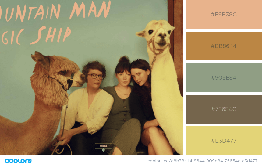
A website created specifically for a new music album. Fully made in warm pastel tones – earthy browns and greens mixed with fruity peachy nuances. The colors used in the website color scheme are:
- PALE GOLD
- DEER
- ARTICHOKE
- DARK BROWN-TANGELO
- STRAW
Inspiring Website Color Schemes retro colors website
13. Andris Gauracs
Based on earthy blues and copper, this website is actually a portfolio of a web developer. The calming effect of the blue convey reliability and trust. Here are names of the colors used in this website color scheme:
- TUFTS BLUE
- FRENCH SKY BLUE
- ALICE BLUE
- WHITE
- COPPER
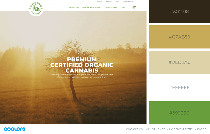
14. The Green Organic Dutchman
Earthy color schemes are perfectly suitable for websites that promote organic products. This is because they are easily associated with nature. Here is a great example of greens combined with golden sand nuances.
- BISTRE
- VEGAS GOLD
- DESERT SAND
- WHITE
- PALM LEAF
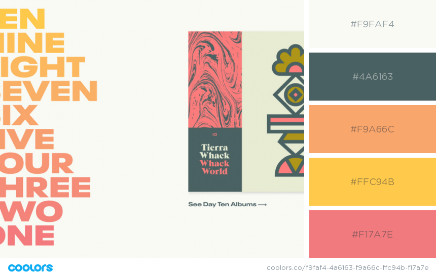
15. 10×18
A website created in pleasant colors conveying warmth and comfort – a website in which 33 artists visually interpret their favorite albums. The warm earthy colors used in this website color scheme are as follows:
- WHITE SMOKE
- DEEP SPACE SPARKLE
- SANDY BROWN
- PASTEL ORANGE
- LIGHT CORAL
16. Adrien Laurent
A portfolio website of a French interactive designer made in brownish-beige earthy nuances mixed up with an energizing orange that reminds of fire. The website color scheme consists of the following colors:
- DUST STORM
- SEAL BROWN
- ORANGE (PANTONE)
- PALE COPPER
- LINEN

Inspiring Website Color Schemes warm colors website
17. Bronze collection by Bang Olufsen
A website about speakers presented in a beautiful artistic style – a bronze theme. Bronze is a famous alloy of metals which translated in a web design, evokes elegance and sophistication. The colors in this palette are:
- ACAJOU
- OLD BURGUNDY
- WHITE
- INDIAN YELLOW
- RUSSET
You may also be interested in 30 Ecommerce Website Design Ideas For Your Online Store
III. Bright & Bold Website Color Schemes: Screaming for Attention
Indeed, bright colors have the power to nail the attention instantly. In contrast to the pastel gamma, bright colors excite and energize the visitor. Websites made with bright color schemes feel refreshing and fun. In this selection, we have picked websites fully made of bright colors and websites combining mixing bright colors with paler tones.
18. MA-TEA
A refreshing drink certainly needs a refreshing website design. A great example of a vivid website color scheme that feels energizing, fun, and balanced at the same time. The leading colors used in this palette are:
- PARADISE PINK
- COSMIC COBALT
- AUREOLIN
- KELLY GREEN
- SAGE
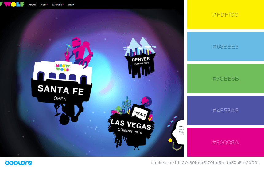
19. Meow Wolf
Bright colors combined with black look mystical and futuristic. This website, which presents an art collective, certainly conveys creativity and mystery that energize and provoke curiosity. Achieved by using the following colors:
- AUREOLIN
- AERO
- MANTIS
- LIBERTY
- MEXICAN PINK
20. Montréal in Motion
A color combo that brings the future right on your screen! Mystic nuances of purple energized with paradise pink and electric blue, translated into beautiful gradients. Achieve this enchanting effect by using the following colors:
- PARADISE PINK
- PALATINATE BLUE
- MIDNIGHT BLUE
- DARK ORCHID
- RICH ELECTRIC BLUE
21. Animat Kreatik
No matter if presented in gradients or in flat shapes each filled with a solid color, bright nuances impress the viewer. In this case – a creative website presenting a flat illustration on a white background to make all the beautiful colors pop.
- KOBI
- HAN PURPLE
- MIDDLE BLUE
- MAXIMUM YELLOW
- RUBY
You may want to check out our collection of Amazing Websites with Illustrations.
22. Happy Online
Bright colors don’t have to be intrusive and all over the place. In this website design, bright colors are translated into fun web design elements that make the whole website experience a lot more fun. The colors used are:
- YANKEES BLUE
- PICTON BLUE
- FOLLY
- ORANGE (WEB)
- MEDIUM SEA GREEN
23. Gramado Summit
A fresh and vibrant color scheme combined with even more graphic design trends in this website design for Gramado Summit: an ultramarine blue color overlay, solid cerise pink background, and pear yellow details.
- CERISE PINK
- PEAR
- PICTON BLUE
- ULTRAMARINE BLUE
24. La Phase 5
Another brand that bet on bright solid color geometric details for their web presence. The white background still conveys the feeling of reliability and the colorful details make the overall look more fun. The colors in this palette are:
- RICH CARMINE
- GOLDEN POPPY
- CAROLINA BLUE
- SEA SERPENT
- ISABELLINE
25. ICO Syndicate
A vibrant combination of signal yellow and neon lavender purple complemented with their paler and softer hues to create a pleasant experience in this website. The website color scheme is as follows:
- FLORAL WHITE
- BANANA MANIA
- SAFETY YELLOW
- MAUVE
- RICH LAVENDER
26. Securinvest
The color of trust blue, combined with an energizing orange, softening pale pink, and exciting neon aquamarine that perfectly grasp the message of this website – a financial service that provokes you to dream big and helps you to live confident.
- MIDNIGHT BLUE
- LIGHT BLUE
- PALE PINK
- MANDARIN
- MEDIUM AQUAMARINE
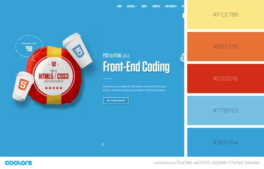
27. HtmlBurger
A fun and easy-going website color scheme for this web development service. The website design was made by using bright and pastel merry colors that break the ice and create a friendly environment for the visitor. The color palette is:
- YELLOW (CRAYOLA)
- DEEP CARROT ORANGE
- VERMILION
- AERO
- CELESTIAL BLUE
28. Juicy Food
Even one bright color can make the whole design feel more cheerful and fun. This is the case for this website. The web designers chose a dark oxford blue overlay for the hero section, a pleasant pastel purple as a branding color, and a vibrant yellow nuance that screams for attention.
- AUREOLIN
- ROYAL PURPLE
- ANTI-FLASH WHITE
- WHITE
- OXFORD BLUE
IV. Dark & Dramatic Website Color Schemes: Unravel the Mystery
Dark color schemes are very popular as they evoke associations of mystery and luxury. And those feelings certainly provoke curiosity. Whether fully dark themed or combined with one bright color to jazz up the screen, dark website color schemes feel intriguing. Check out the websites we’ve prepared for your inspiration.
29. My 360 mirror
To achieve a clean elegant look accompanied by a sense of luxury, the designers of this website used a dark grey color scheme jazzed up with mysterious turquoise nuances. The website color palette includes:
- ONYX
- TAUPE GRAY
- WHITE SMOKE
- QUEEN BLUE
- MEDIUM TURQUOISE
30. Margaux Leroy
A dramatic dark blue monochrome web design combined with an energizing mint green color for a mysterious and fresh look. The website which is a portfolio of a UX | UI designer used the following palette to create this look:
- KEPPEL
- GUNMETAL
- OUTER SPACE
- ARSENIC
- RHYTHM
31. Iván Ibáñez
A black-and-white website design with monochrome grey illustrations and a pop of a vibrant violet nuance. This website represents a freelance UX designer and was made in the following color scheme:
- TROLLEY GREY
- DARK VIOLET
- LIGHT GRAY
- DAVY’S GREY
- JET
32. Production Portugal
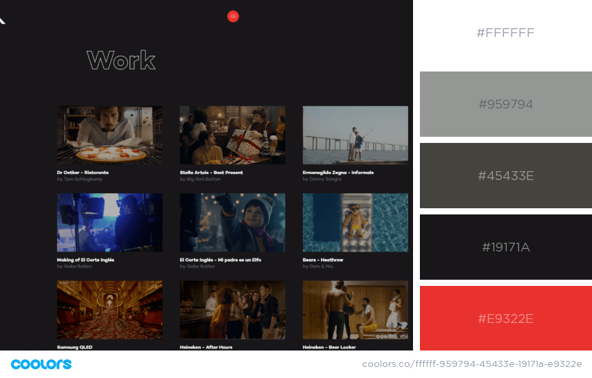
For a platform that showcases works wouldn’t be right to steal the spotlight with a “screaming” website color scheme. For this web design, the creators bet on a few grayscale tones and added a bit of color by using energizing red.
- WHITE
- SPANISH GRAY
- RIFLE GREEN
- EERIE BLACK
- PERMANENT GERANIUM LAKE
33. Microsoft by the Numbers
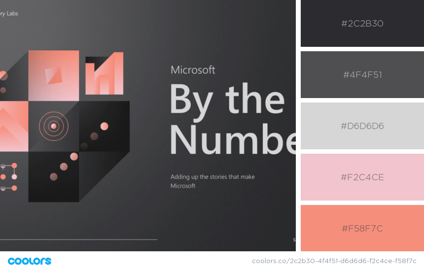
A web page design that epitomizes the perfect example of combining dark and dull shades with warm pastel colors to create a mysterious, yet friendly and soft appearance. The color palette for this web page is:
- CHARLESTON GREEN
- DARK LIVER
- LIGHT GRAY
- ORCHID PINK
- TEA ROSE
Do you want to check out some amazing CSS parallax examples?
V. Monochrome Website Color Schemes: a Single Color for the Win
Sometimes, a web designer would choose one color for the whole web design and play with all its shades and hues to create an experience worthy of competing with multi-color websites. Monochrome websites may feel dramatic, fresh, sweet… it all depends on the color that is used for a base. Here are several examples of websites that rock the monochrome website color schemes.
34. Ephraim Joseph
A portfolio website of a creative director who bets on clean design and clever words for his projects. This is exactly what his monochrome website based on clean and calming ocean blue communicates with the audience.
- INDIGO DYE
- OCEAN BLUE
- TOOLBOX
- BABY POWDER
- PALE AQUA
35. Whitetail Gin
A clean and classy look achieved by using white and several tones of greyish blue in order to grasp the spirit of the brand and embrace the philosophy behind the brand name. The exact colors used in this palette are:
- WHITE
- GLITTER
- OXFORD BLUE
- PAYNE’S GREY
- ROYAL BLUE
36. Fitspirit Fashion
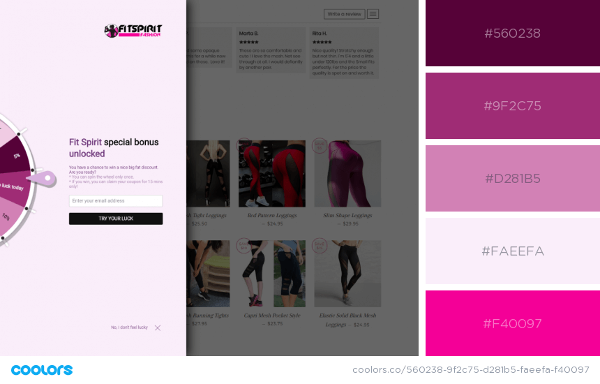
When it comes to creating a monochrome website design whose target audience is women pink is probably the best fit. Fitspirit fashion combined their brand color bright cerise pink with pastel nuances in the purplish pink gamma.
- TYRIAN PURPLE
- AMARANTH DEEP PURPLE
- MIDDLE PURPLE
- LAVENDER BLUSH
- HOLLYWOOD CERISE
37. Sikkema
Energizing, feminine and optimistic, this yellow monochrome website design conveys associations of the warmth and brightness of the sun. The website color scheme consists of several nuances of a vivid yellow.
- TANGERINE
- SELECTIVE YELLOW
- SANDSTORM
- MINION YELLOW
- FLAVESCENT
38. Gotham Siti
A dark grayscale monochrome website whose absence of color conveys drama and mystery. The website’s color palette presented with noise perfectly embraces the dark atmosphere and communicates the website’s message.
- TAUPE GRAY
- RAISIN BLACK
- DIM GRAY
- SILVER
- REGISTRATION BLACK
39. A’ja Wilson
A website design that welcomes the visitor with a purplish grey monochrome video for the hero area with its hues and shades as follows:
- ANTI-FLASH WHITE
- LIGHT GRAY
- OLD LAVENDER
- RAISIN BLACK
- PURPLE TAUPE
That’s it!
We hope this collection of website color schemes inspired you to roll up your sleeves and start creating amazing web designs today. We’ll be more than happy if you share your creations with us in the comments section below. See ya!
You may be interested to read these related articles:
- 80+ Sources To Find Design Resources and Assets
- 10 Web Design Secrets That No One Ever Tells You
- 100 Good Color Combinations That Go Beyond Trends: Inspirational Examples and Ideas

