Updated: June 23, 2022
To create data visualization in order to present your data is no longer just a nice to have skill. Now, the skill to effectively sort and communicate your data through charts is a must-have for any business in any field that deals with data. Data visualization helps businesses quickly make sense of complex data and start making decisions based on that data. This is why today we’ll talk about what is data visualization. We’ll discuss how and why does it work, what type of charts to choose in what cases, how to create effective charts, and, of course, end with beautiful examples.
So let’s jump right in. As usual, don’t hesitate to fast-travel to a particular section of your interest.
Article overview:
1. What Does Data Visualization Mean?
2. How Does it Work?
3. When to Use it?
4. Why Use it?
5. Types of Data Visualization
6. Data Visualization VS Infographics: 5 Main Differences
7. How to Create Effective Data Visualization?: 5 Useful Tips
8. Examples of Data Visualization
1. What is Data Visualization?
Data Visualization is a graphic representation of data that aims to communicate numerous heavy data in an efficient way that is easier to grasp and understand. In a way, data visualization is the mapping between the original data and graphic elements that determine how the attributes of these elements vary. The visualization is usually made by the use of charts, lines, or points, bars, and maps.
- Data Viz is a branch of Descriptive statistics but it requires both design, computer, and statistical skills.
- Aesthetics and functionality go hand in hand to communicate complex statistics in an intuitive way.
- Data Viz tools and technologies are essential for making data-driven decisions.
- It’s a fine balance between form and functionality.
- Every STEM field benefits from understanding data.
2. How Does it Work?
If we can see it, our brains can internalize and reflect on it. This is why it’s much easier and more effective to make sense of a chart and see trends than to read a massive document that would take a lot of time and focus to rationalize. We wouldn’t want to repeat the cliche that humans are visual creatures, but it’s a fact that visualization is much more effective and comprehensive.
In a way, we can say that data Viz is a form of storytelling with the purpose to help us make decisions based on data. Such data might include:
- Tracking sales
- Identifying trends
- Identifying changes
- Monitoring goals
- Monitoring results
- Combining data
3. When to Use it?
Data visualization is useful for companies that deal with lots of data on a daily basis. It’s essential to have your data and trends instantly visible. Better than scrolling through colossal spreadsheets. When the trends stand out instantly this also helps your clients or viewers to understand them instead of getting lost in the clutter of numbers.
With that being said, Data Viz is suitable for:
- Annual reports
- Presentations
- Social media micronarratives
- Informational brochures
- Research
- Trend-trafficking
- SciViz
- Candlestick chart for financial analysis
- Determining routes
Common cases when data visualization sees use are in sales, marketing, healthcare, science, finances, politics, and logistics.
4. Why Use it?
Short answer: decision making. Data Visualization comes with the undeniable benefits of quickly recognizing patterns and interpret data. More specifically, it is an invaluable tool to determine the following cases.
- Identifying correlations between the relationship of variables.
- Getting market insights about audience behavior.
- Determining value vs risk metrics.
- Monitoring trends over time.
- Examining rates and potential through frequency.
- Ability to react to changes.
5. Types of Data Visualization
As you probably already guessed, Data Viz is much more than simple pie charts and graphs styled in a visually appealing way. The methods that this branch uses to visualize statistics include a series of effective types.
Maps
Map visualization is a great method to analyze and display geographically related information and present it accurately via maps. This intuitive way aims to distribute data by region. Since maps can be 2D or 3D, static or dynamic, there are numerous combinations one can use in order to create a Data Viz map.
The most common ones, however, are:
- Regional Maps: Classic maps that display countries, cities, or districts. They often represent data in different colors for different characteristics in each region.
- Line Maps: They usually contain space and time and are ideal for routing, especially for driving or taxi routes in the area due to their analysis of specific scenes.
- Point Maps: These maps distribute data of geographic information. They are ideal for businesses to pinpoint the exact locations of their buildings in a region.
- Heat Maps: They indicate the weight of a geographical area based on a specific property. For example, a heat map may distribute the saturation of infected people by area.
Charts
Charts present data in the form of graphs, diagrams, and tables. They are often confused with graphs since graphs are indeed a subcategory of charts. However, there is a small difference: graphs show the mathematical relationship between groups of data and is only one of the chart methods to represent data.
With that out of the way, let’s talk about the most basic types of charts in data visualization.
Bar Graph
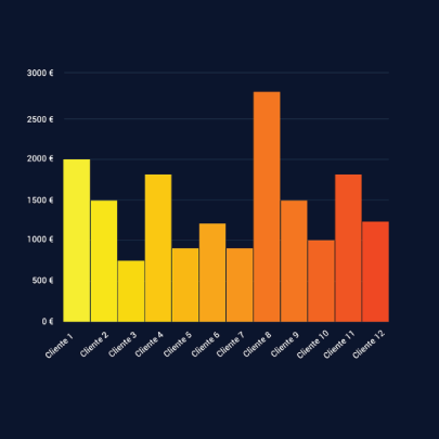
They use a series of bars that illustrate data development. They are ideal for lighter data and follow trends of no more than three variables or else, the bars become cluttered and hard to comprehend. Ideal for year-on-year comparisons and monthly breakdowns.
Pie Charts
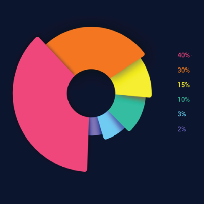
These familiar circular graphs divide data into portions. The bigger the slice, the bigger the portion. They are ideal for depicting sections of a whole and their sum must always be 100%. Avoid pie charts when you need to show data development over time or lack a value for any of the portions. Doughnut charts have the same use as pie charts.
Line Graph
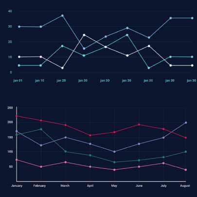
They use a line or more than one lines that show development over time. It allows tracking multiple variables at the same time. A great example is tracking product sales by a brand over the years. Area charts have the same use as line charts.
Scatter Plot
Example
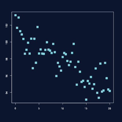
These charts allow you to see patterns through data visualization. They have an x-axis and a y-axis for two different values. For example, if your x-axis contains information about car prices while the y-axis is about salaries, the positive or negative relationship will tell you about what a person’s car tells about their salary.
Tables
Unlike the charts we just discussed, tables show data in almost a raw format. They are ideal when your data is hard to present visually and aim to show specific numerical data that one is supposed to read rather than visualize.
For example, charts are perfect to display data about a particular illness over a time period in a particular area, but a table comes to better use when you also need to understand specifics such as causes, outcomes, relapses, a period of treatment, and so on.
6. Data Visualization VS Infographics
5 Main Differences
They are not that different as both visually represent data. It is often you search for infographics and find images titled Data Visualization and the other way around. In many cases, however, these titles aren’t misleading. Why is that?
- Data visualization is made of just one element. It could be a map, a chart, or a table. Infographics, on the other hand, often include multiple Data Viz elements.
- Unlike data visualizations that can be simple or extremely complex and heavy, infographics are simple and target wider audiences. The latter is usually comprehensible even to people outside of the field of research the infographic represents.
- Interestingly enough, data Viz doesn’t offer narratives and conclusions, it’s a tool and basis for reaching those. While infographics, in most cases offer a story and a narrative. For example, a data visualization map may have the title “Air pollution saturation by region”, while an infographic with the same data would go “Areas A and B are the most polluted in Country C”.
- Data visualizations can be made in Excel or use other tools that automatically generate the design unless they are set for presentation or publishing. The aesthetics of infographics, however, are of great importance and the designs must be appealing to wider audiences.
- In terms of interaction, data visualizations often offer interactive charts, especially in an online form. Infographics, on the other hand, rarely have interaction and are usually static images.
While on topic, you could also be interested to check out these 50 engaging infographic examples that make complex data look great.
7. Tips to Create Effective Data Visualization
The process is naturally similar to creating Infographics and it revolves around understanding your data and audience. To be more precise, these are the main steps and best practices when it comes to preparing an effective visualization of data for your viewers to instantly understand.
1. Do Your Homework
Preparation is half the work already done. Before you even start visualizing data, you have to be sure you understand that data to the last detail.
Knowing your audience is undeniable another important part of the homework, as different audiences process information differently. Who are the people you’re visualizing data for? How do they process visual data? Is it enough to hand them a single pie chart or you’ll need a more in-depth visual report?
The third part of preparing is to determine exactly what you want to communicate to the audience. What kind of information you’re visualizing and does it reflect your goal?
And last, think about how much data you’ll be working with and take it into account.
2. Choose the Right Type of Chart
In a previous section, we listed the basic chart types that find use in data visualization. To determine best which one suits your work, there are a few things to consider.
- How many variables will you have in a chart?
- How many items will you place for each of your variables?
- What will be the relation between the values (time period, comparison, distributions, etc.)
With that being said, a pie chart would be ideal if you need to present what portions of a whole takes each item. For example, you can use it to showcase what percent of the market share takes a particular product. Pie charts, however, are unsuitable for distributions, comparisons, and following trends through time periods. Bar graphs, scatter plots,s and line graphs are much more effective in those cases.
Another example is how to use time in your charts. It’s way more accurate to use a horizontal axis because time should run left to right. It’s way more visually intuitive.
3. Sort your Data
Start with removing every piece of data that does not add value and is basically excess for the chart. Sometimes, you have to work with a huge amount of data which will inevitably make your chart pretty complex and hard to read. Don’t hesitate to split your information into two or more charts. If that won’t work for you, you could use highlights or change the entire type of chart with something that would fit better.
Tip: When you use bar charts and columns for comparison, sort the information in an ascending or a descending way by value instead of alphabetical order.
4. Use Colors to Your Advantage
In every form of visualization, colors are your best friend and the most powerful tool. They create contrasts, accents, and emphasis and lead the eye intuitively. Even here, color theory is important.
When you design your chart, make sure you don’t use more than 5 or 6 colors. Anything more than that will make your graph overwhelming and hard to read for your viewers. However, color intensity is a different thing that you can use to your advantage. For example, when you compare the same concept in different periods of time, you could sort your data from the lightest shade of your chosen color to its darker one. It creates a strong visual progression, proper to your timeline.
Things to consider when you choose colors:
- Different colors for different categories.
- A consistent color palette for all charts in a series that you will later compare.
- It’s appropriate to use color blind-friendly palettes.
5. Get Inspired
Always put your inspiration to work when you want to be at the top of your game. Look through examples, infographics, and other people’s work and see what works best for each type of data you need to implement.
This Twitter account Data Visualization Society is a great way to start. In the meantime, we’ll also handpick some amazing examples that will get you in the mood to start creating the visuals for your data.
8. Examples for Data Visualization
As another art form, Data Viz is a fertile ground for some amazing well-designed graphs that prove that data is beautiful. Now let’s check out some.
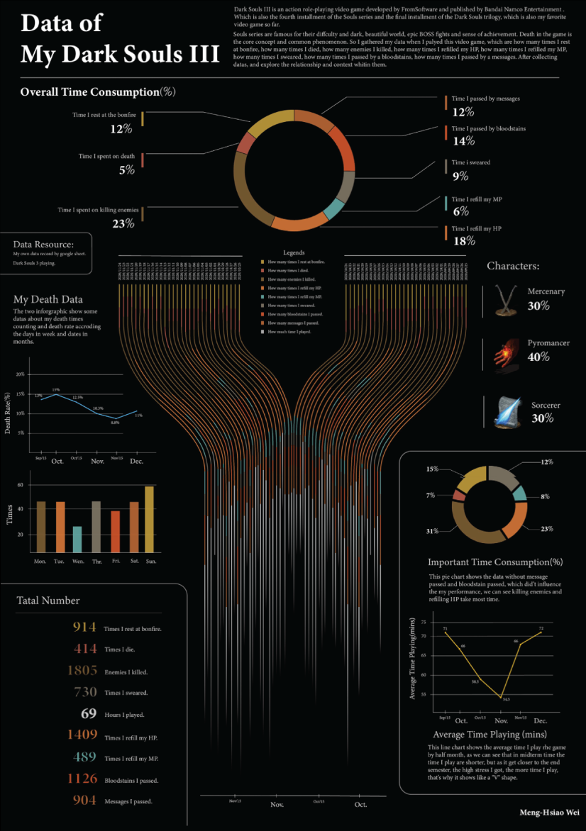
Dark Souls III Experience Data
We start with Meng Hsiao Wei’s personal project presenting his experience with playing Dark Souls 3. It’s a perfect example that infographics and data visualization are tools for personal designs as well. The research is pretty massive yet very professionally sorted into different types of charts for the different concepts. All data visualizations are made with the same color palette and look great in infographics.
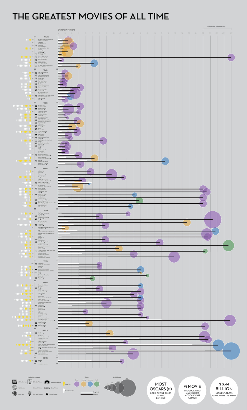
Greatest Movies of all Time
Katie Silver has compiled a list of the 100 greatest movies of all time based on critics and crowd reviews. The visualization shows key data points for every movie such as year of release, oscar nominations and wins, budget, gross, IMDB score, genre, filming location, setting of the film, and production studio. All movies are ordered by the release date.
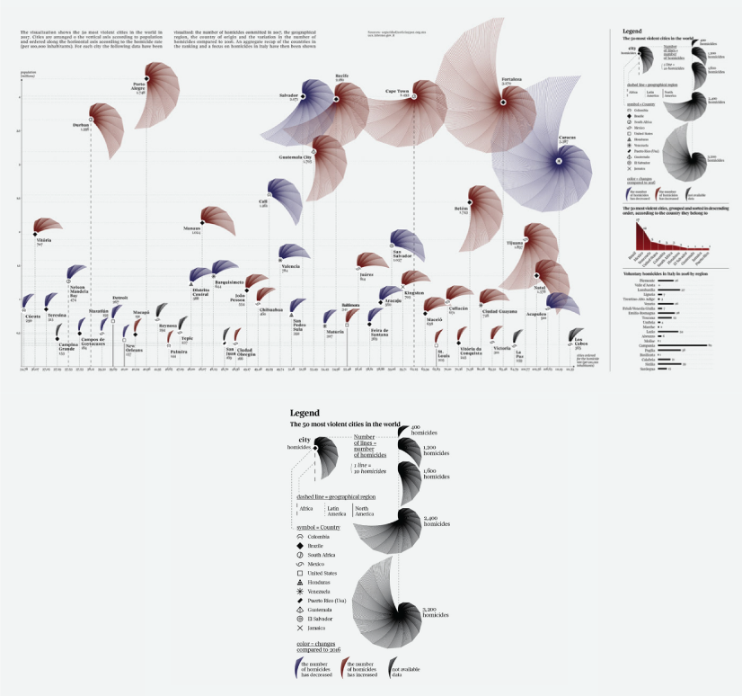
The Most Violent Cities
Federica Fragapane shows data for the 50 most violent cities in the world in 2017. The items are arranged on a vertical axis based on population and ordered along the horizontal axis according to the homicide rate.
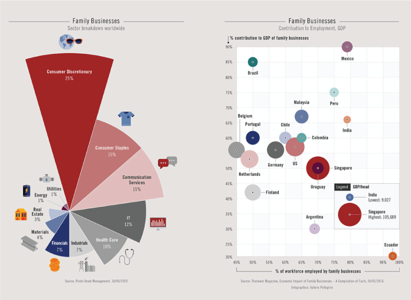
Family Businesses as Data
These data visualizations and illustrations were made by Valerio Pellegrini for Perspectives Magazine. They show a pie chart with sector breakdown as well as a scatter plot for contribution for employment.
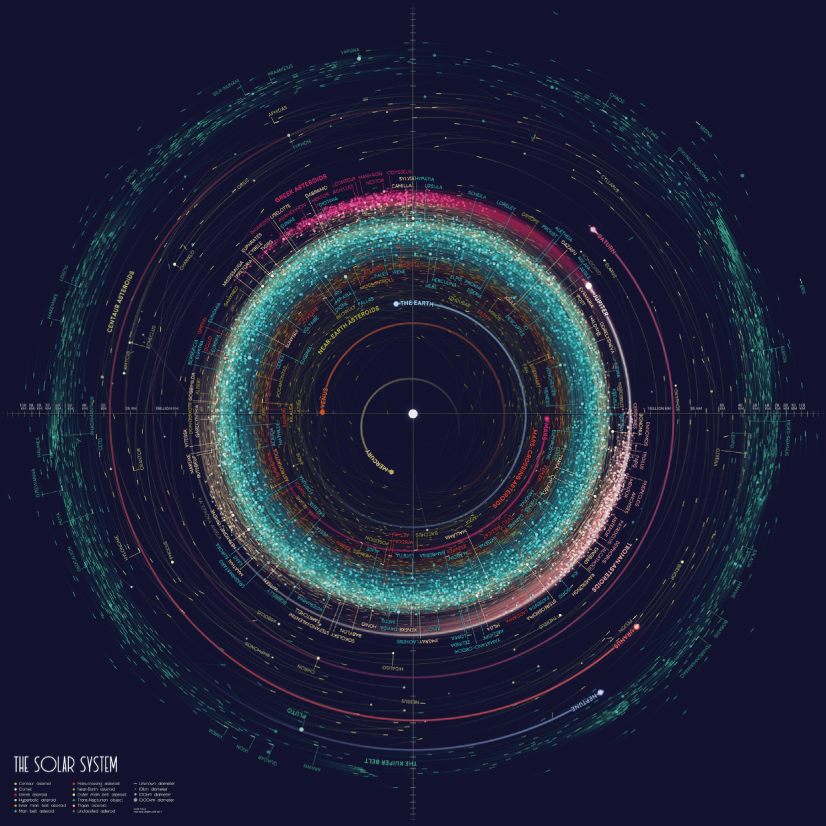
Orbit Map of the Solar System
The map shows data on the orbits of more than 18000 asteroids in the solar system. Each asteroid is shown at its position on New Years’ Eve 1999, colored by type of asteroid.
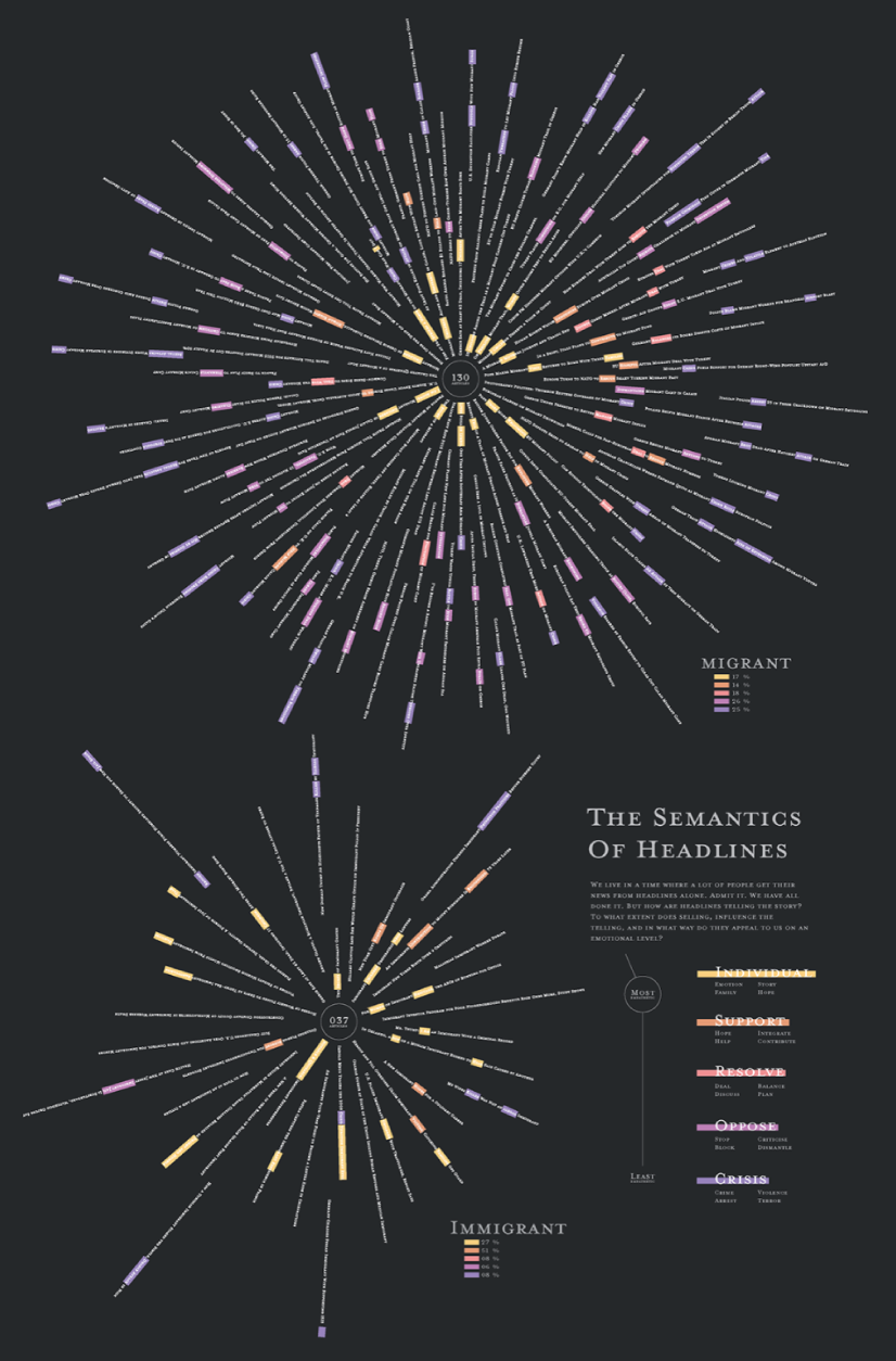
The Semantics Of Headlines
Katja Flükiger has a take on how headlines tell the story. The data visualization aims to communicate how much is the selling influencing the telling. The project was completed at Maryland Institute College of Art to visualize references to immigration and color-coding the value judgments implied by word choice and context.
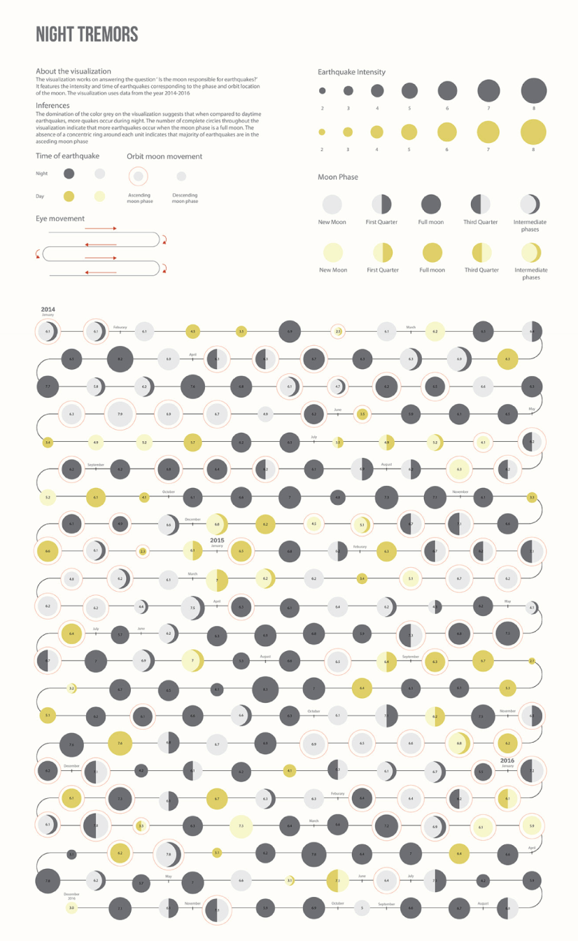
Moon and Earthquakes
This data visualization works on answering whether the moon is responsible for earthquakes. The chart features the time and intensity of earthquakes in response to the phase and orbit location of the moon.
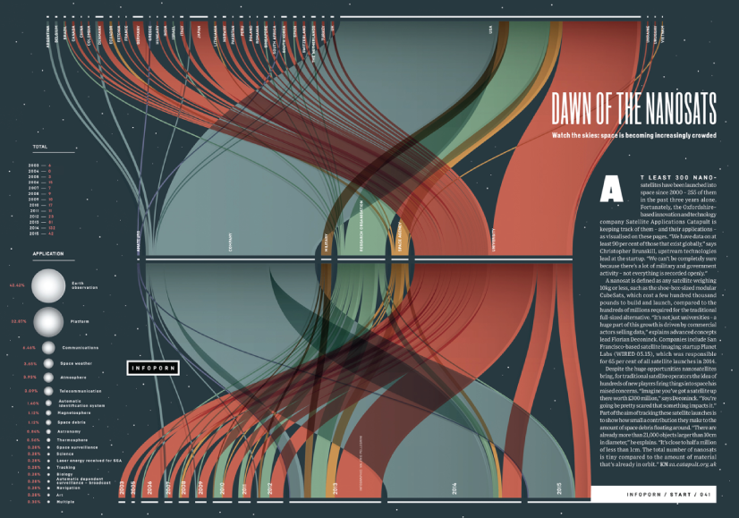
Dawn of the Nanosats
The visualization shows the satellites launched from 2003 to 2015. The graph represents the type of institutions focused on projects as well as the nations that financed them. On the left, it is shown the number of launches per year and satellite applications.
Final Words
Data visualization is not only a form of science but also a form of art. Its purpose is to help businesses in any field quickly make sense of complex data and start making decisions based on that data. To make your graphs efficient and easy to read, it’s all about knowing your data and audience. This way you’ll be able to choose the right type of chart and use visual techniques to your advantage.
You may also be interested in some of these related articles:

