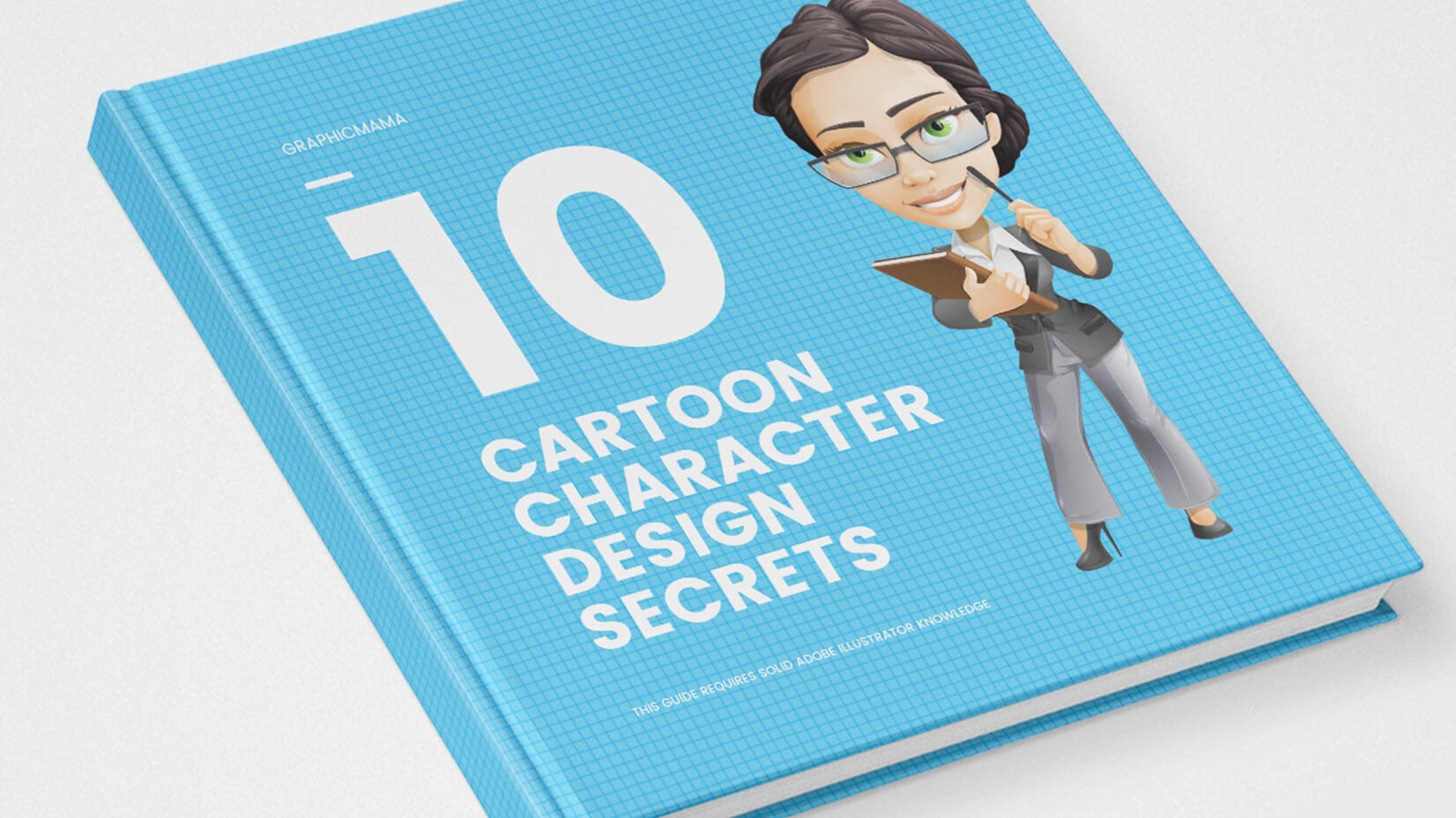
There’s no single path to success. Every illustrator, designer, or generally, a professional has established their own ultra-productive techniques that simply deliver results. GraphicMama is no exception to this rule. It’s not much of a secret formula though, rather than a bunch of little tricks that has made our style work. So, here they are: our 10 little big character design secrets to make a cartoon character design off the charts.
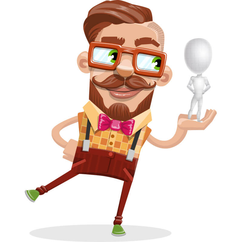
 1. We put ourselves in the viewers’ shoes…
…from the very beginning! It is essential to look at the character we are creating through our audience’s eyes. The point of this valuable perspective is to help us understand how the general viewer would feel about our cartoon character design, what would their connotations be and would they immediately grasp the concept behind it.
This awesome technique gives us an idea of whether we are on the right track at any point of its creation, or we have swerved off the road. That’s why is takes a leading position among our character design secrets.
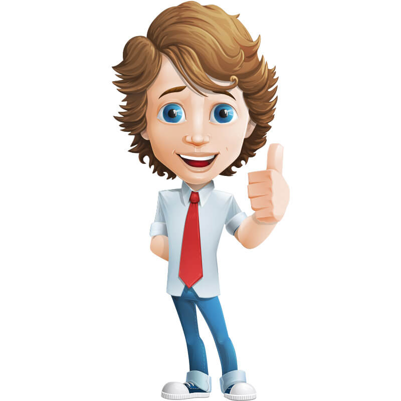
 2. We add a personal touch.
The second ingredient of our spicy cartoon-designing recipe is to make GraphicMama’s personages easily distinguished from the sea of characters out there.
Developing our own unique visual style throughout the years is a result of multiple trials and errors and plenty of time analyzing what works for us and how to best express our true style through the cartoon character’s design.
These days all GraphicMama characters can be easily told apart from all the rest. They simply emit this unique vibe we breathe into them the moment we put that first stroke down. Well, not much of a secret any more!
3. Really high quality work styles.
But you must have already noticed this one, haven’t you? No wonder this is one of the most important character design secrets. The way the cartoon has been drawn is not simply the factor that speaks a lot about their personality, gender, occupation, etc. It also reveals what kind of projects they are suitable for and what kind of audience they would most likely appeal to. In all cases, the high quality production is more than a must-have for GraphicMama. Here are the 3 basic design styles you can encounter in our arsenal of characters:
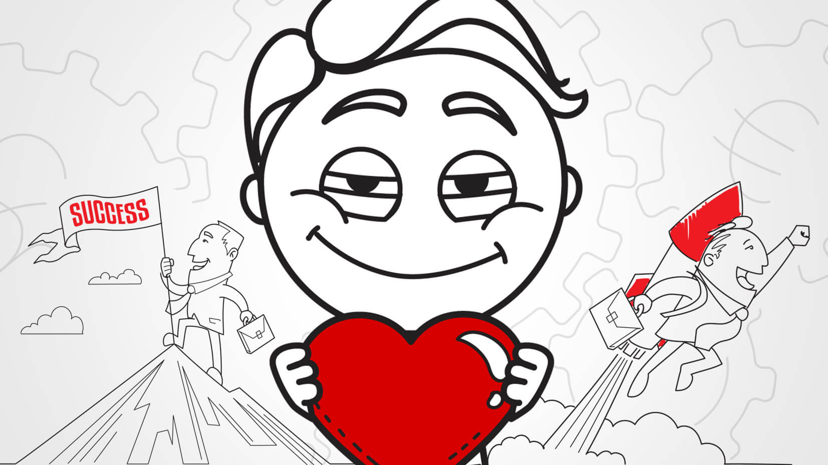
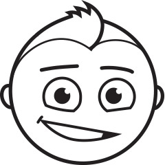
 Line art.
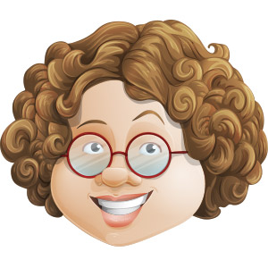
We use this style to achieve a more “cartoony” look. What makes it peculiar is that the shapes are formed by linear drawings, i.e. all the details are outlined.
Realistic style.
No explicitly defined lines here! All character’s shapes are formed by multiple gradients. Also, the lights and shades are very smooth. We use this style to achieve a really realistic look but the end result might be a bit heavier for some kind of projects.
 Flat style.
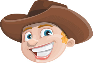
You must be pretty familiar with this one. The rising popularity and usage of flat design as a whole have not only inspired but also created necessity of flat characters to aesthetically fit into the quickly popping flat designs. Their motto? Simplicity and functionality!
 4. Exaggerating certain features…
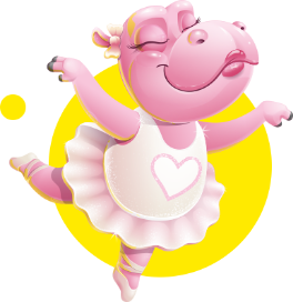
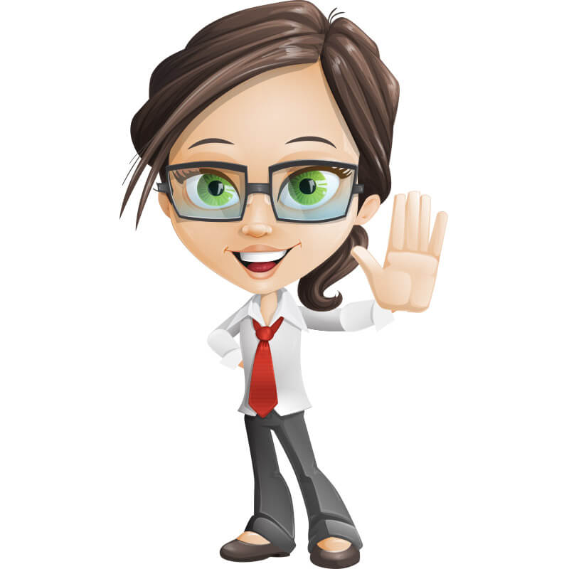
…to achieve a particular effect, of course. Maybe you have noticed that all GraphicMama characters communicate friendliness, cuteness, open-mindedness, innocence, and generally give off quite positive vibes. This effect is achieved by emphasizing certain facial features within the cartoon character design, i.e. we make their eyes and smiles bigger! Exaggerating their eyes not only makes them look cute but it also lets them convey their emotions better. Character design secrets are not only about appearance but about conveying feelings and the eyes are the window to the soul, right?
Another major trait we put an accent on is the size of the head. The idea of a bigger head is to make it easier for the audience to grasp the facial expression even when the character is zoomed out.
 5. Custom accessories
Accessories are what makes the character complete. But we are not talking about just some random accessories that we find cute and decide to add, nor about the traditional accessories that all sets include such as arrows, mobile devices, notebooks, etc. Customization is key!
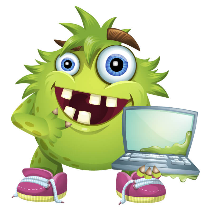
For each type of personage we create a unique set of accessories and tools to complement their presence and their personalities. For example, the pirates wear pirate hats, they own maps, hand held telescopes, treasure chests, parrots and more. In most of the sets even the traditional accessories are fully customized. Take the monsters, for example. Even the laptops they hold are covered in gross substance.
The size of the accessories also matter. They help us define the physical traits of the cartoon character design. This is the reason that the kids cartoons are illustrated with larger accessories. It helps the viewers instantly assume that this is a child character. Turns out, customization has been hiding plenty of character design secrets, hasn’t it?
 6. See the big picture!
Another trick we use when illustrating characters is to step back and look at them from a big distance. This approach is really helpful when we want to understand if the characters could instantly convey all the emotions they are supposed to convey, even when appearing in smaller sizes. To really get what we mean, check out any of our sets. The poses they are presented in are small in size but you can still get the concept behind them, right?
Stepping back also gives us an idea of how well the character could actually fit into other designs. Is the composition concise, or has it become too expansive?
 7. Silhouette clarity.
A super important quality of any cartoon character design is to have a contour so clear that even if turned into a black silhouette, the gestures and the overall pose meaning can still be instantly recognized. Here’s the trick we use to achieve such clarity. In many of the poses, we illustrate the character’s hand gestures to the side of the body instead of in front of it, so that the pose’s message could be grasped even if turned into a silhouette. For example, if a character shows a thumb up, points at a direction, waves, etc., this is pretty clear by the silhouette itself. The same applies for key accessories, such as presentation boards, laptops, loudspeakers, etc. Lots of character design secrets have been hidden in the silhouette, right?
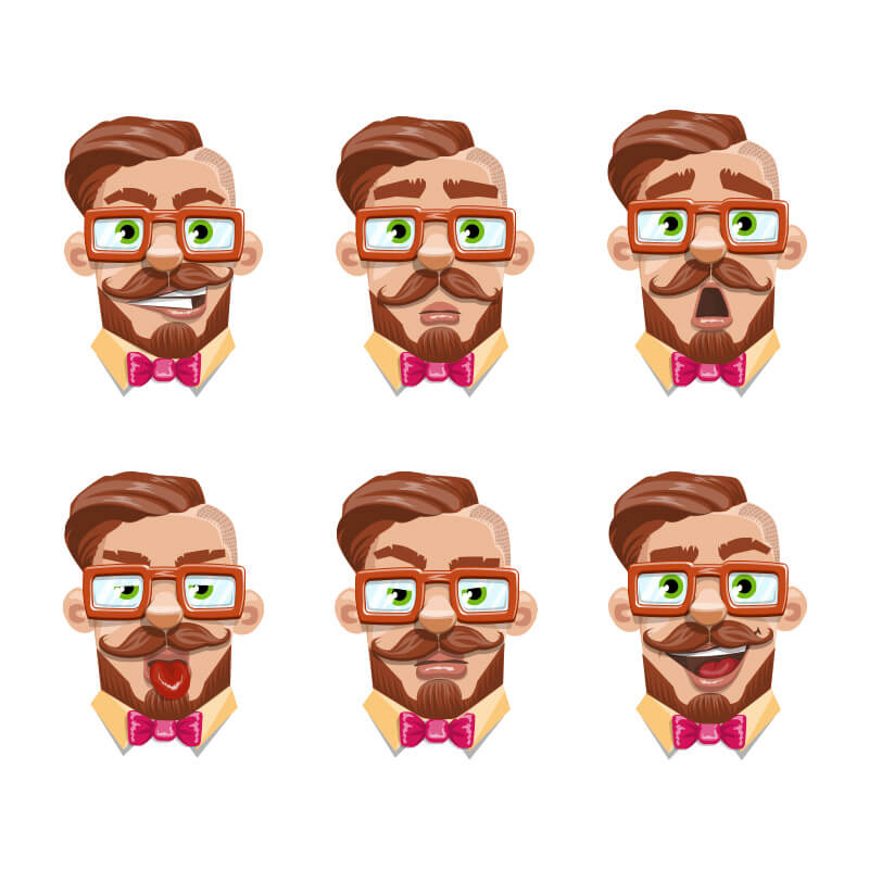
 8. Wide range of emotions.
It’s not really a newsflash that we strive to have all the basic emotions covered. When we create a character, not only that we want it to be good-looking but it also needs to be functional, productive and serve a lot of purposes. That’s why we release our cartoons in rich sets containing plenty of facial expressions, hand gestures and body poses.
The more emotional poses a cartoon character design comes in, the more opportunities lie ahead of you to play with it, combine it with other designs and use it in multiple projects. We simply want to give you freedom!
 9. Getting feedback on the design…
…is crucial if we really want it to be successful. Having in mind that plenty of our users are not actually designers, nor illustrators, it is critical to have a second opinion on the cartoon character’s design, especially one coming from a non-designer. Sometimes, a non-professional may spot something that is wrong or unclear in the character’s composition, or simply something that we have overlooked.
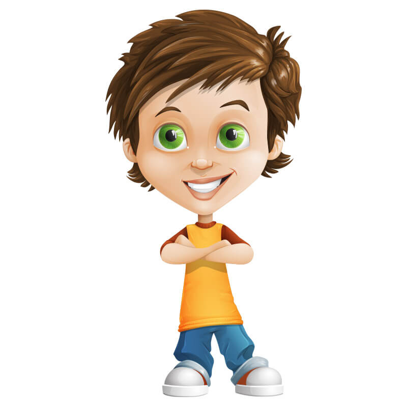
 10. We give our characters souls.
Not really a design secret but a powerful addition to this collection. The process of building belief in our cute cartoons wouldn’t be complete forming their specific personalities. Who are they? How are they called? What is their story? What are they good in? Every GraphicMama character is unique in their own way and that’s why they all get different names, qualities and back-up stories. This helps us make them more trustworthy, authentic and even more real!
So, these were our special 10 behind-the-scene tricks that we use to make our cartoon characters super successful. Which character design secrets did you see coming and which ones were totally a surprise for you?
 1. We put ourselves in the viewers’ shoes…
 2. We add a personal touch.
 Line art.
 Flat style.
 4. Exaggerating certain features…
 5. Custom accessories
 6. See the big picture!
 7. Silhouette clarity.
 8. Wide range of emotions.
 9. Getting feedback on the design…
 10. We give our characters souls.
