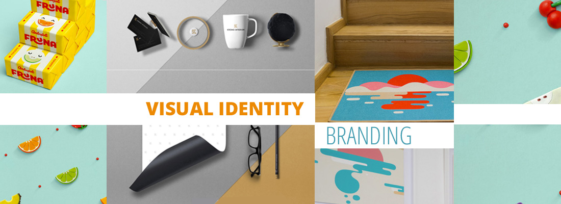
Visual identity and branding are two terms that are often confused in the process of building a brand. As simple as it gets, visual identity is the visual aspect of branding the business and trying to evoke certain feelings in the consumer through visuals. It conveys symbolic meanings that cannot be imparted through words alone. A brand is all the actions a company takes to create awareness and to separate itself from the competition.
 What is Visual Identity
In general terms, a corporate visual identity expresses the values and ambitions of an organization, its business, and its characteristics.
Visual identity is part of branding, and branding is not only making a logo for your company.
Visual identity includes the following elements:
- logo design
- fonts
- photos
- colors, shapes and forms
- and any other visuals helping to convey your brand’s message
Emarex has done a very simple video with infographics explaining the importance of visual identity for a business:
You can notice, that they “educate” you on the topic and “inform” you, but in the same time, give you brief information about their services. If you are interested in the topic of brands as educators, communicators, and supporters for customers, you might as well enjoy our article on storytelling that dazzles audiences.
Here also 3 views on visual identity, in 3 minutes, from 3 men working within the design field:
 What is Branding
Branding is what communicates your values, it is your promises to the consumer, and finally, part of communicating these, is preparing the visual identity. Branding is not what you tell people to think, branding is not “sell, buy, I’m the best in business” thing, but it is what people FEEL and THINK about your brand.
Here is a short, 3minute video, that will further help you grasp the concept of branding:
According to the video, branding is:
- confidence
- passion
- belonging
- action
- security
Still, one of the most important ingredients of successful branding is credibility. It is the ability to make promises that the customers believe in, and to be able to keep these promises.
The brand is a promise. Well, if you don’t trust the promise, then it’s of no value. So, trustworthy promises – make credible brands, make powerful brands, make strong market positions…. People are willing to pay a premium for a promise, they believe in
BJ Cunningham
Watch the full interview with examples of famous companies and how they make their branding:
How to Develop Your Brand
 1. Increase customer awareness
It takes time and careful planning. Once you build transperancy and trust with your brand; create preference to your products, people will remember you name and look for it more often. Think of Pampers, Xerox – these are name of companies, which people now use to identify and look for products. If people start using your brand name as verb, then again, you know you are successful with creating brand awareness – google it, facebook friends, hoover the carpet are just some of the examples.
 2. Identify your target market
You can agree that not all the customers out there would easily identify with your brand, product and service. The good thing is, that that’s not your goal. Your main task is to indetify your ideal client and offer him/her what they need. Cater to the interests of your potential clientele.
 3. Legality and trademark
Research your ideas so you don’t infrindge on another brand. Another important step to make, is to register your trademark legally, so you protect long process of creating identity from imposters and to minimize customer’s confusion with other businesses.
 4. Logo, typeface, color schemes
There are many rules for creating a visually pleasing and “working” logo and most probably, we would devote a separate article on that topic. Still, if we have to sum things up, we would say: “KISS – Keep It Sweet and Simple”. If you look at some of the most famous logos, they have only 2 to 3 colors used. Another useful tip is to choose font for your indentity, which is easy to read.
You can watch a very interesting video of how a professional graphic designer does his research and creates a new, contemporary logo for a fishing company. He explains his process, what is bad about the old logo and how he tried to implement the company’s values in his newly designed logo:
5. When suitable, use tag lines

Famous tag line by McDonald’s
These are catchy phrases, which can be used to show the customer that you identified a need of theirs. Again, it is not about you want to sell the customer, but what you can offer them, which will make their life easier and nicer!
For example, McDonald’s tag line “She deserves a break today” identified the need of some housewives to rest a bit, and encouraged families to go out for a fast food meal.
But in the same time, be careful what you promote, promise and be authentic. As we discussed earlier.
Last but not least, let’s look at some varios and beautiful examples of visual identity. You can see how the designers matched successfully the companies’ core values with the visual representations:
Great Visual Identity Examples for Your Inspiration
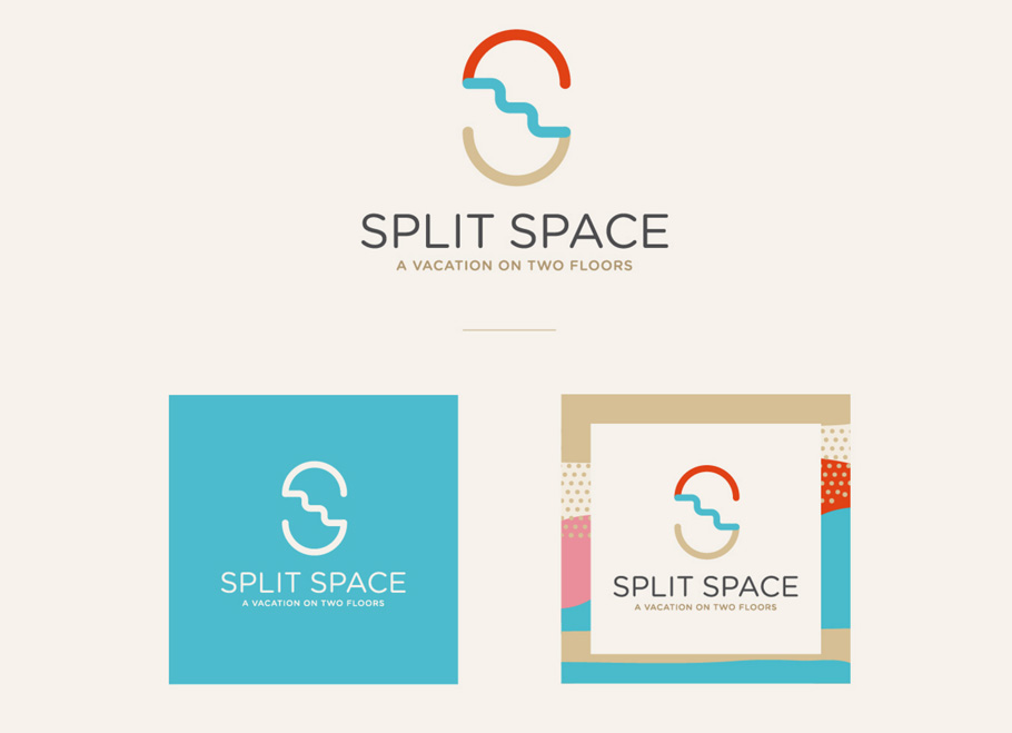
A small Mediterranean apartment, decided in bright, fresh colors. Two floors of the building are combined into one, which makes it a little bit more spacious. This is also how it received its name and this characteristic became part of the logo and the indentity. A visitor would immediately recall and connect the name with the place. Take a look of how they run the color scheme, typo and other visual identity elements throughout the whole apartment and stationery:
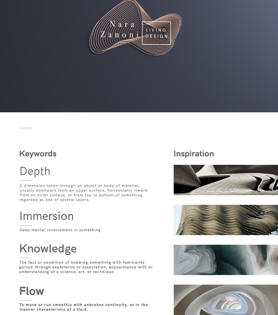
Very simple, elegant and stylish design – just what the interior company wants to convey as message to the audience. One immediately gets the impression that the business is high-end and very professional. What do you think? Did the design team do a great job?
Let us show you some contrast in the design solutions made for different companies. We just showed you a relatively monochrome color scheme used for an interior company’s visual identity. Let’s look at a visual idesntity project for sweets/candy. What does come to your mind first? That’s correct. Colors, juicy, bright and lots of it!
At this point you are starting to get an idea of how designers treat the company’s core values in the design execution and how they are trying to show the essense of a business with the help of visual identity. We are sure you can guess straight away, who is the target audience of the next project for a dental clinic:
Dental Service Visual identity concept by Ramotion
And we admit they used cartoon illustrations flawlessly – everyone loves cartoons, they are friendly, cute and they help to remember and explain things. Great job!
This project is from the same author, which comes to show that a good designer understands the brief of the client, what the company is about and how to apply different styles for the different projects.
Here, focus words would be new, innovation, green, fresh, beginning, security, organized, plan – all keywords that a new company would like to be associated with.
That’s why, the design is also very clean, with simple, but modern font, green and blue colors (reliability and freshness) and has a lot of infographics/ icons to help explain ideas.
In this project, the designer made the effort to include the keywords and concepts in his/her proposal to the client. The designer made sure to show, that he/she understands what the business is about and he/she used them as inspiration for the design. Through the design solution, the designer is hoping to evoke the same thoughts and feelings in the observer. As we said previously – branding is all about what the observer perceives.
Let’s see another beautiful example of visual identity made for a restaurant. The designer created an endless variations of design solutions for the client, and surely, the brand won’t stay unnoticed or confused for something else. The message is consistent and it stands out. Make sure to check out the whole Behance project, it’s worth looking at:
An important step of maintaining a consistency in branding is creating a style guidelines, style book. This is a document which explains in detail how the logo is used in different mediums, what are the main colors for the design, what fonts are used and any other useful information helping a designer to create a unified look.
Here is an example for guidebook, rebranding for VOX company – you can get an overall feel of what is a style guide like:
Sometimes, a company or institution is already well known, and all they need is just a little refresh and brush up on the design. Such is the case of the Saint-Étienne Opera House – the building has a lot of character already and the deisgner decided to use it as strong visual statement for his new logo concept. The difference here, is that the client doesn’t need to build identity from scratch, but needs a fresh logo which will best reflect their strong identity and personality.
See the wonderful project here:
They took their design one step further, by creating a fun element in their advertising. The posters were very successful, catching the citizen’s attention. This fun twist makes the opera more approachable for ordinary people and help them to relate to it. It also sparks curiosity and makes you want to visit!
Hungry for even more inspiration? Curious about winning designs? You can see the winners from 2016’s International Visual Identity Awards.
Do you want to learn how to design your own business card? Check out our tutorial.
We hope you liked this article and that it gave you some ideas about your own branding.
We are always happy to hear from you, so drop us a line below and tell us what you think! Feel free to spread the word, if you’d like to.
 What is Branding
 1. Increase customer awareness
 2. Identify your target market
 3. Legality and trademark
 4. Logo, typeface, color schemes