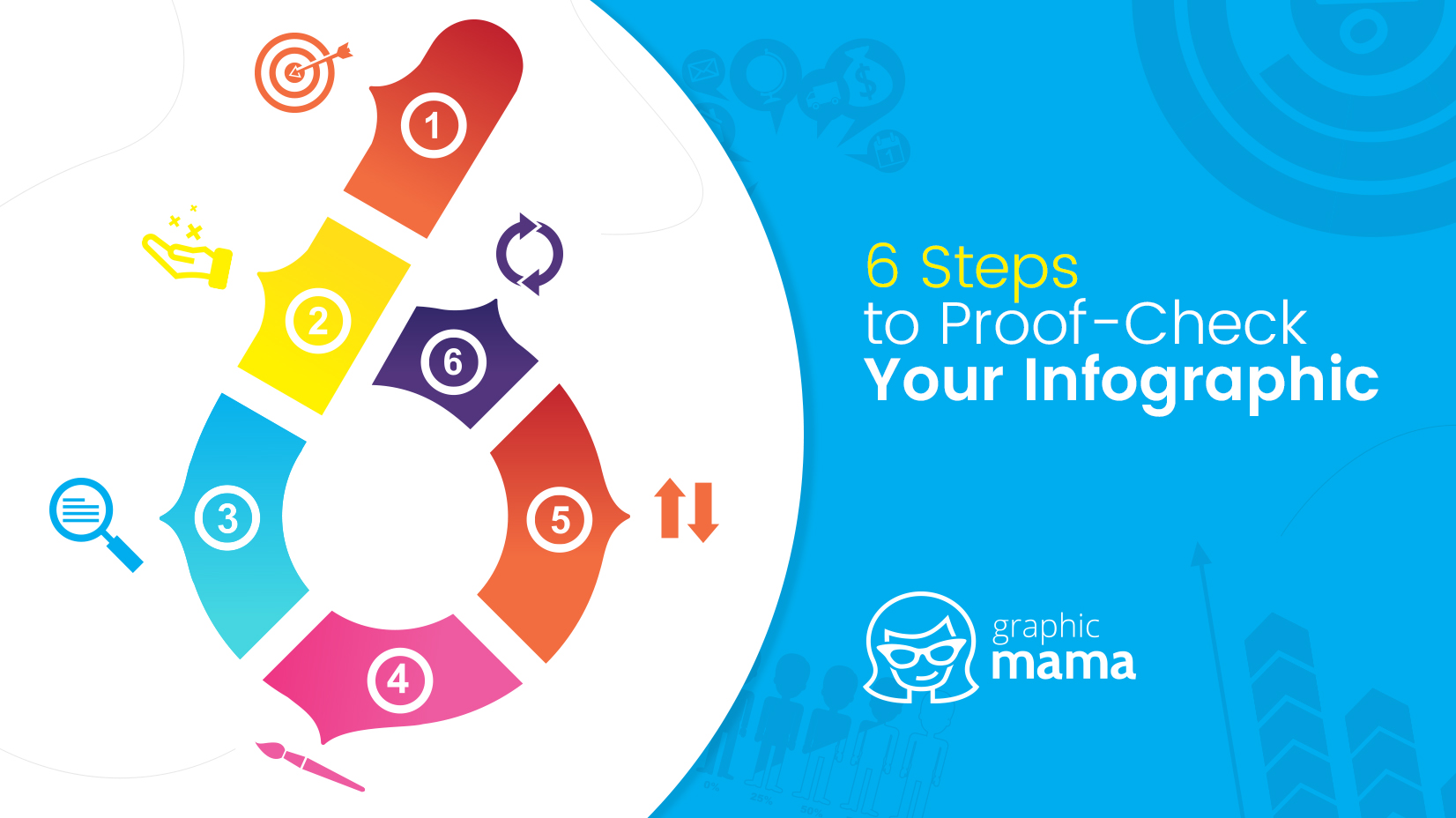
6 Steps to Proof-Check Your Infographic Design Before You Publish It
An insightful look into the 6 most important qualities of an infographic. If your infographic design lacks these, don't bother publishing it.
An insightful look into the 6 most important qualities of an infographic. If your infographic design lacks these, don't bother publishing it.
There are tons of guides and tutorials for infographic design available across the web. Yet, most people fail in producing visually appealing, highly engaging pieces. Creating an impactful infographic design goes beyond having a wireframe and then putting together a bunch of pie charts in the same color palette. Infographics are marketing tools that combine impactful visual content and easy-to-read text information.
So far so good. However, it turns out that creating an infographic is not as easy as it sounds. For every great infographic design that pops up, several others not so great emerge. Ouch! Why is that? What do people miss? Today we’ll talk about the super obvious qualities of an infographic which in fact people often overlook. Keep reading to find out what are the most common mistakes contemporary infographic design face and which 6 traits are crucial for an infographic.
Obvious? Not so much.
The purpose for the viewer to read your infographic is your purpose for creating an infographic. Don’t go design a piece of information just for the sake of designing. If this is the case, put your effort elsewhere. Naturally, the purpose comes before you even start thinking about creating an infographic and it answers one or more of these questions.
Generally, the right approach to identify the purpose is to put yourself in the reader’s shoes and decide: who your reader is and to what extent they would be interested in reading your piece.
You can learn more in our in-depth guide on finding successful infographic topics.
The value doesn’t come with the amount of data but rather with sifting out all the data into the essential info only. We’ve already established that the user needs a purpose to read. Once you catch their interest, you must provide them with info that justifies their decision to stay and read.
How to make sure you provide valuable information?
Firstly, gather as much info as you can find on the subject and start sifting out the significant pieces. Don’t be afraid to cut out details. Your infographic would better contain little but essential facts than being overcrowded with much information that will stay unread.
Then, double-check your resources. The information you put into your infographic must be credible. Don’t forget to cite your resources! Otherwise, your piece might be considered plagiarism.

The visual presentation of information should ease its consumption. This is why you need to achieve excellent readability. When it comes to readability, there are several factors that a play major role in its improvement:
The differently sized text gives the feeling of hierarchy and a good arrangement of information. It also allows people to scan which for most users means saving precious time.
The right combination of fonts will make your piece more readable and your design more flattering. Use no more than three font types but make sure they get along. If you are not sure about font combination, just check out some of the many guides available on the subject.
Whitespace or negative space refers to those sections of the design which are left empty. To a high extent this space is responsible for the infographic’s clarity, as it lets the elements “breathe”. A whitespace is also a great tool for focusing attention on a certain part. Call-to-action buttons, for instance, are often surrounded by generous negative space, so they can pop. Designers use the same technique for infographic designs – the bigger the whitespace around an element, the more attention is drawn to it.
The non-appropriate choice of colors can literally make your text impossible to read. Be careful when pairing text colors with background colors. These two need to be contrasting but you should certainly avoid colors that stress the eye as the neon colors do. Dark text on a light background is classic but the light text on a dark background works just as great as long as the color combo is flattering for the eyes.

Although it’s pretty obvious that an infographic design should contain design work, many of them actually lack design work. Throwing a few pie charts and putting a title is just something that a user can do by themselves.
The infographic design should visually communicate the content and the text should simply support it. Start by determining the structure, and then the focal point of the design. Now, regarding the structure, you have a wide field for experimenting but some of the best practices include:
Regarding the focal point – this is the most prominent part of the infographic that you want people to remember. Most infographic designers neglect this significant element – the piece of information which the reader will take away. Naturally, you need to place this part in the middle and build the rest around it, or put it in the bottom and let everything else lead to it. Make sure this element has the most visual weight. This can easily be achieved with colors, negative space, and size.
Don’t get too carried away with elements and decoration! Too much decoration on graphs, pie charts, bars, and other statistical elements is called chartjunk. It may be enticing to decorate your graphs but be careful not to distract the user from the essence. Too many distractions tend to create a messy design that the user would prefer to skip than try to figure out.
The infographic’s only job is to lead you from the beginning to the end, and somehow many infographics fail in this mission. We daily encounter designs that are too chaotic or simply lack flow.
Now, you can build a flow by arranging the visual elements in a gradually developing way. Otherwise, there are certain techniques that will come in handy:
Take advantage of people’s natural desire to finish off things. People tend to follow a numbered list till the end. When the title says 7 ways to do something, people expect to read exactly 7 different points and most of them will scroll until the 7th even if they simply scan.
Similar to numbering, the alphabetical order shows which section comes next. This makes your information easy to follow.
Perfect for story-telling, this technique actually illustrates the years on a timeline. They play the role of cues telling the user what to read next.
Both paths and arrows lead the eye effectively from one section to another. Designers tend to use this technique when there isn’t much space available. Lines and arrows help them clarify which section comes next.
Be careful not to escape from balance throughout the way. Balance is a characteristic your infographic design work must have, no matter which flow technique you are using.

Some infographics just make you sit there and wonder: were they created as one piece or were they actually built from several other infographics?
The mixture of too many colors, styles, and fonts certainly does confuse the user, on the one hand, and doesn’t look professional at all, on the other hand. For this reason:
Now, don’t get us wrong. A consistent infographic doesn’t mean repeating the same design in each section over and over again. Think of it as evolvement – as the user scroll, the design develops but it doesn’t escape from the main idea.
creating a super successful infographic is not such an easy job as most people think. It requires focus, hard work, and a lot of errors and mistakes until you finally get there. Luckily for you, we’ve covered the 6 major problems often seen in infographic designs. So, before you hit Publish the next time, proof-check your infographic with this list of 6 must-have traits.
We think you may also be interested in these related articles:

Don’t forget to share!

Iveta is a passionate writer at GraphicMama who has been writing for the brand ever since the blog was launched. She keeps her focus on inspiring people and giving insight on topics like graphic design, illustrations, education, business, marketing, and more.
Here are some other articles we think you may like:
A source of high-quality vector graphics offering a huge variety of premade character designs, graphic design bundles, Adobe Character Animator puppets, and more.
Browse our graphics