A character’s personality is a crucial part of creating engaging, believable, and likable designs. It is not enough to have a beautifully drafted character, but your audience should be able to relate to it and “connect”. Since the dawn of humanity, people memorize things through storytelling – we just love stories! So it is no wonder that we also look for the personality and the story behind the characters as well.
Designers are more and more concerned of how to convey the personalities and the tale of the characters. And we don’t blame them, since it’s proven, that designs with a story and “character” get far more positive responses and engagement from the audience.
Back in 1946, Solomon Asch wrote a paper on how the impression of physical appearance affects the impression of personality traits. In this article, you will learn how artists mix different techniques to create engaging characters using their physical appearance. Some of the most important tools they use are shape, variance, and size. Get these downright, and your audience will easily relate to your designs, and … probably fall in love with them!
1. Shape
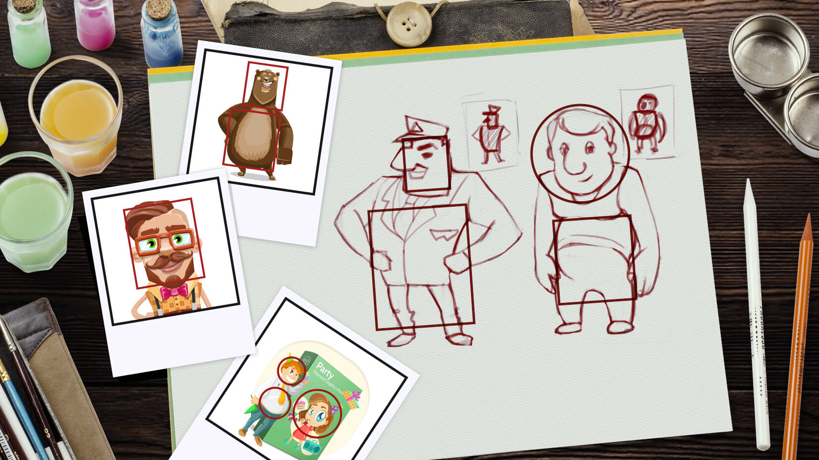
Let’s start big, before going into details. David Colman, an Emmy-winning character designer found in his practice and research, that facial expression is really secondary when reading a character. The first thing to notice is the face shape, posture, and body language (not so much the shape of eyes, eyebrows, mimic, etc). Communicating a personality through body language and silhouette is far more powerful than only showing emotion through facial expression. That is why we will first look at the primary shapes used to design the head and body of characters ( the bigger picture) and then we will go into the details. Although color can be interpreted in different ways from culture to culture, it seems shapes have more universal meaning across the globe.
Any character could be broken down into primary shapes onto which we are projecting our real-life experiences. We often subconsciously assign qualities to a person or a character by only perceiving him/her as a combination of shapes.
Conveying the character’s personality with a square
The square shape is often found in nature as a solid shape of rocks, and mountains and it is usually perceived as something stable and heavy. You can often see strong and masculine characters and warriors with square or rectangular shapes in their physical appearance. There are cases too, where the character is not macho/hero, but the designer is using square shapes in his body too, to project his solid, stable, and maybe stubborn personality. Other qualities often assigned to a character’s personality, because of their square shape are dependability and confidence.
Conveying the character’s personality with an oval
Think of the sense of touch, something instinctive and natural. We inherited the perception of oval shapes as safe and soft, on the contrary, angular shapes are a warning of possible danger. Let’s focus on the ovals for now, and in the next section will talk about the triangle primary shape.
Most of the well-known protagonists are designed around oval shapes, as this shape is perceived as friendly, safe, and harmless. The oval shapes are often present in baby characters – children and animals, chubby adults, and so on. Have a look at Remy’s brother from Ratatouille – both of them mice, but the first is much more rounder to convey the soft and a bit naive nature of the character. Next is Russel from Up – his whole body is made of soft, round shapes and it is used as a contrast to the square body of Carl. This is yet another technique to underline someone’s personality, by putting him next to another character. Last but not least, Owlbert is one of our friendly and cute characters at Graphic Mama, who is for sure a great helper and a good friend!
Conveying the character’s personality with a triangle
Angular shapes have always projected danger. They are found around us as thorns, pieces of glass, and rocks eroded from severe climate conditions, you got the point. That is why often designers use triangles and pointy shapes in their villain character’s personality. Very good representatives to illustrate that concept are Maleficent and Jafar.
Triangles also give direction. In contrast to squares, where we have only 2 directions-vertical and horizontal, here we have 3. Besides portraying horrifying characters’ personalities, artists also use them to show a hero’s determination, drive, and opportunism. This is the case with our Angelina Justice character at GraphicMama and Peter Pan.
Mixing them up
Often, for building a more complex character’s personality, more than one shape is needed. So artists use combinations of shapes instead. The variations are endless. Strong, powerful character (square), but also mean (triangle) or big hero (square), but soft at heart (circle) – it’s your pick!
Remember we said we are going to go into the details too? So here is an example of the different shapes used on a smaller scale – in the facial features of a character. What do you think they say about the character’s personality?
2. Variance
Again, contrast creates interest. That is why designers avoid breaking their characters down into equal-sized shapes. They often divide their characters into 3 parts: head, torso, and legs. And then, comes the interesting part! They play with different proportions (remember not equal parts) of these elements. This is also used in the proportions for the face. Here are some examples of characters, created with the use of variance:
What you can notice from these thumbnails is, that usually babies have large, round heads and small bodies, which makes them so adorable! A small head, with a heavy, pointing downwards body depicts a maybe not so smart but physically capable and strong character. A woman’s character designed with the help of triangular shapes easily comes across as active, athletic, and driven. On the contrary, a woman with a heavier lower body and overall round features will suggest a soft, compliant character’s personality.
3. Size
One more factor which can make your designs more appealing and attractive is using the size relationships in your character. The road to good design is often paved with different size shapes, combined in an interesting and unpredictable way. The first example (a.) is of shapes, similar to one another, stacked up on top of each other in progression, which is a bit boring to look at. Then the same shapes (b.), but varied in size are put together in a more interesting way (first is the medium in size shape, the smallest, and finally, the largest). Much better! This rule is of the same importance for creating the details in the character, as it is for building the main shapes (a.1, b.1). Notice, how the second girl has big eyes and a small nose, compared to the first girl, where facial features are equal in size.
How do these 3 work together?
Just remember to mix things up! Let’s give you one more example here. In picture a., the shapes in the bear’s head are relatively equal in size and they are symmetrically placed within the face (similar to the first girl’s face above). We will try to do a little bit better in example b. – here we change the size of the different elements in the bear’s head, but they are still in the center. Hmmm. Example c. is the best version, still using the exact same shapes! But why? This time, we moved all the character’s features a little bit down, to break the symmetry in the face. Next, we varied just a little bit more the size of its eyes, ears, nose, and so on. And we can probably safely say now, that we can read his character’s personality, only by looking at the shapes he is made of!
Ok, so we got size and variance mixed up, but what about using different shapes? The bear looks all around and may be a bit boring in that sense. Well, we leave the experimentation to your imagination, and as an exercise to what you just learned from this article! Still, we couldn’t help but share with you our cool Santa Claus concepts, created from different shapes:
We hope you liked this post! We have no other way of knowing, but by dropping us a line in the comment section below!
If we’ve sparked your interest you might also like our other articles on character design on GraphicMama’s blog. You can also put your fresh-baked knowledge to test and use our cartoon characters at GraphicMama to analyze their shapes, personality, etc.
Oh, by the way, who’s your favorite character of all time? Can you tell us why? Can you tell how designers used the upper mentioned techniques to portray their personality?




![Win an Oscar for art? Mission possible for the team of Spider-Verse [Interview]](https://i.graphicmama.com/blog/wp-content/uploads/2019/09/19093417/Mission-possible-for-the-team-of-Spider-Verse-120x70.jpg)


