Update: Graphic Design Trends 2025 are officially out. Check them out.
Trends come and go. The graphic design world is always evolving. Some design trends fade away for months, and others stay for years. Today we’ll spill the beans on which graphic design trends will generate buzz this year.
Whether you will follow the crowd or set up a new trend yourself – the choice is yours. Either way, it is vital to be up-to-date. We have taken the time to browse the web and find out which design trends will take the leading positions in 2017. We will also reveal some of the graphic design trends which should better stay in 2016.
Year 2017 is pretty much all about imagination off-limits. The majority of our examples depict a combination of two or more trends, even though we have focused on each one separately. Hope it sounds promising, so let the show begin!
 HOT: Asymmetry
A super hot trend in graphic and even web design is creating asymmetric layouts. While striving to create original designs nowadays, designers have been breaking the rules of symmetry more often than ever and the results are fascinating. In this kind of composition, the graphic design elements are not exactly balanced on both sides of the design when we draw an invisible line in the middle, dividing the composition into two even parts.
Breaking the rules of symmetry certainly sounds exciting and cutting edge. Here are a few examples:
 HOT: Popping Colors
If you want to catch the wave of the latest graphic design trends, then all you need is to turn the volume up on the colors. The rule is simple: the brighter, the better. This 2017 trend has taken over plenty of famous brands, as well. As bright, popping colors look absolutely stunning on all kinds of designs: branding colors, posters, business cards, web designs, etc. we absolutely recommend that you shouldn’t play it safe this year. Here are a few examples to depict how stunning bright colors look in modern design compositions.
 HOT: Duotone
Another major trend of avant-garde graphic design is creating duotone compositions. Being consisted of basically two bright colors, there is no chance that this kind of design will go unnoticed. Indeed, it requires some advanced design skills but the results are absolutely mind-blowing.
The two colors combined may be contrasting for a even more impactful composition but simply combing two bright colors of your choice will work out just as well. Here are a few suggestions to draw inspiration from:
 NOT: Muted Colors
Playing it safe is certainly not one of the graphic design trends this year. In case you are trying to escape the boring, predictable designs… which we are absolutely sure about since you are here reading this article.
Our advice is, stray from using dull color schemes in 2017. In the year when everyone else is going big on the color brightness, your muted color designs may not get the attention you’ve been fighting for. In other words, direct your design energy and creativity into creating louder compositions.
 HOT: Low-Poly Designs
This trend inspired by game graphic designs is now taking over all graphic design fields. This year we’ll be seeing more of it as website redesigns, on posters, banners, ads, business cards, flyers, and more. The trend alone certainly looks cutting edge since it comes in geometric shapes and color game which gives the feeling of a 3D composition.
To take it to the next level, designers have been combining it with other graphic design trends such as bright colors and asymmetry which makes it even more alluring.
 HOT: Geometric Designs
A trend that has been present for a while. Using geometry shapes in all kinds of graphic works of art is not fading away any time soon. It looks classy, and clean and can help you achieve impressive, eye-pleasing compositions. To make this trend even more modern, you should totally combine it with other 2017 graphic design trends such as bright colors and typography. As a result, your designs will leave an even longer-lasting impression.
Here are a few geometrical designs that will help you create stunning masterpieces yourself. Be careful though, this trend is addictive!
 HOT: Custom Graphics and Illustrations
We can’t hide our excitement that illustrations are indeed one of the biggest graphic design trends this year. Having the power to make you stand out from the crowd, illustrations and custom graphics are here to stay. So far, we have proven to you how illustrations and graphic design just fit together by showing you plenty of examples such as these two collections:
- 80 Illustration Based Web Designs: Mega Pack, Mega Inspiration
- 100 Insanely Creative Cartoon Business Cards
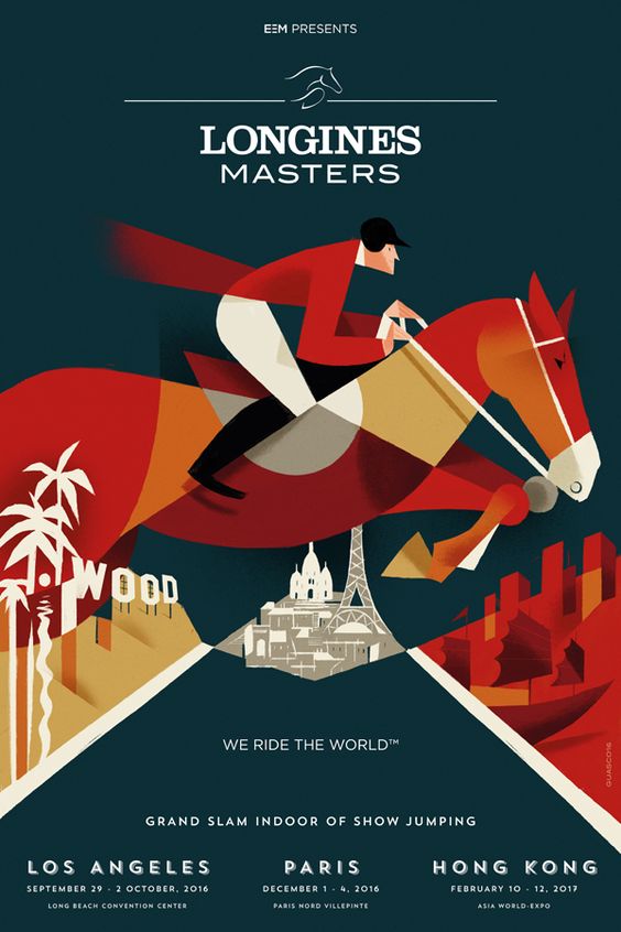
Illustrations create plenty of opportunities and push the creativity boundaries. Here are a few modern graphic design posters based on illustrations:
 NOT: Stock Photos
Using stock photos in your graphic and web designs is way too predictable and boring. We live in times when a little bit of creativity can take your composition off the charts. So if you decide to go for boring stock photos which have been used numerous times by other people before you, instead of opting for a unique composition, don’t blame your audience if they are not much impressed with your design.
There are so many alternatives to stock photos, even if you don’t have any design skills. If this is your case, our suggestion is that you take the time to make your own authentic photos. We have already revealed more than 20 secrets of taking amazing photos, so all you have to do is grab your camera and shot it on!
 HOT: Open Composition
A composition in which the elements float and go beyond the boundaries of the design itself is an absolute hit this year. Don’t put your creations in frames, let them breathe instead. This trend is typical for photography but in 2017 it’s gaining speed for web designs, as well. Its impact can be enhanced even more if combined with effects conveying movement, such as the parallax technique.
 HOT: Chaos
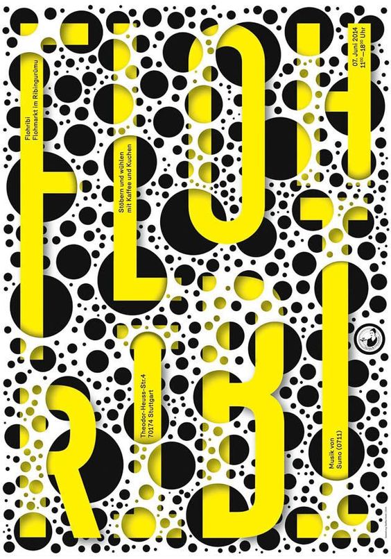
Graphic design in 2017 is all about the decorative details. The more decorations and chaos you have in your design, the better.
Sort of taking over the role of rebellions against harmony, more and more graphic designers say “no” to putting limits to their imagination these days, so that they can come up with unique, atypical compositions. Here are a few examples to depict chaotic designs, also combined with another major trend – bright colors.
 HOT: Typography and Font Combos
Combining not only fonts of different families, but also fonts with images in quite creative manners, typography is a trend that has firmly taken its place in top design trends for 2017.
From designs whose most prominent element is a letter to designs that depict images wrapped in texts and vice versa, this tendency of playing with texts is not fading away. On the contrary, it will gain even more popularity since it gives designers the opportunity to unleash their imagination to the highest extend.
Here are a few daring and impressive graphic designs featuring typography:
 NOT: Minimalism
Minimalism, having become too boring in comparison with all the other expressive graphic design trends this year, is certainly losing its position from last year. Having just the essential elements on a design was indeed a breather for a while. However, the audience is now ready for some cool flamboyant creations which immediately nail the attention.
Those of you who are still fans of minimalism must know that there is a way to keep your design minimal and still be up-to-date in 2017. We’ll finish off with two more hot trends which look like upgraded minimalism.
 HOT: Cropped Elements
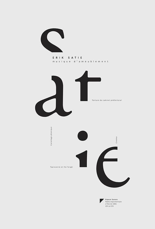
Here is how to save your beloved minimalism and still be modern: crop ’em off! Being described as a form of minimalism, this style characterizes by cropping your text’s letters so that they can still be readable without putting any additional effort.
As a derivative form of minimalism, this trend will appeal to those who find all the bright chaotic designs gaudy. Here are a few examples of how exactly this cropped minimalistic trend is applied in graphic design.
Well, that’s it! These are the graphic design trends that will shape this year! If you agree or disagree, you are more than welcome to share your thoughts in the comments section below. If you want to learn how to become even a better designer this year, check out recommendations in 22 Common Design Mistakes and How To Avoid Them. Be creative and stay TOON-ed! 🙂
You may also be interested in some of these related articles:


