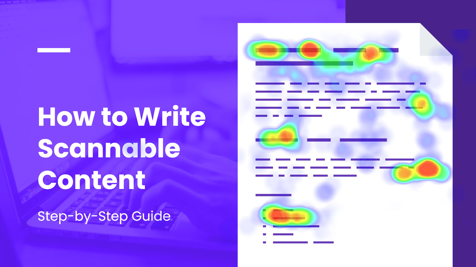
In this petite blog article, we will discuss the difference between online written content and print materials and how to write scannable content.
That’s right, there is a difference and various research showed that if we want to be successful in content writing, we need to tailor it to the online users’ needs.
We will explain the process and guide you in 12 easy steps, but first a quick overview of Writing scannable/readable content:
1. Use headings – divide big blocks of text
2. Create subheadings
3. Use white space
4. Format your text – use bold, italics, highlighting moderately
5. Create high contrast between text and background
6. Pick a good font size
7. Write short paragraphs
8. Write short sentences
9. Create lists and use bullet points
10. Include graphics
11. Link to other sources
12. Be objective and balanced
One of the purposes we gave you the list first, is to notice how much these tips are applicable to creating a textbook.
A textbook has the mission to explain certain ideas to the students, but also its most important role is to help them remember the content.
Usually, when reading for pleasure, it’s not crucial if we forget a line or two. But on the internet, people often come to search for particular information, and hopefully, remember it.
So using the textbook analogy is safe to say, online readers need to be presented with well-structured, visually divided scannable content. And scannable content is readable.
Backing up our theory with facts
The way we read on the internet is different from the way we read a book.
Over time, content creators noticed 2 things:
- Online content, written like a traditional piece, doesn’t work well anymore
- There is content saturation on the internet – many sources compete for the readers’ attention
And they were able to identify the behavior of the “new” users:
Today’s online users are scanners and skimmers.
They are looking for quick and easy ways to digest information. Also, they were overconfident in what they were able to remember from reading online.
Let’s see how people interact with written content online and face “the hard facts”.
Reading online vs Books/Prints

Online vs book reading comparison
It turns out that reading online is less pleasant and it’s slower.
Maybe that’s because of how our brain works. People are visual creatures and prefer to create “visual maps” in their short-term memory to understand and “store” information.
A study conducted in 2017 shows that people remember less when scrolling and more when creating “visual placeholders”. For instance, when reading a book, it’s much easier to recall if a picture, text, or diagram was placed at the center of the page, were highlighted, or placed at the bottom.
If we don’t have that kind of visual separation, and we only scroll, our short-term memory becomes overwhelmed, hence – we remember less.
More differences between online written content and traditional
Furthermore, professor Liu Ziming makes 3 main points in his paper “Digital reading”:
1. Screen-based reading is characterized by
- Browsing and scanning
- Keyword spotting
- Non-linear reading
- Reading selectively
- Les concentrated reading
(which is very different from traditional reading)
2. There is a decrease in sustained attention
3. Annotating and highlighting are not so common in the digital environment (as in traditional reading)
The structure of the scannable content is different – it’s inverted pyramid writing
One more difference between traditional writing and online written content is that the second uses the so-called inverted pyramid structure.
In that structure, the most important things are written in the beginning.
On the contrary, in traditional writing, there is a lot of information shared before a conclusion is drawn.
That’s why many content creators make the mistake of structuring their content as if it is academic writing. And most users on the internet are NOT looking for academic articles. They are looking for
Scannable content for the modern user
Because of how today’s users operate, we need to take a new approach – making things easy for online readers.
And here will explain in easy steps how to create scannable content:
1. Use headings – divide big blocks of text
Use heading to divide big chunks of information and try to make them descriptive. You can hint already in the heading what the reader should expect from the following paragraph.
2. Create subheadings – be simple and practical, not fancy
Subheadings help you divide a big paragraph of text. Again, visual separation helps the reader to grasp your ideas.
3. Use white space – create “visual placeholders” in readers’ brains
People are visual creatures.
White space, or the empty space surrounding your content, helps the reader to separate information and to make pauses.
The more white space you leave, the more you give the user room to breathe, relax, and absorb information.
4. Format your text – use bold, italics, highlighting moderately
We already mentioned that in print, the reader is able to highlight important parts of information. It helps to memorize and summarize.
Because the online readers don’t have a marker in hand, help them by putting certain pieces of text in bold and italics. That will point them to parts of your content, that you consider important.
5. Create high contrast between text and background
Contrast is important! When the contrast between text and background is decreased, readability suffers.
You can use different tools to check if your contrast is ok, including Google’s contrast checker. This tool checks your page according to WCAG2 – Web Content Accessibility Guidelines.
6. Pick a good font size
Consider the font size of your body text.
After all, most of your crucial information is in your paragraphs and you want to be seen. And read!
12pt is a standard, but many designers use even 16pt today. You don’t want people to squint their eyes!
7. Write short paragraphs
When using headings and subheadings it’s completely doable to write as many short paragraphs as you like.
Small bits of information are easy to scan, read, and remember – therefore, they are a successful piece of content.
You will see more and more often, that content creators write only one or two sentences per paragraph and put only one idea in a paragraph.
That’s not a lucky accident. They try to keep the user focused as much as they can. Long texts and boredom are a no-no for scannable content.
Short paragraphs improve readability and leave the user satisfied.
8. Write short sentences
More than 16 words per sentence are too many. Also, more than 4 syllables in a word are too many (and makes the word hard to read).
Again, think about what can make the life (or least the reading) for the user easier.
And the short answer is – simplicity.
9. Create lists and use bullet points
There is something really attractive to bullet listing. It is almost like it creates different boxes in your mind and the boxes are nicely organized.
See what you prefer:
Our shop offers handmade soaps, hand-drawn greeting cards, dried flowers, and home-baked cookies. You can also order online or give us a call at 834 535 45
or
Our shop offers
- handmade soaps
- hand-drawn greeting cards
- dried flowers
- home-baked cookies
you can also:
- order online
- give us a call at 834 535 45
I think we can agree, that the second example is the one that helps us scan the information and remember it faster.
10. Include graphics
You may also be interested in What Is Data Visualization: Brief Theory, Useful Tips, and Examples
11. Link to other sources – for additional information
There is no need to explain everything in the tiniest of detail.
You should stick to your main points and link to other sources if the reader wants to learn more.
In this article, we linked to several external and internal sources, if someone wants to go more in-depth. We didn’t write in detail about the studies’ results, nor did we write another topic within the main topic in this article. Just enough to prove our main points!
12. Be objective and balanced when writing
There is something very repulsing, more importantly, extremely distracting for the readers – and that is bragging and exaggerating.
Don’t try to sell too much, to make things look better than they are.
Instead, try to build credibility with your audience, try to be honest, and balanced in your observations.
Final words
With that, we conclude our list with helpful tips for creating scannable content. We hope our blog article was also readable for you. Maybe you’ve noticed some of the tips applied here and there.
Don’t forget that practice makes perfect and that you will refine your writing with time.
You might also be interested in these articles:


