


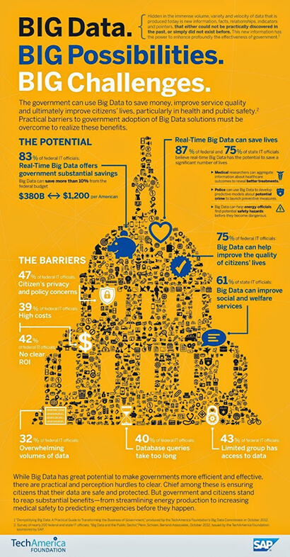
![Win an Oscar for art? Mission possible for the team of Spider-Verse [Interview]](https://i.graphicmama.com/blog/wp-content/uploads/2019/09/19093417/Mission-possible-for-the-team-of-Spider-Verse.jpg)
If you think that making an engaging infographic is not easy, nor quick, well… you are probably right. Making an infographic that engages the reader effectively takes time and effort. Luckily, we are here to help with a full guide on how to make an engaging infographic.
To simplify the whole process, we’ve broken it down into phases and steps that are really easy to follow.
You’d probably like to check out 50 Engaging Infographic Examples That Make Complex Ideas Look Great.
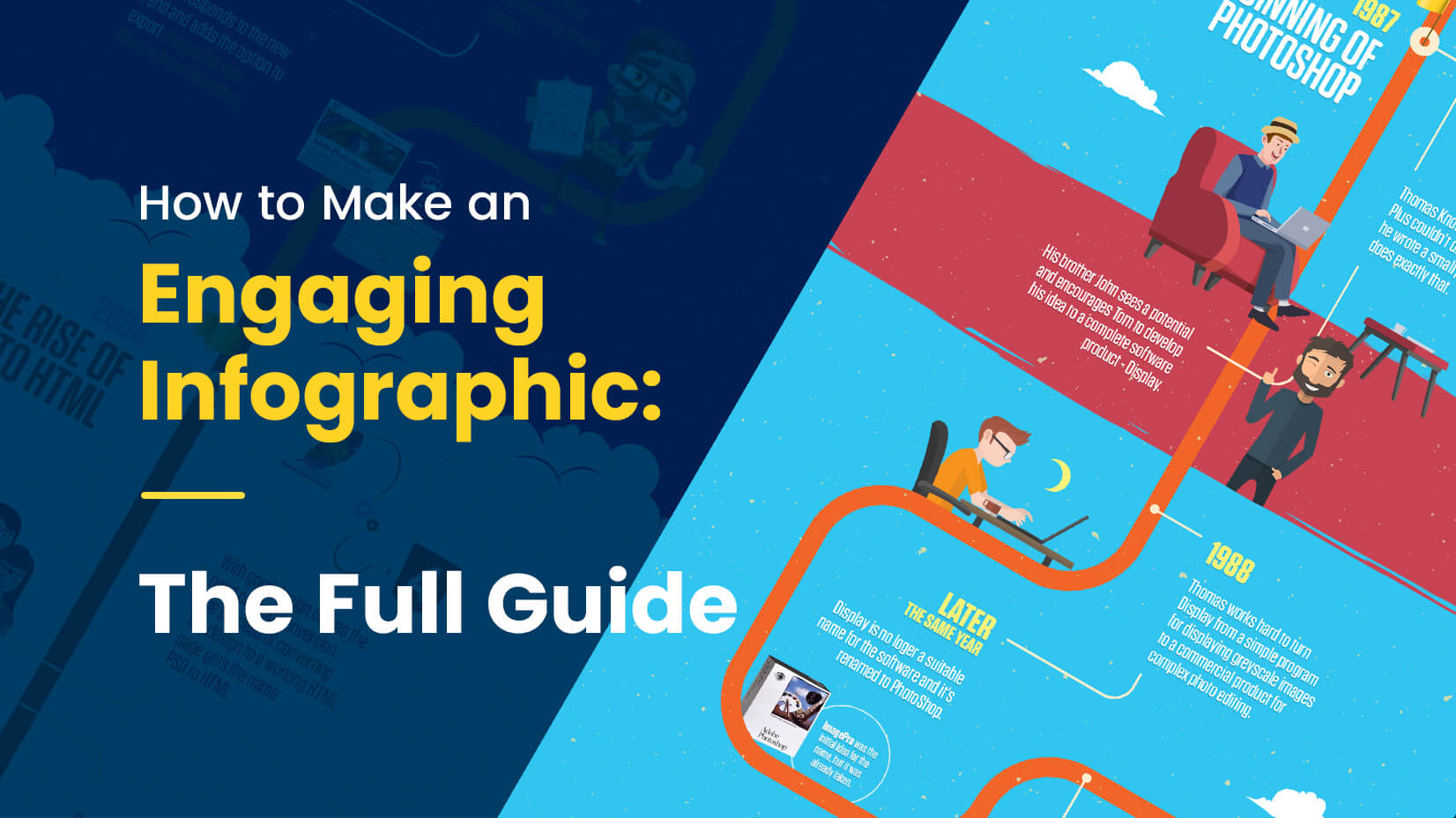
How to make an engaging Infographic Steps:
1. Preparation Phase
2. Content Phase
3. Design Phase
4. Optimization Phase
A quick video overview of How to make an engaging infographic:
1. Do Your Homework
aka the Preparation Phase
Making an infographic doesn’t start in Photoshop or another design software. It doesn’t even start with writing your content. Making an engaging infographic starts in your head. The preparation phase will help you clear up the concept and formulate your strategy.
1.1. Set your goal and topic
How will you spark your audience’s interest and what do you want them to do afterwards?

Sit down and analyze your prospects. Dig deep into their needs and interests. What would impress, influence and touch them? How will they benefit from the information they read? Most importantly, what should they do afterwards? Clear up these questions from the beginning in order to clear up the overall concept you have on your mind.
Each infographic is unique and has unique goals. Here are some of the most popular purposes people make infographics for.
- Raise awareness for a problem
- Raise brand awareness
- Bring traffic to a specific website
- Make people download a specific product
- Strengthen the customer-brand relationship, and more
Of course, an infographic can serve more than one purpose. Usually, the more specific the purpose, the better. Then, pick a topic that works in favor of this purpose and corresponds to your audience’s interests in the same time. From our experience, specific topics with specific target audiences lead to more conversions.
Here you can learn in detail How to Find Good Infographic Topics.
1.2. Research & browse inspiration
What’s the situation out there?

Making an engaging infographic is a creative process, above all. So, you will certainly have to put all your creative powers into action for this. Before you start creating your piece, you will have to find out how much information on the subject exists. You wouldn’t want to bore your audience with a content they’ve read before, would you?
Scope out the competition and consider how you would be able to bring more value to the reader. Will you be able to provide new data, or a new perspective, or perhaps, be more thorough? Browse other infographics and save everything that can be of use.
When it comes to visual inspiration, Pinterest is probably one of the best social media platforms for the purpose. You can easily create a collection of the designs you love.

Behance is another favorite place to find inspiration and get ideas. Staying up to date with the graphic design trends 2019 will also help you come up with a modern and engaging design.

2. Hit the Books
aka the Content Phase
Infographics are visual creations which are built on the basis of information. The second phase of creating an engaging infographic is devoted to gathering information and sifting out these pieces that bring the most value to the reader.
2.1. Gather data and filter it
Use credible sources only and leave the chit-chat for somewhere else.
In order to sift out quality data, you have to gather as much of it as possible from credible sources only. An engaging infographic doesn’t simply look good – it brings value. Think in terms of:
- Books
- Surveys
- Industry reports
- Presentations from experts in the field
- Official statistics, etc
Once you’ve made a thorough research, review all gathered information and filter the essential pieces.
Use a three-column approach to organize this process:
Must-have
Key information that will move you toward your goals.
Optional
Less important data with the potential to enrich the content.
Trash
Data that doesn’t bring any value to the reader.
2.2. Create a catchy title and a content outline
…to catch and keep the attention of your prospects.

The title is one of the most important elements of your infographic. If the title doesn’t catch the attention of your prospects, all of your efforts to create a killer infographic will go in vain. Here are a few practical tips to use when creating a catchy title:
- Determine your keywords and use them in the title.
- Straight to the point by highlighting the value.
- Use a clever hook without sounding like a clickbait.
- Use a headline analyzer to identify the best title version that will attract the most attention.
Build a content outline based on the key information in order to discover the best infographic structure that will feel natural for the user to scan, follow, and read. Put the key content points (data, charts, paragraphs) together in a logical flow. Here are some popular structures for infographics:
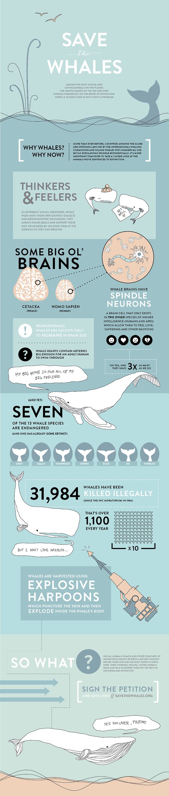
Click on the image to view the full infographic example
A story
The content is arranged as a story “introduction-body-conclusion”. The body is broken into small paragraphs in order to make the content scannable.
Click on the image to view the full infographic example
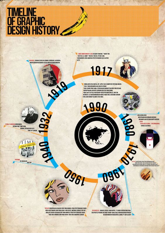
A timeline
The content is arranged by the time at which the events happened.

Click on the image to view the full infographic example
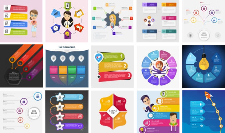
A numeral or an alphabetical order
A structure suitable for presenting pieces of information that are equally weighted.

Click on the image to view the full infographic example
Pros and cons or comparison between two or more subjects
The content is divided into two or more vertical sections in order to compare subjects by different factors.
Other structures and hybrid structures
The examples above show just a few popular structures for infographics but there are so many other structures to use. It all depends on the nature of your content. In addition, you can combine different structures into one infographic.
3. Roll up your sleeves
aka the Design Phase
The most fun phase begins! Since people are naturally attracted to everything visual, the actual design of the infographic is what “sells”. In other words, the design is what nails the attention and helps you convey your message in the right way.
Don’t forget to check out the Infographic Design Trends in 2022 before designing your infographic.
3.1. Pick your tools
…depending on your level of expertise.

Are you going to do the design yourself? How familiar are you with graphic software like Photoshop, Illustrator, Sketch, Affinity Designer, InDesign, etc.? What is your budget? Depending on your level of expertise and resources, you have a few options to realize your infographic.
You may be interested in this related article: How to Make an Infographic in Less Than 5 Minutes in Adobe Illustrator
Have a graphic designer or a graphic design studio do it for you.
If you are not confident in your skills or simply don’t have the time to invest in creating the infographic, your best option would be to hire a graphic designer. Of course, this would be the most costly option but if you are aiming for a highly engaging infographic, you are aiming for a high ROI, as well.
Use a premade infographic template.
A premade infographic template is a great option if you are looking for a ready design just to place your content in. This option is quite more affordable than hiring a graphic designer as long as you find a template that communicates the type of your content effectively.
Here are 47 FREE Photoshop Infographic Templates which can save you time and effort.
Use premade infographic elements.
If you have a bit more time and skills in using design software, you can build your own infographic with the help of infographic elements. There are many free infographic elements available on the web and the paid ones are usually quite affordable.

Use an online infographic builder.
Online infographic builders are very convenient for most users, as they usually don’t require having professional skills in designing. No matter of the infographic builder you will use, you will have a library of design elements and a gallery of premade templates to choose from when building your design. There are free and paid subscription plans. Usually, the free plans include the platform’s branding on the final infographic design.
Read more about Infographic Creator Tools: Top 5 Infographic Creator Tools to Try Now (No Design Skills Required)
3.2. Sketching and wireframing
…to achieve the first visual interpretation of your ideas.

Sketching is the first step of the design process: the rough drafts of your infographic-to-be.
If you’ve decided to create the design yourself, lay out your ideas on a sheet of paper first until you establish the most effective way to distribute your content throughout the infographic’s body.
Then, based on the sketches you’ve made, distribute the content throughout the infographic’s body in the exact dimensions it will be. Position the images, the texts, the graphs, and charts, so you have a clear structure of the infographic before you start making the actual design.
Here are a few examples of infographic wireframes:

3.3. Choose the colors and fonts.
…to make the infographic attractive and readable.
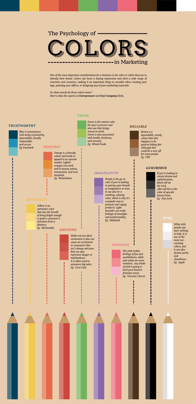
When it comes to choosing the colors, you need to take two factors into consideration: the meaning of colors and the branding.
The psychology of colors is a complex matter. Different colors mean different things and they also convey different emotions. Identify the colors that will support your message and appeal to your target audience.
Another factor to consider is the branding. If the infographic is specifically related to a brand (and especially if your goal is brand awareness), present the design in colors consistent with the brand’s colors. Here is a bit of insight on the psychology of colors by Louise Myers:
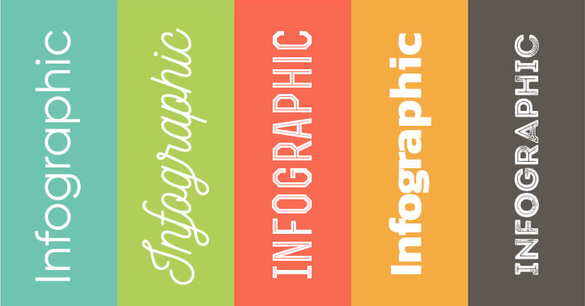
Regarding the infographic fonts, you don’t have to limit yourself with using only the standard web fonts. The infographic is presented in an image file format which means you can experiment with unique fonts as long as they are readable. Feel free to combine 2-3 fonts, e.g. choose a serif font for the headings and sans serif for the paragraphs. It usually looks good to use a fancy font for the title. If you want to stress on a part of the sentence, make it bold or in a different color.
3.4. Use analogies and visual cues
Make it fun and functional at the same time.

Metaphors and analogies help you spice up the infographic, especially when the subject is boring and/or complex. Use analogies that your audience can easily relate to. Think of unique and fun ways to visualize your data. Here is a cool example – an infographic using cola cans and pizza slices to depict data and statistics.
![]()
Visual cues are important because they tell the viewer what to read next. Especially if the order in which the user should follow your content is hard to grasp. Even if the flow is obvious, visual cues help achieve an arranged and logical design.
Use lines and arrows. They lead the viewers’ eyes and make the infographic look tidier.
Use ABC or numbering. They are very easy to follow even if the content is scattered all over the design.
No matter which option you go with, make sure to leave enough white space in order to make the design digestible. This is the blank space left between images, design elements, and text. It makes the design organized and easy to understand.
3.5. Finish with a call to action
Because you are doing it for conversions, after all.
As we’ve cleared it up, each infographic has a goal. This goal is best achieved when you place a call-to-action button or a link at the bottom of the infographic. You would want to direct traffic that you’ve brought here towards your goal, so tell your readers what you want them to do next:
- Should they visit your website?
- Should they download a product?
- Should they sign up for something?
Also, have in mind that white space around elements kind of works like a frame. The more white space you leave around an element, the more it will pop. Leaving enough white space around different sections in your design will separate them visually, and leaving enough white space around your call to action will focus the viewer’s eyes right towards it.
Practical design tips for the call to action:
- Leave white space around it – it works like a frame.
- Use bigger and bold fonts.
- Use a contrasting color.
- Centralize it.
4. Steal the show
aka the Optimization Phase
What would be the purpose of putting all this time and effort into creating an engaging infographic if people don’t know it exists? The final steps of this journey are related to making your infographic discoverable and accessible to as many people as possible.
4.1. Proofread and cite sources
…in order to be taken seriously.
Make sure your content is free of grammar and punctuation mistakes. It’s a good idea to use a grammar checker tool to catch the mistakes that are not so obvious.
Sleep on it, so you can identify mistakes better. Let the design rest for a few hours or even better – for a day. Sometimes, it takes a pair of fresh eyes to identify those little details that are not quite right.
Make sure to credit all authors of information that you used in the infographic. The practice is to cite the sources along with links. As an alternative, you can cite the sources on the page you’ve published the infographic. This way, the readers can easily just follow the links to get more information.
You can learn more in-depth in our article Proof-Check Your Infographic Design.
4.2. Make it shareable and easily discoverable.
…to reach as many prospects as possible.
Infographics may look amazing but don’t forget that they are simply static images. Choosing a great font for yours will surely improve readability but unfortunately, search engines will still perceive it as an image. Optimize the infographic image itself – add alt tags and image description, and publish the infographic’s content as text right after the image for even better optimization.
When it comes to sharability, a high-quality full version of the infographic is great for sharing on platforms like Pinterest and Behance. For other social media platforms that apply image restrictions (like Facebook and Twitter), prepare a meta image for sharing.
There are a bunch of sites where you can easily submit your infographic and gain views, such as:
- SubmitVisuals
- OnlyInfographic
- InfographicBee
- CoolInfographics
- InfographicReviews
- InfographicJournal
- NerdGraph
- InfographicPlaza
- InfographicsDirectory
- Visulattic
- ShitHotInfographics
- Galleryr
- AllInfographics.org
- ILoveCharts
- Graphs.net
Make your infographic as a presentation, so you can upload it to SlideShare. Browse inspiration from 35+ Free Infographic PowerPoint Templates To Power Your Presentations.
Here is how we made this article as a SlideShare presentation. Feel free to spread the word if you’d like.
Final words
Learning how to make an engaging infographic is a process that you may not nail from the first time. Just follow these steps and you will get there faster.
We hope we’ve been helpful with this guide. If you have anything to add to the subject, we’ll be waiting for your comments below. See ya!
You may be interested in these related articles:
 100vw, 756px\" data-jpibfi-post-excerpt=\"\" data-jpibfi-post-url=\"https:\/\/graphicmama.com\/blog\/top-color-combinations\/\" data-jpibfi-post-title=\"Color Combinations 2022: Top 8 Color Trends in Graphic Design\" data-jpibfi-src=\"https:\/\/i.graphicmama.com\/blog\/wp-content\/uploads\/2022\/05\/17122703\/best-trendy-color-combinations-756x420.jpg\" >")