


Looking for practical flyer design tips that you can apply right now? Read on.
Whether as a part of visual brand identity or as a separate project, almost every graphic designer has been given the task to create a flyer. Now, when you are experienced in the field, this may not scare you at all but for someone making their first steps in graphic design, making an impressive flyer design may turn into a quite big challenge.
In this post, we’ve gathered many practical flyer design tips accompanied by great examples that will give you the confidence and inspiration needed to nail your next flyer design project.
A quick prep: Understanding the types of flyers
Once you have a task to design a flyer, it’s so tempting to rush into the design right away. Before you start giving your vision a physical dimension though, carefully analyze the type of flyer you will be making. This will help you determine its content with better accuracy and distribute it rightfully on the canvas.
Generally, flyers are created for several purposes:
-
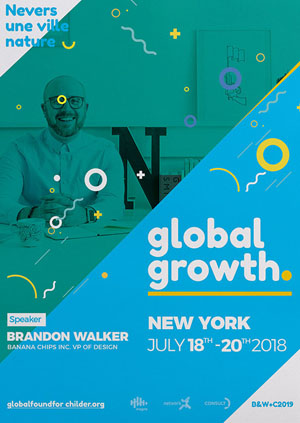
Promoting an event
Flyers are very effective in announcing and promoting events. Such a type of flyers usually includes information like event name and/or participants’ names, city/venue, date and time, ticket prices, and contact details (a phone, an email, a website). Here are a few examples.
-
Advertising a campaign, an offer, a promotion
It’s a very common practice to use flyers for advertising specific campaigns, product discounts, special offers, bundles, and other promotional activity. Such flyers may include several offers on the sheet or focus on just one. Another important information that goes on promotional flyers are deadlines and special conditions.
-
Advertising brand products and services
Distributing flyers is a good way to spread the word about a new product or a product promotion. In this case, the flyer includes key selling points about the product advertised – features, pricing, discounts, as well as where and how to buy or order.
Usually, designers and marketers utilize both sides of such flyers in order to include more information about product features, uses, benefits, etc.
-
Popularizing a brand
Promising startups, newly open salons, and shops, all kinds of local business, as well as online businesses. Almost all brands can benefit from using flyers to give their business a word of mouth. Such flyers most certainly include the competitive advantages of the brand and key information of the services provided.
-
Raising awareness for an initiative, a cause, etc.
Flyers are a great way to spread the word about an important social initiative and campaign, to raise awareness about a social problem and more. Such campaigns may be related to a brand, the government, independent organizations, and more.

Design: James Young-Williams
I. Flyer design tips: Fonts and typography
Information is the most important part of each flyer design. After all, the primary idea of the flyer design is to communicate a certain message – inform about a new product launch, spread the word about an event, raise awareness for a cause, and more. When it comes to designing the copy of any marketing material, make sure to emphasize the key selling points.
Tip #1: Make the copy itself the main design element
Full or partial typography design fits very well on the limited canvas size of a flyer and it doesn’t have to be boring at all.
Use a font with good readability and make important words pop by using a different color or a color background. Combine it with a photo or an illustration, or just leave out the visuals entirely.

Design: Martyn Playford

Design: Briana Bolger-Schuth
Tip #2: Make the typography interact with the other design elements
Typography interacting with the design is a visual technique that breathes life into the whole composition. Make the words an active part of the design to achieve such kind of movement – decorative elements winding around the letters, elements, and words overlapping each other, etc.

Design: Travis Wagoner

Design: Travis Wagoner
Tip #3: Use fun and quirky fonts
Unlike web design, graphic design (especially for print) allows you to experiment widely with the way your words look. Unleash your imagination and use flyer design as a field for experimenting with unconventional fonts. Decorated words in the style of the design, hand lettering fonts, and funky styles – all of these and more can make your flyer design unique.

Design: Goooood Company

Design: Goooood Company
Tip #4: Combine fun with classic fonts
If your flyer design piece must include more text information, it is inevitable to use classic fonts, as well. To make the design more appealing, use an artistic font for the headings and a classic font for the paragraphs (see the first example).
Another good practice for flyer design with little text is use an artistic font for the title and a classic font for the additional information (see the second example).

Design: Aly Alalfy

Design: Travis Wagoner
Tip #5: Experiment with font orientation, alignment, and effects.
Think outside the box and experiment with the orientation and alignment of your fonts. Asymmetrical and tilted orientations make the design composition look fun even if you use a classic font. A classic combination of horizontal and vertical alignment also works wonders for flyer design.
Effects of distortion and liquefaction are among the top graphic design trends that will certainly make your piece look cutting-edge.
II. Flyer design tips: Colors
The choice of colors and color combination have a strong and specific influence on people. Colors have the power to evoke different emotions, impact the mood, and provoke actions. It is essential to learn how to use color in your flyer design, so they grab the attention and support your message.
Tip #6: Bright colors on your flyer design will nail the attention
Bright colors may be considered too harsh on the eyes when used in digital graphic designs. However, when it comes to print materials such as flyer design, they definitely help catch the eye of your prospectives.
Combining bright contrasting colors work well on backgrounds, design elements, and fonts. To maintain an excellent color harmony, you may have to use the neutral white and black, as well. For example, white font on a bright red background, black font on a bright yellow background, and many more combinations.
Tip #7: Combine black and white with bright color accents
Black and white have always been a classic color combination which makes a graphic design look dramatic, mystique, and elegant. When it comes to flyer design, the black and white duo looks very good combined with a bright color whose purpose is to nail the attention.
The color accent can be incorporated in the composition details, on the background, as an overlay, and more.

Design: Goooood Company

Design: Goooood Company
Tip #8: Use enchanting gradients
Dreamy colors are ultra modern and such gradients are among the trendiest graphic design looks this year. The idea is to recreate an enchanting fantasy look that amazes the viewer.
Gradients in such color combinations can be used in different ways – as overlays, for examples, if you want to make them a primary effect, or on some design elements – let’s say, the typography, if you’d like them to be а complementary effect.

Design: Travis Wagoner

Design: Téo Vilela
III. Flyer design tips: Composition types, styles, techniques
The choice of typography and colors can be easily made once you know the design style you are pursuing. With the following tips, we hope we’ll clear up for you the different types and styles of designs.
Tip #9: Open vs closed composition types – know the difference
The open design composition seems to go beyond the frames of the flyer design (see the first example). The closed design composition, on the other hand, is clearly encapsulated in a frame (see the second example). Even if there isn’t an actual frame, all elements in the closed design composition are centered in the canvas and don’t go beyond its borders.
Both ways, you need to ensure enough space for the bleeds. This way the essential information will stay inside the composition when the final design is printed and trimmed.

Design: Téo Vilela

Design: Travis Wagoner
Tip #10: Go 3D for a more realistic look
Flat graphic designs look good but 3D effects can simply “wow” your prospectives as long as you know how to utilize it. By using 3D techniques, you can achieve very realistic and futuristic looks. Either way, a three-dimensional composition can make the viewer immerse no matter if it’s made in pale or bright colors.

Design: Téo Vilela

Design: Alexander Pevchev
Tip #11: Use illustrations for a more artistic look
The illustrative design style has always been among the top choices of designers who want to impress prospectives with creativity. The opportunities for this kind of style are pretty much limitless. You can recreate any kind of effect by using illustrations.
If you are not an illustrator yourself, you can purchase design packs with stock illustrations in which design elements are created in the same illustrative style.
Tip #12: Use geometric shapes for ultra modern futuristic looks
Complex geometric shapes especially combined with futuristic colors are very satisfying to look at, especially when symmetrical. They may even have a mesmerizing effect on the viewer. Use this advantage

Design: Travis Wagoner

Design: Lady LYFE
Tip #13: Bring out some retro vibes
Vintage and retro-inspired designs provoke nostalgia. This makes them very effective in communicating certain messages. Before using this effect, you must really take the time to analyze the target audience for this marketing campaign.
Retro-inspired looks are characterized with pale, yellowish color nuances to recreate a worn-out effect or an old paper.
Tip #14: Impress with negative space design technique
Negative space is one of the undying trends in graphic design that make each composition more interesting and unique. You can apply this technique on big lettering or some design elements. Either way, the effect will be worth it.

Design: Alexander Pevchev

Design: cherry wtz
IV. Flyer design tips: Brand identity
In most cases, when you have a task to design a flyer, it will be related to a specific brand. In such situations, you will have to abide by the established visual identity of a brand or create one. Think in terms of brand colors, brand fonts, mascots, logo and tagline, and other elements that must be included in the design, so that the brand is easily recognized.
Tip #15: Aim for consistency in the style
One way to make a brand instantly recognized is to maintain consistency by making design compositions in the same style.
The following flyer design examples are consistent in the illustration style and design composition. The designer has used the same flyer aspect ratio (1:1), frame, logo placement, date placement, and has centralized the whole design.
Tip #16: Aim for color consistency
The following brand identity example shows that using the same color scheme, illustration styles and some repetitive elements (the splashes) helps you achieve perfect design consistency in spite of using different design arrangements and types of composition – a closed in the first example (all elements stay inside), and an open in the second (elements go beyond the design borders).
The brand recognition is achieved in the third example, as well, where the only element that changes besides the copy, is the color. This strategy is useful when the brand can be associated with several colors.
V. Technical flyer design tips
Tip #17: Use at least 300 dpi or 600 dpi for high-resolution printers
To make sure your design looks crystal sharp on paper, set the canvas resolution to a minimum of 300 dpi before you start designing. If you will be using a high-resolution printer, it’s even better to set the resolution to 600 dpi although it might make your file a little heavier.
Tip #18: Design with bleeds and trim guidelines
When it comes to print design, including flyer design, it is imperative to use bleeds, as well as guidelines for a safe design area. Position all important design elements inside. This way, you will ensure no essential information will get cut out in case of printing or cutting errors.
Tip #19: Design in RGB and convert into CMYK upon printing
The best practices show that it’s best to design in RGB, then convert the file into a flatten CMYK file, and save it in a TIFF file format upon submitting for printing.
Sometimes, the colors vary when converted into CMYK files, so it would be best if you know the exact values beforehand (especially when it comes to using brand colors). Such information is usually provided in the brand style guide of the brand you will be designing for.
Tip #20: When it comes to choosing a paper type – test, test, and test!
Matte or glossy, coated or uncoated – the choice of paper matters a lot. It can either complement your design and boost its effectivity or completely disguise the effects you wanted to achieve.
You will hear plenty of advice related to the choice of paper, most of which comes from personal preferences. Our recommendation is, test each design on different paper types to find which one will help you achieve the effect you are pursuing.
You can also use free premade templates, which you can find here: 70+ Free PSD Party Flyer Templates.
To sum up,
All you need to master flyer design is practice. Just like anything else, this process takes time, devotion, and patience. With the flyer design tips covered in this post, you will definitely level up your designs and feel more confident about your compositions.
We hope you feel inspired and loaded with ideas! If you’d like to leave us a comment, feel welcome to do so in the section below.
 100vw, 756px\" data-jpibfi-post-excerpt=\"\" data-jpibfi-post-url=\"https:\/\/graphicmama.com\/blog\/how-to-calm-down-before-presentation\/\" data-jpibfi-post-title=\"How to Calm Down Before a Presentation: 10 Practical Tips and Techniques\" data-jpibfi-src=\"https:\/\/i.graphicmama.com\/blog\/wp-content\/uploads\/2022\/03\/11143200\/how-to-calm-down-before-presentation-756x420.jpg\" >")
