Nowadays, brands fight for customers’ attention more furiously than ever. There is an endless abundance of visual stimuli around us which makes it harder and harder to keep one’s interest. That is why, all companies, especially the big ones, are raising up their game with their marketing strategies. Often these strategies is to make the mascot design look trendy, in order to keep and attract customers’ interest and loyalty to the brand.
We all know that you never get to make a first impression again. And what’s the first client’s encounter with a business? The company’s logo, mascot, and name. We’ve discussed already the importance of having a mascot for your business 5 Superpowers of a Cartoon Character and we showed you some of the most iconic brand mascots – 21 Most Famous Brand Mascot Designs of All Time.
But what you may not be aware of, is that famous brand characters and mascots didn’t always look, as they do today! Companies that know their market well are making refresh their mascot design from time to time, so their brand still feels contemporary, looks fresh, and matches the new needs of the clients.
In this article we will go through 10 brilliant transformations in mascot design, that famous brands undertook. So let’s see their ideas, thoughts, and results!
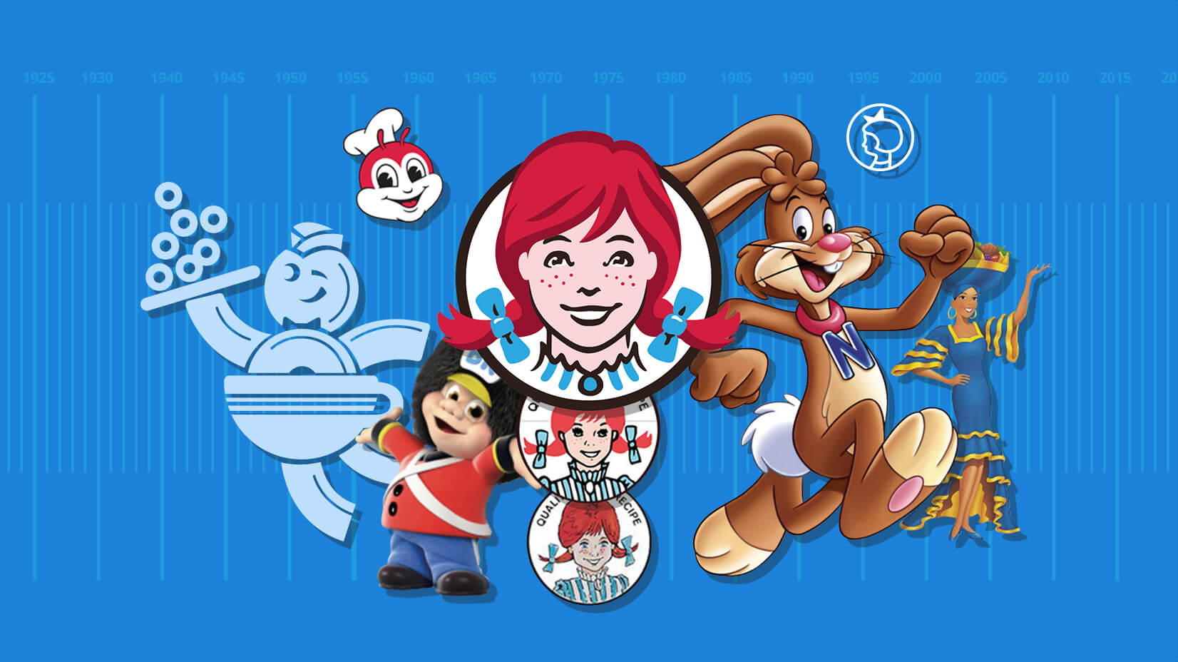
1. Michelin’s Bibendum (Michelin Man)
The first character design of the Michelin Man was quite sinister, but after later reinventions, he became cuddly and jolly. Legend has it, that the idea for the mascot was born 4 years before the actual realization of mascot sketches, while the brothers were looking at a pile of tires. They thought, that the pile would make a perfect man character, if only he had arms and legs…
One of the first good decisions the artist made about the new mascot design, was to discard the bottles and cigars, common accessories in Michelin’s commercials at this time. Following the character development through the years, he became a rounder, fun, and cartoon-ish character, until its latest years, when he “lost weight” again and became more macho-looking:
Mascot redesign during the years


Facts about Michelin:
- 1889, founded by the 2 brothers – Edouard and Andre Michelin
- 2009, launched a 20 million US dollars ad campaign
- They manufacture tires for space shuttles
- Patent for removable pneumatic tire
2. Pringles
The mascot of Pringles is a male character, called Julius Pringles, with a large mustache and parted bangs. In 1979, designers changed the red color of his eyes and we think they did a good job! The character also had eyebrows for a long time, until 2001, when they were removed from the design. In 1998, his cheeks and lips also dropped out from the mascot, his face widened a little and he got a nice red bow. Did you know, that the designers in the house always try to keep his mustache’s shape similar to the specific shape of their potato crisps? And if you are very (very) curious and observant, you might notice that the dot in the Pringles name also transformed into a little half-mustache. Cute!
Mascot redesign during the years


Facts about Pringles:
- 1967 the product is first sold by P&G
- 140 countries sell the stackable snack
- a hyperbolic paraboloid is the saddle shape of the snack
- “peppermint white chocolate” is one of their seasonal flavors brought in 2012
- Brad Pitt once starred in Pringles Commercial
3. Wendy’s
The name of the 3rd largest fast-food restaurant in the world is after the founder’s daughter’s nickname, and the mascot is inspired by how she looked back then, 8 years old. Some of the first mascot design decisions for makeover were to make Wendy’s hairstyle simpler and to use flat colors. It is nice to see in the latest mascot, designers brought volume and styling to her hair, while staying true to the original. A contemporary design decision was to peek her pigtails out of the frame, this way bringing the character closer to us and making her more dynamic. And what is our time and lifestyle, if not fresh, dynamic, and connecting people?
Mascot redesign during the years


Facts about Wendy’s:
- 1969 founded in USA
- 2013 first major brand logo transformation in 30 years
- 2015 opens a lab for technology innovation
- 6,500 outlets worldwide
4. Milka
Inspired by the motto: “Make the familiar strange and the strange familiar” Suchard decided to give Milka’s mascot a purple color, the same as the color they chose earlier for packaging. The unusual color choice was made in an attempt to stand out from the competitors and to communicate their main message: softness and tenderness. And so far, proved to be recognizable, memorable, therefore- successful!
Although at times, the cow mascot was not used for the packaging, product versions with Milka are outnumbering the ones without. Through time, the world-famous character has been constantly simplified and developed. Though, one important design decision was made – to keep the dear cow in the focus of their designs. Proportions, patterns, and bells have slightly, nearly not changed over time. The last change they have made is to tilt the cow’s head towards the viewer, to engage and establish a connection.
Mascot redesign during the years
But let’s see now, in more detail, how they redesigned the mascot through time:
The cow is not a central character for some of the old packaging.
Facts about Milka:
- In 1825 Suchard founded his first own confectionery
- 25-30 kilos of homemade chocolate per day was able to produce Suchard when he started
- 1901 Milka brand is registered
- Milka got its purple package and cow from the very beginning
5. Irma
Denmark is a small country with a population of not over 5.7 million people, but they are extremely popular for their Scandinavian design all around the world. The qualities of this design – simplicity, proportion, neutral colors, and clear lines are translated also in the contemporary redesign of one of their most famous mascots – Irma girl. The girl is a mascot of a Danish supermarket with a long tradition. Having in mind, that the Danish nation is the one with the most blonde representatives in Europe, it’s no surprise, that the mascot girl is with short, of course, blonde hair and fair skin:
Here are also some current color choices for the Irma character and the supermarket’s products:
Mascot redesign during the years
The most obvious thing about the design transformation, during the years, is that Irma was constantly being simplified. Furthermore, the design of her shoes is changed and is more neutral now, so that she resembles a modern girl. When creating or reinventing a mascot design, is also important to think about the little details – first, the tilt of her head is changed to a more natural one, and second, the wave in the dress is more proportionate now. The design team also produced an avatar with her head, for contemporary design needs, packaging, etc.


Facts about Irma:
- 1886 founded, the Danish supermarket, started as a small shop selling eggs
- 71 stores, mostly in Copenhagen
- 2nd oldest groceries store in the world, after Mark&Spencer (leading only with 2 years, by the way)
6. Chiquita
The first mascot design of Chiquita (the famous banana company) was a great success among consumers. She played an active social role, educating people about the nutritional value of bananas and even participating in radio shows, commercials, movies, and who would have guessed – in a symphony orchestra! The mascot appeared on the labels of the products in 1963 and was first changed in 1987. In the beginning, Chiquita was a half-banana, half-woman character until she was redesigned by Oscar Grillo (The Pink Panther) in 1987 into a “whole” woman. Today, Chiquita’s mascot is represented by a real lady, dressed in the typical costume of Chiquita – Jenny Canales. She keeps the tradition of being a popular and active social figure, teaching both kids and adults about healthy living and making appearances on reality shows.
Mascot redesign during the years


Facts about Chiquita:
- 1870 founded
- 1944, Dik Browne creates a mascot – half woman, half banana
- Chiquita means “tiny girl” in Spanish
You may be interested in How to Design Your Own T-shirt: Best Practices & 40+ Examples
7. BR Toys
BR toys are the most popular toy store chain in Denmark, with shops operating also in other Scandinavian countries, and Germany. BR is the initials of the founder – Børge Rasmussen, and the whole mascot’s name is “Cousin BR”. Initially, the company started as a shop for magazines and newspapers, which sold toys only around Christmas. The 2 founders were a family and had 2 sons, who probably inspired the mascot design for the toy store – a little boy, dressed in a Royal Life Guard uniform.
Mascot redesign during the years
They had the mascot design change through the years, but the changes are very subtle – the hat’s shape, simplifying the typo and the coloring, slightly enlarging the face, to stand out more, and making him 3D realistic:


Facts about BR toys:
- 1963, founded in Denmark
- 92 stores only in Denmark
- over 100 stores in Europe
8. Jollibee
Jollibee first started out as an ice cream parlor and experienced rapid growth after shifting its focus to selling hot dogs and other fast food, prepared for the specific taste of the Asian market.
Its mascot, a large red bee with a blazer, shirt, and chef’s hat, was introduced in 1980 and it is probably the favorite character in the Philippines. The idea behind the mascot was to portray the typical Filipino optimism and energy, with the help of a hard-working bee, serving delicious food. The mascot got so popular, that the company launched TVshow, starring the happy bee and his friends and the program had successful for 5 seasons in 5 years!
Through the years, the designers simplified his clothing and changed the proportions of his face, antennae, and eyes, to make him more believable and aesthetically pleasing. As you can see from the pictures below, his trousers also dropped out from his first fashion look, to reveal the typical bottom body part of a bee, with red and yellow stripes.
Mascot redesign during the years


Facts about Jollibee:
- 1978, founded in the Philippines
- 3,000 stores worldwide
9. Quik
An interesting fact about this popular bunny mascot is, that he wasn’t very warmly welcomed when introduced in France and Greece. The reason? The same drink, Nesquik, already had a different-looking mascot for the European market – a big yellow rabbit, or the so-called Gros Quik (Big Quik). The customers loved the yellow brother of the American Quik and protested when the company replaced their big old friend with the Yankee.
Mascot redesign during the years


Facts about Nesquik:
- 1948 the chocolate drink hits the market
- 1950 introducing strawberry flavor
- 1978 creation of the character
- 1999 changing name from Quik to Nesquik worldwide
10. Dunkin Donuts mascot design
Once upon a time, Dunkin Donuts had as an inseparable part of their design vision, a mascot and a buddy, called Dunkie. Somehow, he got lost during the years and in the latest years, Dunkin Donuts were more recognized for its minimalistic design. Fresh, orange, and pink letters and a simple logo of a steaming coffee cup. But things changed – for their 60th years anniversary in 2010, they approached Matt Stevens with the exciting task and honor to redesign and prepare the good old Dunkie for a makeover.
The designer used as inspiration the old vintage look of Dunkie from the 50-s, retaining all of his elements and basically, simplifying his shapes. Looking back at the old mascot, they finally found a solution of how to combine their 2 main mascots (products) into one again.
Mascot redesign during the years


The people in house in 2010 also put their creative powers into producing new versatile packaging and they were really inventive in implementing the new mascot redesign:


- 1950 founded
- 9,000 stores worldwide
- 2.5 million donuts a day
- 2 million cups of coffee a day
- 3 million customers per day
This time travel through mascot redesign of famous brands was interesting and curious, wasn’t it? Tell us what you think, leave us a comment below and we hope that you will stay around for more interesting articles about our passion – characters!
Did you know, that we also craft beautiful and customized character designs at Graphic Mama? So don’t hesitate to ask – we could be the right team for a fresh redesign of your own mascot!